Bonjour, mes amis! You know, I’ve been daydreaming about Paris lately, and it got me thinking about French fonts. You know, those elegant, sophisticated typefaces that just seem to exude that certain je ne sais quoi? Well, I couldn’t resist delving into the topic, and now I’m thrilled to share an intro for an article all about these beautiful and charming fonts. Are you ready to embark on this journey with me? Allez-y!
There’s just something so enchanting about French fonts, don’t you think? They have this amazing ability to transport us to the charming streets of Paris or the rolling hills of Provence, all with a few strokes of the pen.
And the best part? French fonts come in so many different styles and flavors, from romantic and whimsical to bold and avant-garde. There’s truly a French font for every occasion and mood.
Alright, mes amis, I’m beyond excited to dive into the fascinating world of French fonts and share all the wonderful things I’ve learned with you!
For ages, the French have had a well-deserved reputation as being stylish.
But while France has established itself as the tastemaker in Europe and beyond, setting the standard in luxury design, fashion, and art, its graphic design, particularly in recent decades, may be less well recognized.
Hence, take inspiration from the French and avoid letting practicality and commerce stifle your creative vision.
Best French Fonts For Creative Projects
Browse the list of French Fonts below to find fantastic, user-friendly digital design tools.
Antique Olive Font
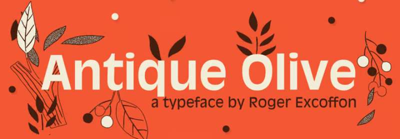
One well-liked sans-serif typeface is Antique Olive Font. Roger Excoffon, a French graphic, and online designer created this font. It is available in a range of weights and styles, including medium, condensed, condensed bold, wide, bold, and extremely bold. This typeface is utilized in the Sesame Street TV series because of its bold characters. You can use it to create card designs, game logos, wall murals, and other things. Several official businesses find this typeface helpful for their various design projects, such as t-shirt designs, product designs, mug designs, and certifications.
Univers Font
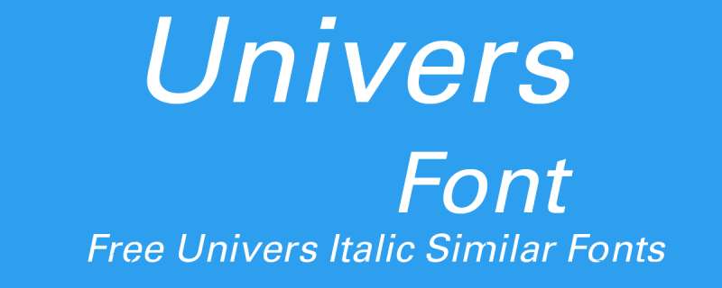
One of the most significant typographic developments of the second half of the 20th century is the font family Univers. The family benefits from having a range of weights and styles that, even when combined, convey steadiness and homogeneity. Univers is a readable font ideal for practically any typographic purpose because of its straightforward, objective forms.
The French type foundry Deberny & Peignot aimed to expand the selection of Lumitype typefaces in 1954 by including a linear sans serif type in several weights. The art director for the foundry, Adrian Frutiger, recommended against using an existing alphabet. The family was introduced by Deberny & Piegnot in 1957, and Linotype later produced it.
Peignot Font
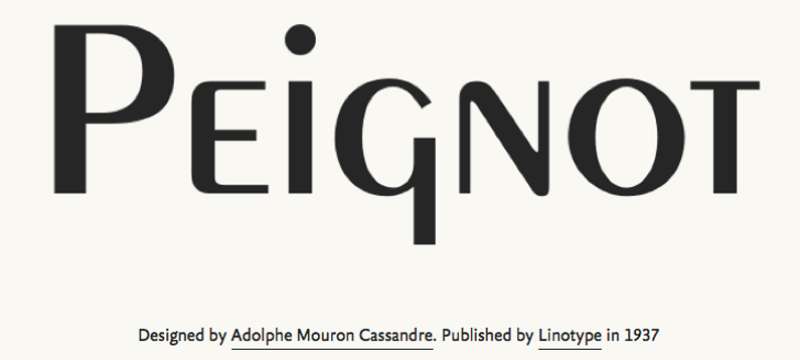
A. M. Cassandre created the sans-serif display typeface Peignot in 1937. The French foundry Deberny & Peignot commissioned it. The typeface is unique for lacking a typical lowercase and instead using a “multi-case” that combines small capital letters and traditional lowercase letters. From its introduction through the late 1940s, the typeface enjoyed modest success in the poster and advertising publication industries.
Mistral Font

The Mistral font family was designed by French graphic artist Roger Excoffon and is named after the brisk, strong winds that blow across Southern France. All letters of the informal script known as Mistral are connected by bold strokes. Its brush-like stems, which were first introduced in 1953, appear unplanned and young. The descenders are pretty long, and the entire alphabet creates a memorable impression on the page. Mistral works well with sans-serif typefaces.
French Serif Font
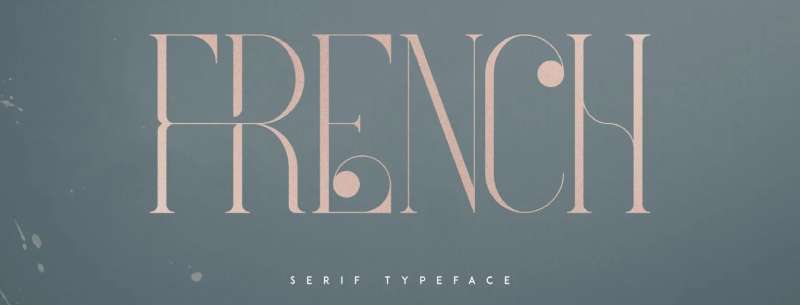
Four typefaces in the luxurious, contemporary typeface French will delight your upcoming project. Alternate glyphs, ligatures, and multilingual support are loaded. Fonts with a lot of versatility that function well in both large and tiny sizes. French works well as a classy text overlay on any backdrop image and is ideal for branding projects, home décor designs, product packaging, magazine headings, and more.
Ecolier Font
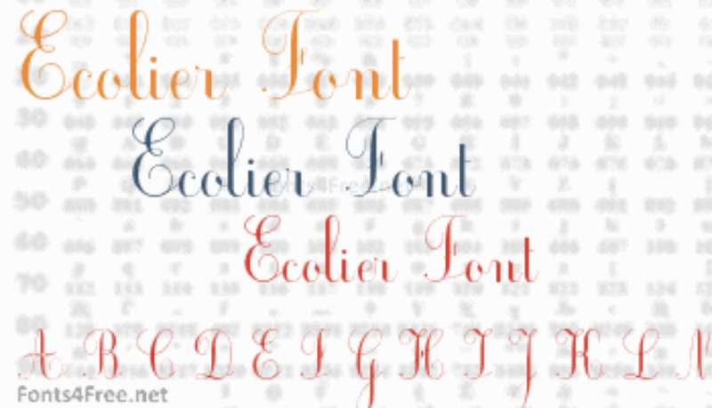
Jean-Marie Douteau created the script font known as Ecolier for use in schools. The font can be used for free for private purposes. The Ecolier font has 151 distinct glyphs and 223 defined characters.
Adobe Garamond™
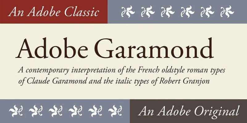
The Claude Garamond typefaces from the sixteenth century served as the inspiration for the Adobe GaramondTM font family. The italics of this serif face, which was designed by Robert Slimbach and published by Adobe in 1989, were inspired by Robert Granjon, Garamond’s assistant.
One of the most adaptable typefaces now on the market, as well as one of the most beautiful and graceful in print, is the Adobe Garamond design. Because the letterforms use less ink than those of other comparable faces, it is also among the most environmentally friendly typefaces to print. The instantly recognizable Google logo has been created using the Adobe Garamond font family.
Auriol Font
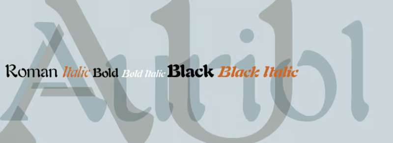
George Auriol designed the display typeface Auriol in 1901 for the Parisian foundry G. Peignot et Fils. Early in the 20th century, Auriol gained popularity in Europe and America and was frequently employed as a display type in books, posters, and the applied arts. Moreover, it was used for station signage in the Paris Métro.
New French Font

Austin Signs created and freely distributed New French, a casual, attractive, and straightforward handwritten typeface. Lowercase and capital characters, as well as multilingual accents, symbols, and numbers, are all included in the new French font. The elegant and sophisticated look of the new French font will add a touch of refinement to any creative design project. This lovely script font is ideal for logos, headlines, and brands for things like footwear, apparel, coffee shops, motorcycle clubs, posters, social media, and t-shirts.
Russelot Font

An eye-catching graffiti typeface is Russellot. primarily created as an attractive uppercase graffiti font design with a bubble appearance. This typeface has an appealing appearance that will instantly make you say “aww,” whether it’s used for massive branding text or catchy headlines. It is ideal for a variety of design tasks, including posters, logos, book covers, branding, headings, printed products, merchandise, social media campaigns, etc.
ITC Eras Font

French designers Albert Boton and Albert Hollenstein created the ITC Eras font. It has an ordinary little forward tilt and subtle variations in stroke weight that set it apart from other sans serif typefaces. ITC Eras is a free-flowing typeface that drew inspiration from both Roman capitals and Greek stone-cut lapidary letters.
Eras typefaces have a refined and tidy appearance. Because of this, you can use this font when writing essays and paragraphs, printing textbooks, creating cards, and even creating logos. This typeface can also be used for the titles of animations and websites. This font has already been used by certain designers in video games, presentations, album art, instructional videos, picture books, etc.
Ronde Script
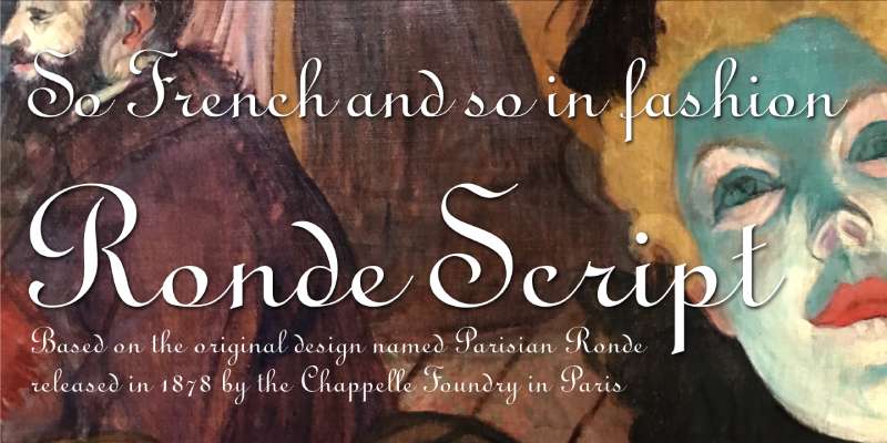
Ronde script gives the characters a rounded appearance when read as a whole since its thick strokes are nearly upright. is based on the original style known as Parisian Ronde, which the Chappelle Foundry in Paris first issued in 1878. For more than 130 years, this type of script has been a highly popular option when creating wedding invitations and numerous other official announcements. It has a formal, aristocratic, and vintage or retro feel and is very readable.
Fournier Font
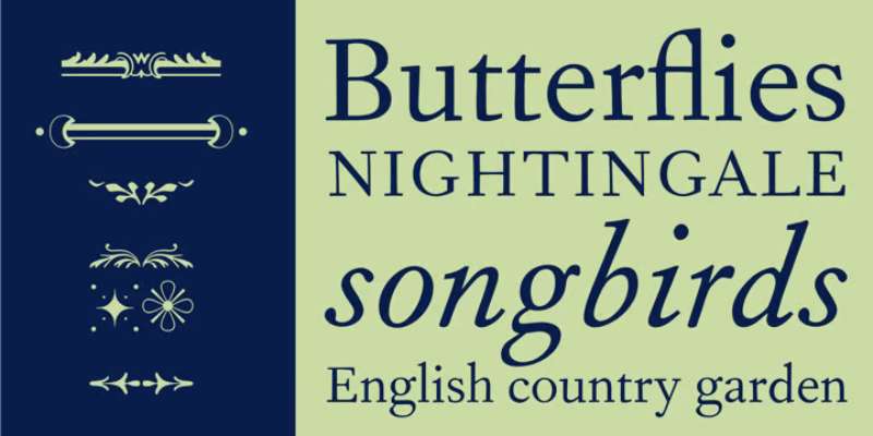
Monotype created Fournier in 1924. The style is inspired by some of the most well-known designs from the eighteenth century, types cut by Pierre Simon Fournier around 1742. Fournier’s typefaces were some of the first examples of the transitional” style and served as a bridge to the more austere “modern” form that Bodoni made popular later in the century.
They had less or no bracketing on the serifs, greater contrast between thick and thin strokes, and more vertical emphasis than the old-style fonts. Fournier maintains an even color, has a light, clean appearance on the page, and offers exceptional text economy.
Banco Font
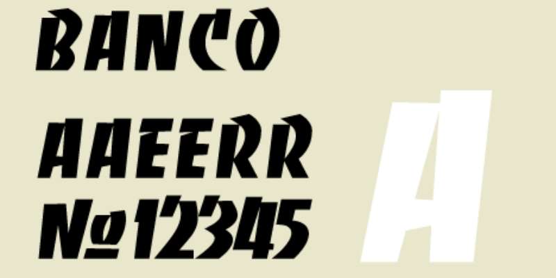
The bold decorative font known as Banco has a fantastic appearance. Phil Grimshaw created this magnificent typeface in 1997 for Linotype. The powerful font Banco, created by French graphic and poster designer Roger Excoffon and published by Fonderie Olive in 1952, served as the inspiration for this project. This is unquestionably a fantastic alternative for making larger text and larger artwork. Because nearly 400 characters undoubtedly result in a wide variety of designs. The best aspect about it is that you can also use it with other typefaces.
FAQ about French fonts
What are the most common French fonts used for printing and typography?
Garamond, Sabon, Futura, and Helvetica are a few of the often used French fonts for printing and typography. The elegance, readability, and adaptability of these fonts in diverse design contexts make them well-known.
What is the difference between serif and sans-serif fonts in French typography?
Serif typefaces are frequently used in French typography to create conventional or formal designs, whereas sans-serif fonts are favoured for more contemporary or minimalist designs. Decorative lines are added to the ends of characters in serif fonts like Times New Roman and Garamond but not in sans-serif fonts like Helvetica or Arial.
Can you recommend some free French fonts for use in graphic design or web development?
Popular free French fonts for web design or graphic design include Josefin Sans, Amatic SC, and Parisienne. These fonts are readily available through a number of online font repositories and offer a variety of styles.
What is the history of French typography and how has it influenced modern design?
With a long history that dates to the Middle Ages and the Renaissance, French typography has made significant contributions from artists like Claude Garamond and Pierre-Simon Fournier. Modern design has been greatly influenced by French typography, especially in the fields of book and poster design.
How do French fonts differ from fonts used in other languages, such as English or German?
French fonts are distinct from other language typefaces in that they have a unique character set and use of diacritical markings. For instance, French fonts frequently have accents on vowels like é or à that are absent from English or German fonts.
Are there any rules or guidelines for using French fonts in official documents or publications?
While there aren’t any set guidelines for using French typefaces in official publications or papers, it’s nevertheless vital to take the context and design goals into account. Marketing materials may benefit from more contemporary sans-serif alternatives, whilst formal documents may call for more conventional serif fonts.
What are some popular French handwriting fonts and how can they be used in digital media?
Scriptina, Mademoiselle, and French Script are three common handwriting fonts in France. These fonts give digital creations a distinctive and tailored touch, especially in the branding and marketing fields.
What are the best resources for finding and downloading French fonts?
French fonts can be found and downloaded from a variety of sources, such as design blogs, font foundries, and online font libraries. Google Fonts, Font Squirrel, and MyFonts are a few of the more well-liked choices.
How do you choose the right French font for a specific design project?
The project’s overall style and tone, target audience, and context must all be taken into account while selecting the ideal French font. Serif fonts may be suitable for more formal or conventional designs, while sans-serif alternatives may be more suitable for contemporary or minimalist designs.
Are there any legal considerations when using French fonts in commercial or personal projects?
There are usually licence agreements and copyright constraints to take into account when utilising French typefaces in professional or personal projects. When utilising a certain font in your design, it is crucial to make sure you have the required authorizations.
Ending thoughts on French fonts
French design engages its audience physically, emotionally, and intellectually while being distinctive, artistic, and sophisticated. There is no doubt that the French have an abundance of flair, so follow their lead when it comes to using a variety of approaches in your graphic design. Draw attention to the images and visual tale while appealing to the intelligence of your audience. Find the ideal match for your upcoming web and print design projects of all sizes by browsing the French fonts available for download above.
If you enjoyed reading this article about French fonts, you should read these as well:
- Fonts similar to Lato to use in your awesome designs
- Fonts similar to Avenir that will get the job done
- Fonts similar to Garamond. The alternative typefaces
The post French Fonts: A Versatile Choice for Your Creative Projects appeared first on Design Your Way.
Source: https://ift.tt/0w9XV6B
 Divashree is the founder of