8 Top Blogging Platforms for Bloggers in 2020

Tuesday, September 29, 2020

Blogs are an essential part of any website these days. Companies hire freelancers or in-house content writers who can create blogs and get them published on their websites. But there are some independent bloggers who prefer to create, publish, and maintain their blogs. For such bloggers, there are so many platforms that offer free access to space where they can post their content and keep it forever. Moreover, such bloggers write because they are passionate writers, and blogs are one way to let their creativity flow freely.

This article covers some of those platforms where the bloggers can publish their blogs under various domains. Here, we have discussed the platforms that let you publish personal blogs. Let us take a look.

1. Wix:

Wix

Wix is, hands down, one of the best blogging platforms you can use as a blogger. If you want to create your blog platform the easy way, Wix is the right place to start since it is simple to use. You can get a lot of easy to integrate templates that can change your blogging platform’s face. With drag and drop editor, you can customize the templates and the designs as per your likings. Along with a simple and intuitive blog manager, you also get analytics and in-built SEO features that make handling the SEO aspects easy.

You can effortlessly add fundamental features like comment section, hashtags, categories, and social tools. Wix easily lets you access SEO aspects like alt tags, internal hyperlinks, SEO titles, and descriptions. The blogs on Wix offer the benefit of an automatic email subscription and social media bar beneath each article. This enables you to make the sharing of your blogs on various social media platforms easy. You have to sign up and then sign in to build your blog platform. Once you have signed in, you have to pick up a template that suits your platform and get going.

2. WordPress:

WordPress

If you are looking to create a blog platform that offers a lot of flexibility, you should choose WordPress to make your blog directory. You can do innumerable things through the blog you publish on WordPress. WordPress is one of the major website builders and also powers a lot of websites. To create your website, you need to buy a domain name, including web hosting and create a WordPress account. For web hosting, you can use BlueHost, which is a ready-made web hosting service for WordPress.

Moreover, WordPress recommends BlueHost for your hosting services. With only one click, you can create and run an entire website using WordPress. Hence, if you have to build a website using WordPress, then you should use BlueHost for hosting your website.

Once all this is accomplished, you can move forward to selecting the website theme, website configuration, WordPress settings configuration, and WordPress SEO plugins. If you are a beginner with WordPress, these things can take time. But once you are through it, you can start writing blogs that agree with your target audience. WordPress is also known for its scalability, so if your platform is growing, WordPress can handle it.

3. Medium:

Medium

There have been so many bloggers that are using Medium as their permanent platform. And so many readers also use Medium to read the content from their favorite categories. Medium was formed by Twitter co-founder and former CEO with the answer to the short limits of Twitter. Hence, he came up with the name Medium for it. By the year 2017, Medium managed to have around 60 million visitors from all over the Internet. The readers read the content on Medium with a lot of curiosity and an intention to read something. Moreover, Medium also tells its readers how much time it can take the reader to read a specific article.

When it comes to posting the article/blog on the Medium, it has a WYSIWYG editor, which lets you see how your post would look like after it is published. It can take you some time to find the formatting tools, but it is easier to find them. If you are a writer who leads a team of writers, select Medium Publication. This lets you add writers and bloggers to your blog platform. You can define the home page of your blog with this kind of selection.

4. LinkedIn:

LinkedIn

When we talk about professionals networking on social media, we all know that we are referring to LinkedIn. It is a social network platform for professionals all around the world. It takes pride in having around 590 million users, and out of it, 154 million of them are based in the USA. Moreover, it has approximately 44% of active monthly users, which makes a lot of people using LinkedIn. Initially, Linkedin was created with the idea of hosting a resume. It used to be a platform for job hunters. People used to hire other people or used to get hired by other people using LinkedIn. But for the last few years, blogging has redefined the role of LinkedIn in people’s lives. If you want to build a business blog, you get around 45% of LinkedIn article readers who belong to managers and VCs. LinkedIn is known to offer stability, civility, and real value, which other social media platforms seem to have missed.

If you are a writer who dedicates his life in writing consistently, then it can reinforce your understanding of the subject in the readers’ minds. It lets the reader see how in-depth you know about the subject. If you are looking for a ready culture that likes to read business blogs, then you should begin writing on LinkedIn. This is the right place to showcase your skills and your in-depth knowledge of business or other subjects.

5. Instagram:

Instagram

Instagram bases its core concept on visuals – that include images and videos. It also lets the user write a caption, longer or shorter, beneath the pictures or videos. Instagram enables you to use the caption space for the text, and it stops you from writing when you reach about 300 words or around 2200 characters. If you belong to lifestyle, dance, or art domains and create stunning visuals out of it, choose Instagram. If you belong to the disciplines mentioned above and are also a writer, choose Instagram to create posts that include visuals and the text.

You can also create a short video that explains your audience about something that you do. Instagram has evolved to such an extent; you feel that Instagram is the best thing to happen to everyone around the world. You don’t need to be a product manager or build an audience from zero if you are on Instagram. If you are an artist who wants to go live, Instagram offers this facility where you can go live. You can showcase something that is going on at your end using this facility. It also lets you save the video and share it for people who couldn’t catch it while you were streaming everything live. Hence, Instagram is a platform for someone good at clicking pictures and videos but also knows how to write well.

6. Squarespace:

SquareSpace

If you are looking to build websites, Squarespace is a widely used website development tool around the planet. You can create the user interface of your website using drag and drop tools. People who want to develop websites for small scale businesses can use Squarespace to make their websites. Since its inception, Squarespace has managed to power millions of websites worldwide. Squarespace has a LayoutEngine feature that isn’t available with other platforms. With this feature, a blogger can click, drag, and resize the images and set the user interface quickly. Everything that you add in the UI aligns perfectly because of the grid setting. You can drag and drop the images, text, and other things wherever you want to place them.

This is a blogging platform where you can also run an e-Commerce store while writing blogs. You can add a template that customizes your website and unique look. If you become a premium member of the platform with an annual subscription, you get your domain name for free. If you are stuck with it, you can contact the Squarespace team experienced in it. With Squarespace, you don’t have to worry about your mobile-compatible website. When you start using Squarespace, a mobile design template makes your website compatible with the changing screen sizes. If you are looking to change from one blogging platform to Squarespace, you can effortlessly do it.

7. Ghost:

Ghost

If you want to focus only on the blog without worrying or getting distracted about the aesthetics of your blogging platform or website, then you should use Ghost. Ghost came into existence around the year 2013, and it works as a hosting platform. It is also software that you can install on your computer, and you can host yourself using this software along with the Internet. Even though the focus of the platform primarily is to curate content, you can still embed videos, images, and more. As it is based on an open-standard base, you can extend it completely. By using a robust tagging feature, you can fine-tune the control over the categories of the blog that you have. With a dynamic routine, you can organize the content as per your requirements.

You don’t have to worry about the SEO configurations, as Ghost comes with inbuilt SEO configurations. Hence, external plugins are not required for SEO configurations and settings. Moreover, the social media sharing facility also comes with Ghost, which makes sharing seamless and effortless. If you are into email marketing, then Ghost lets you send emails without any cost. Even if your email list grows, Ghost still enables you to send out marketing emails. If you have premium content on your blog and have loyal readers, you can have paid Ghost users. Ghost lets you customize the locking system on the platform. This means that if you want to lock specific articles while keeping others open, then you can do it. Since Ghost offers an SSL certificate for free along with global CDN, the website loads quickly from any location around the world.

8. Facebook:

Facebook

The number of people who use Facebook comes to a figure of around 1.49 billion worldwide, which is worth taking into consideration. Hence, you can think of how many people you can have who would want to pay attention to and read your blog. It is not difficult to have organic traffic for your blog posts as far as Facebook is concerned. The shortest but the smartest way to create a blog on Facebook is by creating a page or a group on the said platform.

You can use Facebook Creator Studio to have a single point of interaction. It can double up as the point for publishing your blog and then analyzing it using the same tool. If you use Facebook as a standard blogging platform, use their Notes section to post the blogs. The blogs in the Notes section can have basic things: a header picture, a title, and the text in the body of the blog.

Conclusion:

If you are a writer at heart and want to begin writing for different fields that interest you, you should give the above-given platforms a chance. Individual are paid, but some platforms offer you a free of cost platform. Other than writers, you can also look at these platforms to read some exciting content. Since specific platforms are open, you can choose to write as much as you want, and about the things that you like. It can be trivial as a cup of coffee to something big like a tech startup.


via https://ift.tt/2G9ZJcX

10 Tips to Design Stunning Graphic Novels

Monday, September 28, 2020

Comic books and graphic novels are a form of art that represent stories, characters, and plot in a graphical way. Popular comics Marvel and DC have allowed the world’s best creators and storytellers to come together and form endless stories. These stories have managed to win many people’s hearts. There are so many comics that you should most definitely read. But, if you are a designer, you should know how to design a graphic novel that compels a reader to read. Moreover, the graphics you add in the book should lure a reader in.

In this blog, we are going to discuss the tips that help you design stunning graphic novels with specific tricks and tips. This blog lets you understand how you should design a graphic novel that stands out.

1. Brainstorming and sketching out the story:

Brainstorming and sketching out the story

Developing a story is not an easy thing to do. And if you are about to design a novel, or create a series of novels, you should always have a well-planned story. Moreover, when you go ahead in the story, you cannot change the story in the previous settings, and hence, a nicely planned plot goes a long way. A graphic novel always consists of a story, along with drawings. These drawings should match the style and appearance of the characters of your story.

Hence, it is essential to start with brainstorming the story and creating a rough outline of your story’s characters. For instance, if your story begins with a superhero girl with a typical appearance, that should be depicted clearly. Suppose if the girl has a crooked nose for which she is mocked upon by her classmates, then that should come out in the sketching of the character. This is the phase where you give a rough idea to your story’s characters and their appearances. While creating human characters, you have to keep in mind the human body’s proportions.

2. Setting up the scene:

Setting up the scene

Here, you define the opening scene of a novel, where the novel starts telling you a story. This is the introductory scene that you have to pay a lot of attention because this scene sets the tone for the rest of the story. The first scene decides how the following settings can make up the story. Hence, the opening scene should have the largest image or graphic of the story’s central or lead character. You should be able to grab the reader’s attention through this scene. If you are successful with this scene, then you set the tone of the scene correctly.

If the story opens with an emotional scene, it should be nice enough to keep the reader gripped and intrigued. You can accomplish this using the right graphics and an exciting plot. Here, you have to decide which shapes and strokes look good according to your imagination. You have to see how and where the images should be placed. It is up to you to decide if you want to have an action scene, a funny or humorous scene, or want to open the story with the lead character. Here, you develop the opening scene with a pencil or a digital tool like an illustrator. You can use the tools that you prefer to develop the scene.

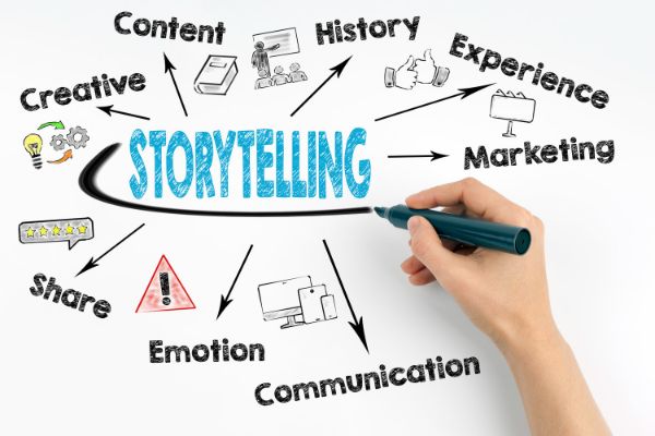
3. Storytelling process:

Storytelling process

Once you establish a scene or a character’s presence in the opening scene successfully, you can now start telling your reader the story that you have. By the time you reach this phase, you have to be sure about all the characters of the story. Here, all the rough sketches have to be created perfectly using digital tools like Adobe Photoshop or Adobe Illustrator. You have to find out the right stroke size for your characters.

You can make sure that all the characters have a firm border and their appearances. Once you are done tracing the edges of the characters, you have to make sure that you leave the spaces for the text to go. Novels have texts along with the graphics, and you have to make space for the text. You can trace the borders using digital applications like Adobe Illustrator. This sets the beginning of your graphic novel. Along with the characters, you also need to have a strong storyline that goes along with the feelings of the story.

4. Writing the story:

Writing the story

Some people prefer creating the graphics before they start writing the story while others develop the storyline and go on designing the pictures as the story advances. This is up to the artist’s choice as to how to proceed with the story of the novel and the graphics associated with it. If you create the graphics first, you have to keep track of the characters and their movement along with the story.

When you start adding the text with the graphics in your novel, you should use attention-grabbing sentences that provoke a thought process in your readers. You don’t have to add text to all the graphics. It is okay to leave the story up to the graphics to depict some part of the story.

5. Converting your story in the digital format:

Converting the story in the digital format

It is your choice whether you want to convert the novel in the digital format. But if you need a digital form of your novel, you can take pictures of the graphics. These pictures can be rough drawings, or you can import them in the Adobe Illustrator and reduce their transparency. After this step, you can trace clean strokes of the edges of your characters and your graphics. This helps you bring clarity to your feelings and the illustrations of the novels.

You can develop the edges and the graphics using software applications like Adobe Illustrator or Adobe Photoshop. Also, you can use a digital pen to trace the edges of the rough copy of the graphics. Moreover, you can add colors to your characters and graphics if you are looking to develop a colorful graphic novel. This is how you create the first page of your visual novel. It is entirely your choice to see if you want to develop a colorful story or a black and white novel. You can also divide the graphics into different layers and change certain aspects of it.

6. Studying other graphic novels:

Studying other graphic novels

When you conceptualize the process of creating a graphic novel, and if it is the first time you are trying your hand on it, it is best to study other novels. Googling about famous graphic novels can help you see how artists have created graphics. You can see how these graphics have given these artists much needed fame and how that graphic novel turned into one of the bestseller graphic novels. If you are creating a graphic novel for the first time, it isn’t easy to understand the flow of the story and the graphics according to the story.

Hence, it is always a good idea to conduct an in-depth study of the existing graphic novels, which managed to earn a lot of appreciation around the world. You should always analyze the kind of graphics people use, or the kind of story people like to read. Researching and going through different graphic novels help you understand the type of illustrations you would like to have. Moreover, it also lets you analyze the plot of your graphics novel and gives you a chance to modify it to make it better.

7. Pick an exciting background for your novel:

Pick an interesting background for your novel

So many people judge a book or a graphic novel by the kind of graphics the novel has to offer. Certain people are visual, and good graphics make a good novel for them. A graphic novel generally has two forms of visible setting: foreground and background. The backgrounds of the novel tend to reveal the setting of your story. It would be best if you always made it a point to keep the background of the story interesting enough to last it for the length of the book. So many writers tend to choose New York as the story background setting. This is because people all around the world fancy New York as a perfect location for specific situations.

Hence, it is essential for you to understand what kind of background you would like to build and how it can support your storyline. For instance, if your story revolves around science fiction, space or universe is the best setting to choose. If your story revolves around adventure and rugged environments, you can always look up to jungles and wild forests. This can help you set the story according to the background of the story.

8. Pay attention to the details:

Pay attention to the details

Your story should be interesting enough to keep the reader intrigued until the end. If you have been a story writer and a storyteller previously, and if this is your first graphic novel, you should address the story concerns in similar ways. Your story should have a lead character who spins the story, the supporting characters who support the lead character, and the villain against the lead. All these characters should be interesting enough to create an even intriguing story.

Any story is generally linear when it comes to novels. But if you want to make the story to reach new heights, you should always target three-dimensional plots. Three-dimensional storylines are stories that talk about all the characters individually. Moreover, each character receives proper attention from the storyteller and weaves a new part of the story with each character altogether. And since it is a graphic novel, each character can be as impressive as the main character. For instance, you can make a villain more good looking than the main character. There have been stories in the history that have seen villains win over the main character in terms of the story plot and the portrayal of the villain. You can also take this up if you would like to have an engaging plot for your graphic novel.

9. Plan the sequels:

Plan the sequels

As you finalize the plot of your graphic novel, you should always keep in mind if you want to have a sequel to the story, if the story turns out to be successful. You can also plan a limited series of graphic novels to keep it exclusive and enjoyable. Moreover, a limited series of your visual novel can make it more valuable for your readers. If you think you want to plan sequels, make sure your story is long enough to be divided into sequels.

You can always tell a graphic novel story in sequels if the story is exciting and long enough to keep it interesting. But if the story is being extended, make sure it is not bland and dull that the reader throws away the idea of reading it further. And if your story is not long enough to have sequels, make sure the short story is also interesting enough to keep the readers glued to the graphic novel.

Conclusion:

A graphic novel is a challenging thing to create, and it requires a combination of a writer and an illustrator to carry it ahead. There is a different mass of readers who like to consume and gobble up the graphic novels. Generally, people who are voracious readers don’t pick up graphic novels as often. Hence, it would be best if you always created a story that keeps the graphic novel readers interested. Apart from designing, this blog also guides you through creating a good storyline that keeps the readers intrigued. Hence, it is not always the graphics that turn a novel into a bestseller. But, graphics play a huge role in its success, along with a good plot of the story. Hence, the success of a graphic novel is in the balance between the graphics and the storyline. In the subject of graphics novel, one is incomplete without another. Therefore, as a writer, you should know how to strike the right balance between the graphics and the story accompanying it.

The post 10 Tips to Design Stunning Graphic Novels first appeared on Line25.


Source: https://ift.tt/3kYQ4ot

10 Things NOT to Do While Creating a Website Layout

Friday, September 25, 2020

One of the most challenging things to do when it comes to the website is creating a website layout. Many companies struggle to generate a website that attracts enormous conversions and a lot of revenue. Your website should be visually appealing, but it loses its point if it fails to make money. Many businesses think that they should focus on the design to make it look good. But they fail to understand that the design should be such that it will offer you maximum conversions. Such mistakes damage your business in the long run. Such problems tend to chase the website visitors away and may cost your business tens or hundreds of thousands in lost revenue.

To increase your visitors and revenue, you need to stop making some of the most common mistakes made by business owners today. It is a little challenging to find errors and fix them, but it is not an impossible task. If you apply consistent efforts, you can increase your lead generation, website traffic, and conversions. This blog takes you over the things that you should not do while designing a website. Let us take a look.

1. Unresponsive Design:

Unresponsive Design

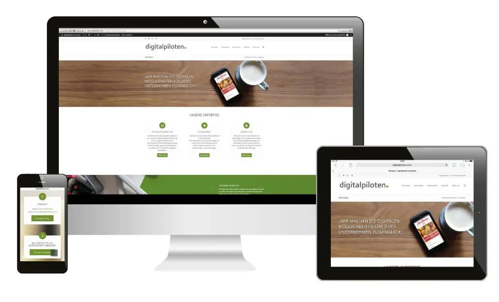
One of the most important traits your website should have is responsive design. Responsive design is one where your website design adjusts itself according to the device or the screen that the user is using. And responsive design is listed as one of the most significant features of the website layout. The responsive design of a website makes sure that every user on the planet can access your website, irrelevant of the device, or the location of the user.

It would be best if you had your website design optimized for various devices. These devices can range from a laptop, desktop, mobile phones to PS4 device. And this is something that Google insists on having, as far as your website is concerned. Your website should have the kind of optimization where the same URL is used, even if the devices change. And the layout of the website varies according to the CSS file code.

2. Absence of Favicon:

Absence of Favicon

Favicons are the icons on the top left corner of the browser tab that tells the user about which website is open in that tab. It would be best if you used favicons while you design the website so that it is easy to identify the website by merely looking at the favicon. So many users prefer to have a lot of tabs open in their browser while they read something on another tab. In such cases, you can take a look at the favicon and see which website is accessible in that specific tab. These favicons are not only useful when you are browsing a website while multiple websites are available in other tabs. When you are going through the bookmarks or browsing history, favicons help you see which websites are those.

It is necessary to have a favicon through an SEO perspective because it suggests that the site is usable and leads to a high rank in the search engine results page. It saves the user a lot of time while they are browsing and going through multiple websites. Hence, if your website has no favicon, there are chances that the user may or may not consider your website worthy of visiting.

3. Generic 404 pages:

Generic 404 pages

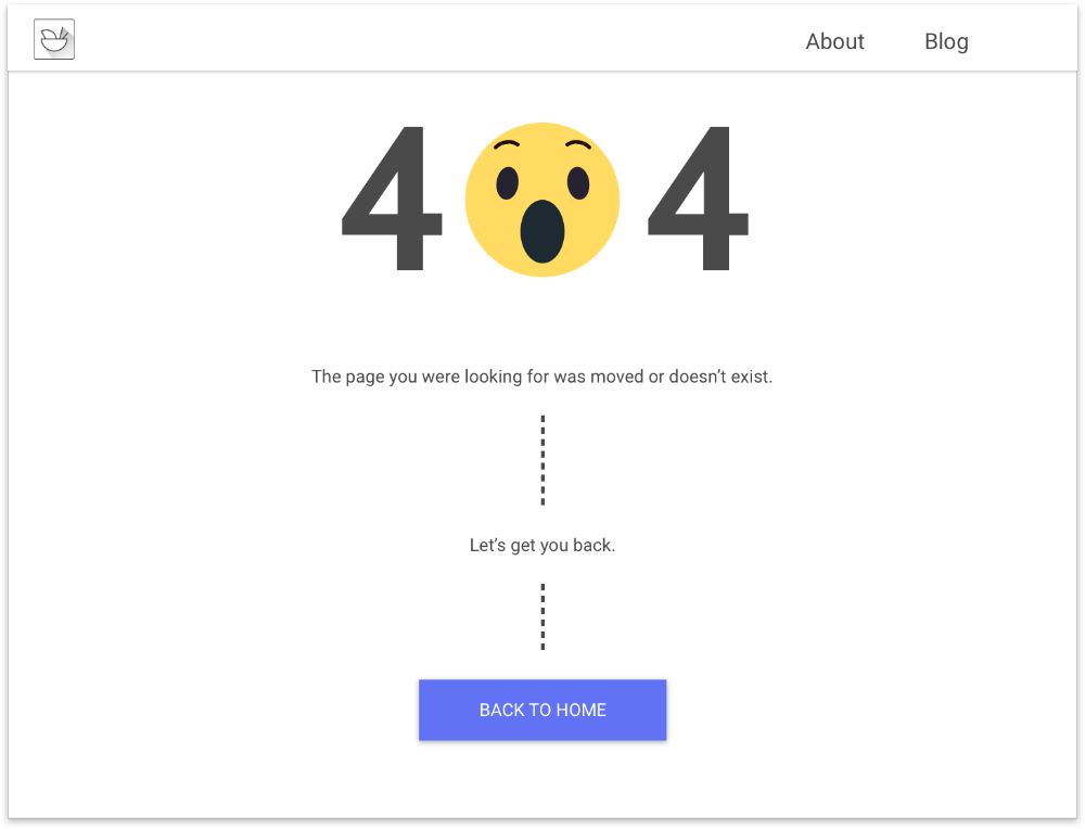
404 pages are the error pages that your website should show when there is an error finding the page that the user is looking for. The error 404 is generally translated to page not found in the world of website design and development. 404 pages silently kill the traffic of your website. And users who hit this page almost always choose to bounce off your website. Moreover, these users don’t take any initiative to resolve the problem.

Hence, if you have 404 pages on your website, you should give an action that a user can take. For instance, you can tell the user to report the broken link or take the user to the page from where he landed on this page. You can also choose to have the user reach back to the home page from the 404 pages. If you are including 404 pages on your website, make sure to include proper CTA to direct the user.

4. Using Carousels on your home page:

Using Carousels on your home page

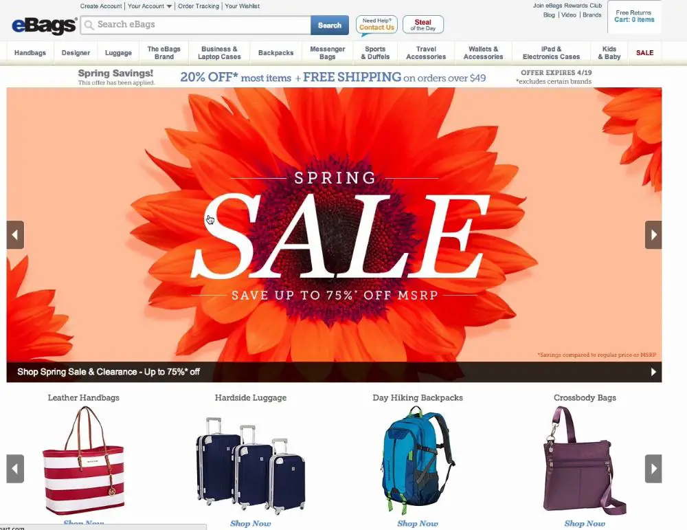
A revolving slider is called a carousel, which a website uses to display its top-selling products or professional portfolio. You can choose to use a carousel on your website, but it is necessary to show relevant information in the carousel. When you go through the things in a carousel, you can choose to revolve the carousel when you want to see something on the other side of the carousel. As far as you can move the items in the carousel, things look good.

But the trouble starts when the carousel starts moving automatically. This doesn’t give your user a chance to see the products or items correctly. Moreover, these days add also look a lot similar to carousels that revolve. This causes banner blindness, and the user may think that the carousel is an advertisement. Hence, the most important thing that a user should notice often goes unnoticed. A carousel is known to distract or irk the user, and this may result in a customer going without converting on your website. Therefore, you should use the carousel only if it is necessary.

5. A slow website:

A slow website

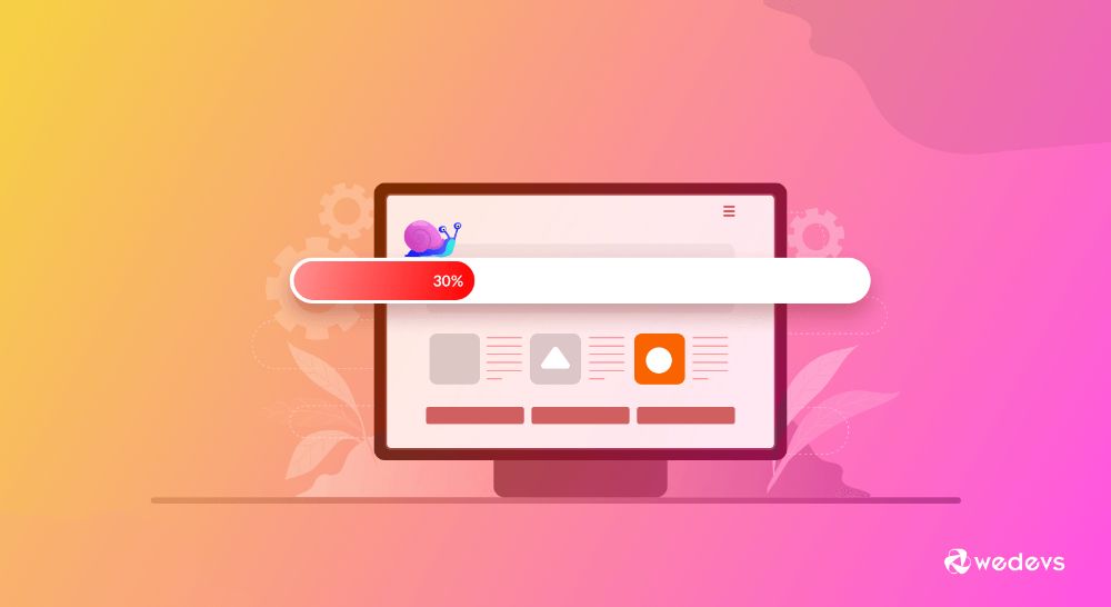
Nothing turns a user off than a website that takes ages to load the web pages and the web page elements. In the fast-paced Internet, if a website takes more than 4 seconds to load, it is considered slow. In a study, Google found that a maximum of websites took seven or more seconds to load. What do you do when you encounter a slow website? You leave the website and go to another website that seems comparatively faster.

If you want to keep your visitor on your website, you should develop a website that takes 3 to 4 seconds maximum to load everything that you have. If you don’t serve the user in this window, your user may consider your website slow. He may choose to leave your website. This is called the Bounce rate. Like the bounce rate of your website increases, the traffic of your website decreases. Moreover, if your website has a high bounce rate, it can hurt your ranking on the search engine. With an increased bounce rate, the search engine thinks that your website is too slow and may rank your website lower than it should be.

6. Low server response time:

Low server response time

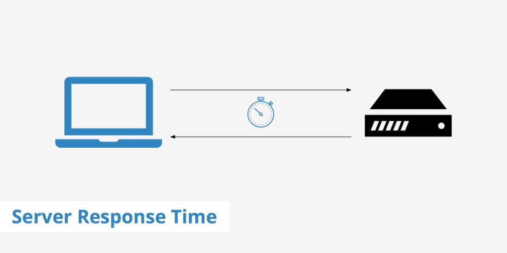
A server is a place where the browser requests or summons a web page of which the user has asked for the URL. The time is taken to render the browser’s web page when the user requests the web page is the server response time. As the server response time increases, the website generates slowly. A slow server response time is indicative of an underlying problem related to the performance.

Ideally, the response time should be 200 ms or lesser when the website is requested from the server. There can one or more following issues that lead to slow server response time:

  • Slower application logic working behind the website
  • Database queries are slower.
  • Issues with frameworks and libraries.
  • CPU resource starvation issues.
  • Issues where memory starves.

Faster response time is the key to increased website speed and improved website performance. It would be best if you always looked at the above-given issues before hosting your website on the server. If these issues are ignored, your website can lose traffic, and in turn, you may lose the conversion.

7. Using too many different fonts:

Using too many different fonts

The selection of the fonts is essential when it comes to putting textual content on your website. The fonts should be such that the text should be readable. They should neither be too small nor too large for the user’s reading preference. It is common sense to use similar fonts for similar purposes. For instance, all the headers should be written in Times New Roman fonts. But subheaders can be in Arial fonts. The textual content on the website should be restricted to a few font variations.

Using a lot of variations in the fonts can confuse the user when he is on your website for reading the content. If you use a lot of fonts, the user may be distracted and may lose the understanding of the hierarchy of the content. Moreover, it reduces or weakens the cognitive fluency of the user. Using different fonts may break the user’s focus while reading the content of the website. Hence, avoid using too many different types of fonts on your website.

8. The content is not focused on the visitor:

The content is not focused on the visitor

Content is the heart of the website. The readers prefer reading the textual content on the website rather than focusing on the images on the web pages. A piece of content is the small part of the text that explains the user about the website. For instance, if your website deals with the coffee products, it is imperative to write down about the coffee types that your business can offer to the customer.

Hence, the textual content should be visitor-centric, where you take care of what the visitor needs to understand about the product. If the visitor understands perfectly what you have to offer, it gives him an opportunity to convert. Through word of mouth, you can have the possibility of having more traffic on your website. You should always have the kind of content that explains how your website can benefit the user.

9. Using whitespace poorly:

Using white space poorly

White space is the space between the different pieces of content and the images on any web page. It allows the user to focus on the textual content because of the existence of white spaces. White space increases readability, comprehension of the text, improves user’s attention, and increases clarity. With white space, you offer a separation between the different types of content.

If your website doesn’t have enough white space, it means that your content is taking up too much space on the web page. With a lack of sufficient white space, your web page may look cluttered. And no one likes to look at things that have been poorly organized. You should pay attention to managing the content wisely. Moreover, if you sardine the page with too many elements on the page, the user may not be able to find the piece that he is looking for. Hence, with a good amount of white space, there are so many benefits to your website’s user.

10. Poor Grammar:

Poor Grammar

The most significant part of any text is the grammar. If your text contains grammatical errors, it turns a user off instantly. And nothing can revive the wrong impression once it is created. Poor grammar destroys the image of your business as soon as it is made. Moreover, good English is always required when you are targeting the global business sector.

It is imperative to have the textual content in good English that has correct spellings without any grammatical errors. Hence, you should always make sure that the content you write on your website is free from grammar issues.

Conclusion:

The design of the website is as important as the back-end that you use to retrieve the information from the database. A website is an extension of your business and helps you to create a digital footprint. You can extend or enlarge the digital print with the way you design and develop your website. A website is only successful if it is made using specific standards during its creation. As a web designer, you have to understand the website design from the user’s point of view. And designing after understanding the user’s mental model helps you in creating a website that resonates with the user. This can benefit your business mainly in the long run and can bring you a lot of conversions.


via https://ift.tt/3kFM4Jk

Design your way

This summary is not available. Please click here to view the post.
 

The Cash Box Blueprint

Most Reading