Good restaurant menu design can radically change your business. A menu is more than a list of dishes. It’s an advertising tool. It will help create and build your brand.
The right menu layout will not only help customers understand what you have to offer, it can even stimulate their appetite. It can make a difference to your annual income by as much as $1000 no matter what kind of restaurant you are running.
How do you create amazing menu layouts? Figuring out how to design a menu that helps you drive profit is hard. Here are a few tips for designing a menu that works great for your business.
A Menu is a First Impression
While the look and décor of your restaurant are certainly important, they’re not what you’re actually selling. The menu is the first impression customers get of your food and service. You want to convey quality. Depending on the kind of atmosphere you have, you might want to make sure it seems fun, quirky, classy, or family-friendly.
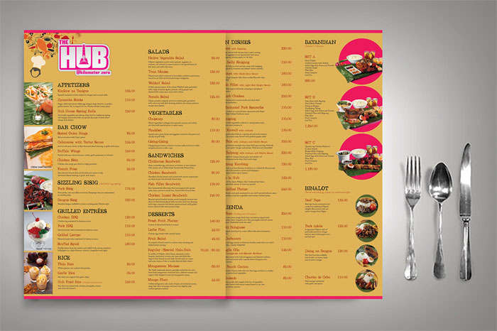
Diners tend to quickly scan menus, taking an average of 109 seconds to look through it. A menu needs to make a big impact quickly. Use clear headings. Make the names of dishes easy to find. Colors should be bold and pleasant to look at. Make sure you can read the color of the text easily on the background.
Many designers look into what part of the menu diners look at first. Menu items in these areas are often the most profitable. For vertically arranged menus, people usually spend the longest time with the first and last items. These are often the biggest sellers. Your first impression is highly important.
Reading Patterns Matter
The best restaurant menu design will take advantage of the way people read. Research has shown that diners’ eyes tend to move to the upper right-hand corner of the menu first. Many in the restaurant menu design industry call this “the sweet spot”. Most restaurants place the item they want to see most in this area.
This is often an expensive dish. Take a look at some restaurant menu examples to see what they place there. You’ll find high-priced seafood very commonly placed in the right-hand corner, often highlighted by an illustration or photograph and bold typography.
It’s worth noting that the location of the “sweet spot” will change depending on the menu layout. How many panels you have and the orientation can switch things around a bit.
For instance, with two-page restaurant menu designs, people first look just above the center on the right page. They then look at the first and last items on the list. Those are the areas you want to place your best and most expensive dishes.
Some research suggests that many menus are read like books, beginning in the top left corner. This is much more likely for menus that are formatted into a book-like format. Look into reading pattern research to see what works best for you.
Highlight Certain Menu Items
When deciding on how to design a menu, make sure you remember to emphasize select items. You want to create what are called “eye magnets”.
These are similar to the “call out” quotes used by newspapers to draw people to certain bits of information. These items can be the most expensive, the newest, your specialty item, or just about anything you want customers to order.
Color Creates Feelings
Color is always emotionally charged. People respond to color in instinctually emotional ways. Use it color to emphasize items and create an atmospheric impression. Study color theory to create better, more evocative cool restaurant menu designs.
There’s a good reason that graphic designers use color theory to create everything from packaging to branding campaigns to user interfaces. Take advantage of it for your restaurant menu design! If you just change the colors of your menu to fit better with color theory and leave it the same otherwise, you may notice a major difference in sales.
A good place to start is with red and blue. Many designers say that this color combination helps stimulate appetite. This may not work for your restaurant’s theme or atmosphere, but this sort of bold color combination is something to consider.
High contrast color schemes have a unique and appealing pop to them. Even if you don’t use it for your overall restaurant menu design, use high contrast colors as another way to highlight items you want your customers to buy.
The colors in your menu should complement and fit the environment. They don’t need to match your color scheme exactly, but they should not look out of place. This way, your menu’s design helps create your restaurant’s atmosphere and not disrupt it. If you have a branding plan, make sure your color scheme fits with it.
Be Smart About Using Photos
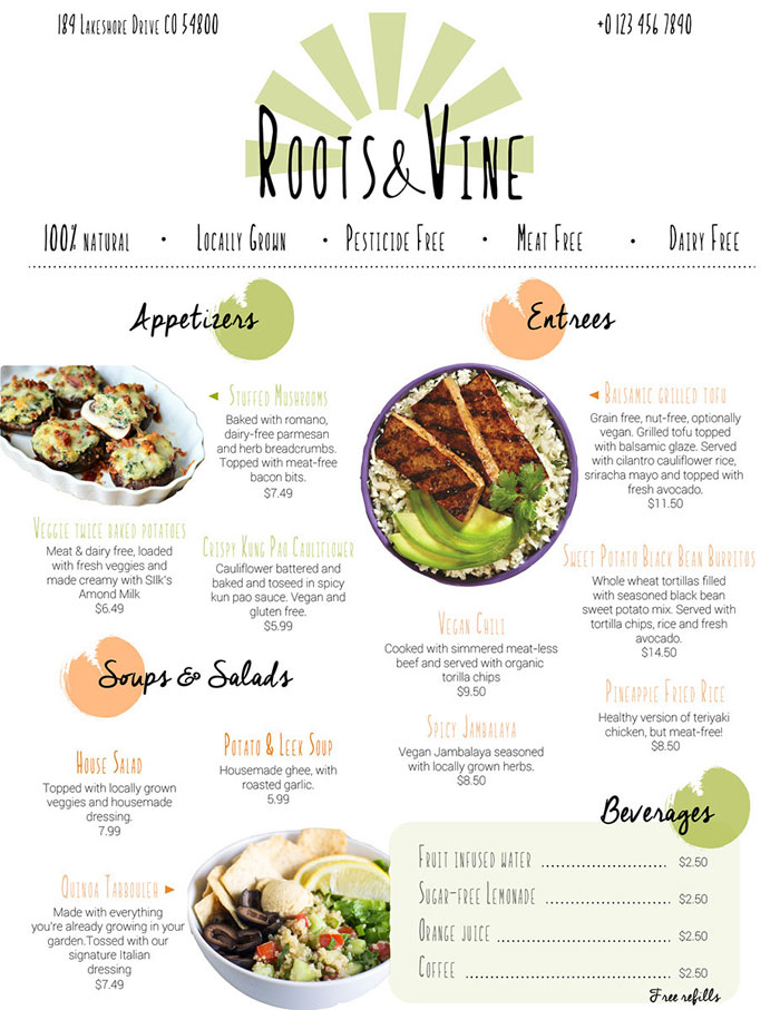
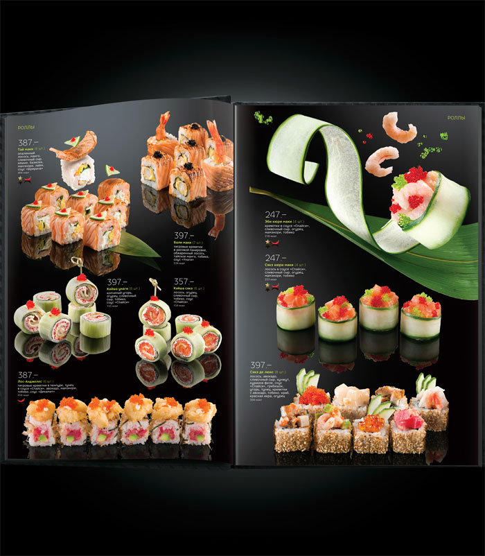
It’s tempting to include a photo of every dish on the menu. After all, appealing looking food makes people hungry. However, this is not a smart idea for a good menu layout. It looks cheap and low-end. Many high-end restaurants avoid including many pictures and they often don’t include any pictures whatsoever.
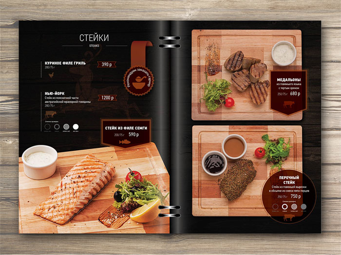
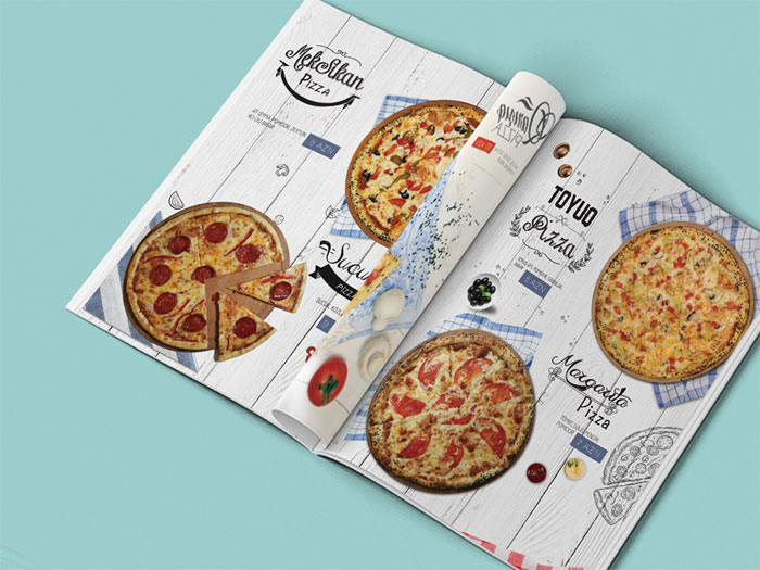
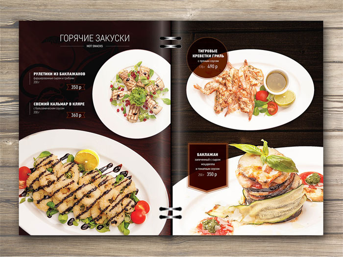
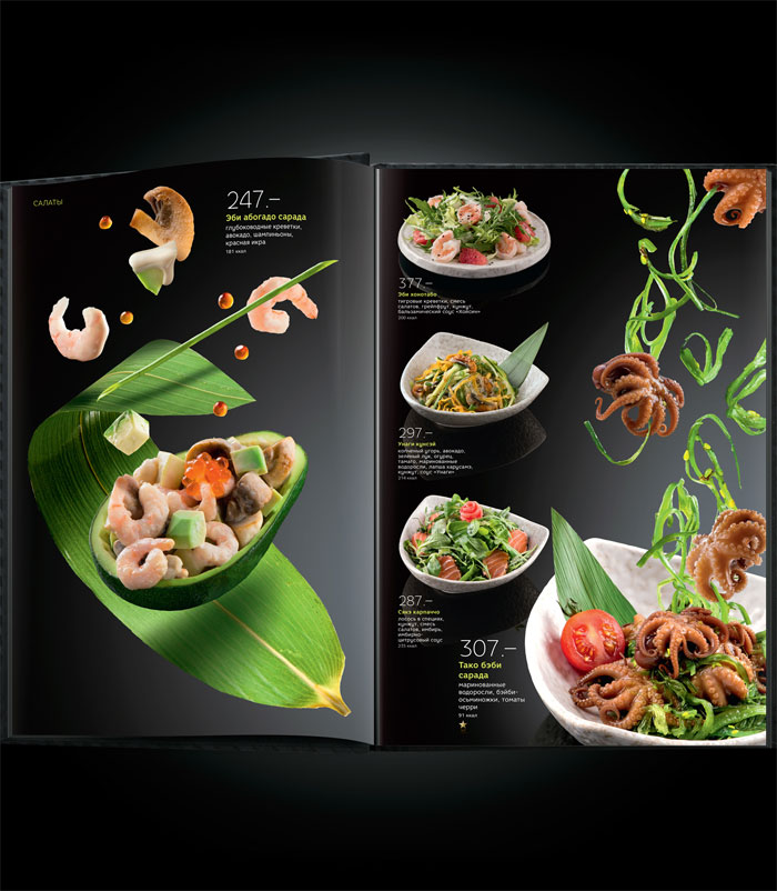
This isn’t the best menu design strategy, though, since research has shown that having one photo per page increase sales for that item by as much as 30%. Include photos sparingly for your best results and make sure that you choose the best items to highlight.
Any photos you use should always be high quality. Look into what makes for good food photography. Unappetizing, grainy, low quality, cheap looking images will hurt rather than help.
Lighting is extremely important to good food photography, your kitchen or dining room lighting will rarely work well for food photos. Make sure the background highlights and doesn’t detract from the subject. Don’t hesitate to hire a professional food photographer if you need to.
A word of caution: food photography is subjective. Not all food photos are appealing to all people. In some cases, for some people, the images may make them lose their appetite. It may be for the best to stick with describing your food well rather than showing images of it.
Use Descriptive Language
Names and descriptions are the core of the menu. It’s the info that customers base their orders on. Without it, there’s no point to even having a menu. It just becomes a piece of paper or plastic.
The best menu designs use item names and descriptions that are tantalizing. You want the diners’ to feel their taste buds tingling as they read about the item. A good description can increase sales of an item by almost a third.
It’s easy to just list what the ingredients of a menu item are, but it rarely works out very well. A list of ingredients is often meaningless. It doesn’t do justice to what the items taste like or all the work that goes into making them. “Chicken, Teriyaki sauce” looks better as “Baked Chicken with Teriyaki Glaze”. This is a more evocative description.
Studies have shown that an evocative description gets more favorable reactions. For instance, use “tender and juicy fillet” rather than “steak” and you’ll get a better reaction.
Diners feel more satisfied with their meal if it is described using these kinds of words. It’s important to make sure the item lives up to the description. Saying that a burger is fresh and juicy when it’s really a frozen and flat patty will not get a favorable reaction. It might result in poor reviews online, as well.
What kinds of words get the best results? Try sensory descriptions like satin, tender, and succulent. Cultural and/or geographic descriptors sell well, too, like Italian, New York-style, or Cajun. Nostalgic terms have become popular as well, so try including words like traditional, Homestyle, or even “Grandma’s”. Research has shown that using these kinds of words increase sales by 27%.
For desserts, there are five C’s to remember: citrus, coffee, caramel, chocolate, cheesecake. These are terms that appeal to different tastes and different moods, but all of them make people instantly think of dessert.
It can be difficult and time-consuming to create good descriptions of your menu items. Remember, people usually spend a very limited time looking at a menu. Your descriptions need to be both evocative and concise.
Don’t go into too much detail. It’s worth the effort to craft good item descriptions, however, and including them will make a marked difference in your sales. Again, if necessary, hire someone out to do this if you find it extremely challenging.
Keep it Organized
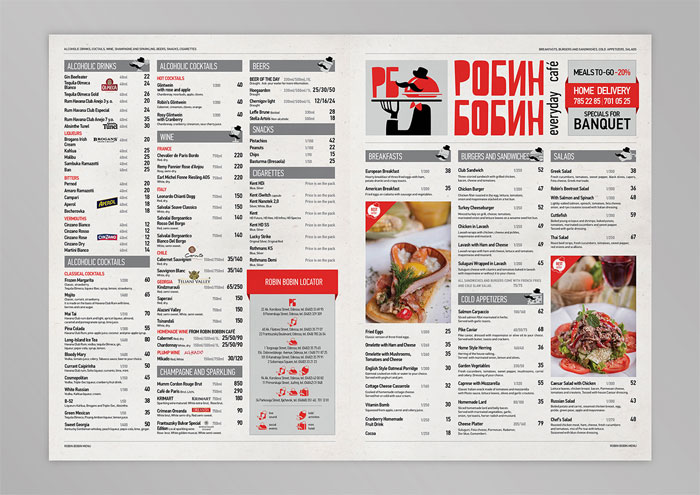
A busy, crowded menu will confuse customers and also make your restaurant look cheap. You’ll feel the effects on your sales. It’s simply too much information to sort through. Customers will have a hard time finding what they want or what you want them to find.
They might lose interest or miss out on important info like your phone, social media, or website. Streamline your menu and focus it. Only include information that helps people understand what you’re offering. Doing this will also make it much easier to revise the restaurant menu design as you continue your menu design process.
Logos Matter
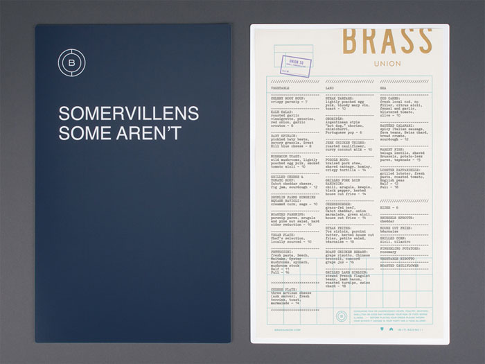
Your logo is a major element of your brand. It should be something that encapsulates what your venue is all about. It should be something that diners instantly identify with your business, whether it’s on your sign or on a catering van.
Make sure it’s prominent on your menu. Your font choices, color schemes, and imagery should fit in with your logo. Use it as the basis for building your brand.
Spotlight Specials
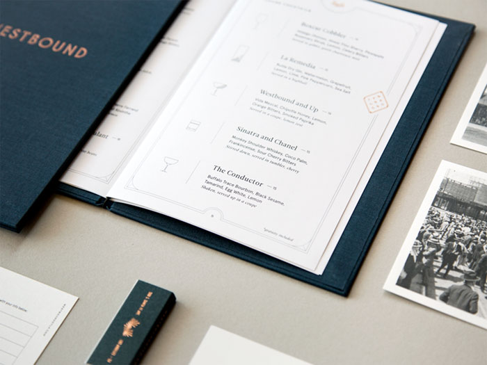
Make your premium and special dishes stand out by using design accents. Show them off with decorative boxes or arrows. Use colors that stand out, but don’t detract, from the rest of the color scheme. Customers never spend long on a menu (just over 100 seconds), so anything you want them to pay special attention to needs to be highlighted.
This spotlighting technique also helps organize your menu so that it’s pleasant to look at. It provides visual breaks and minimizes reader fatigue. It’s also a good way to combat price scanning.
Make Several Different Menus
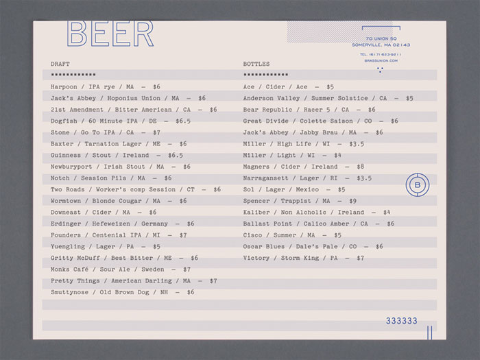
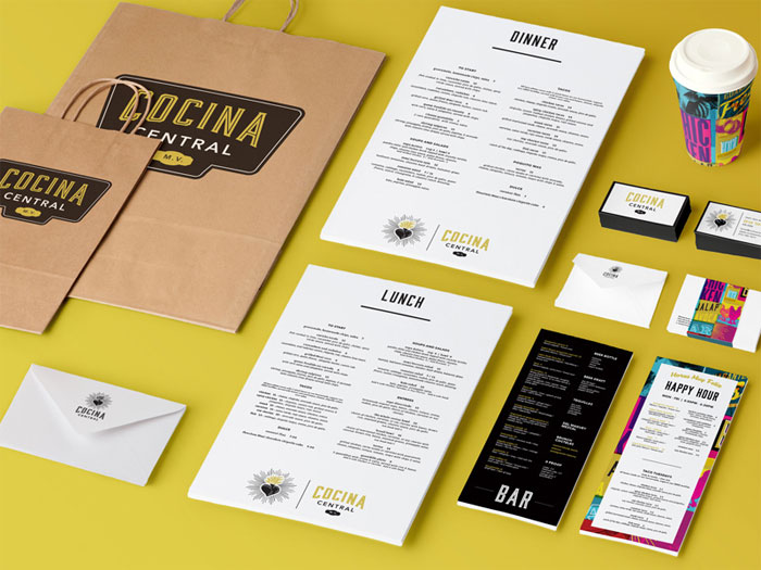
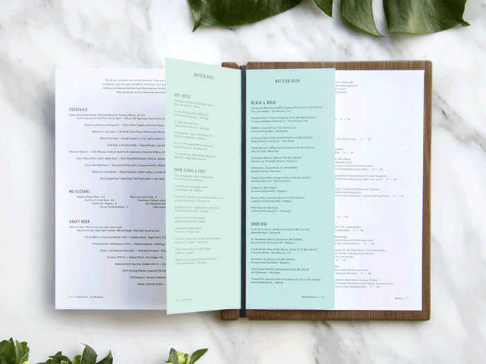
Make different menus to help boost your sales. Try creating half page lists of daily specials, beverage table tents, beer and wine menus, menu inserts for your specials, and digital menu boards. They all help upsell items, highlighting them and helping diners focus on them.
Standalone dessert menus, for instance, are a proven way to raise sales as well as pace meals better. This keeps tables turning and prevents your staff from getting overwhelmed, which will lead to a decline in service and so a decline in customers.
It also makes it more likely that customers will order an appetizer since they’re likely to skip the appetizer if they see a tasty dessert on the menu. If you hand them the dessert menu after they’ve finished the main course, it is less likely to affect how they order their appetizers and entrees.
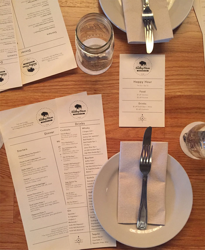
If you have happy hour, try designing a happy hour menu that only features those specials. This can lead to diners saying “they have a good happy hour” and leading to repeat business. Do the same for a reverse happy hour if you have it, as well.
Theming
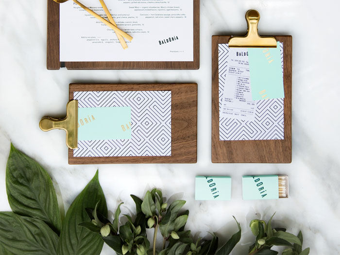
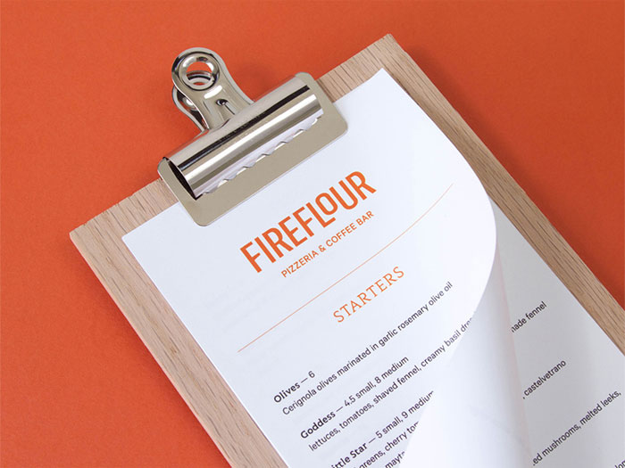
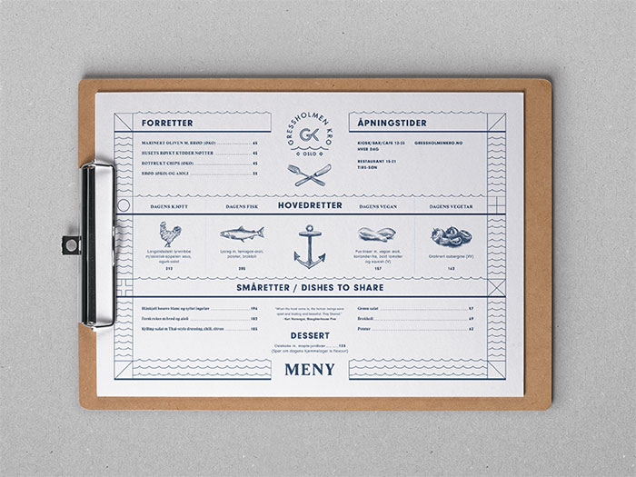
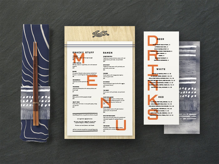
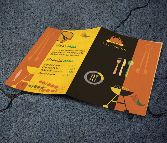
Don’t forget that your menu is an extension of your overall theme. Colors, menu layout, fonts, and pictures should fit in with that theme. If you want to be creative, display your menu on different kinds of items.
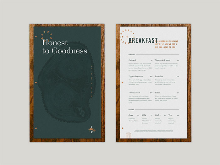
Consider a chalkboard or breadboard menu display. Scrolls are an unusual choice that can fit in well. Menus inside corrugated metal or wooden covers can be very striking depending on your theme, though they may be expensive to produce.
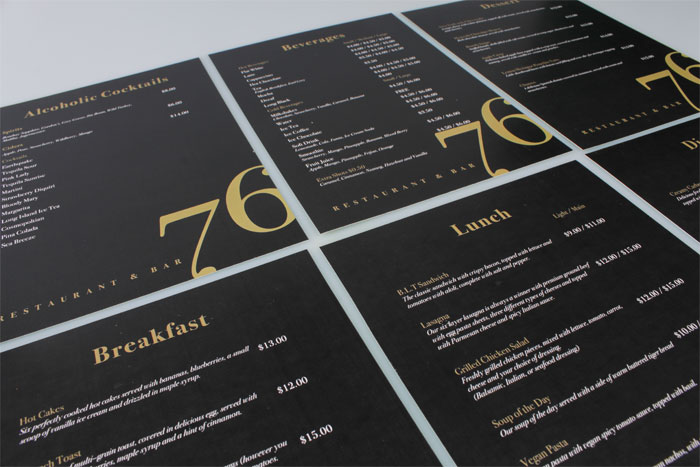
Make sure you use font choices that are easy and pleasant to read. It should be large enough for everyone to see without squinting. Make sure your font and background colors are easy to read. Black letters on a cream or white background is a reliable choice. Make sure you ask other to see how easy it is to read, since your own perspective may be off from that of others.
Menu Layouts
A smart menu layout will help both you and your customers.
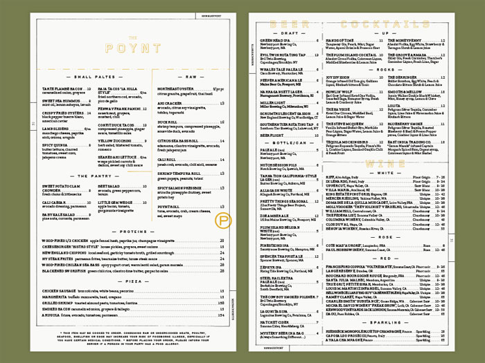
Most menus are laid out like a meal and divided into different categories. Begin with appetizers and drinks. Follow those up with soups, salads, entrees, and desserts. If you have daily specials, create a separate sheet and insert it into the menus every day.
Showcase house specialty items with some simple distinguishing marks, like a box, star, or bold print. If you have a particular specialty, like desserts or signature drinks, think about creating a separate menu for those items.
Customers need to see all the menu items at the same time. Don’t use anything larger than a tri-fold menu. Otherwise, your menu design is going to be too bulky for diners to process. They may end up giving up on trying to find something and order something they don’t really like.
You don’t have to capitalize everything. Capitalizing the dish names is okay, but try to leave the descriptions in lowercase. This will slow down your customers’ eyes and make sure they don’t just scan through the whole menu without processing it.
Pricing
Pricing is very important. It should be carefully calculated since it determines profit and loss. Food costs should stay between about 30 and 35 percent of the menu price. Add together the cost of all the ingredients of the item to determine the food cost basis.
Menu cost might fluctuate from this average depending on your target customer and the type of restaurant you are running. High-end restaurants may be able to get a higher percentage for their food.
Take a look at competitors in the area to figure out what the right pricing is for your areas. Pricing should remain consistent throughout the whole menu. Don’t mix and match amounts like $9.85 or $3.49. Everything should be a whole dollar amount or end in .99 or .50.
Interestingly, a CIA study shows that diners are more likely to buy cheaper food if they see a dollar sign on the menu. The euro symbol and pound symbol are not as frightening and don’t cause people to close their wallets as much.
Don’t forget to consider the costs of free items like butter, ketchup, bread, and fortune cookies. Think about adding $.05 to menu items for every one of these free items.
Remember to Spellcheck
Even a nicely designed menu will look cheap if it is full of typos. Proof for misspellings and other typographical errors. Watch homophones (words that sound the same but have a different spelling and meaning). Typos look sloppy and make the restaurant look unprofessional. They also impede communication of what your menu items are.
If you’re using names from other languages like French, German, or Spanish, make sure they are spelled correctly, including accents and other special characters. Sometimes there is more than one way to spell these words, so be sure to use the same one throughout the menu if you use it more than once.
Last but not least, double check to make sure that the word actually refers to the food item you’re describing. This will help you look professional, especially if you have food aficionados or native speakers of the language come in.
Healthy and Low Carb Menu items
It is increasingly common for restaurants to have a healthy and/or low card selection of items set aside in some way. Healthy food choices are one of the most commonly cited factors that influence where people want to eat. If you have these kinds of options, you’ll find that you get more diners. If you offer catering, include them on your catering menu.
You can either have these healthy food choices set aside in a special section of your menu or on a smaller menu altogether. Make sure you highlight the healthiness of these items.
State that they are all under s certain amount of calories, or consider showing their calorie count as a part of their description. Place these items all in the same border or box to help them stand out more.
What’s more, serving healthy foods like fresh seafood, whole grains, lean cuts of beef, pork, or poultry, and a wide variety of vegetables can help you showcase your culinary skills. Don’t feel that you need to remove fried foods or greasy menu items altogether. Adding these healthier, low-calorie items can be a big boost, however.
Serve them in smaller portions with equally smaller prices. This can be done alongside your regular, less healthy options without any issues. This will offer customers more variety deepening on their current diets and/or moods. It may even make your venue a more appealing choice for groups and families since people are more likely to find something they want.
Menu Contents
Your menu is not just going to be a list of items. It’s an expression of your restaurant’s concept. It should have enough variety to appeal to many different people. At the same time, you need to keep your costs and price points firmly in mind. Draft options and carefully calculate costs. If an item is not selling or working with your restaurant’s concept, think about replacing it.
Make sure every item on the menu resonates with customers. Place all of these carefully made choices on a well-designed menu layout so that they look their best. If you are using any photos, make sure the food looks both healthy and appetizing.
Remember, many restaurants have seasonal offerings on their menus. Use these seasonal menus to experiment. If the items on your seasonal menu are popular, you can possibly figure out a way to incorporate them into your regular menu.
Consider doing the same for holidays like Mother’s Day or Cinco de Mayo. Make sure they fit well and match the sort of item people want to eat at that time of year.
Common Restaurant Menu Design Mistakes
Item Placement
The placement of every item on your menu should be calculated. Haphazardly scattering items through your menu reduce their sales and will reduce your profits considerably.
You may have your favorites, but you should consider every item for its value. Place the most popular and profitable items in the most-read areas of your menu layout. They need to be something that customers see as soon as they look at the menu.
Most restaurants find it easy to organize their higher value items since they tend to fall into the same categories, like steak or seafood. You can easily group them together without the grouping feeling gimmicky or forced.
If you don’t take advantage of the best placement for your most valuable items, it can be very bad for business. Customers will be less likely to notice these items, leading to a downfall in sales, meaning you’re missing out on potential profits.
Overuse of Dollar Signs
For many people, a dollar sign is like a flashing warning. It makes you seem too money-conscious. The restaurant will look like it only cares about money. It will seem less friendly and welcoming. The best menu design will make the restaurant look friendly and hospitable. It won’t make it seem like a place where the most important thing is the bottom line.
Many restaurants avoid using dollar signs at all. The prices are often incorporated in menu item descriptions or listed as numbers without dollar signs.
Placing the prices on one side or having a series of dots leading to them will direct people’s eyes to look at the prices and scan for the least expensive item. This will prevent them from actually looking at the menu options and their descriptions, which you want to avoid as much as possible.
Item on the Left, Price on the Right
The placement of menu items and prices make an impression on guests. Don’t get locked into a traditional menu layout, with the item on the left side of the menu and “…$ price” on the right side of the menu.
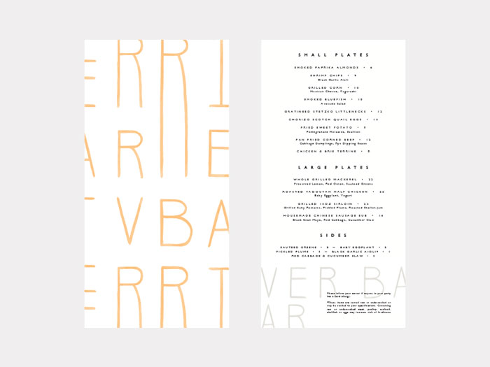
Use a column format with nested prices instead. The traditional menu layout looks generic and encourages customers to read from left to right, beginning with the least expensive items, which usually aren’t the most interesting items on the menu.
A good menu layout should allow for diners to easily scan item names and descriptions to see if anything catches their eye. You should be encouraging people to make decisions based on what sounds or looks best instead of deciding based on the price. See how nesting the price into the item description works.
Use the same size font. Consider placing two spaces between the end of the description and the price. This will allow you to still have the cost listed without emphasizing it. After all, someone will probably read the description before seeing the cost, therefore becoming more likely to order the item.
Lack of Merchandising
A restaurant menu is a guide to your best items and the one with the highest profit margin. It’s more than just a list of items you offer. Use the menu to take your diners on a tour of what makes your restaurant stand out from all the rest.
The best way to achieve this is to merchandise at least one (but never more than two) items on every panel or page of the menu. Make sure you do not overdo your merchandising. This will make the menu too busy and all sense of emphasis will be lost. When done right, however, merchandising is something diners appreciate because it offers guidance.
Lack of Digital Menu Boards
Digital menu boards are the way of the future, especially in some markets that have a much higher cost. They can lead to a return on investment (ROI) of 28 percent higher on average.
Staying with QSR or fast casual operators with static boards means you’ll lose out on this great advantage. Digital menu boards offer fast casual operators to demonstrate food photos and show off specific dishes, especially if you have daily specials.
As an example, Burger King implemented digital menu boards in their Birmingham and London locations starting in 2010. Within the year, they had a 64% increase in sales at these locations.
Static menu boards are less interactive and much more difficult to update when you want to change something about the menu. It can be costly upfront to implement a digital menu board, but you’ll start noticing the benefits very quickly.
Too Many or Too Few Items
Too many items can result in confusion for your customers. People enjoy making decisions and having options, but they also like their decisions to be easy. If choosing an item is difficult, diners will be less likely to return to your restaurant. They will be less likely to find what makes your establishment unique.
Confusion when you’re sitting down to eat is never good, either. Streamline your menu so that the most successful and popular are the only ones that are left on it. Cut out less successful menu items altogether.
On the other hand, having too few items isn’t good, either. Many people like to vary what they order. They enjoy restaurants with a lot of great-sounding options on the menu. If the is only one thing a customer likes on a menu, he or she will probably not return and look for a restaurant with more options.
The trick is to find the perfect sweet spot between serving everything you can make and challenging your chefs to create more dishes. Your menu should mostly feature unique items while leaving room (about a third of your menu) for more creative and experimental items.
Lacking Mobile Compatibility
You’ll find that a lot of restaurants don’t have their menus posted online or that their website doesn’t allow customers to view their menu on a smartphone. 80% of customers have said that they prefer to be able to view a menu before they decide on a restaurant.
70% want to view that menu on their smartphone. 62% will not even consider going to a venue that doesn’t have a menu available online. Mobile compatibility is very important.
Your menu layout on the internet may need to be different from the one you use at the actual restaurant to make it more easily readable on a smartphone, but you’ll notice that it can make a big difference in the number of customers you get.
If your business is located in an area frequented by out-of-town visitors, this can be even more important. They may find your restaurant by looking at nearby places to eat on their phone. Before they go there, however, they will want to check the menu. Not having one available to view on their phone means they probably won’t even think about coming in the door.
If you don’t adapt to the increased use of the internet, you’ll find that you will soon be left behind by your more tech-savvy competitors. It’s fairly inexpensive to reformat and upload a menu to your website, so don’t hesitate. Think of it as the modern equivalent of posting your menu out front of your front entrance.
Dirty and Ratty Menus
A physical menu sees a lot of abuse. They are very susceptible to water, grease, and food stains. Daily use causes all sorts of wear and tear. Restaurants that provide crayons for children may end up with menus that have crayon marks on them.
Like every other aspect of your restaurant, the state of your menus is a reflection of your values and brand. Worn and stained menus make the restaurant looks old, cheap, and dirty.
Your menus should be made out of durable materials like laminated paper or paper with a special matte finish. You can occasionally find a restaurant that prints its menus on materials like wood or other materials that fit with their brand.
These manage to add atmosphere while being highly durable. While cost may be a concern, in the long run, your business will look better and you won’t have to keep printing new paper menus.
Infrequently Updated Prices
You should be conducted a profitability and competitive analysis at least twice a year. The price of food fluctuates a great deal every year. This is normal and continuous. You need to increase prices when food costs rise or else lose profit.
However, you should not have prices that fluctuate too widely. Customers will notice and you may lose regulars who can’t gauge how much eating at your restaurant will cost. Other people have budgets they’re working with, too.
If ingredient prices get too high too quickly, consider swapping out menu items.
Infrequently Updated Items
You should evaluate the items on your menu much like you evaluate your prices. Unpopular items should be cut to make the most out of the menu. All items you leave on should be popular with your customers.
Something that can add a bit of variety for little cost is to see if you can create new dishes using the same ingredients as other dishes you already have. If your chicken is already popular, think about adding a chicken sandwich or chicken salad. Anyone who enjoys your chicken is more likely to try out these sorts of new dishes.
Not Keeping Up With Trends
Serving food that was popular yesterday but won’t be popular tomorrow is not going to go well. Tastes, trends, and food prices all change ion a regular basis. There are often many indicators of these changes before they really take hold. Look at the trends toward organic food, healthy options, and low-calorie diets for previous examples.
Your menu updates should not keep items that are past their prime popularity. Customers often want to try the next biggest thing and offering it is a sure way to make sure you seem up-to-date rather than old-fashioned.
Selling Like Items
All items should be unique and efficient. Offering the same items with varying sauce, for instance, makes them competitors to themselves and takes up room you could use for some other more original item. Since your restaurant menu design should be carefully curated, every inch of space counts and should be used wisely.
If you have different option for an item, consider including them in the description. This way the customer can still see all of them but they don’t take up room. If you are currently offering a “plain” version of an item, consider eliminating it entirely, especially if it is ordered less frequently.
Not Using Limited Time Offers
Limited time offers are a great opportunity to show off the fact that your restaurant is keeping up-to-date. They’re also a great chance to offer something new and attract new customers.
Another interesting aspect of limited time offers is that they help keep your employees from growing too bored since they can now offer something new to your customers. This can help improve service and keep the atmosphere friendly. All too often, an unchanging menu results in bored employees who feel like they’re stuck in a time loop.
Missing Specialty Drinks
While specialty drinks often include alcohol, any establishment can do it. Just highlight super-fruit drinks, smoothies, and specialty flavored iced teas. Specialty drinks attract customers in a unique and fun way that often costs less to make.
Good specialty drinks will create repeat customers. Photos are great when you’re trying to highlight your restaurant’s specialty drinks, especially if they feature vivid color or fun glasses.
Having Too Many Menus
While having a beverage and dessert menu can be a great idea, try not to swamp your customers in menus. This can be confusing and physically difficult to manage. Only create separate menus to highlight really special items.
Ending thoughts on creating a restaurant menu design
Good restaurant menu design is not a matter of luck. It’s such an important factor in a restaurant’s profit margin that it merits serious consideration. Keep in mind these tips and tricks to help you create the best restaurant menu design to help build your business.
If you liked this article about creating a restaurant menu design, you should check out these as well:
- Infographic Examples And Ideas On How To Make Them
- Graphic Design Jobs: How to Get the Ones You Want
- Graphic Design Interview Questions You Should Know Answers To
The post Restaurant Menu Design: How To Make A Menu With A Great Layout appeared first on Design your way.
Source: https://ift.tt/2KaAfcL

No comments:
Post a Comment