Coming up with a unique image for a business can be challenging and intimidating, especially for those who aren’t very artistically inclined. Trying to create a logo, menu, or any other kind of design can be stressful, time-consuming, and ineffective, especially when it comes to the restaurant industry. When it comes to food, everything must be in perfect harmony, and the logo for a restaurant must encompass everything, from the restaurant’s vision, to the ingredients that they use, to the food that they serve. Bad designs can give a restaurant a bad reputation and an unfriendly, uninviting vibe, therefore, designers must pay close attention to every little detail.
We searched for the best and most attractive designs and compiled a list of 40 restaurant identity projects you’ll be inspired by. These are examples of superb restaurant designs created by talented artists from all around the world that will surely captivate you. If you saw these designs in real life you would surely not overlook them, as they attract your attention and immediately spark your interest. So have a look and judge for yourself, and we hope you’ll find these designs as lovely as we do!
Logotype for butchery Prochazka by Vera Matys
Great design is the first thing that a potential customer will notice, and will have a great influence on the popularity of your business. Take this for example!
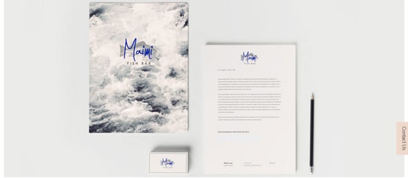
Maimi fish bar
This is the branding project for Maimi Fish Bar, a fine dining restaurant serving sustainably sourced seafood in fried, sandwich, soup or taco form.
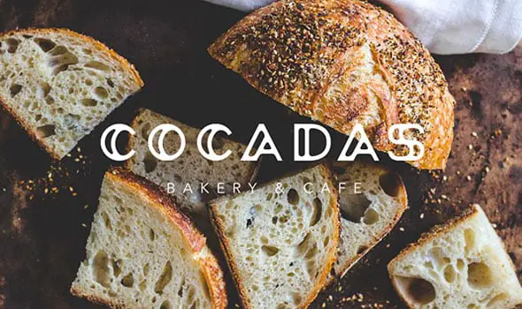
C O C A D A S – Bakery&Cafe
If a restaurant succeeds at creating a warm and inviting vibe, it will attract more people and truly set itself apart from the rest. Check out this logo design, for example!
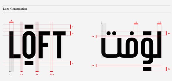
LOFT
This business’s brand identity focuses on bringing immersive and interactive shopping experiences in a dramatic theatre like staging.
Voyageur-du-temps
This is a beautiful branding project by San Francisco studio Character. Voyageur du Temps (VDT) is an artisan bakery and café which serves world-class bread, pastries, and coffee.
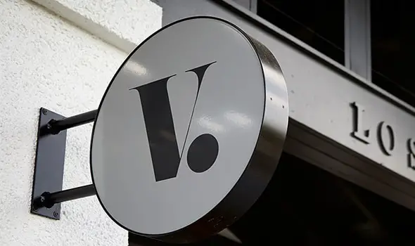
UBAR
Simple, modern and minimalist, these are the attributes that best describe this restaurant’s logo design.
Prime Star – fast food restaurant chain
The branding for this project was designed in order to transmit modern, stylish, tasty and healthy feelings to the viewers. Also, take a look at the packaging design for this project, as it will surely inspire you.
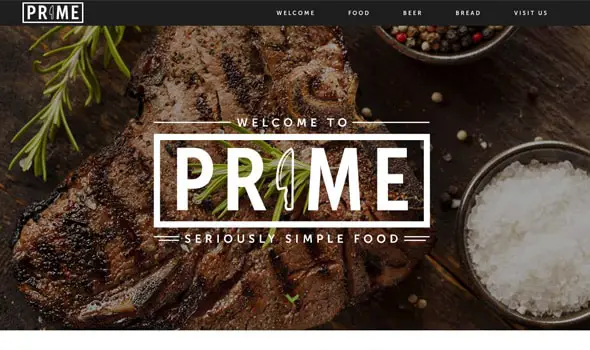
Prime
This is an awesome landing page for a fictitious restaurant called ‘Prime’. It features good imagery and a clean layout. This template is also responsive and uses HTML5 and CSS, plus the parallax slider was created without any Javascript or plug-ins involved.
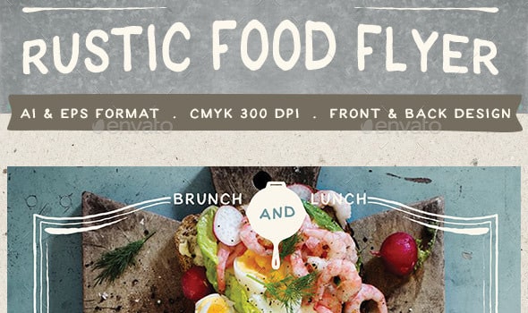
Rustic Food Promo Flyer Template
Rustic Food Promo Flyer is perfect for a new business, as it will help you build a flyer that will capture the customers’ attention and interest; and best of all, you don’t have to worry about the design part whatsoever. You can edit it to make it your own, and it even includes a tutorial on how to do so – it doesn’t get any easier than this – and the result is absolutely stunning!
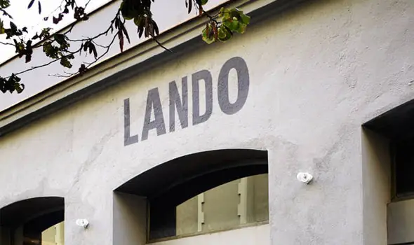
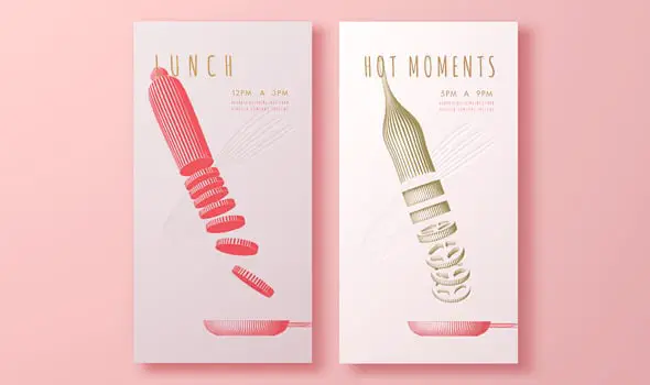
LANDO Restaurant (Identity, Print) by Lo Siento Studio, Barcelona
This is the simple logo for a restaurant. Its menu is based on a European classic cuisine with Mediterranean accents. All the graphics for this projects are handmade.
Cacerolitas Restaurant Identity
This is the lively branding design for a traditional Colombian and Mexican food cafe/restaurant based in Medellín Colombia. Also, make sure you check out the illustrations the designer created for the walls and menus, in the link above.
Boulangerie ID
In the fast-growing world of the food industry, a unique and eye-catching image is vital to the restaurant’s success, and it all starts with a vision that leads to a beautiful design.
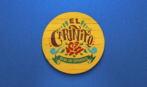
El Cariñito
This is the awesome design and branding project for a Mexican restaurant located in the downtown of Querétaro, México. It has hints of Mexican kitsch elements in their logotype in order to represent a traditional culture.
BAGATELL
This logo design has a somewhat hipster vibe added to it. It’s simple, modern, just like the Scandinavian design.
PopChicken Gourmet Express
This branding project was created for a gourmet “fast-food” restaurant chain. It’s simple, yet effective and easy to remember.
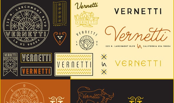
Vernetti
Here’s the artwork for an Italian restaurant opening in south Hollywood. It has a vintage vibe and lovely fonts.
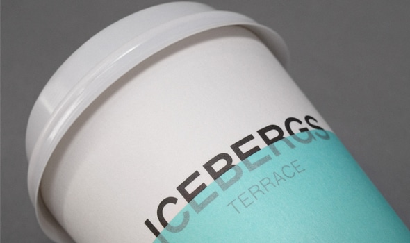
Icebergs restaurant identity and cups designed by M35
The concept behind this branding project is “The invisible restaurant” and an abstracted Bondi tide line coming to the fore. The color palette uses transparent foil, white on white and aqua.
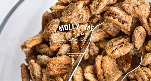
Molly & Me Pecans
Molly and Me Pecans is a restaurant from Charleston which a simple logo, with white typography and a lovely website.
Caribou
This is an interesting branding design for a resto-bar. It is simple, efficient and has some elegant details.
The Meat Up
The Meat Up is a food shop in San Francisco. This is the packaging design for The Meat Up market & deli which has a lovely vintage vibe.
Roots & Freens
This is a simple branding design for a restaurant. It has a retro vibe, due to the font chosen, and some cute vector illustrations. It’s only in black and white.
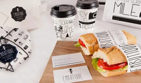
EMBUTIQUE
EMBUTIQUE has it’s own logo and style, and the packaging is distinctive and reminds the customer where the food came from. This way it will imprint the restaurant’s name in our memory, which makes it much more likely for the customer to return and recommend it to others.
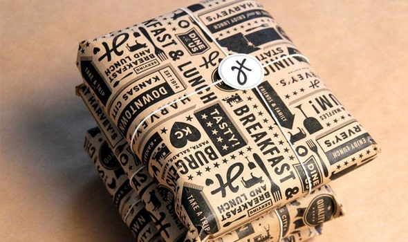
FOOD IDENTITIES BY TAD CARPENTER On
We love this packaging and branding design! It’s easy to remember and has a retro atmosphere, perfect for this restaurant type.
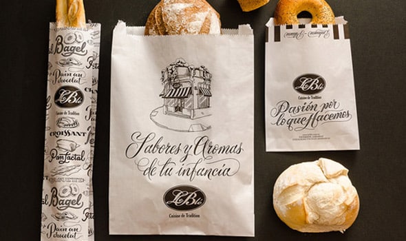
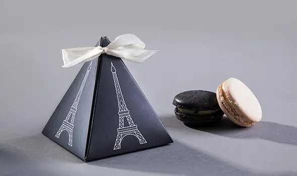
LE BLÉ DELI RESTAURANT
Every packaging material is crafted carefully and attentively in order to make the customer aware of the brand’s identity. Take this for example! This is an artful new packaging for Argentinian restaurant and French kitchen Le Blé.
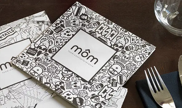
Menú y diseño
This is the menu design for the restaurant MOM. It’s super-illustrated and definitely unique. The design is black and white.
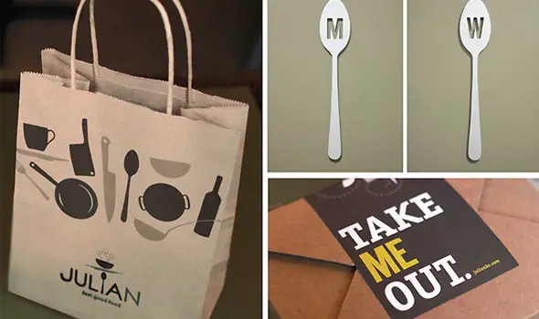
Julian restaurant branding by Jordan Grey
Here’s the Julian restaurant branding by Jordan Grey. It’s very interesting, and successfully combines bold typography with black and white elements and illustrations plus some inventive cut outs.
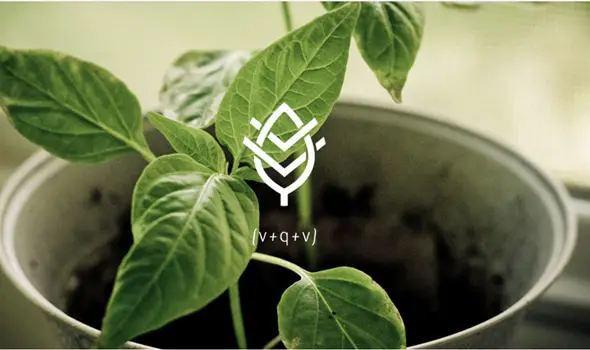
VQV Identity
This awesome identity design was created by Lisa Nemetz. Check out the link above to see more than just the logo! You will find the designs for the mugs, pillows, t-shirts, and more!
Garçon
This is a complete branding design project which includes everything from the logo design, to packaging and even web! Make sure you open the link above.
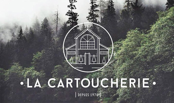
La Cartoucherie
Sacha Grellard is the designer behind this amazing branding project. In the link above you will find the logo, tickets, flyers, posters and menus designs.
Restaurant logo
We love how simple yet inventive this logo design is. What do you think? This is work in progress, but still a great source of inspiration.
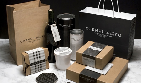
CORNELIA AND CO
This is a black-and-white identity package design for a clean, black-and-white brand. Cornelia and Co is a restaurant, bakery, winery, coffee shop.
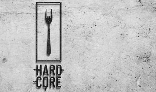
Hardcore bar
This is the design for a rock bar. We love the smart logo and overall branding for this project. Check out the link above and see the complete work.
Food Studio designed by Bielke&Yang
This is the design for a food Studio created by Bielke&Yang. The concept behind this was to create a holistic brand and experience, and they succeeded!
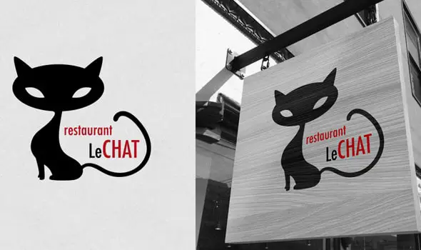
Le Chat
This is the branding design for the restaurant Le Chat. It contains the logo, menu, business cards and other essential elements.
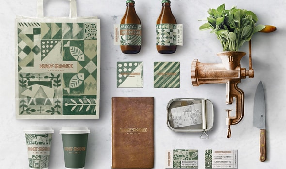
HOLY SMOKE RESTAURANT by Bureau Bumblebee
This is the branding done for the Holy Smoke restaurant. It has an elegant, masculine style with a unique atmosphere that is reinforced by earthen colors.
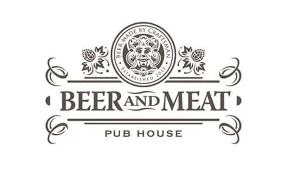
Beer and Meat
Beer and Meat is a Colombian restaurant and this is the final, approved design. It has some interesting details and it’s surely easy to remember.
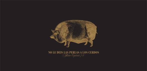
Pig´s Pearls
This is the graphic identity project for a gourmet burger restaurant located in the American Colony in Guadalajara. It was inspired by the Victorian age and the English engraving technique.
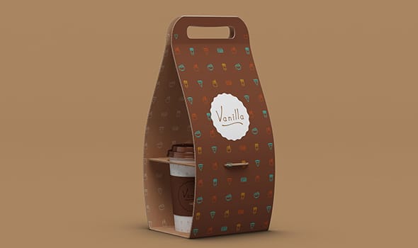
Vanilla
This is the branding design for Vanilla, a small food takeaway in Bijeljina where you can get great pancakes, sandwiches, and salads.
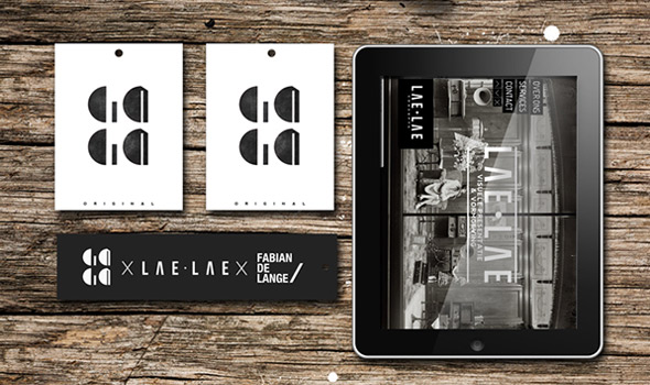
L A E – L A E
This is an amazing branding design project created by Fabian De Lange. We also love the presentation, so make sure you check out the link above to see the full project.
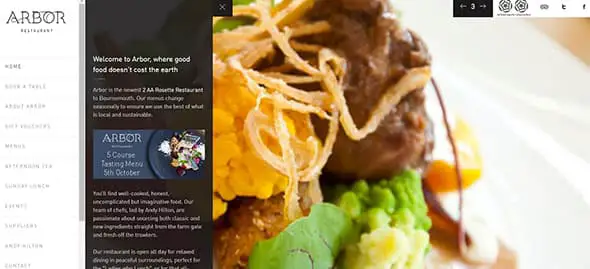
Arbor Restaurant
Arbor restaurant has a really neat and elegant design and we also love the website! It consists of a large slider and a vertical menu bar, plus some other content elements.
The post Showcase: 40 Restaurant Identity Projects appeared first on Line25.
Source: http://ift.tt/2nYKWFL


No comments:
Post a Comment