Landing pages are a very important part of your online business. They are the digital storefront of your online activity, and they serve as helpers for advertising and merchandising. A successful landing page can help you dramatically improve your business, so you have to pay attention to this step.
Below, you can find a list with 25 of the most effective and appealing landing page examples on the internet, which we hope can offer some inspiration if you plan to create your own landing page soon.
Bankjoy
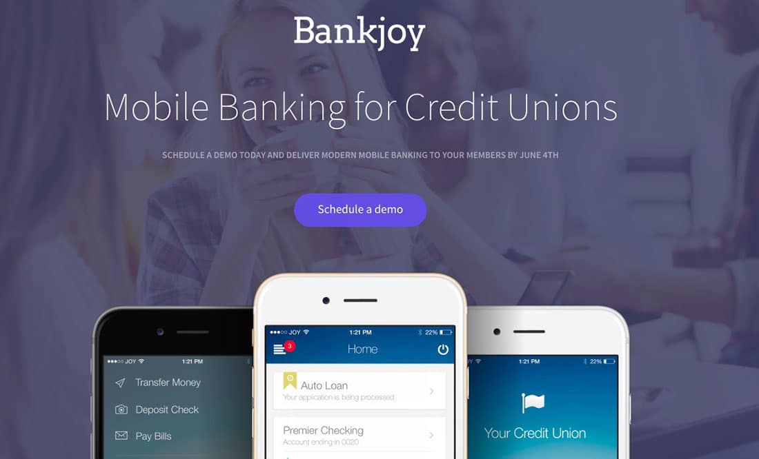
Bankjoy is a website that offers a wide range of mobile banking services to its clients.
Their landing page has a simple, orderly and minimalist design that clearly conveys the purpose of their work. The intro consists of the company’s name and description and then offers a call to action that consists of scheduling a preview. There is a possibility to sign up for a demo at the bottom of the page where you just need to give your email address.
BlockScore
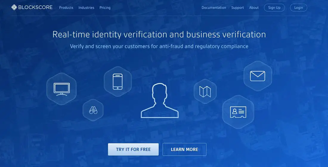
This is a very helpful service especially nowadays when internet fraud is so popular. BlockScore offers business verification services in real time so that you can check your customers. The principle is simple, they just analyze the users through a sophisticated algorithm that can verify any fraud regarding your customers.
The landing page is clean and has a high-tech look, offers a clear message about their services – business verification and personal verification.
Checkr
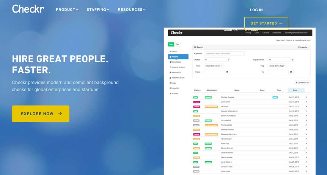
Checkr is an interesting service which allows you to check a business or a startup before entering in any collaboration. More accurately, Checkr helps you to do more thorough background checks for the people you need to hire or work with, thus presenting an extra step of security.
The landing page is simple and clearly shows what is the service they provide and displays also how they provide it, by showcasing a report example. Basically, you get a GIF image on the homepage that you can interact with and check each section and feature and have a detailed review of each category.
Flynn
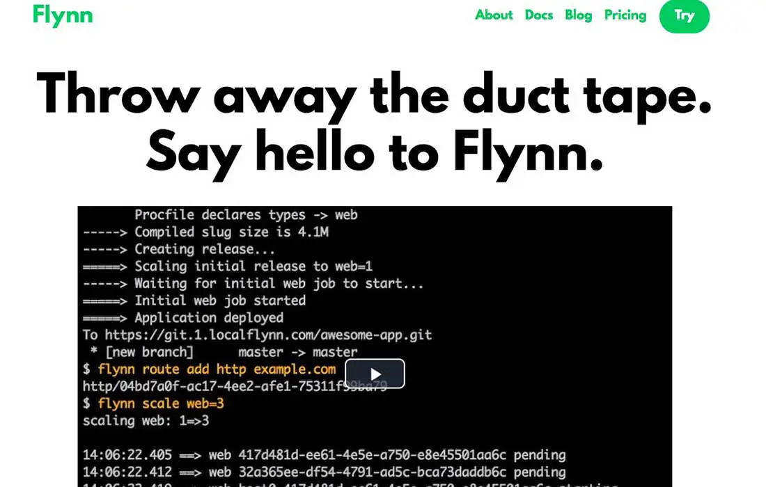
Flynn aims at becoming the only tool web developers require to develop, extend, and maintain running software. It is created to run anything that can run on Linux, has built-in database appliances, manages TCP traffic, HTTP and HTTPS.
The landing page has a quite simple and neat design and an intro that leaves you wondering what they offer. The big headline, video example, and the neat menu represent a concise approach accompanied by the call to action buttons for product examination and e-mail subscription.
Payable
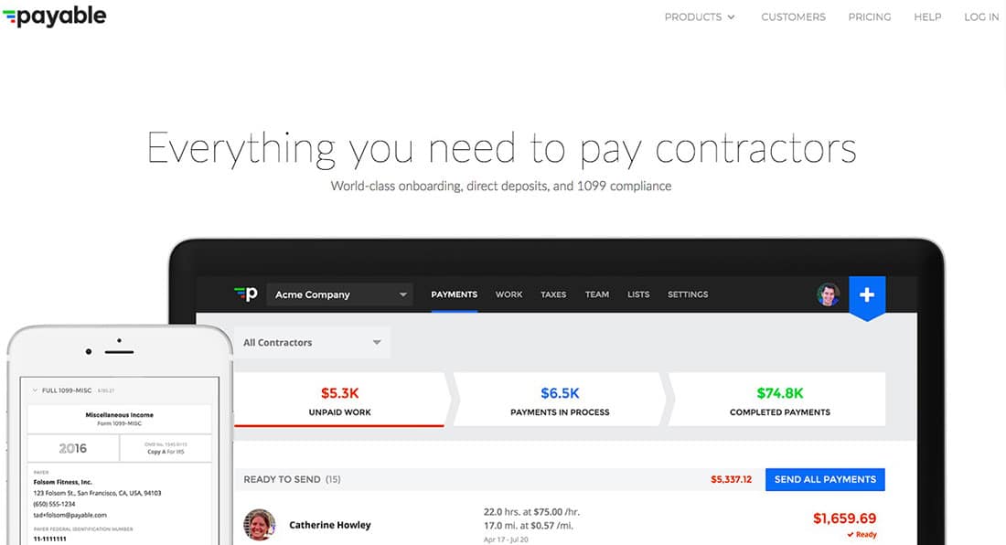
Payable has a neat and modern design, with a clear and well-structured menu and images, and big headline and intro. They offer the possibility to manage stuff like paying your contractors, their taxes and also their benefit entitlements.
Fundera
Fundera is a service which provides the possibility to obtain funding for your startup. So far, they reached a funding value of more than $150,000,000 and helped more than 3000 businesses to obtain funding. The process is quite simple, you just have to enroll your business, specify the amount you require to start or grow your activity, the purpose of the loan, and that’s it.
Benchmark
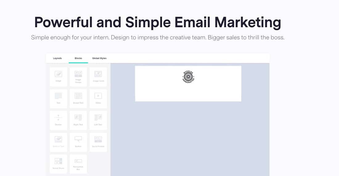
Benchmark is a powerful email marketing platform and has a more unique, modern and interactive design. The landing page has a big headline explaining what they offer, and it also contains a free plan for customers, to try the service.
BuzzSumo
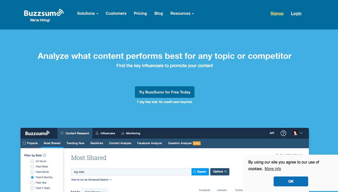
Buzzsumo helps users to analyze what content performs best regardless of the topic and the competitors, and find the key influencers to promote content. Buzzsumo is a highly used service for marketers, content creators, and bloggers who need to improve their content.
MailChimp
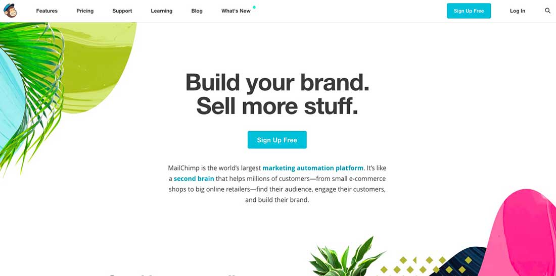
MailChimp is the world’s number one marketing automation platform. Their free plan allows 2000 emails within an email list, and that’s without any restrictions. Their landing page is built on a simple and minimalistic design and with a quite simple approach – just a headline, an intro, a photo and a large call to action button.
Contently
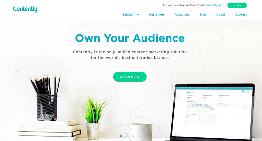
Contently is a company that offers content marketing services for your business. They help you take your idea and build a massive content around it so that you can deliver it to your public for a great performance.
Their client acquiring process is quite simple: they offer customers some data, a preview of the service, offer some freebies, a review and that’s it. The landing page design is based on high-quality pictures, big headlines, and compelling service explanations.
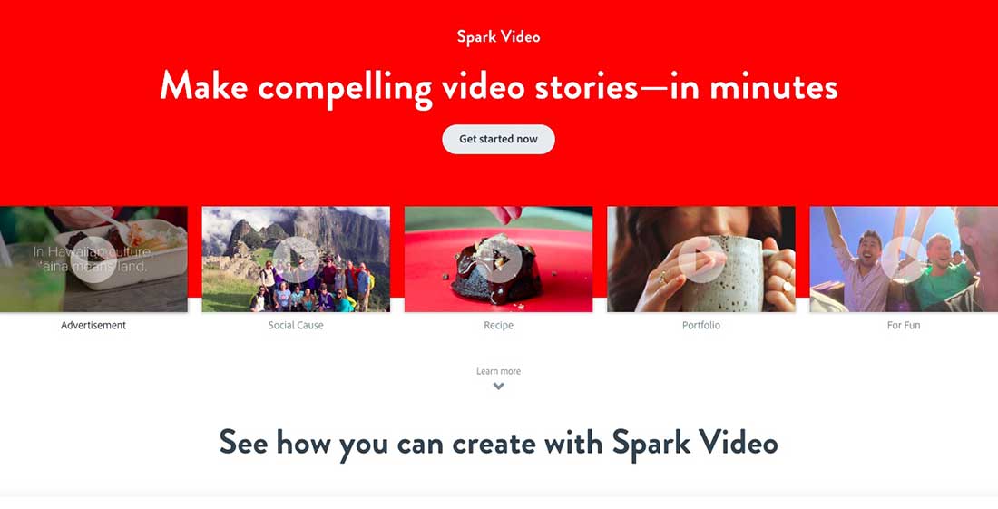
Adobe Voice
Adobe Voice is a platform dedicated to creating engaging animated videos. Users can create videos to portray ideas and stories and use for marketing purposes. Another cool feature is that users can record their own voices which you can mix up with visual content elements from the Adobe Voice library.
Ahrefs
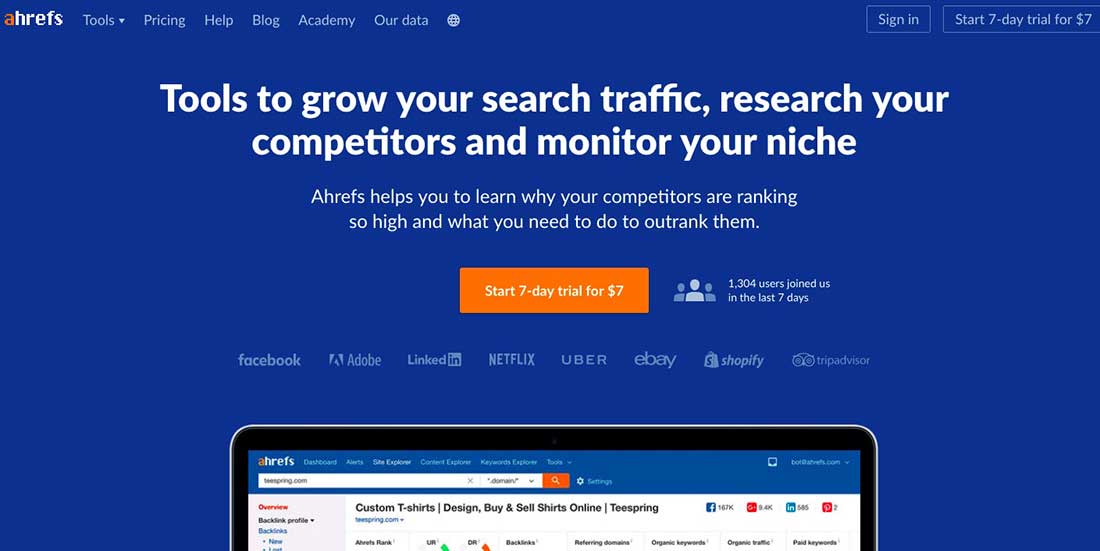
Ahrefs is a toolset for SEO & marketing for analyzing and monitoring anything in relation to search engine marketing and includes backlink checking, competitor analysis, keyword research and much more.
The landing page has a neat design and is centered on big headlines and showcasing popular clients.
Coinbase
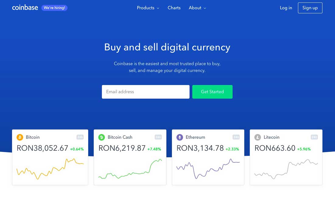
Coinbase is a digital currency exchange which offers broker exchanges services for Bitcoin, Bitcoin Cash, Ethereum, and Litecoin.
Svbtle
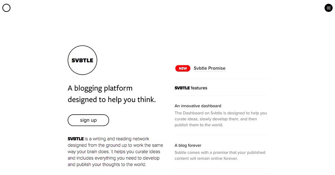
Svbtle is a writing and reading network created to work in a similar way the brain works. Svbtle has a neat and minimalistic design and their service is very popular amongst developers, designers and creative professionals who require simplicity.
Wistia
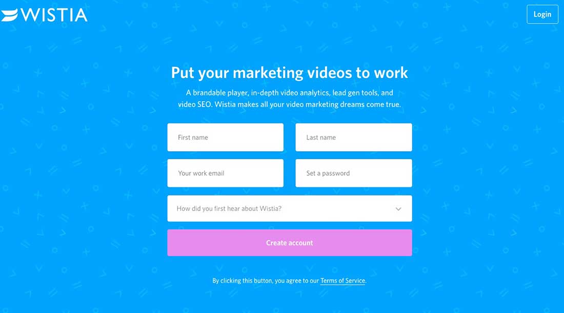
Wistia is an internet video hosting and analytics company created to help filmmakers collaborate remotely online. The landing page has a simple and minimalistic design centered on a one-field form for creating accounts.
Unbounce
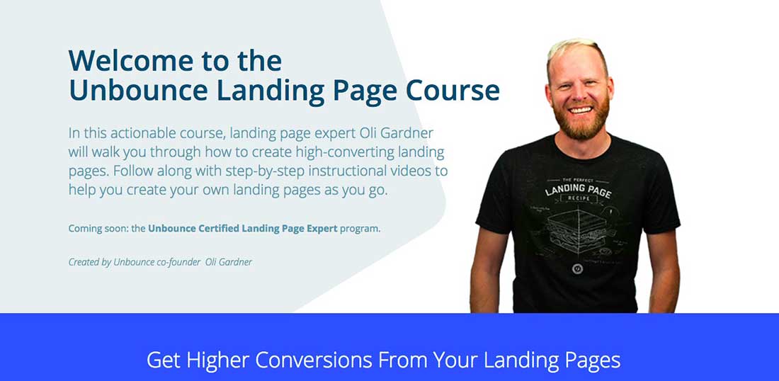
Unbounce is a software company that produces creative landing pages for websites. They usually create high-converting landing pages containing interactive elements that attract the visitor’s attention.
Muzzle
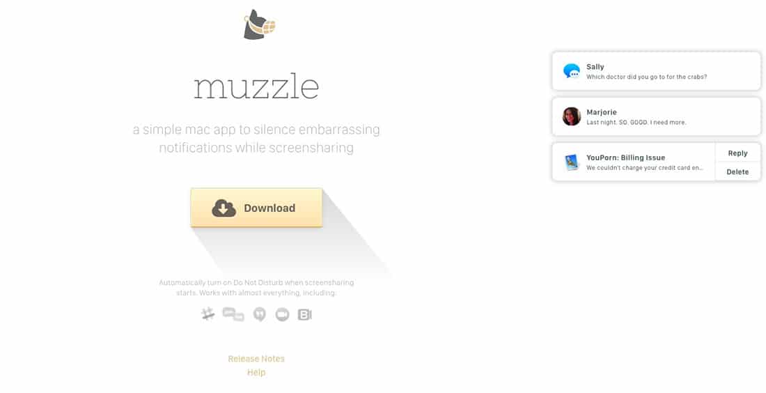
Muzzle is a much-needed app that silences on-screen embarrassing notifications while screen sharing. Their landing page says it all. The simple design actually helps to highlight the big header line and the pop-up embarrassing notifications.
Trulia
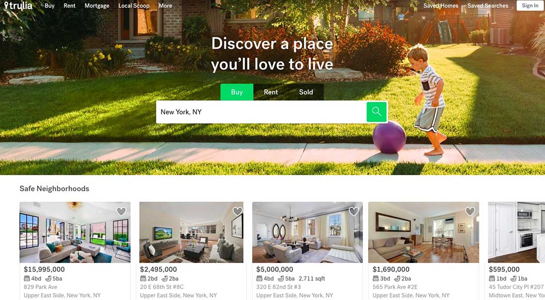
Trulia is an online residential real estate site dedicated to home buyers, sellers, renters and real estate professionals. Their landing page is modern and well-structured and centered around a simple form asking for “an address”.
Webprofits
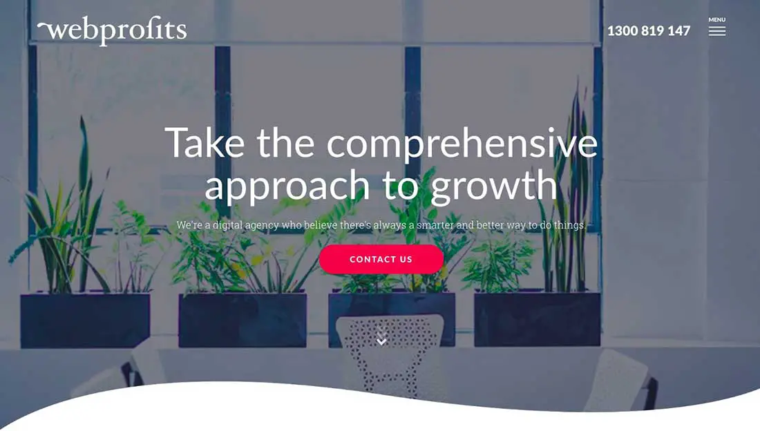
Webprofits has a minimalistic and modern landing page with a simple header line, a short description and a big call to action button.
Velaro Live Chat
Velaro is the top-rated live chat software for websites and their landing page is quite simple and centered around a big headline.
Airbnb
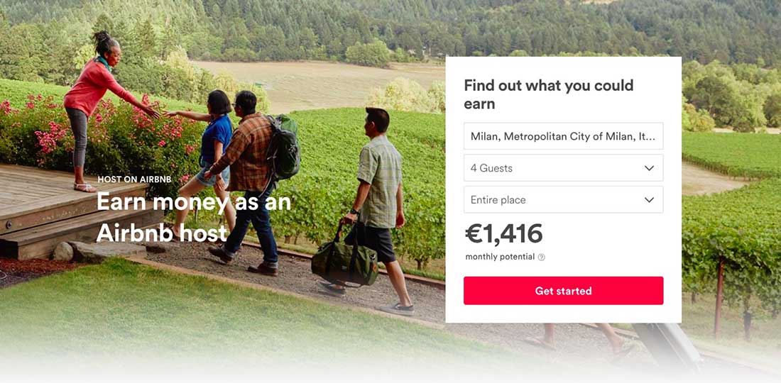
Airbnb, the largest real estate company owning no real estate. For their landing page, Airbnb tries to hook the clients by offering an estimated weekly average earnings projection based on their location. That is because Airbnb is so popular and anyone knows about them.
IMPACT Branding & Design
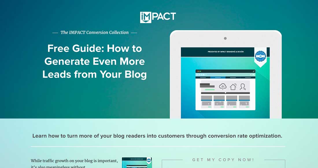
IMPACT landing page has a simple layout, centered around a large headline and an image.
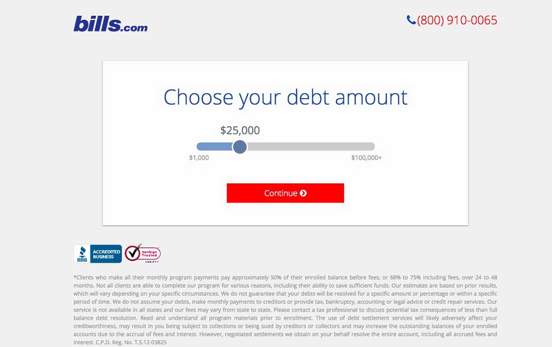
Bills.com
Bills.com is a company that offers financial planning tools and financial services for individuals. Their landing page offers you the possibility to check how you can benefit from their services by just checking a certain debt amount.
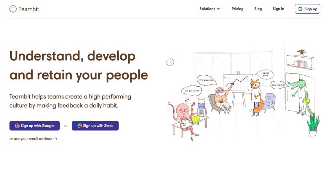
Teambit
Teambit is a company dedicated to helping teams and workgroups to improve engagement and performance with real-time feedback, performance reviews, and employee surveys. Their landing page is simple and centered around the big headline detailing what they do.
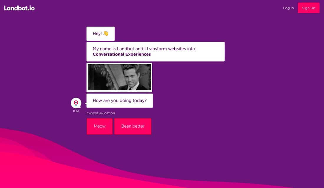
Landbot
Landbot is a service that creates chatbot-based landing pages.
On their landing page, online visitors are greeted by a welcoming bot who encourages them to provide information in a conversational format, instead of through the conventional form.
The post 25 Effective Landing Page Examples You’ll Want To Copy appeared first on Web Design Blog | Magazine for Designers.
via https://ift.tt/2I04fq9



No comments:
Post a Comment