Are you unhappy with the current customer retention rate on your website? If your answer is “yes”, then you are not the only one.
Even powerful techniques like SEO and social media marketing can’t get the results you want if you ignore the website design itself. This is because you can’t market a product unless the product itself is refined and modified according to today’s standards and trends.
Good Designing is Followed by Redesigning
The only constant in this world is “change”. So, even if you are proud of your website design which you created after putting hours of work and applying all the techniques you learned from the top graphics design magazines that every prominent designer is reading today, you need to understand something- you can’t achieve success without embracing the new trends.
It doesn’t matter how much money you put into building a great website, you should be open to website redesigning every once in a while to stay up to date and give your customers a quality experience.
If you want to give your website a fresh new look and stand out from the competition, then the following are some of the latest design strategies that you can learn from and apply to your website if you haven’t already:
-
The Art of Minimalism
It’s becoming harder and harder to learn how to reach and engage millennial audiences in today’s world of smartphones and Internet. We are flooded with instant messages, emails, social media updates, and all kinds of notifications on our smartphones and computers/laptops every day.
It’s not a surprise anymore that an adult’s average attention span has lowered to mere 8 seconds, which is even lower than a goldfish! So, what does it have to do with your website design? The answer is “a lot”.
If your website is a huge mess of numerous tabs, drop-down menus, varying design elements, and links, etc. there is no way you can grab the attention of your average website visitor for long.
Here is the thing – you have to make it easy for them to find out what they are looking for. And a complex web design, even if it looks like a masterpiece to you, won’t work.
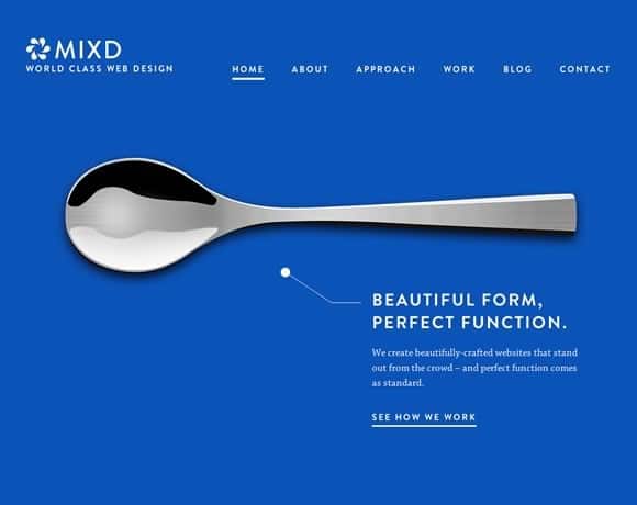
What you need is a minimalistic design that’s easy to process. It should make navigation smoother, and loading time quicker. Once this is taken care of, you are bound to see a huge improvement in the feedback you receive from the visitors.
-
New Logo, New Brand
When was the last time you updated your company logo? If your current logo uses chat bubbles, arcs, or letter overlaps in the design, then you need to know – these logo design trends left the industry a long time ago. You need to recreate your brand with a new logo that’s appealing and invited by today’s cultures and trends. But how do you go about it?
The recommended method for redesigning your company/website logo is to find a suitable online logo creator. Don’t worry, there are a number of excellent tools like these available on the Internet.
Once you have found the perfect logo designing platform, all you have to do is provide a few details about your business and the kind of logo you want. The program will do the rest for you and create a unique and original logo that’s currently in vogue and can make your website more appealing and attractive.
-
Think Mobile
Mobile internet traffic makes for 52.64% of the global online traffic (Source: Statista) and it’s only going to increase in the coming years. So, understanding that the majority of your website visitors are going to access the same with their smartphones, it’s crucial that your website is not only mobile-friendly, it’s optimized so that it makes the most of the small screens and other features particular to the smartphones today.
A mobile-friendly website is easy to use and navigation but also good for your SERP (Search Engine Results Page) rankings, which means more organic traffic for you!
-
Landing Pages
Website landing pages are today more important than ever.
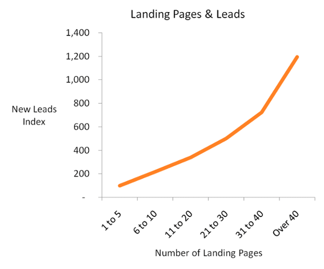
Hubspot’s recent report Lead Generation Lessons from 4,000 Businesses sheds light on a very important observation – lead generation is directly proportional to the number of landing pages your website has. So, if you have only up to 5 landing pages now and you increase them to around 11-20, then you can increase the average lead generation rate by as much as 300%!
So, the number prove that landing pages are important, but the question is – how do create a lot of them? The answer is “attractive offers”.
The key is to create different offers/landing pages for different types of leads, something that can be summarized as personalized marketing. For instance, a person who is new to your line of products can use a handy eBook to learn the basics. Similarly, someone who is already using a product sold by your rivals can use a video that shows why yours is better.
-
Popular Design Elements
Talking strictly about the UI, there are many new trends to take inspiration from or directly adopt for your current website. These include:
- Vibrant Colors, Bright Gradients: More and more websites are using vibrant and bold colors for their designs today. So, now is the best time to experiment with uncommon colors and use combinations that make your website stand out. Also, gradients are back in style and greatly loved too. So, feel free to incorporate them in your website wherever appropriate.
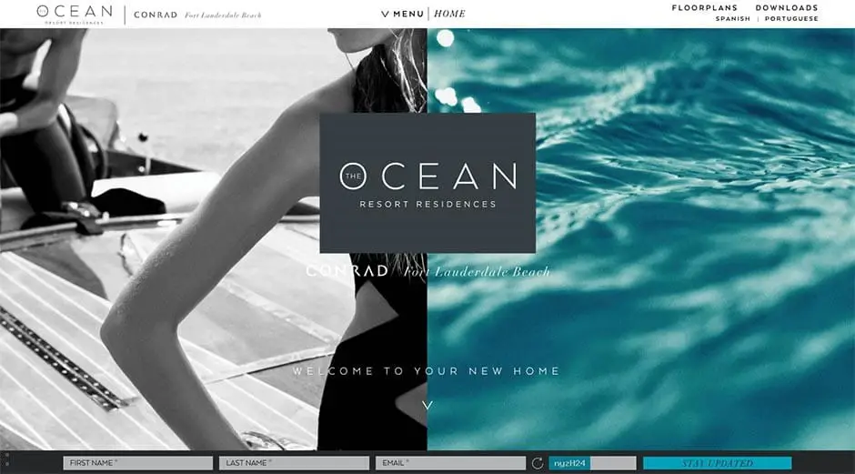
- Split Pages: Having a hard time putting two different types of content on a page? Use the split-page design which is especially good when you want to separate text from images.
- Creative Typography: Look for fonts and calligraphy styles that are unique but fit perfectly with your brand. The blogosphere is already crowded with traditional fonts like Open Sans, Lato, Arvo, etc. So, a unique font alone can make your website look distinct and attractive.
- Single Page Design: In a single-page website design, the pages are lined together vertically. So, a user can browse through different sections by simply scrolling down. This minimizes distraction and doesn’t break the immersion- a popular technique used by a number of top websites today.
So, there you have it – some of the most important design features that every modern website should have today. If you are missing even one of these, then you should make the changes ASAP.
Website redesigning might be a labor-intensive and time-intensive process, but it definitely pays in the long run. Good luck!
The post Top 5 Web Design Strategies to Make Your Website Look Fresh & Up To Date appeared first on Web Design Blog | Magazine for Designers.
via https://ift.tt/2IKasds


No comments:
Post a Comment