Every designer has always used Photoshop CC as part of the Creative Cloud package. All designers have to work with a team at some point where they have to eventually share the Photoshop files with others. So it is very important to focus on this basic move as it is not included in many of the tutorials for Photoshop.
There are many instances where you receive a Photoshop file and you feel confused when opening that file. Consequently, you might wonder how to solve this Photoshop puzzle. So it becomes a priority to handle this task with due care to save your relationship with fellow designers.
These basic Photoshop etiquettes can help you to save your goodwill across the designing fraternity. Besides that, following these rules will help you to improve your working methodologies.
In nutshell, you have to be ready to follow these painful rules and change your Photoshop working styles. In fact, if you stick by these etiquettes then, you can avoid future discrepancies in the designing work.
Here is the list of top 10 basic Photoshop etiquettes that all designers should follow:
- Label the Layers to Avoid Confusion:
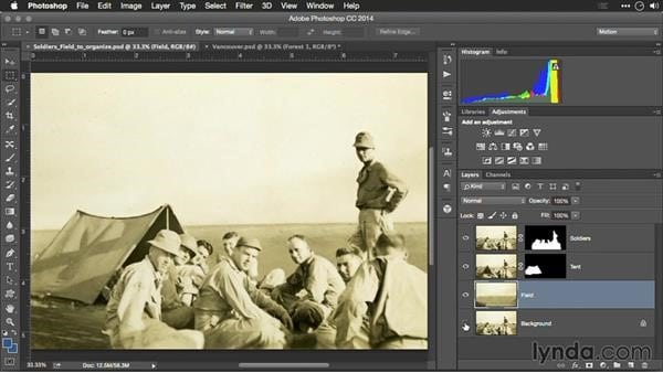
Label the Layers to Avoid Confusion: The 10 Basic Photoshop Etiquette All Designers Should Follow
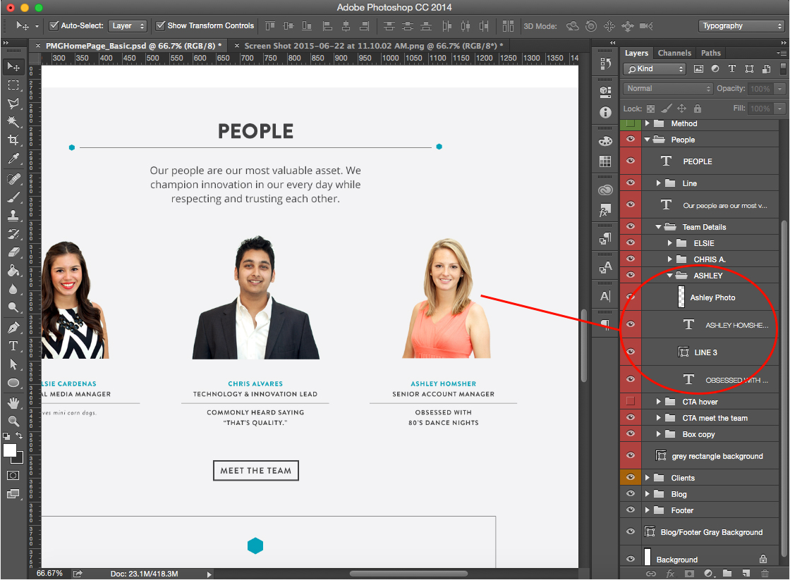
As the title suggests, it is the most boring routine for a designer. Start with one of the most basic Photoshop etiquettes and add names to the different layers in the file. You might say that some things are obvious but actually, it is not. As a matter of fact, it is very hard to find a layer hidden in the middle of countless copies of layers. Thus, you should prefer to name even a simple layer to avoid confusions later.
After getting done with the labeling of layers, subsequently, sort the layers in a group folder. As a result, you’ll be able to hide or show large segments easily. In addition, lock the important layers that you don’t want to move unintentionally. The task is not over yet. Have a look at the file to delete unwanted empty layers.
- Logical Sorting of Files:
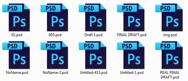
Logical Sorting of Files: The 10 Basic Photoshop Etiquette All Designers Should Follow
You should make sure that the naming of files should be easily understood by your fellow designers. Don’t name your files like version 1 and 2 with no name, as there will be no final version in some cases.
Apart from that, you should assemble your files like, ‘Name_Type_Size_Version’. The reason being, you should be able to recognize the name first that will help you to figure out the project. In addition, adding type, size and version will help to know the project type (website, email, social media, etc.). Defining the version allows you to identify the previous changes in the file.
Consequently, this method of sorting files will enable you to save each change separately. Organizing your files in the specified format also helps in recovering the previous version of the files.
- Mask Only Once:
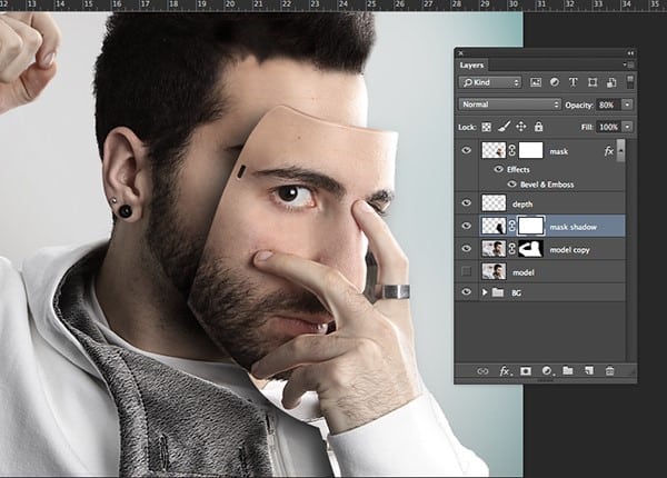
Mask Only Once: The 10 Basic Photoshop Etiquette All Designers Should Follow
Don’t mask each and every layer separately rather, group the layers and mask it once. Masking can get really confusing for other designers as the layers will not be visible. Do not leave your PSD file messy with multiple layers being masked.
- Don’t Forget to Save your Path:
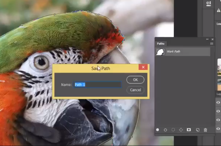
Don’t Forget to Save your Path: The 10 Basic Photoshop Etiquette All Designers Should Follow
If you are using the pen tool to craft a perfect clipping path then, save it to avoid doing this work again. The more you keep this habit of saving the path, the better you will become. This will also help the next designer to understand what has happened in the file.
- Avoid Stretching of Text and Images:
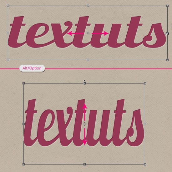
Avoid Stretching of Text and Images: The 10 Basic Photoshop Etiquette All Designers Should Follow
You should keep in mind that stretching a text or an image can hamper the whole design. In fact, you should avoid stretching of buttons and vector shapes with rounded corners. Rather stretching images, you should scale it down to transform the image.
Subsequently, in case of fonts, you should know that stretching the fonts will make your design look unprofessional. Besides that, you can always use smart filters to avoid distortions due to stretching. In fact, following this simple rule will help you to create better mobile friendly designs with enhanced retina display.
- Switch on to Rulers for Snapping:
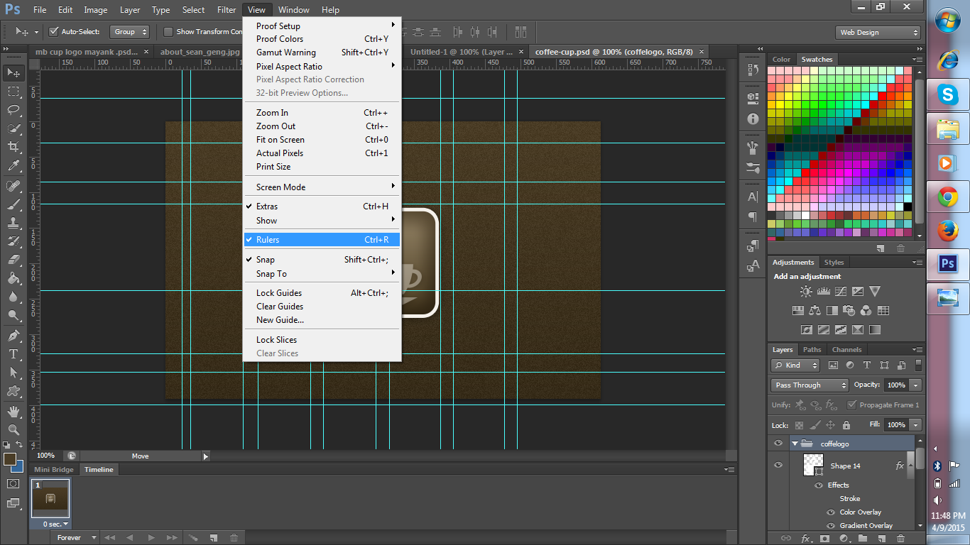
Switch on to Rulers for Snapping: The 10 Basic Photoshop Etiquette All Designers Should Follow
A good alignment skill is the sign of a professional designer. So don’t wait for anything and switch on to rulers for snapping grid, layer and pixel. Snapping with rulers enables you to create a well-balanced design and help to keep elements at the best place to look more pleasant.
- Avoid using too many Effects:

Avoid using too many Effects: The 10 Basic Photoshop Etiquette All Designers Should Follow
Don’t apply the effects on all the elements of your design. In fact, excitedly don’t apply effects like drop shadow, color overlay, and bevel, etc. You should know your tools to use them effectively. So the best thing to do is use appropriate effects to enhance the looks of your design.
Rather using the effects repetitively, you should copy the layer style itself. While you’re not using the Global Lighting option then, turn it off to avoid confusion. Subsequently, if you don’t follow this practice, there are chances that you might wonder who changed my design.
- Save Unused Images and Resources:
Save Unused Images and Resources: The 10 Basic Photoshop Etiquette All Designers Should Follow
When you are done with your design experiments then, don’t forget to save the experiments itself. Apart from that, create a separate folder space to save these unused resources. Subsequently, you’ll be able to use those unused resources for your future design expeditions. In addition, this practice also allows you to include any quick changes or add-ons in the design.
- Proofread to Avoid Errors:
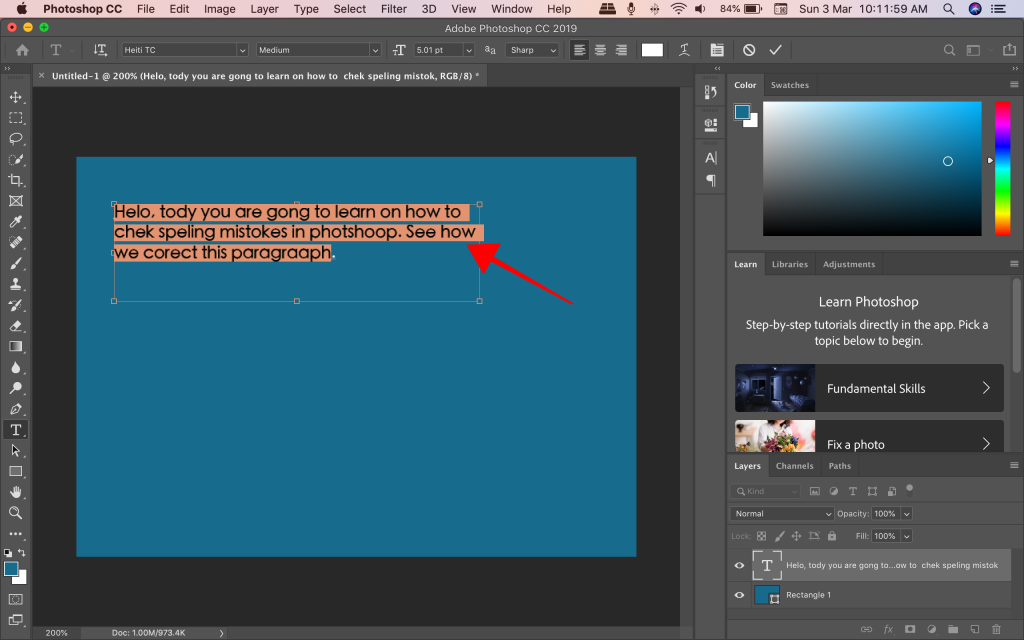
Proofread to Avoid Errors: The 10 Basic Photoshop Etiquette All Designers Should Follow
After getting done with your designing assignment, you should proofread your design. Subsequently, this etiquette allows you to avoid a small mistake like wrong spelling. In addition, proofreading will lower down the chances of rework on the design.
- Don’t Mess up things:
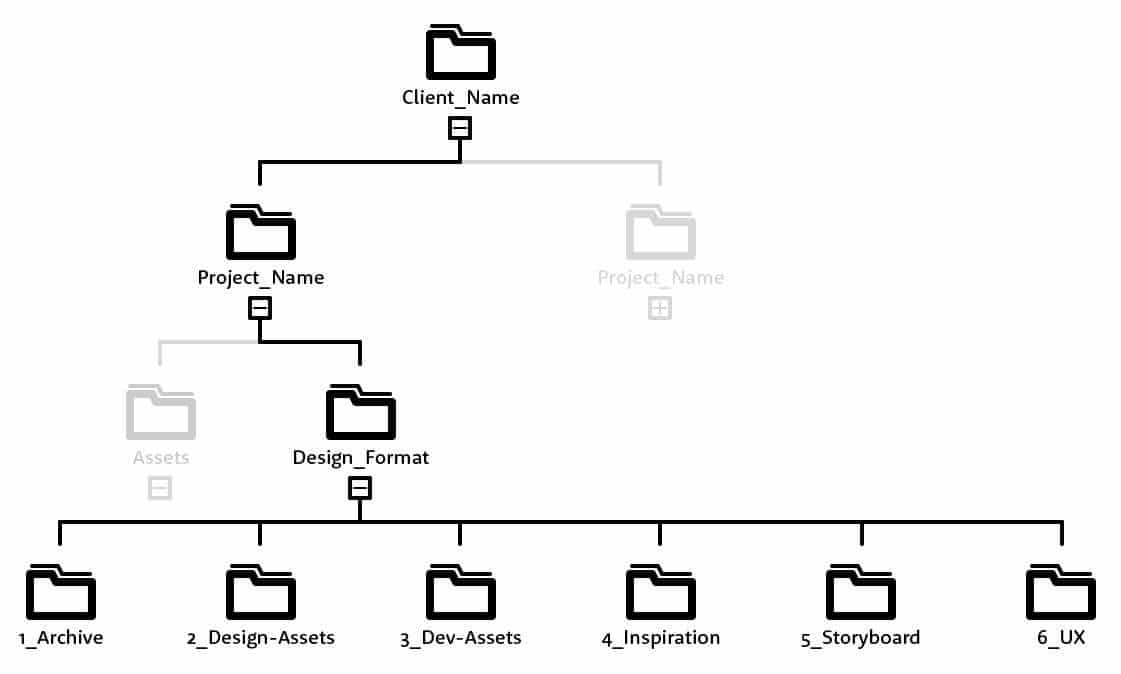
Don’t Mess up things: The 10 Basic Photoshop Etiquette All Designers Should Follow
It is the most important Photoshop etiquette to store your files at a proper location to find it easily. In fact, if you fail to store your files with relevant stock images and resources then, you might end up in a puzzle game later.
You should not save the file in a random folder because random is never important and you may delete the folder in disguise. Apart from that, your designer fellows won’t be able to find out the file, if you have not sorted it appropriately.
The post 10 Photoshop Etiquette Rules All Designers Should Follow appeared first on Line25.
Source: http://bit.ly/2GcIljA

No comments:
Post a Comment