If you are trying to build your business image or brand, a corporate brochure will form an important part of your marketing program.
Creative brochures help you to build up your corporate image. You will also be able to share important information about your company with your clients.
Without a professional brochure, your marketing material will feel incomplete and your products will not be as profitable as they could.
We’re here to show you some great creative brochures. Find brochure inspiration for your business by browsing through these corporate brochure examples.
Corporate brochure templates
Now it’s time to explore some great brochure templates to inspire you to create your own designs.
Corporate brochure
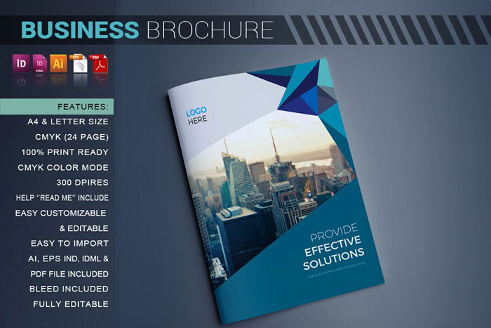
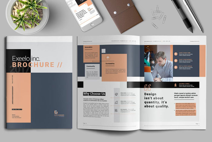
CO Business Brochure
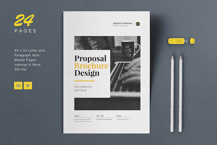
Proposal Brochure
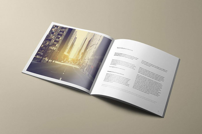
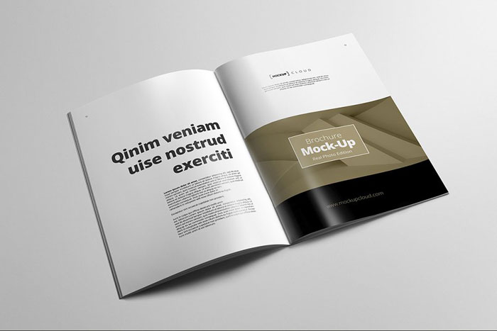
Square Brochure Mock-Up
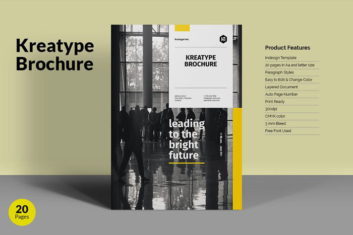
Kreatype Brochure
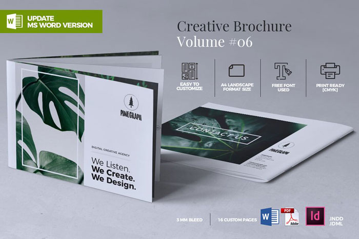
Creative Brochure Template Vol. 06
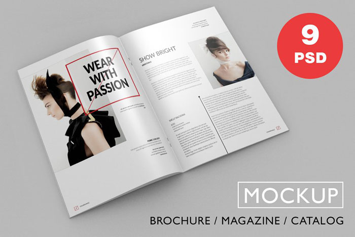
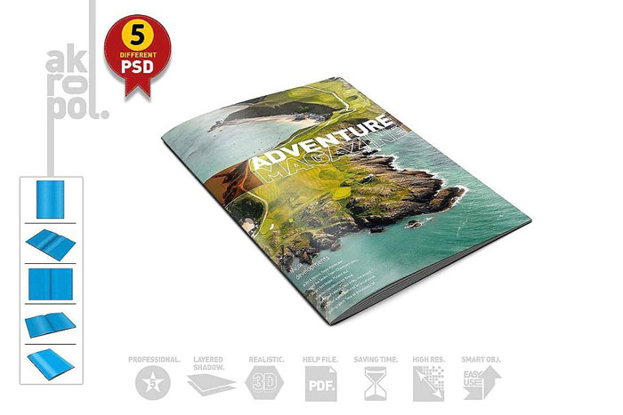
Brochure / Magazine PSD Mock-Ups
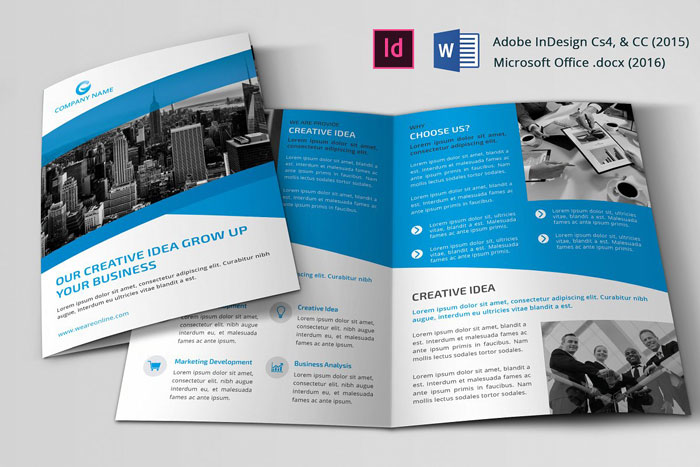
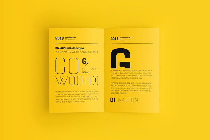
Corporate Bi-fold Brochure
Brochure Mock-Up / A4 Portrait
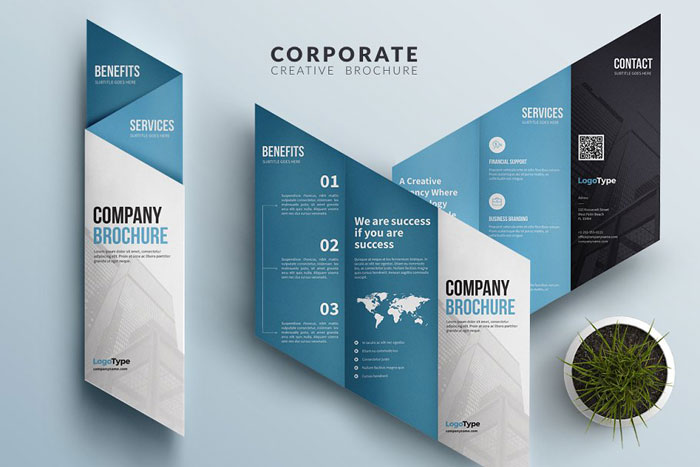
Corporate Trifold Brochure
US Letter Bifold Brochure Mockup
Magazine- Brochure Mock Up-02
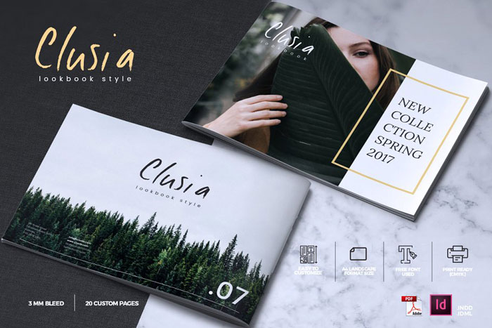
CLUSIA – Lookbook Brochure Catalogue
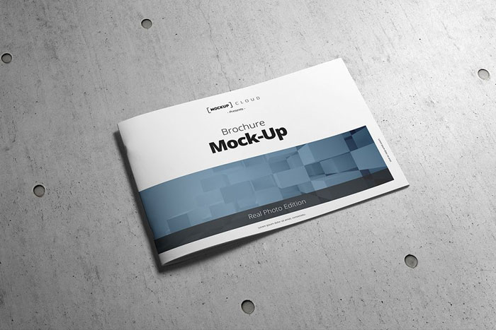
Brochure Mock-Up / A4 Landscape
Corporate Brochure by artico
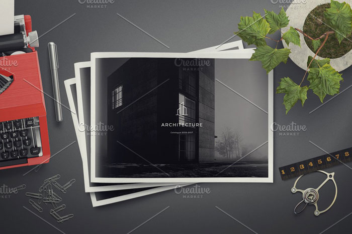
Architecture Landscape Brochure
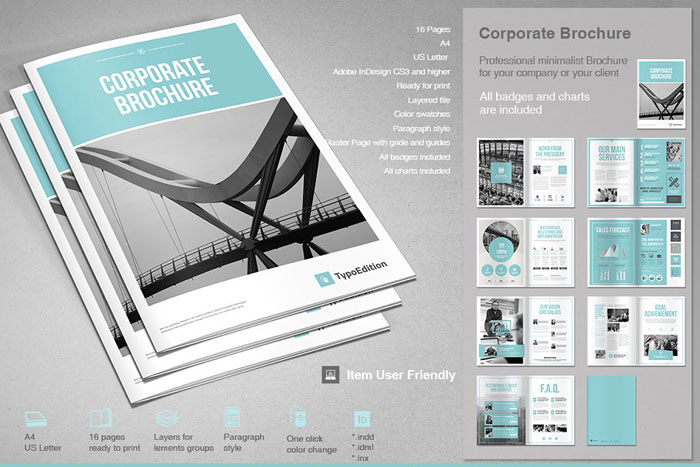
Corporate Brochure by Typo Edition
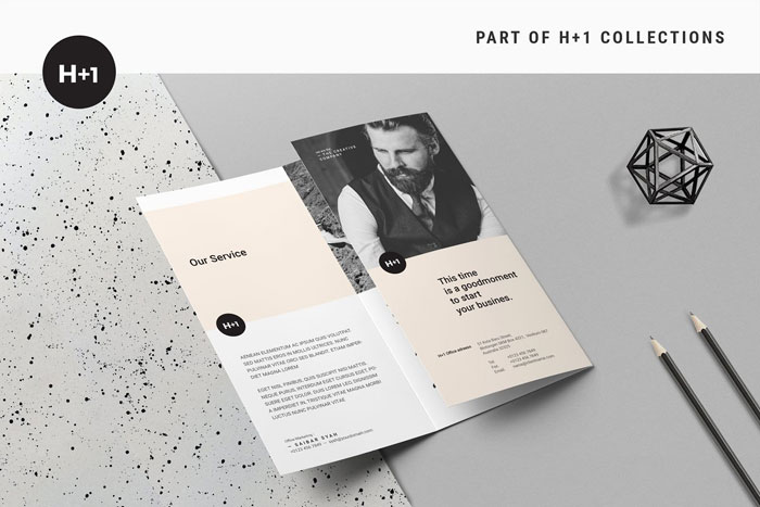
Business TriFold Brochure
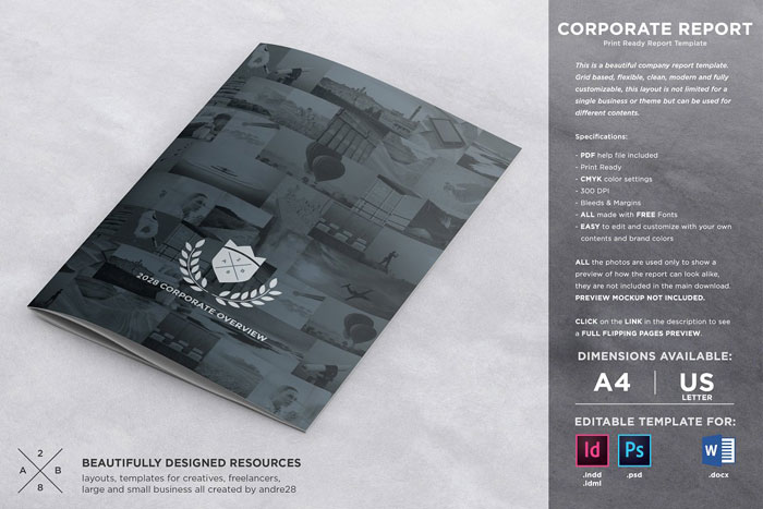
Corporate Brochure Report Template
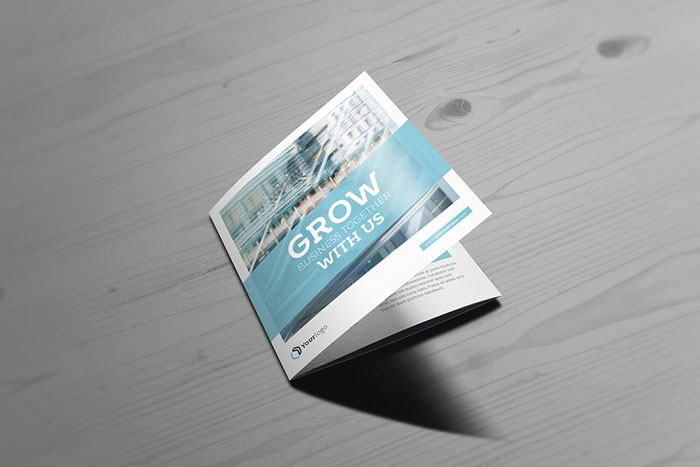
Square Trifold Brochure
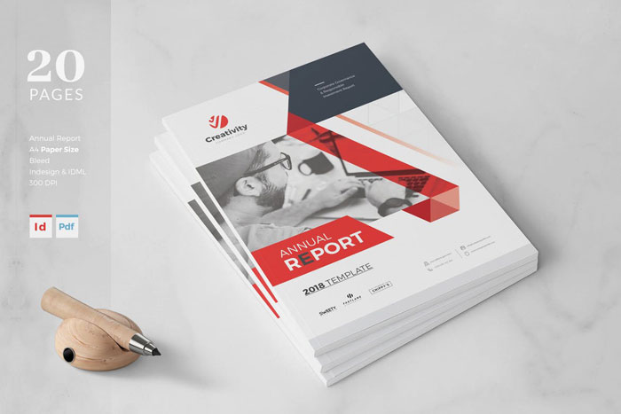
Annual Report – Business Brochure Template
This corporate brochure template was designed to create attractive annual reports for your small business.
It has 20 pages which can be used in A4 to create a unique report. Use with CS4.
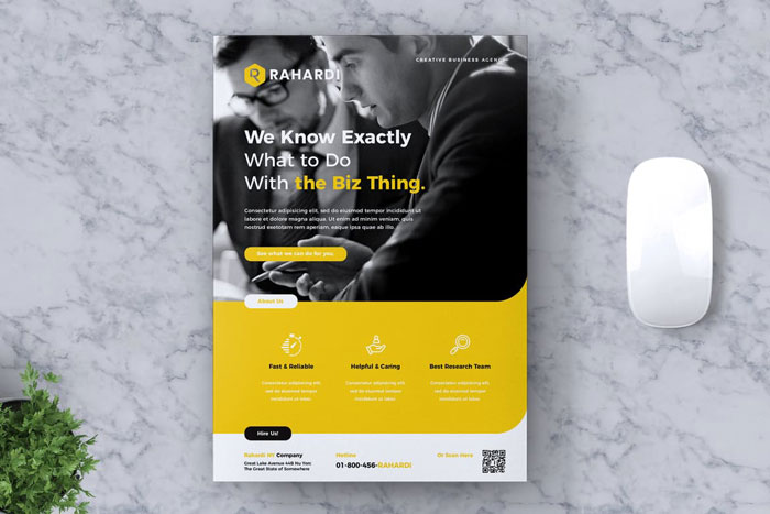
Corporate Business Brochure Template
This creative corporate brochure template is great for an advertising campaign or marketing company.
It can be used with both Illustrator and Photoshop and comes in A4 format.
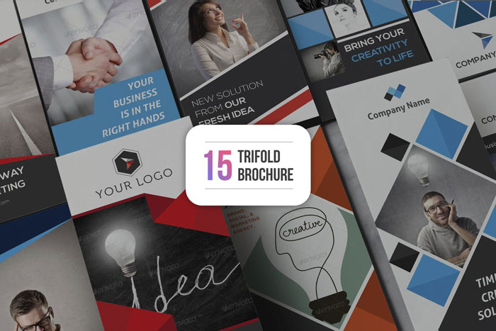
15 Tri-fold Brochure Templates
This company brochure template has 15 different styles to choose from.
It comes in A4 and can be used in Illustrator and Photoshop.
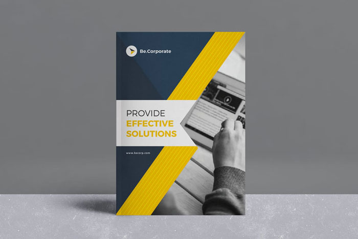
Corporate Brochure Template
Marketing and advertising agencies would benefit from this catalogue layout. It has twenty different pages to use to showcase your products and services.
You can use this template in A4 format and US letter size.
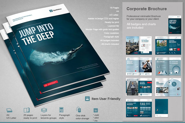
16-Page Business Brochure Template
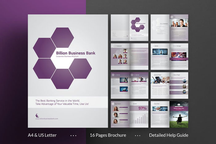
This brochure layout design has been created specifically for corporate use. Design your brochure in A4 or US letter size.
You will have 16 pages to create your content with as well as easy color choices. One your designs are complete, your work will be ready for print.
28-Page Creative Brochure Template
This sophisticated corporate brochure template will give you 28 pages to create content. You will also get a range of interesting shapes for dynamic designs.
Marketing agencies as well as advertising companies would benefit from using this template. It comes in both A4 and US letter format.
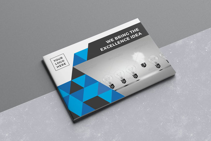
Landscape Company Brochure Template
Are you looking for a landscape brochure design? This new trend is becoming increasingly popular.
With this corporate brochure you will get 20 pages to use for your unique content as well as a 6/12 grid.
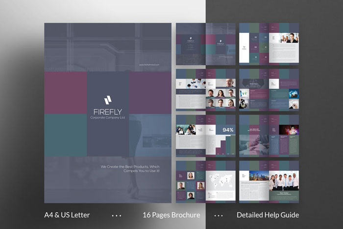
Firefly A4 Brochure Template
This corporate brochure design is perfect for showcasing your business content.
You can change colors and fonts and edit the template until you are completely happy. Once you have done this then your 16 page brochure will be ready for printing.
Tips for designing your corporate brochure
Incorporate a gradient into your corporate brochure
Gradients are super trendy and will create an attractive backdrop for your catalogue layout.
Bring in neutral accents to complement your gradient. This will keep you marketing brochure clean and uncluttered.
However if your gradient is neutral, you can use bright colors to send your message.
Keep your information clear and simple and add evocative imagery to make an impact.
Use a color filter on your corporate brochure
Color filters are highly effective yet simple to use. All you have to do is drag your shapes into place and you’ end up with an attractive feature which will enhance your product brochure design.
Classic colors such as dark blue make great filters and will highlight your accent colors.
Frame your images for a cohesive corporate brochure
Every designer struggles with images. Very often the perfect choices for a corporate catalog come in many different shapes and sizes.
By framing them you can adjust their shapes and sizes for a coherent business catalog.
Use bright colors and icons to highlight calls to action
Marketing agents understand the importance of a call to action. A great call to action converts your viewers into clients.
By using a call to action you show your viewers the next step to take.
A call to action button is most often associated with website design. However a call to action is an important part of company brochure design too.
Some corporate brochures may even use two different calls to action in combination. Make them stand out from one another by using bold colors
Create a cohesive style with your photos
Take your overall corporate brochure design into account before adding your photos.
Have a look at the message you want to send and how each photo will add to, or distract from this message.
Depending on your color choices and the message you want to send, your photos will either add or clash.
Include images which will add interest to your content as well as create an emotional resonance. Choose images which are relevant to your content.
This will help your catalogue layouts feel finished.
Use visuals consistently throughout your brochure design
Consistent images will add polish to your corporate brochure. When each section unites to create an overall impression, your business brochure design will flow.
Keep your images consistent and stick to images which repeat through out many different sections. Inconsistent images will distract your viewers, disturbing the harmony and flow you want to create.
Use a contrasting color to create visual interest
If you want to draw attention to a specific aspect of your brochure, use color. The best brochure designs often use contrasting colors to make their brochures pop.
You can mix your fonts with bold colors to attract attention, creating a visual hierarchy which attracts attention.
As minimalist brochure design is becoming less popular, bold colors are starting to return. Brands use these colors to emphasize important content as well as to create a visual impact.
Feature handwritten fonts in your brochure design
Handwritten fonts add a personal touch and have started to become increasingly popular as the world becomes more digital.
This is because handwritten fonts make a business brochure feel more friendly and approachable. Add them to your brochure design to connect with your viewers.
Use color to organize your marketing brochure
If you are using a simple brochure design, you might be trying to fit in as much content as you can.
Too much text can be confusing to readers and you will need to arrange it so that it is simple and easy to grasp. There is a limited amount of space to include information in your trifold brochure.
Keep your brochure organized by using colors to group your information. You could use different colors for different sections of your brochure. You could also select your fonts according to sections.
Ending thoughts on corporate brochures
We hope this article has inspired you to create an outstanding corporate brochure for your business. An attractive brochure design will help you to communicate with your viewers.
It will also add an important element to your marketing campaign. Browse our inspiring brochure selection and follow our handy tips until you have the results you need.
If you enjoyed reading this article about corporate brochures, you should read these as well:
- World map vector graphics you can download with a few clicks
- Great looking annual report design examples and templates
- Free business card templates you can download today
- Business card mockup templates to use for presenting your designs
- Free brochure templates to use for creating your brochure
The post Great looking corporate brochure templates to check out appeared first on Design your way.
Source: http://bit.ly/2UzFXh7



No comments:
Post a Comment