Stationery design became popularized as an important element of social interactions during the Victorian era. If you are familiar with stationery design, you’ll know that it comes with paper, letterheads, envelopes, cases, business cards and other office supplies.
In a corporate environment, the goal is to use business stationery as a means of branding. This branding extends into corporate stationery which is used throughout a company.
Business owners understand that stationery designs create a professional image. Business stationery shows your clients that you are professional, help to identify your brand and allow you to stand out.
Many companies extend their branding onto the online or digital realm. Many clients are familiar with the digital dimension and will be impressed to receive business stationery from a popular company.
A company who carries its brand into creative stationery will help to improve its self-image, building up its brand.
Why use stationery design when you can go digital?
Do you find your digital and online lives collide? Have you ever read a glossy magazine, looked at the fashion brands or celebrities within this magazine and then followed them on social media?
Digital and print media often combine! You may read your favorite author in print but then follow him on Twitter.
The same goes for your business. Clients who interact with you via your website or social media sites will still be interested in your stationery design or printed branded material.
Printed materials will help your clients identify you. Each and every aspect of your business will communicate your brand message.
You will want the quality and message behind your brand to shine out in every way possible.
Tips for creating the best business stationery
Stationery design is an excellent way for businesses to communicate with clients. You can also use corporate stationery to send friendly letters or even use your stationery designs at networking events.
However you use your corporate stationery, you’ll want to allow your brand to shine. We have some tips to help your stationery designs come alive:
Keep it simple
It can be exciting to imagine your business stationery filled with a range of different design elements or styles. However, the more simple your design, the more it will appeal to your recipient.
Allow certain elements to stand out in your stationery designs while keeping the rest of your page clean. This will prevent your page from becoming cluttered and overwhelming.
Here are some tips to help you out:
- Limit your typography styles. A maximum of two different styles is most effective.
- Keep your colors to a minimum. A maximum of three colors will keep your page clean and uncluttered.
- Make use of white space. White space helps you to break up your page, keeping it clean, professional and easy to digest.
Remember that a simple stationery design will prevent your page designs from overwhelming your content. You will always want your page to send a professional message, supporting your content.
Incorporate your brand
From your lettering to your logo and color schemes, you would like your business stationery to represent your brand.
You don’t have to allow your brand to restrict you, but your customers should be able to identify your corporate stationery as a part of your larger brand.
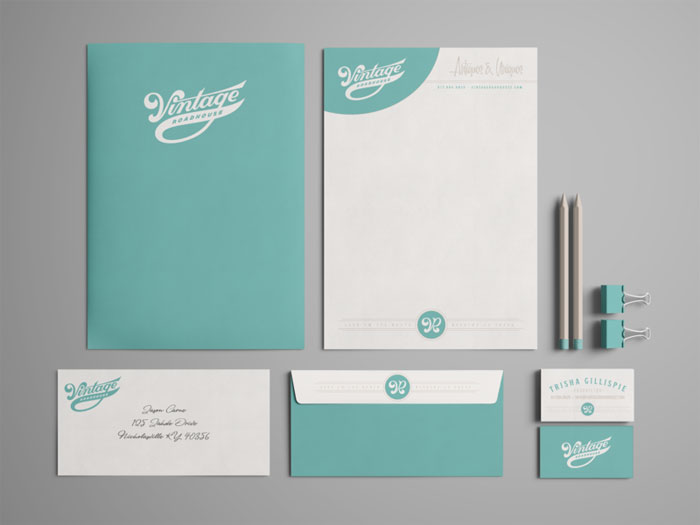
There are many different business stationery items you’ll be using, such as letterheads, envelopes, business cards, and logos, so there are many ways to represent your brand.
You could include your logo on your envelopes, while also incorporating it into your business card. You could allow your logo to create a space between your business information and your content on your letterhead.
This way you’ll represent your brand, making your business easy to identify to your clients.
Be responsive
Once you’ve asked designers to assist you with your business stationery designs, be responsive. Guide a designer and share where you are happy with a design and where you would like changes.
If you are hosting an open contest with multiple designs, offer each designer feedback. A designer can then choose whether to work with you further or withdraw from the contest.
If you love a design, work closely with a designer until you are happy with the final results. If you have more than one result you love, ask team members or clients to form a poll, selecting their favorite choices.
This way you will end up with professional business stationery that you can appreciate and enjoy.
Be specific
When it comes to your business stationery, you will need to be specific. Determine the colors you will be using for printing, the type of paper you would like, the lettering styles which appeal to you and the format you are looking for.
Provide these requirements to your designer, and let them know of the sizes you are looking for in your corporate stationery designs.
Would you like a simple business card or a fold up one? Would you like your letters embossed? What colors would you like? How will you be printing your cards?
Each detail will impact your designs.
Organize your designs
When it comes to business stationery, the way you organize your designs will have a big impact. You would like your design stationery to be attractive, easy to read and practical.
- Use hierarchy in order to layout your page. This means you can use headings as well as bold or italics in order to share attention.
- Use brand colors and typography to break up your page.
- Keep your lettering and colors legible. This will help your clients to digest your message easily.
Keep your branding separate from your content. Your branding, logo and business information should remain separate, keeping your focus on your business content.
This will make your information distinct and easy to notice.
Clarity
When creating a design brief for your stationery design, give your designer as much information as you can. Share any colors associated with your brand, as well as any logos you have.
Your designer will be able to put together a result you will love far more easily if s/he knows the direction you are heading in.
If you don’t have any design information, share your business goals, the culture of your business as well as the message you would like to communicate with your stationery design.
If you have an overall concept or goal, share it. If you don’t, share the emotions or meanings you would like to create. A highly professional design is different to a playful one.
The more guidance you give, the greater success you will have in achieving your aims.
Stationary examples to inspire you
If you are exploring ideas for your stationery design goal, we’re here to assist you. We’ve put together a collection of excellent stationary designs to inspire you.
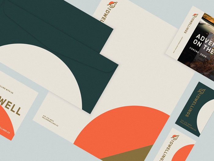
The Dwellings Brand
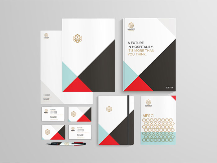
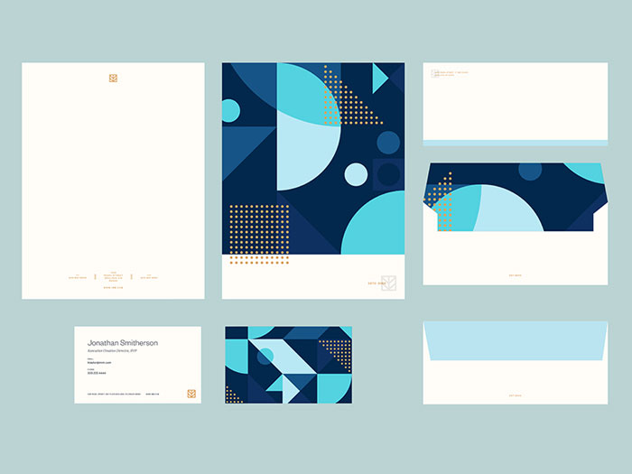
Sommet Education by Eight Hour Day
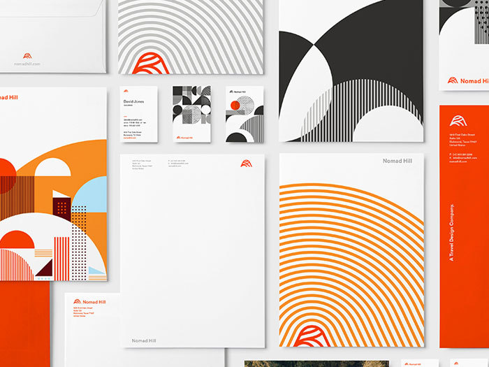
Nomad Hill Stationery – CA Design Annual
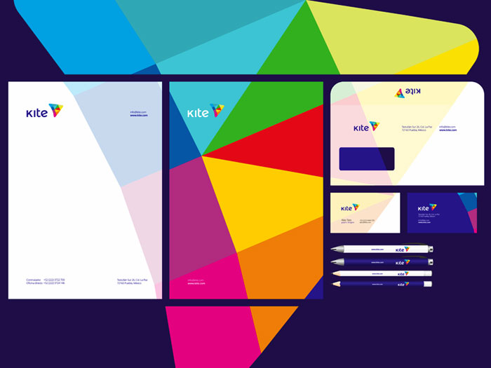
Kite e-learning platform stationery
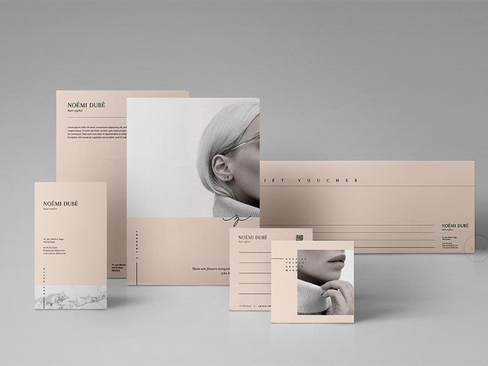
Noémi Brand Stationery Pack
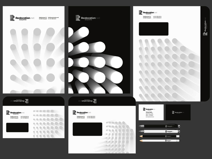
Realocation luxury homes stationery
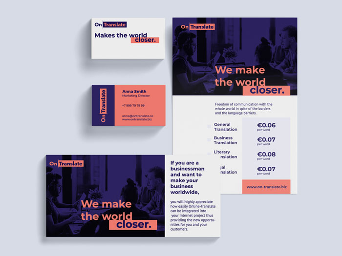
Ontranslate Branding & Stationery
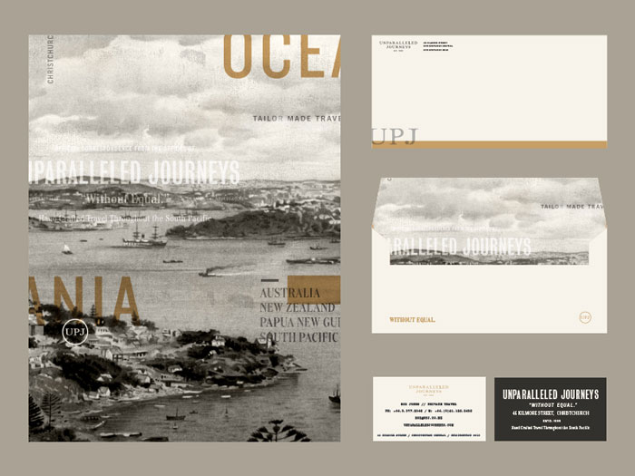
UPJ Stationery
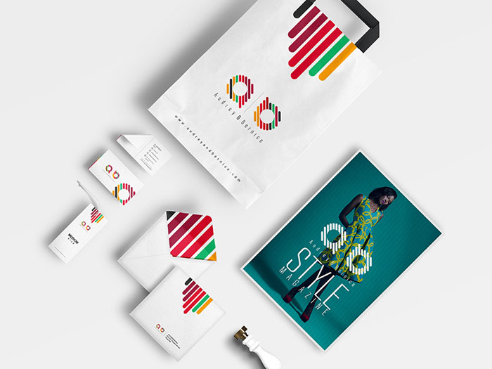
Audrey & Bernice Corporate Identity
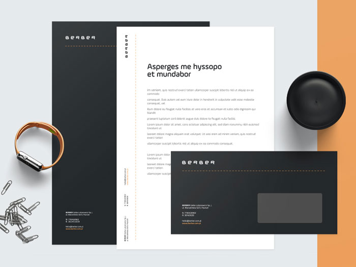
BERBER Stationery
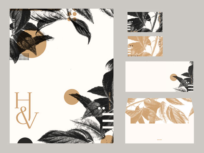
Hart & Vine
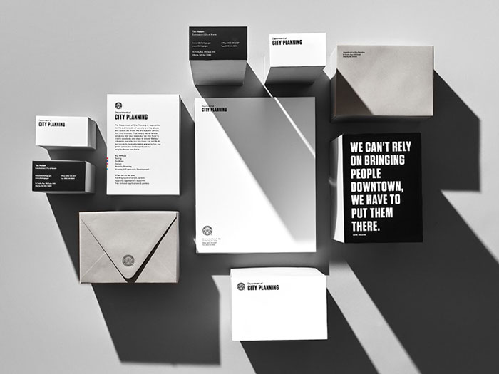
City of Atlanta
IMM Brand Stationery
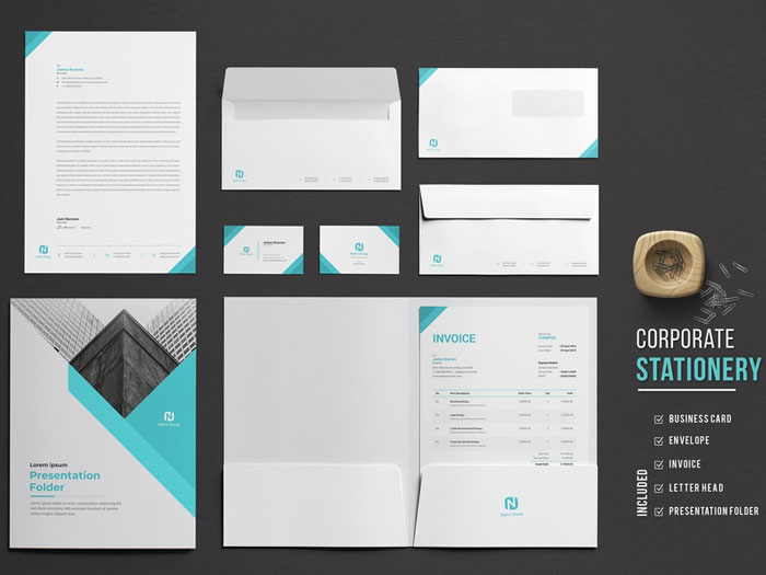
Netro Corporate Identity
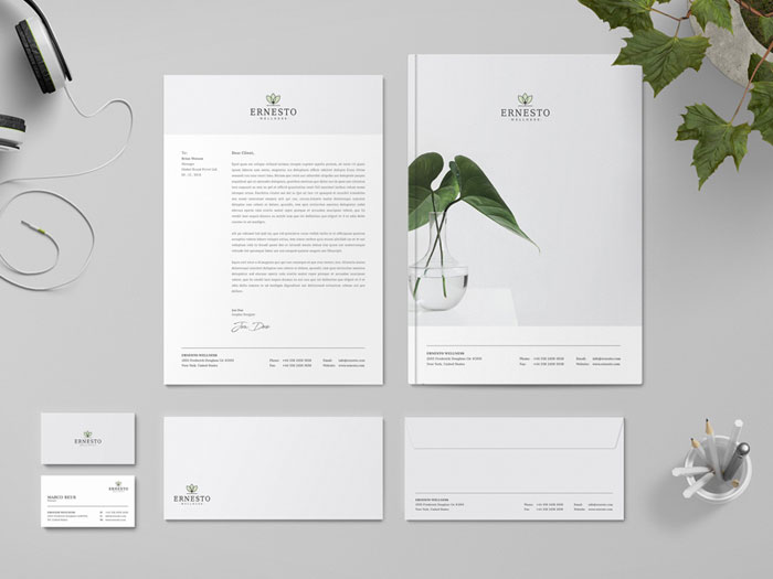
Ernesto stationery
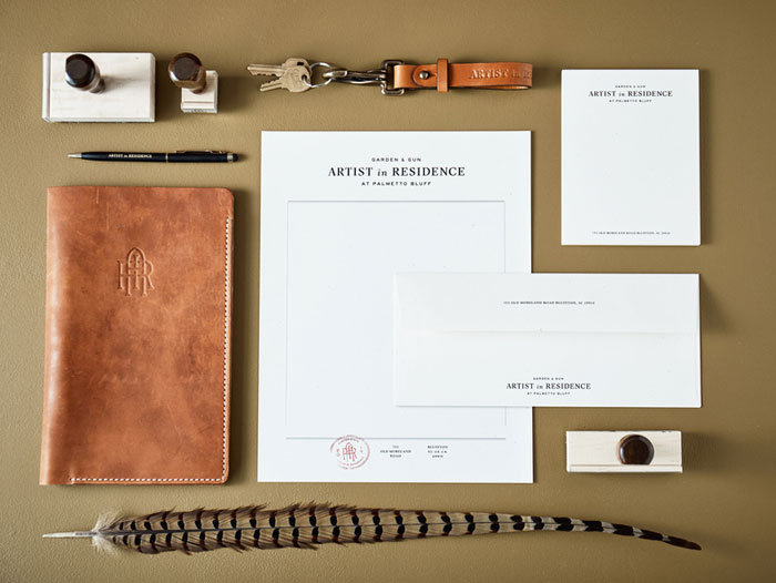
Artist in Residence
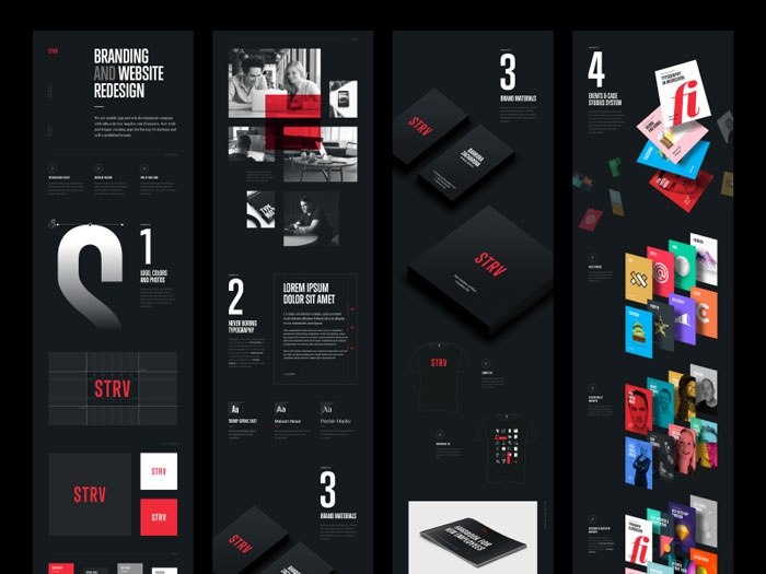
STRV branding
Corporate Stationery mockup
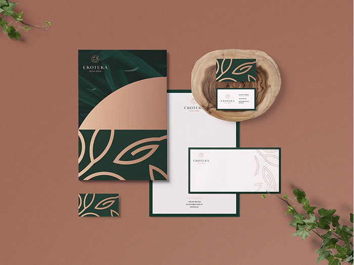
Ekoteka stationary
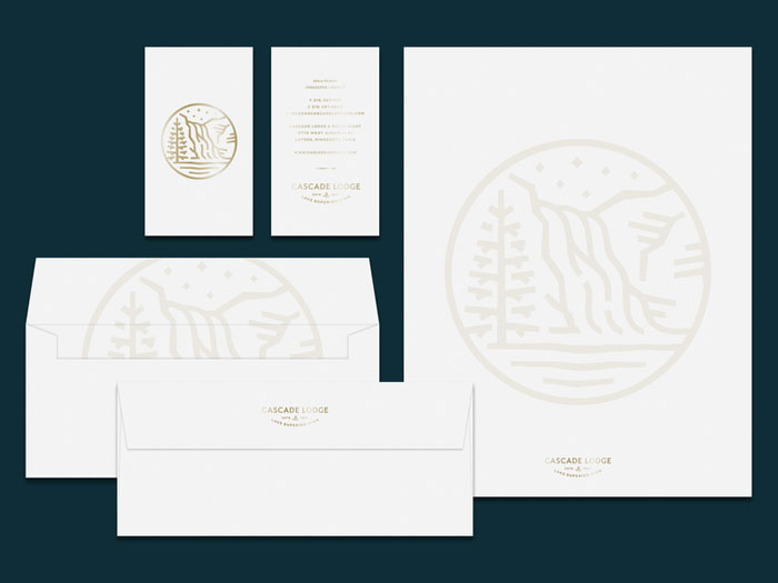
Cascade Lodge Stationery
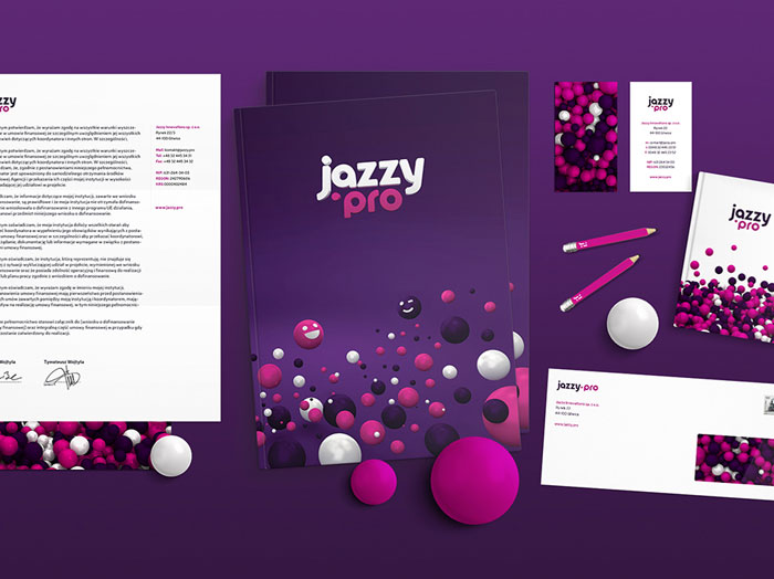
Jazzy Innovations
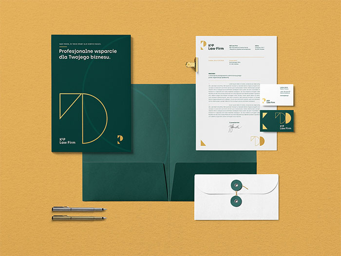
Law Firm stationary
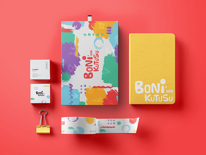
Boni’nin Kutusu branding
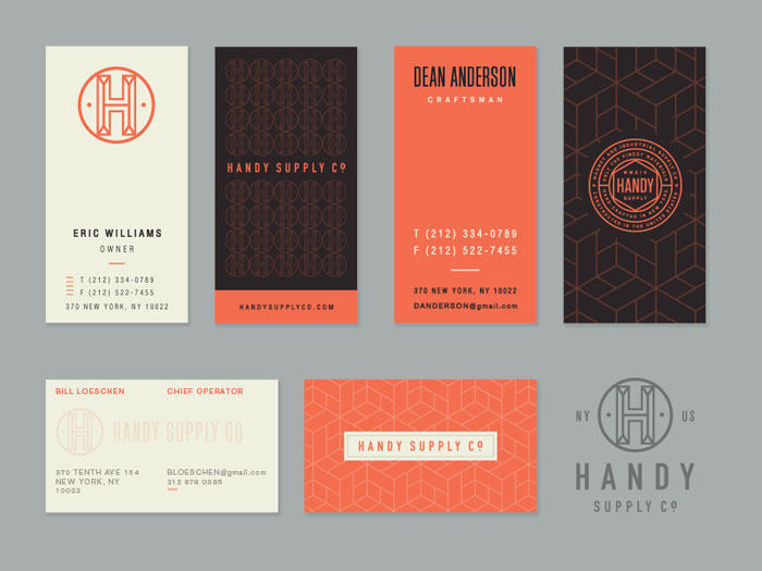
Handy Supply Bus. Cards Options
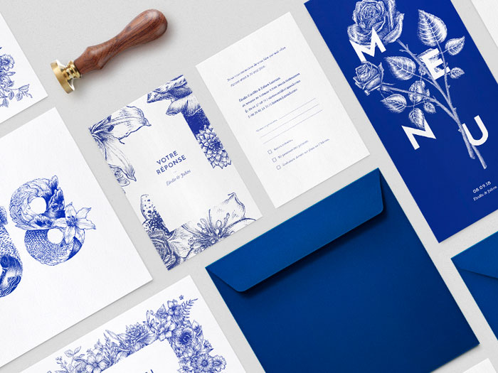
Wedding stationery
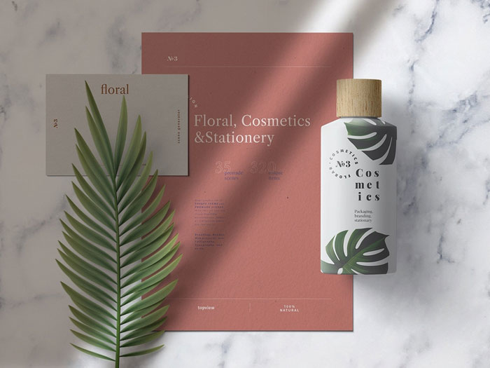
Cosmetics stationery
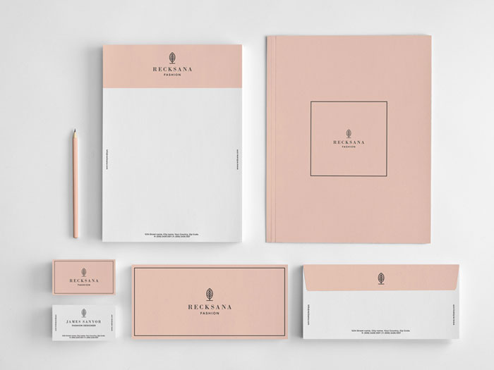
Recksana fashion stationery
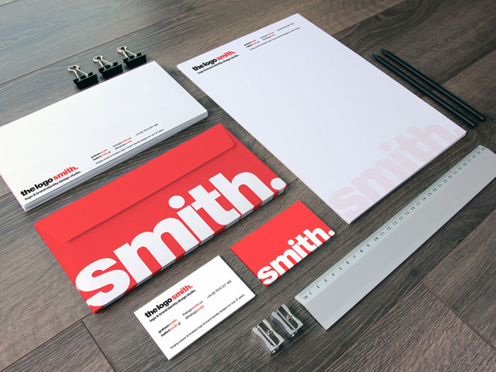
Smith stationery
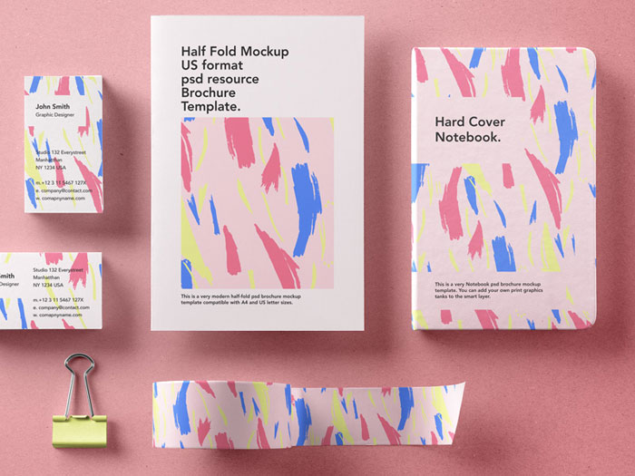
Stationery branding mockup
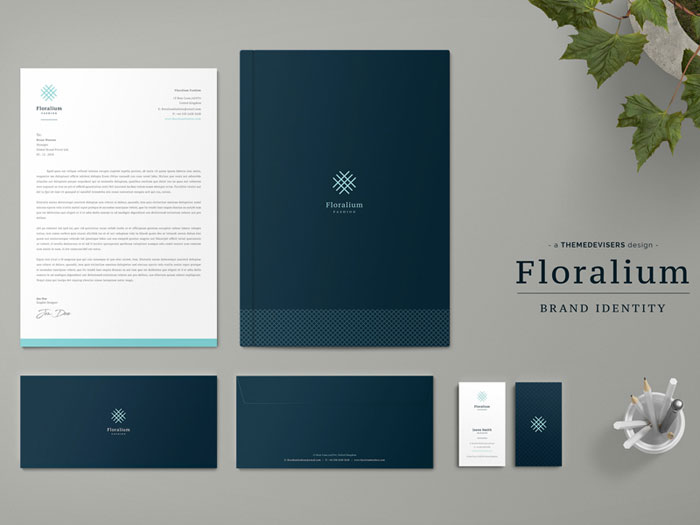
Floralium corporate identity
Ending thoughts on stationery design
We hope that this collection of creative stationery design has inspired you while you work on your own design projects.
We wish you all the best in creating business stationery which appeals to your clients while communicating the message behind your brand.
If you enjoyed reading this article about stationery design, you should read these as well:
- Great looking annual report design examples and templates
- Free business card templates you can download today
- Business card mockup templates to use for presenting your designs
The post Stationery design: best practice and great looking examples appeared first on Design your way.
Source: https://ift.tt/2HW7Rgi

No comments:
Post a Comment