Why do you buy wine? Have you thought that it is because of the wine labels?
If you know about wine, undoubtedly you think about the kind, the taste, and the price of a bottle of wine, but any stop at a grocery store or wine store will show you that even a single section of the wine aisle has dozens upon dozens of bottles to choose from.
How do you know which one to look at and see what its taste is?
Why, the wine label, of course!
The wine industry has grown into a $60 billion industry thanks to millions of buyers like you. Many of those buyers have a mental checklist they go through when selecting wine: red or white, domestic or imported, and price point are the big three.
Even just going by those things, however, you’re often left with three or four bottles to choose from. The truth is that wine labels are often the deciding factor.
This is especially true if you are buying a bottle of wine as a gift. Consumers shop with their eyes first. Just last year, Wine.net surveyed 2,00 wine drinkers and asked them to pick between three bottles of red wine and three bottles of white wine with only a picture to guide them. 80% of those surveyed said that they decided based on the wine label.
If you are an independent wine maker, it’s vital that your wine labels can hold their own on the shelf.
If you’re a freelance graphic designer, understanding how to create a successful wine label (or beer label; many of the same principles apply) can be a helpful skill to have. Keep reading for some tips and tricks on making great wine labels.
Understand Your Brand and Your Audience
Wine labels have very little space for you to use. Every element on a wine label needs to be carefully selected to make maximum impact.
The first thing to do is to decide on who you are as a brand and what your story is. The message a century-old vineyard in France wants to communicate (trust and history) is very different from that of an upstart winemaker from Oregon, who might want to attract more adventurous and younger buyers looking for something new and unique.
You need to figure out how to tell your brand’s story to your target audience in only a sentence or two while also describing the particulars of that bottle of wine, all in a very small space.
Be Personal
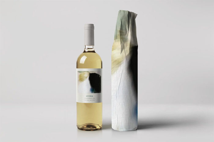
What is your heritage? What are your pets or favorite animals? Do you have a family crest or an old house that’s been passed down for generations? The answers to these questions can be great inspiration for some solid wine label design.
The wonderful thing about persona symbols and family crests is that they can be combined into a new bonded symbol for a customized wine label that fits the couple and their marriage perfectly.
This deeply personal symbols also give your wine label a lot of personality if you are selling it commercially, prompting the curious to pick it up and see what might be inside.
Business Wine Labels
If you are creating a custom wine label for a corporate vent or business, take a look at the city, street, and building where the business operates for some wine label ideas.
There may be a local landmark that represents what the organization stands for. There may be an office motif that you can get wine label ideas from, like plants, bicycles, or even steel rivets.
Don’t settle for just dropping the company logo into the center of the label and calling it done. Go the extra mile.
Once you have a good understanding of who you are and what audience you want to reach, then and only then can you really get down tot eh business of designing your wine label. With such a small space to work with, it’s helpful to have a plan to guide you.
Some Things to Include on Your Wine Label
Most wine labels include some useful and important facts about the wine on the front part of the wine label. This still leaves plenty of room for you to get creative, but a few good ideas to add include the following:
- The name of the wine
- The date of the wine
- Your wine brand
- The variety of the wine or the blend of the wine, whichever it is
- The actual winery that produced the wine and grapes
How Large Should Your Wine Label Be?
If you are creating a custom wine label for an event, for fun, as a gift, or a demo of your design skills, know that it will be covering up someone else’s wine label, so it needs to be bigger than the original.
For ‘feminine’ wine bottles, make your wine label 4.25×3.25 inches or larger. For ‘masculine’ wine bottles, make your wine label 3×5 inches or larger.
The Color of Your Wine Label
Wien bottles tend to have fairly standard bottle colors. Reds typically come in dark green bottles to keep sunlight out and prevent oxidization.
White wines, on the other hand, are sold in pale green bottles or in clear ones. When designing the color scheme of your wine label, you need to make sure it stands out on the bottle that the wine will be sold in.
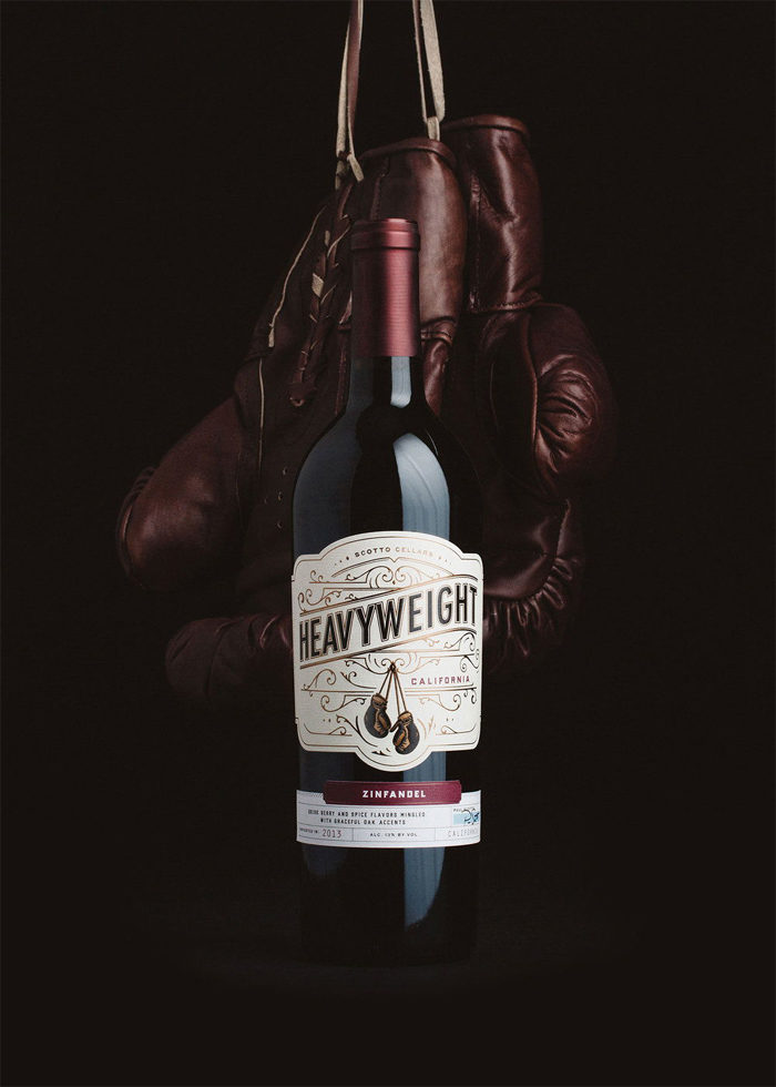
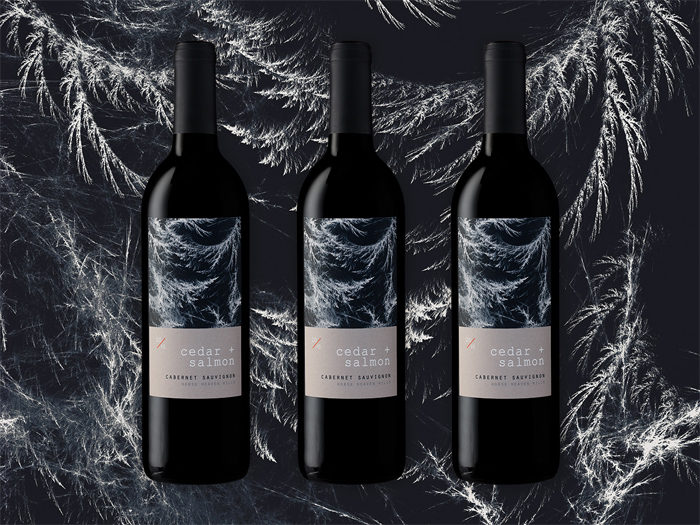
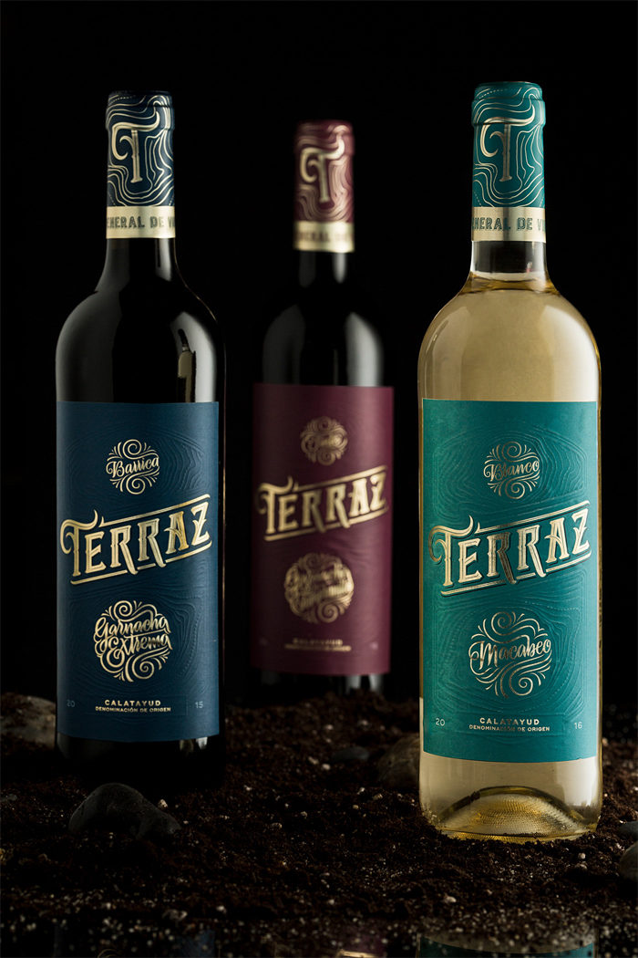
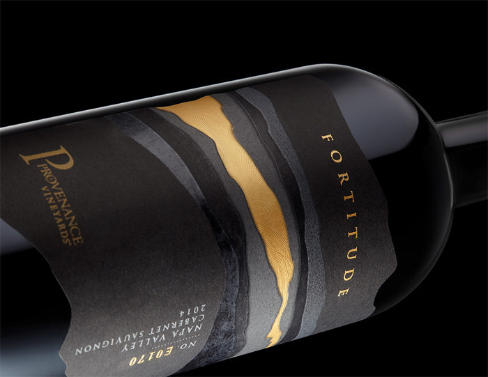
The wine labels for red wine typically follow one of two color schemes: deep and dark colors that have a moody feel or white wine labels with rich ink colors that are often deep reds, blues, and golds.
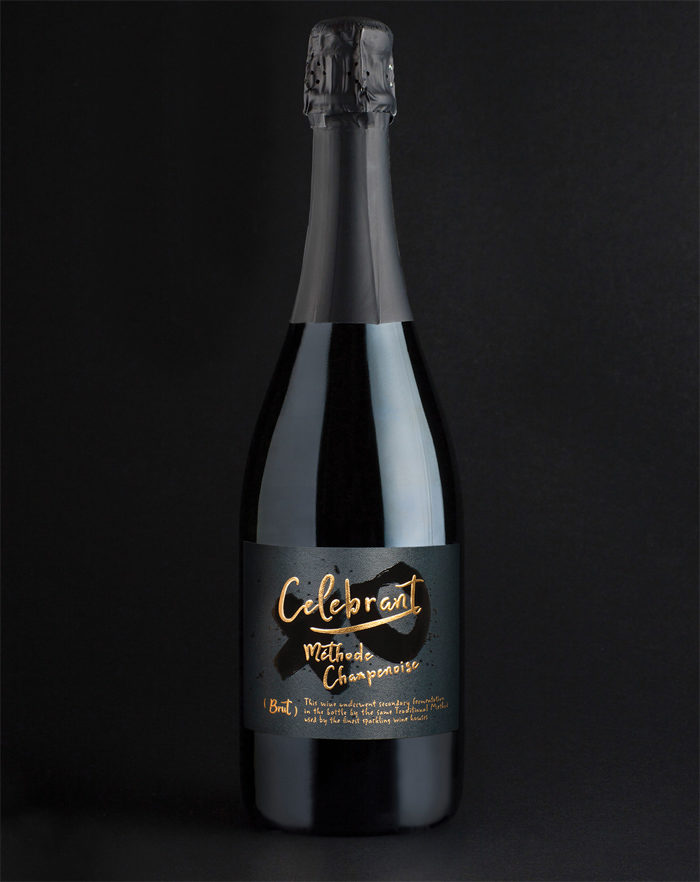
White wine labels tend to have light blues and light greens for an airy or crisper feel. For sparkling wines, the wine labels tend to make use of golds and pinks. Trendy roses often stick with that color scheme as well.
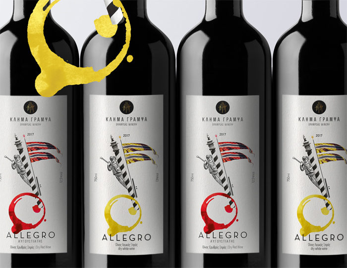
Traditions are made to be broken, however. Recently, vintners have begun getting more playful with their wine labels color schemes.
Using bright or dark labels with white wine to create a bold and contrasting effect, or using a full spectrum of bright colors on the labels of red wine for a more playful look.
The Typography of Your Wine Label
Now that you have a color scheme, it’s time to give some thought to your type. If you opt to have a darker wine label for a red wine bottle, you need to have typography that’s strong enough for the design and can bring in some contrast.
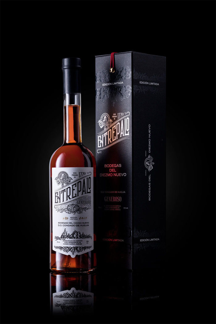
The font you use on a wine label will tell consumers a lot about what they’re buying. More traditional wineries use busier typeface styles and design that help to tell about their authenticity and history. These wine labels often make use of serifed or script type styles.
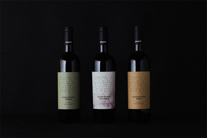
More modern hip wineries tend to use bold sans serif typefaces that have a contemporary feel. Their labels have a roomier look and make a use of a lot of negative space.
However, other wine labels from newer wineries may put emphasis on the full winery name and may pull one letter or their logo out and make it larger and more eye-catching.
Wine Label Style and Imagery
Choose a Theme for Your Wine Label
No matter if you’re creating a custom wine label for a wedding or a corporate gift, a good way to get started on the design process is to select a theme:
- Classic: traditional, prestige, elegant, regal and dignified. These wine labels model traditional label styles.
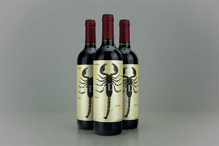
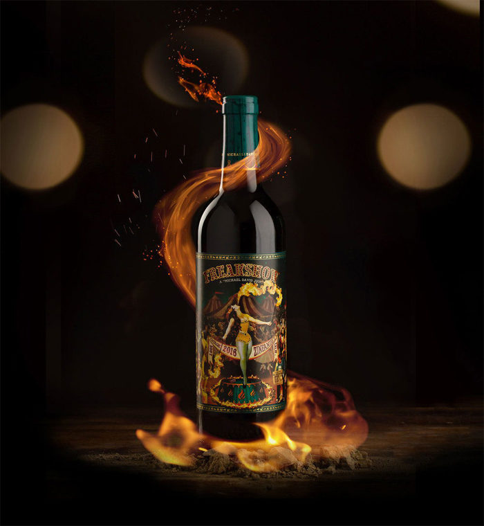
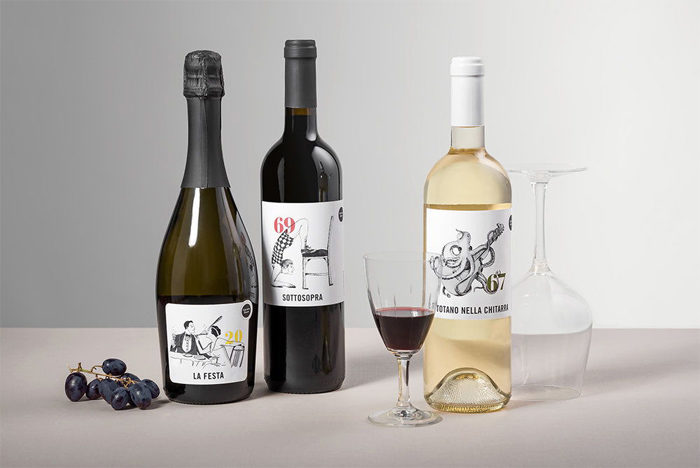
- Fun & Silly: casual, laid back and valuing personal experience over prestige. These wine labels can be hand drawn, whimsical, and often include animals.
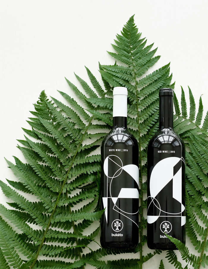
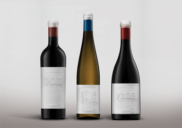
- Modern: state-of-the-art, advanced, other worldly and visionary. Modern wine labels play with negative space, typography, minimalism and focus on the materials on which they’re printed.
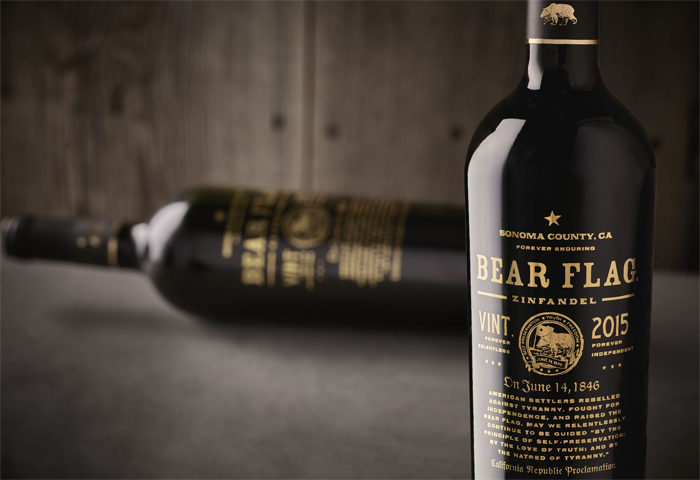
- Old Timey: Think handmade, natural materials, and honoring the past. Old timey wine label designs use classic typography, illustrative designs, and vintage artisan techniques.
These themes actually reflect different styles of wine, as well.
The most popular wine label styles tend to be elegant, bold and modern, minimalist, or classic. You should decide on yours based on the personality of your wine, your brand, and your customers.
If you are looking to sell to older and more sophisticated drinkers with a higher price point, traditional tends to work well. If you want to appeal to millennial drinkers who are just starting to develop their wine palettes, a clean and modern look might be a better fit.
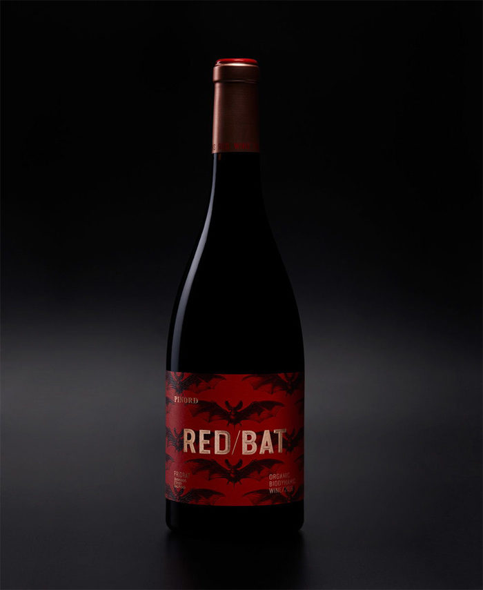
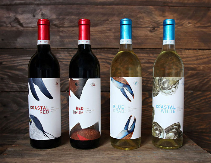
Whatever style you do for, you need to make sure that the wine label has eye-catching imagery to make it stand out. For traditional classic styles, a pencil drawing of the vineyard or estate the wine is from might work.
Minimalist designs may show a small character or logo with a lot of white space around it. More contemporary wine labels may not even use graphics, instead using large typography. Some braver designers opt to make use of a cartoon or amusing designs.
Whatever you use, the imagery should be unique. It needs to set your label and brand apart from the test. Your label allows your customers to know that this is the wine for them and the imagery of your wine labels is a key part of this.
The Back of Your Wine Label
After giving all this thought to the front of your wine label, now it’s time to include the back. You need to make sure you include all the relevant information here.
This can include things like vineyard history and tasting notes, you must also make sure to include less-fun legal information like government warnings, ABV and UPC codes if you plan to sell your wine in stores.
Be sure to research what all of those legal requirements are and provide them to any designer you hire to work on your wine label as soon as you hire them for the project.
Wine Label Materials and Production
Now that you have a design, with a great front and a great back, you need to figure out what the quality and texture of the paper of the wine label are going to be.
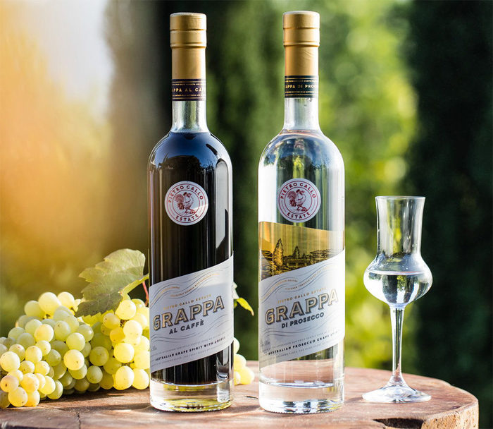
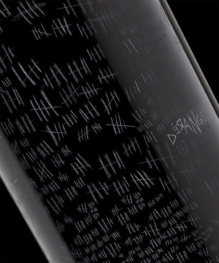
Many wineries have started to use high-quality printing elements on what used to be static labels. You’ll find textured papers, decorative foil stamping, embossed letters and other signature touches.
Many wineries have begun to use hot foil stamping, embossing, and die-cutting for a more glamorous look. These techniques have been used on sparkling wines for some time. The foil reflects light and makes the wine label look attractive and high-end.
Embossing is the process of pressing an image onto the label paper, which makes the image or parts of the image rise above the rest of the wine label. This can be subtle and adds a more tactile feel to the wine label.
These techniques can look very nice, but they are expensive and must be printed in large quantities, so keep an eye on your budget first.
Find a Good Designer
You can get wine labels designed in three ways: you can do it yourself, hire a freelance designer, or run a design contest. Large-scale wineries also can work with a full-scale design agency, but it can be extremely expensive. Most independent wineries cannot hope to afford this.
It can be tempting to design a wine label yourself, but it is a risk. Trained designers have a lot of know-how about how visual advertising works that few of us can just pull out of nowhere.
Specializing in Wine Label Design
If you’re a graphic designer, it is possible to specialize in wine label design. It’s vital that you understand how the industry works and pay close attention to the current trends in your target audience.
Some training in the fine arts and/or graphic design is key. Wine label design is quite similar to other forms of packaging design, but it has an artier feel (like everything in the wine industry).
Ending thoughts on designing wine labels
Designing good wine labels is as important to the success of a wine as the complex process of making the wine itself. Understanding how to appeal to your target audience and knowing what looks good with the kind of wine you are selling are going to be a big help.
If you enjoyed reading this article about wine labels, you should read these as well:
- Interesting Alcoholic Drinks Package Inspiration
- Packaging Design: Tips, Ideas, and Inspiration
- Intelligently Made Food Packaging Ideas (100+ Examples)
The post How to design wine labels to attract the customer’s attention appeared first on Design your way.
Source: https://ift.tt/2PdsmZb

No comments:
Post a Comment