If you’re designing a logo, it can be hard to know where to start. Getting some logo design ideas can be a big challenge.
It is all too easy to try and cheat by doing something almost frighteningly easy, like drawing a circle, then just typing in the company’s name in the middle.
There are designers out there who think the process is that easy and doesn’t; need to be any harder, but it results in logo design ideas that look all the same. It also cheats your clients out of what they’re paying you. They are looking for original, thoughtful work, not something you do just to get it done.
It’s easy to get stuck in a rut even after you’ve started, too. Creativity can seem to run dry, or you can start relying too much on old ideas or someone else’s logo design ideas. Life can certainly get in the way.
You can end up feeling like you have too many clients, not enough time, and no new ideas to work with. The client’s concept can seem ridiculous or boring. There are many, many reasons you can get blocked and none of them are fun.
As a serious design professional, your logo designs need to be smart, thought out, and original. This is all in tall order. Too many designers just start tossing out bad logo designs in bulk to be featured on crowdsourcing websites.
How do you avoid becoming one of those designers? Here are some tips and tricks for creating a logo that makes your clients and your professional pride happy!
Use a Visual Double Entendre
A lot of truly great modern logos use something that is best called a visual double entendre.
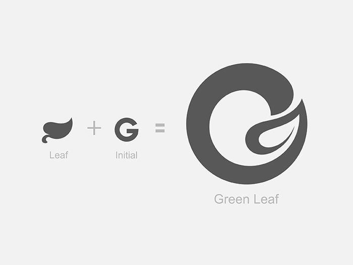
This means that a logo uses two pictures wrapped into one through a clever understanding of an idea or a concept. It is clever and cool when it’s done well. It may even seem playful or profound depending on how you pull it off and what your subject is.
It will make sure your logo stands out to any potential clients as well. Try looking at some of your client’s branding and identity in a new way that may make it much easier to pull off this visual double entendre technique. It’s often much simpler to do than it seems!
Color is Incredibly Important
Color is much of the way we perceive the world. Colors communicate moods, locations, themes, and even ideas. You should think through the colors you want to use in your logo design ideas very carefully. Consider creating your logo in several different variations of a color palette if your client hasn’t been too specific, or even several entirely different color palettes altogether.
Be bold with colors and experiment with a new direction where you can. Colors say a lot about a brand. Even a minor change in color can create a very large difference in the impression the brand logo makes. Take the time to play with different color combinations in thoughtful and different ways.
Avoid Using Clichés and Fads
New fads come along in logo designs every few years. While keeping up with these trends in logo design ideas is a good idea and can also be quite interesting and fun, don’t let them rule your logo creation process. Avoid jumping on any bandwagons.
If you do, you’ll find yourself using the same ideas over and over again, looking much the same as many other designers out there on top of that.
Make note of logo design trends and why they are popular. If they are a good fit to your custom logo design, include them, but not because they’re popular—but because they work.
If you stick too closely to the fads of a time, your logo design will quickly become dated, and not in a fun retro way, but just in a way that seems old. This is a major risk these days because our world moves incredibly quickly due to technological and societal change. What is in today quickly becomes dated tomorrow.
Make It Ownable
This is a concept that is commonly found in marketing. “Ownable” may very well be a made up word (spellcheck certainly does not recognize it), but marketers like to make up words a lot. Regardless, this is a very important concept. It means that you make your logo design ideas something uniquely recognizable.
It is tied quite closely with the tip above. Your custom logo design needs to look like its own thing. It needs to offer your client a distinctive mark they can use to build their brand without being mistaken for anyone else or getting lost in the crowd.
Everyone Likes Custom Type
Custom logos look really good with custom typefaces. It really helps cement the originality of the design. It’s very common to see a logo that fails to do this. Don’t look at a logo’s typeface as something you’re choosing just to make the company name look good. It is much more than that. Your clients are expecting more and will pay you for it.
Rather, the typeface you use in a custom logo is a way to make sure a unique logo stays that way. Custom, hand-drawn type is quite hard for someone to rip-off easily—though if your logo design idea is successful and good enough, people will try to rip it off anyway.
The KISS Principle: Keep It Simple Stupid
All that said, it’s hard to just break out custom hand-drawn script right away. Not all designers are also great typographers or amazing illustrators, though those two skillsets will certainly be a big help.
If you have challenges in this area, there is no need to worry. You can still create amazing logos. In the end, while design skills are very important, ideas and thought are going to matter a lot more.
The key idea in this situation is to remember the old KISS principle: keep it simple stupid! These are four powerful words when it comes to logo design.
Your logo design ideas should be simple but powerful. These kind of simple but powerful logos are everywhere in the world if you look and have endured for decades, sometimes even centuries. With this idea in mind, logo creation just got much easier.
Keep Proportion and Symmetry in Mind
Proportion and symmetry are very basic design principles. It is very easy to get carried away with them, sometimes even to the point of seeming like a complete lunatic (take a look at the new Pepsi logo pitch).
However, they are enduring principles of art for good reason. Strip away the crazy of things seen in the Pepsi logo pitch and you’ll find some good logo design ideas there.
Smart use of symmetry can bring a lot of sense to a logo, while proper proportions are key to making sure any logo design is just right to the human eye.
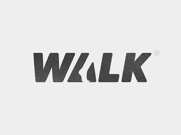
Remember to Think about Negative Space
Negative space is very important to any element of design, from text layout to logo design (of course). N
egative space is an organizing tool. It allows the eye some visual relief and helps people know what o actually focus on. Forgetting about negative space is easy because it is the area where there isn’t anything, after all.
You need to combat this tendency, however, and make sure you take the time to think about the negative space in your logo design. It will help you keep the logo from becoming cluttered and could result in some clever new ideas that really make the logo you’re creating unique.
Passive vs. Active
It’s become increasingly common to try to instill a sense of movement or activity into a logo design. This is not always a good fit. The Apple logo, for instance, works very well and is very passive and static.
However, in some cases, it provides your logo design ideas with just the boost that they need in both visual and conceptual terms.
There are a lot of ways to do this, including through smart use of color and asymmetry. While it’s not the best idea for all logo concepts, it can work well if the brand is one that focuses a lot on something dynamic, like a sports apparel company.
Understand What the Logo Means
The best logo designs have a story. They’re not just pretty sketches.
A good strong logo design is filled with meaning, some of which is obvious, other parts of which are hidden. The FedEx logo, for instance, has an arrow indicating forward motion and the making of deliveries. The Apple logo has a “byte” missing out of the apple.
The Twitter bird is flying upwards.
These aren’t just designed for the sake of design, but designs meant to signify something important about their brand and its values. You aren’t looking to just make pretty and unique liens on paper, but give the company a logo that means something special to them.
Rules for Brainstorming a Logo
Generating logo design ideas can be hard, especially if your client doesn’t have the most thrilling name, mascot, or business. However, there’s a process you can use that makes it much easier to take your custom logo from a contract and some vague outlines of ideas to a concept that can be fully and beautifully realized.
It’s quite similar to the process of brainstorming a business plan, article outline, or even a great new brand name. It basically uses rules to create a channel for your natural creative tendencies to flow through and navigate any challenges. Here are some great rules to get going on that logo design!
Don’t Hold Back
If you’ve got an idea, put it out there. This is not the point in the creative process to censor yourself.
It’s the time to get all the ideas out of your head where they can be looked at more closely and maybe even developed more thoroughly.
Let it all flow. The truth is that you won’t be able to really give your ideas a fair shake if you don’t get them out there for you (and even your team, if you have one) to really see their potential.
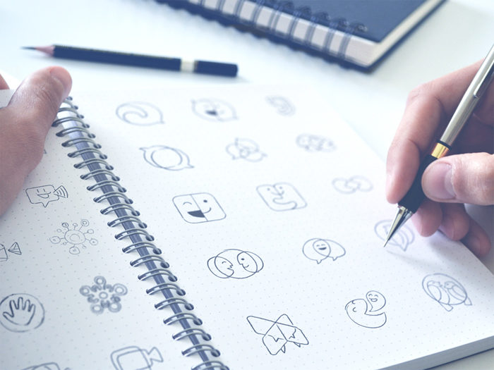
Write Every Idea Down
Put your ideas down on paper no matter how silly, terrible, or ridiculous they seem. You’re brainstorming!
You want to make a comprehensive list of all your ideas on the topic. Even “the worst idea ever” can spark a great conversation. You might find yourself coming back to them when you get into a rut and pulling some good concepts out of some terrible ideas.
On that note, by writing everything down, you’ll have a record you can go back to if you need it. This can be really useful if you hit a block or a problem you can’t seem to resolve using just the concept you decided to go with.
Choose the Right Time
Brainstorming is something that’s best done when you’re at your creative peak. This is different for every person.
Some people find they are at their creative best after breakfast, while others think more creatively just before they go to bed. The best time to brainstorm new logo design ideas is whenever you are at your most alert, creative, and focused.
Don’t try to brainstorm when you’re not in this creative sweet spot. If you’re dead on your feet early in the morning or if your brain slows down after a large lunch, those are not the times when you should plan on brainstorming.
Allow Ideas to Simmer
After you have your ideas written down from your brainstorming session, sleep on them for a little while. Walk away from your list and don’t lay eyes on it again for at least 24 hours. This allows you to come back to it with a fresh set of eyes.
You might be surprised by what you see. Ideas you thought were great might really be silly, and ideas that seemed stupid might actually be the right ones to go with.
Depending on the timeline you’re working with, it can be hard to pull this off. However, it is a really helpful habit to get into when creating a logo. It can make a big difference in how your design process goes and what concept you end up using.
Get Clarity about Your Branding
Your final logo design really needs to feel true to your brand. You need to get very clear about what the brand you’re working with actually is, what it stands for, and what its values are. What is the story of the brand?
What is the brand’s mission? What are the brand’s goals? The answers will provide you with a sense of direction for your logo and allow you to make it a success that stands out from the crowd.
Now knowing the answers to these question right away is just fine. There are several ways to find them
Make a list of adjectives that describe the brand
Is this brand edgy, cool, and sophisticated? Is the brand approachable, energetic, and friendly?
A list of these kinds of adjectives can help accurately define and capture who the brand is. You should start off with 25 to 30 ideas. From there, narrow it down tot eh top five that seem to be the most fitting and prominent in the brand’s identity.
Make a list of words that describe how you want the brand to be perceived
Do you want people to think of this brand as cutting-edge and innovative?
Should they be viewing the brand as reliable and trustworthy? Should they look at the brand and think of it as fun and playful?
Decide on the ideal picture of how you want the brand to be seen in the market. This will tell you a lot about the brand.
Make a list of how you want people to feel when they see your logo design
What do you want someone to feel when they spot your logo? Do you want them to get excited and energized?
Do you want someone to see your logo and feel a sense of calm and start relaxing? Determine the emotions you want to elicit in the target audience.
This will allow you to get a clear picture of the brand’s mission and goals.
Decide on the Logo Elements That Will Tell Your Brand Story
After you’ve clarified your brand identity, it’s time to start pulling together your logo design. You need to figure out the best way to bring that brand story to life for all to see.
There are a lot of elements to any logo design and knowing which ones to select (or even leave out) is a formidable challenge, even armed with your brainstorming list and your idea of the brand identity.
There’s a lot of options out there and you clearly have a lot of ideas in your head. So how do you decide which design elements are the right ones for your custom logo design.
Consider making a design inspiration board
It’s always a good idea to make a design inspiration board when starting out on a new design product. A design inspiration board will allow you to collect all the things you find inspiring for the design in one place whether it’s a color swatch, a painting, or an existing logo design. Look for patterns in what inspires you.
You might see a lot of a particular color, like blue or green. That probably means you should include a lot of that color in your logo design. If you notice a lot of other kinds of patterns, like a lot of retro design, think about looking into focusing on that kind of design.
As you put together your design inspiration board, feel free to pull inspiration from everywhere and anywhere you can find it. Take pictures of things that strike you with your phone as you go about your life, for instance, and stick them on the inspiration board.
Use the things on the board to pick out patterns and use those patterns to help you decide on what design elements are important to you. These can include:
Logotype- You might find a particular kind of graphic or logo shows up a lot on your design inspiration board. This is a good sign of the direction you should go with your logo design.
Typography (fonts) – Font is really important for reinforcing proper branding. Look closely at the typography that shows up on the design inspiration board.
You’ll likely notice font choices that are tied to the theme and tone of the source material. Use those ideas to select fonts that fit the brand. Rounded fonts, for instance, have a nice friendly feel, while whimsical fonts are very playful and bold fonts offers a more serious tone.
Color- It’s hard to overstate the importance of color. It’s one of the most important things your design inspiration board can offer guidance on. You’ll probably notice that a few colors are very common. Pay close attention to these. Color selection is incredibly influential and can make or break the whole logo design.
Style- You’ll notice a lot of commonality in the style on your design inspiration board. If you notice a lot of photos from the 50s and 60s, it’s clear that a vintage logo design is the way to go. Likewise with more modern flat stylings or minimalist ones.
Ending thoughts on this logo design ideas article
Whenever you’re brainstorming logo design ideas, remember that your end goal is. You need to keep in mind what you want to use your logo for. Make (or ask for from your client) a list of any place where the logo will be used.
This includes websites, menus, flyers, merchandise, packaging, and much more. Your final logo design needs to work in all these places, not just a few of them.
This should be the driving idea behind your whole design process and all your logo design ideas. Logo design is not just an academic creative exercise, but a thoughtful one meant to communicate a particular set of ideas for a certain purpose.
If you enjoyed reading this article about Logo design ideas, you should read these as well:
- Best free fonts for logos: 72 modern and creative logo fonts
- Animal logo design ideas and guidelines to create one
The post Logo design ideas that you should use for branding projects appeared first on Design your way.
Source: https://ift.tt/2N15Ul5


No comments:
Post a Comment