The Adidas logo is known throughout the world. However, Adidas has not always been an international brand. The company started out as a small shoemaking label in Germany. Today they are known internationally as one of the leading sportswear brands in the world.
Adidas produces a range of different sportswear equipment and the Adidas logo is known throughout the world. From clothing to tennis rackets and soccer balls, the Adidas three stripes are incredibly popular. The Adidas logo is even seen on running shoes and other sportswear.
Logos are at their best when they are easily identifiable and this is certainly true of the Adidas logo. Many people are able to recognize it instantly. This helps them to recognize the brand and make a perfect choice while buying sports equipment.
Marketing experts see the simple and easily identifiable Adidas logo as a perfect example of brand identity. The logo is unique, meaningful and very memorable.
The company has drawn in a very effective marketing strategy as well as an eye for design. Of course, the Adidas three stripes help to identify the brand. Let’s have a look at the history of the brand, what the Adidas logo means and how the Adidas symbol has been used to build the company’s brand.
Adi Dassler and the Adidas logo

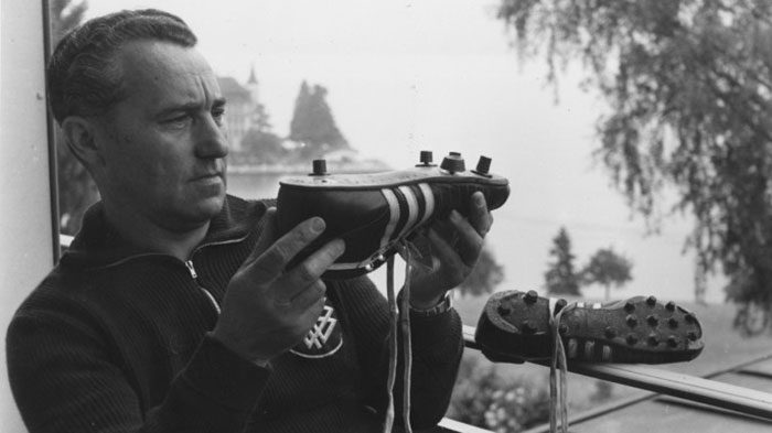
Adi Dassler began creating sports shoes at the very end of World War One. He began working from his mother’s home as an independent designer. He was a sports lover who had constantly looked at how his own shoes could improve his sports performance. As soon as he started to sell his designs they became sought after.
It was because his products were so in demand that he launched the Dassler Brothers Shoe Factory. This factory was set up with his brother Rudolf. At this point, the Adidas symbol had not yet been developed.

Instead, the brothers worked hard to put their shoes onto the market. Eventually, their shoes found an international market because a number of Olympic athletes and winners had been wearing their shoes.
From this point on, the company was recognized as a quality brand, business began to grow rapidly and it was time to develop the brand.
1951: Three Stripes

During the 1930s, a split formed between the two Dassler brothers. Both joined the.Nazi party, but Rudolf was more heavily involved. As the Nazi party grew in power, the brothers were divided in their response to the regime.
Rudolf was drafted into the army during WWII while Adi remained in the factory, producing shoes for the German army. Eventually, Adi broke away from the Nazi party, which alienated him from Rudolf, who had been taken prisoner by the Americans. The two brothers would never speak again.
With the brothers going their separate ways, the company was divided. Adi now had serious competition on his hands. Adi names his company Adidas in 1951. Adidas was a combination of Adi’s nickname and a part of his surname.
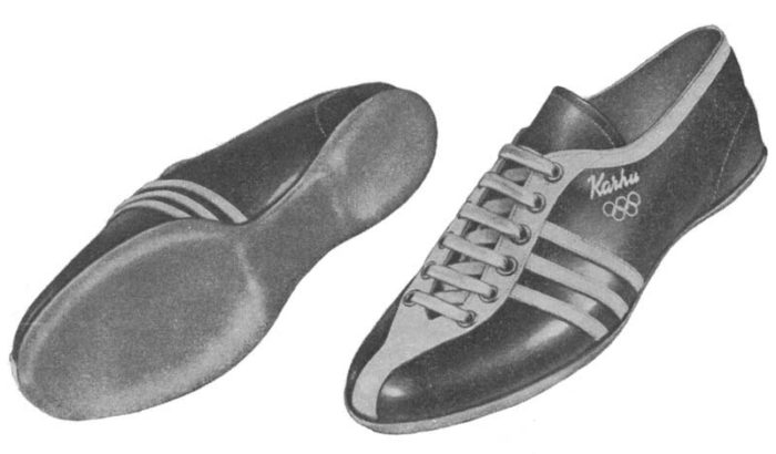
Now it was time to create a logo. Adi purchased a trademark logo from sporting brand Karhu. The original Adidas trademark cost the modern-day equivalent of $1800 along with two full bottles of whiskey. The iconic Adidas logo was born, and most people don’t know that the symbolic stripes once belonged to a different brand.
It was Adi’s complete belief in the three-striped logo which helped him to promote his brand. Adi sometimes referred to Adidas as the ‘three-stripe company’.
1971: The trefoil

Adidas didn’t remain a shoe company for very long. The brand quickly began to expand into the sports and leisure clothing market. It was at this point that the famous Adidas logo, known as the Adidas trefoil logo, was developed. The trefoil logo was chosen from more than 100 other ideas which had been put forward.
While the Adidas leaf logo still included the three striped, the shape changed. The three leaves in the new logo symbolize the American, European and African continents. Diversity is represented by the lines which cross these forms.

The Trefoil logo is still present on t-shirts, classic Adidas Gazelle trainers and Pharrell Williams tennis shoes. As a symbol of street culture, the Adidas trefoil logo still resonates with fans.
When it was first created, the trefoil logo was placed in all of the Adidas apparel as the official logo of the times. Now, however, it is limited to the ‘Original’ clothing and shoes. This logo shares that although times may have changed, Adidas clothing has retained the high quality symbolized by the Adidas trefoil logo.
1997: Adidas Equipment aka “Three Bars”

Another popular Adidas logo has to be the performance logo. This logo is associated with the company’s sports products. Many football kits use the Three Bars logo.
The three bars logo design was created after the company established itself as a popular brand. The new design was created in 1997 to add a unique style to the company’s high performance related products.
For this design, the three Adidas stripes were angled and staggered, giving the impression of climbing a mountain summit. The logo transcended the product and spoke about the ability to push hard to achieve a goal. The products offer the support needed to achieve goals.
This new Adidas logo is instantly recognizable to fans. It is simple and sleek in design and tends to be shown in black rather than the original Adidas green.
After this mountain-like three striped logo was designed, the company restricted the trefoil logo to the Adidas original products. These products are part of the classic Adidas range and include Gazelle trainers as well as the popular Stan Smiths.
2005: The Wordmark

in 2005, the company made the decision to simplify the logo. As a result, a minimalist logo was born. Adidas created a word-mark logo using the classic Adidas font as well as the three Adidas stripes which were placed horizontally. This logo is said to speak for flexibility, quality, and leadership.
This Adidas logo design has become increasingly popular with fans and many have seen the Adidas new logo on the boxes which come with their purchases.
Why Does the Adidas Logo Work?

Logos are designed to help identify a brand. There is no doubt that the logo does just this. The design is simple and effective which makes it easy to remember.
The three stripe logo is easy to recognize and can be placed on all products with ease. Over time, the logo has remained consistent despite the changes which have occurred to the design. From the original three stripe logo to the Adidas leaf logo, to the new logo, fans are consistently able to identify the brand.
With the logo so easily recognizable, the brand is likely to remain a firm favorite with fans for years to come.
A great logo which helps to identify a brand is crucial for any company. However, the Adidas logo has become a vital part of the company’s marketing campaign.
The success of Adidas as a global brand shows how powerful a brand can be when marketing and the powerful logo which accompanies this, is done well.
The logo has assisted the Adidas brand to become one of the most powerful global sports brands. Both the Adidas Boost range as well as the street style Originals have become respected throughout the world.
While the stripes logo has changed and evolved over time, there is no doubt that the Adidas logo will remain easy to identify. The company will be very unlikely to move too far from a concept which works exceptionally well.
If you enjoyed reading this article about this famous company’s logo, you should read these as well:
- Logomark Vs Logotype: Understanding the Difference
- Superhero logos: The symbols of the comic book universe
- Learn About The Apple Logo: The Tech Giant’s Branding
- The Disney logo: All there is to know about the Walt Disney brand
The post The Adidas logo: What makes it so special appeared first on Design your way.
Source: http://bit.ly/2Iw31Ey

No comments:
Post a Comment