If your website contains a lot of information, it becomes difficult for your viewers to search for specific questions or facts. A search button is a useful navigation tool. Adding this simple feature on your website will provide a smooth experience for your users. However, it can be challenging to design a search bar. Here are some of the best practices you can use for designing a site search for your website.
Create a long search bar:
Having a long enough search bar on your website is a good idea. When your visitors type a question in your search bar, you want to provide sufficient space for them to see what they are writing. This allows your visitors to review or edit their questions. A text box with the capacity of 27 characters is appropriate as this is the average length of most questions. Take the width using the size of letter m, or by using ems, this helps you determine your space effectively. If you feel you don’t have that much spare space for a search box you could consider a search box that grows as you type.
Use Auto-suggestions:
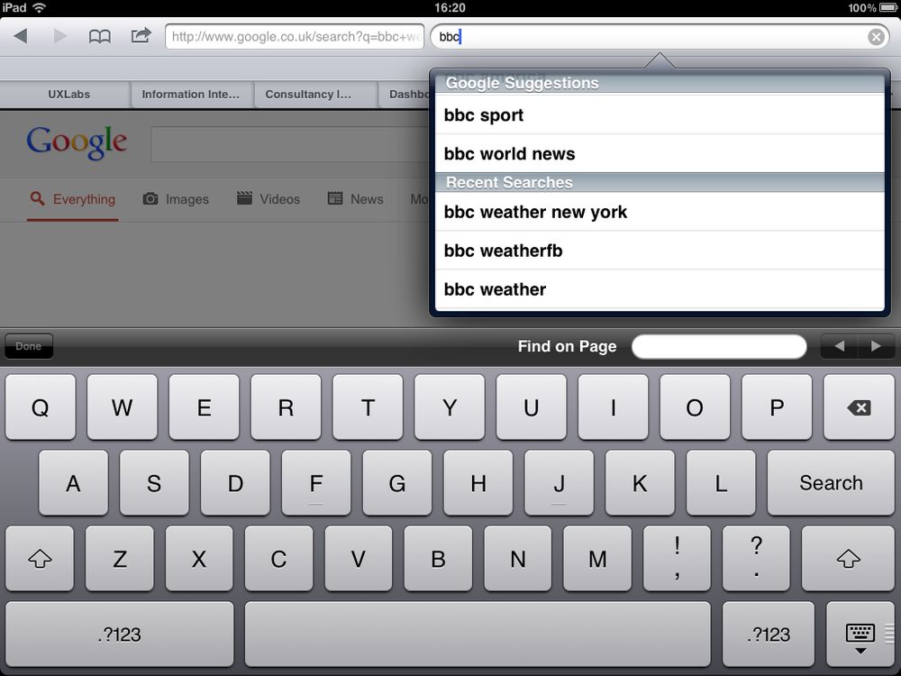
Auto-suggestions guide your visitors with their search queries. Usually, visitors don’t know how to frame their questions, and they also don’t know what keywords to use to find results. Most of the people don’t know how to rephrase their question when they can’t find results the first time they try. These problems can be solved by providing auto-suggestions in your search box. When you create auto-suggestions, try to use keywords that would help your visitors. Also, add predictive text, commonly asked questions, and automatic spelling corrections. This helps the users search for specific terms in your search bar and also helps people who have no clue where to start their search.
Provide options:
Give your users a range of options on your toolbar that would make their search easier. These options should be a range of questions prepared around a specific term or topic. Users must have the option to select questions using the keyboard or scroll key. Add a feature that they automatically return to the top of the page once they reach the bottom. Give your viewers suggestions in creative font to capture their attention. This makes searching much more useful for your users.
Make search bar a constant feature for every page:
Provide a search bar on every page of your website to keep your site efficient and easy to navigate. It is possible that your users land on a wrong page, so you should allow them to correct their mistakes from that page rather than making them come back on to your home page. It is also possible that they find the information they were looking for and want to explore more topics. Also, include your search bar on the dead end link like 404 pages.
Add sort and filter options:
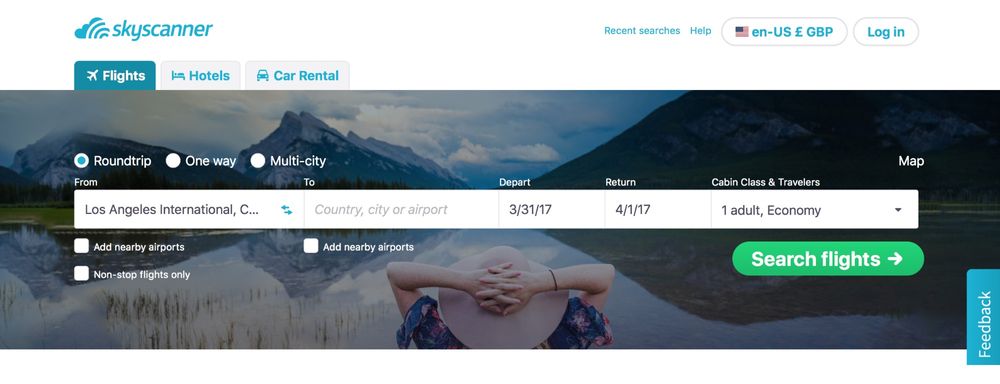
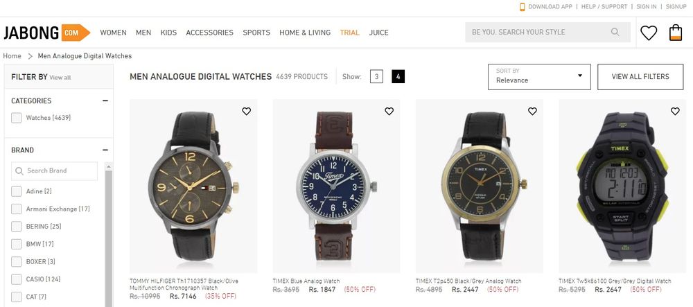
Most people find it challenging to look for information within a wide range of topics. Also, irrelevant results and processing time makes the experience unpleasant for the users. Sort and filter options help the users narrow down the search and look for exactly what they want. Provide separate sort and filter options as they are not the same. Sorting changes the order of the results while filtering limit the results shown. Also, do not provide more than 7 options in filtering since our short term memory cannot hold more than that. If you require more than 7 options, collapse the rest with an option of “view all filters.” Place your options according to the priority people give to them. Make your sorting logic clear so that visitors can change their options accordingly.
Add a Submit Button:
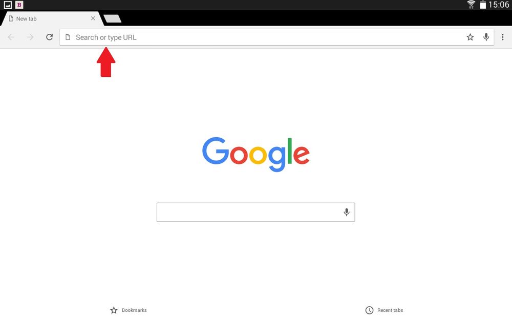
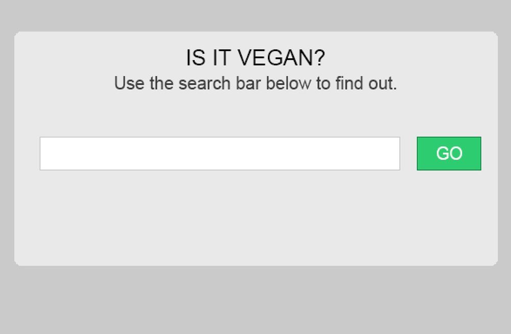
Similar to Google, your search bar searches your website for answers. So you should provide a submit button similar to Google for users to enter their queries on your website. Having a small area for entering the query is inconvenient, especially on a tablet or phone. You should create a search button that is large enough for users to access it. This enter button provides your user with correct results.
Have a prominent search bar:
Ensure you have a prominent search bar that is easy to find. When your users cannot find answers, your search box should be available to provide easy and quick solutions. Show your text field and search icon so that people know where to ask questions. Web designers find it challenging to decide on an ideal position to place their search bar. Usually, the top corner or top center is the place that catches the most amount of attention. Popular websites like YouTube use the top corner to place their search bar. Make sure that you make your search bar more accessible to your users.
Use a magnifying glass icon:
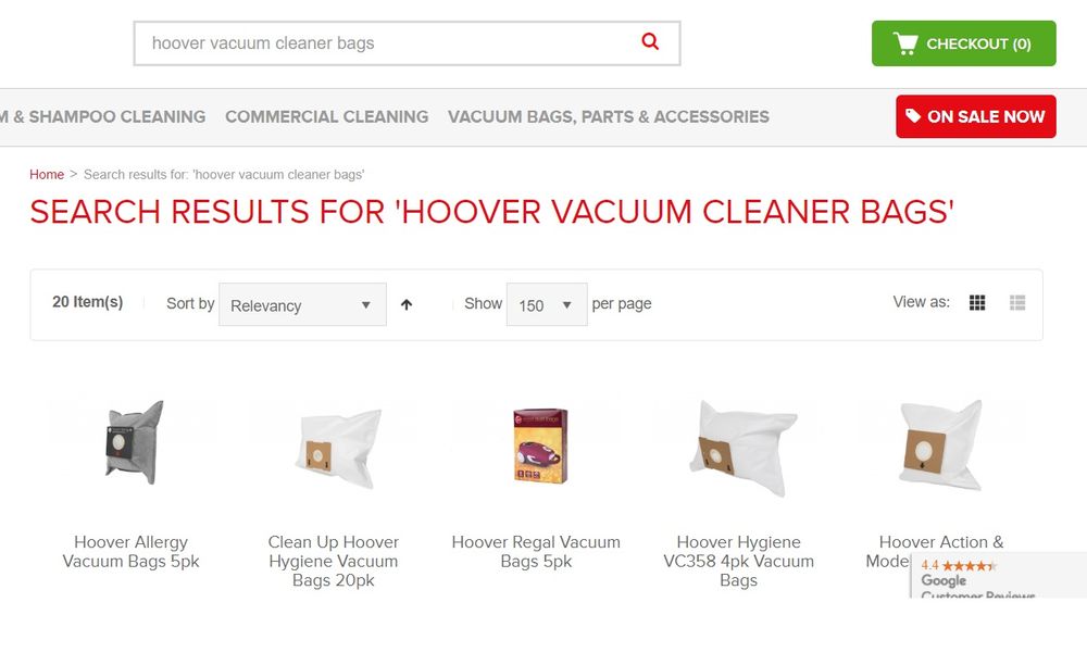
Icons are a visual representation of action, object, or idea. A magnifying glass is one the universal icon for the action ‘search’. So, using this icon displays your message. While designing your search bar, make sure to add a magnifying glass icon on the right of the box. Keep the size of magnifying glass proportionate to the size of your search bar to make it appear clean and organized. Use a magnifying glass with fewer graphics details as it speeds up recognition.
Add category suggestions inside the search bar:
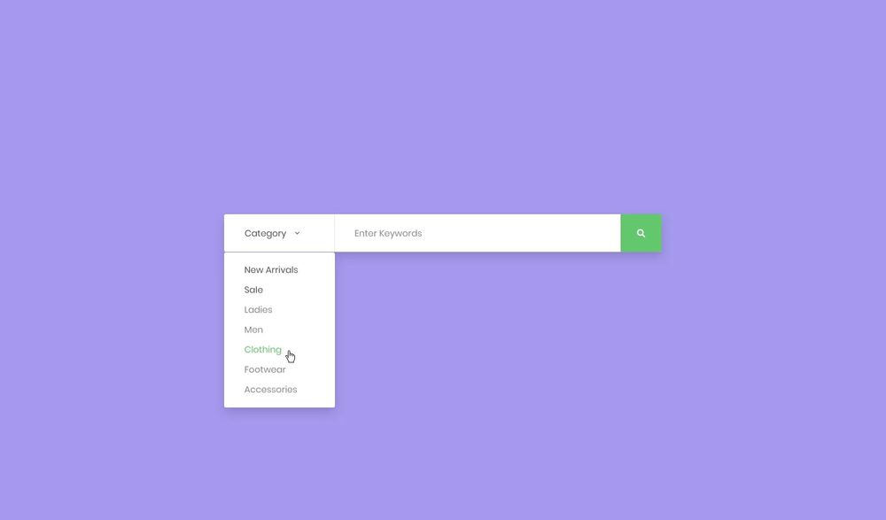
Include a sample category inside the search box to suggest the users what they can search. Make sure to limit your sample to just a few words. Otherwise, it will increase the cognitive load. Most web designers neglect the importance of the contrast ratio for placeholder text. According to the universal guidelines of web accessibility, the ratio should be 4:5:1 for standard text. Also, don’t use placeholder text in forms as it makes it difficult for users to fill the form accurately.
Never display ‘no matches found’:
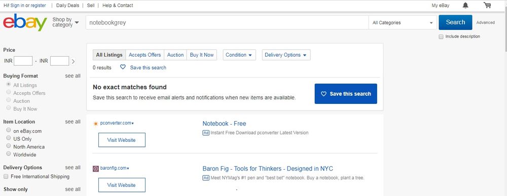
Landing on a blank page with ‘no matches found’ can be frustrating, especially if your users have rephrased their questions a couple of times. So, you should give your users a clear view that you couldn’t find anything related to their search with a range of alternative results. Design your system to generate alternative results considering each word present in the question individually.
A search bar offers your users the opportunity to navigate your site efficiently to find information. This gives your users a sense of control. Hence, creating a simple and identifiable search bar is an excellent way to assist your users.
The post Website Search Design: Best Practices appeared first on Web Design Blog | Magazine for Designers.
via https://ift.tt/2Ygcs1w



No comments:
Post a Comment