Your company logo and visiting card are usually the first brand elements that a potential customer will see. Following them up with a well-designed letterhead lends professionalism to your brand and helps with brand recall. Consistent branding in the visiting card and letterhead establishes your brand in the mind of your customers. You can even use the same fonts for your visiting card and letterhead. Traditionally, letterheads were printed and provided to business customers and partners in the form of a hard copy. However, now letterheads are also used to send invoices and company correspondence online. Hence it is important to design a letterhead that looks good in print and in the digital format.
Here is the list of 10 things that you should keep in mind while designing letterheads.
1. Start with Basics:
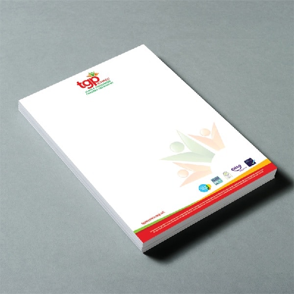
A letterhead can be challenging to design. The focus of a letterhead should be the text content. The letterhead should provide a professional frame to the content. Try to start with simple and subtle designs. Do not load your letterhead with a lot of information. Just keep to the basics. Separate the details in the order of importance to give the letterhead more structure. Visually, when the information is placed or separated in different ways, it helps the reader to segregate information from the letterhead with the degree of importance.
2. Consider the business area:
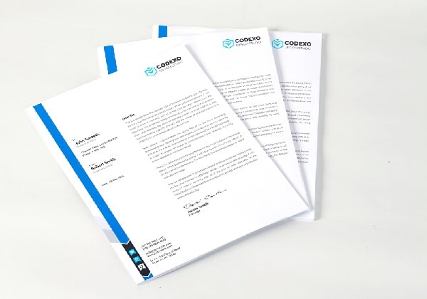
Design the letterhead considering your audience. This is very important, as it will decide the number of people you attract through your designs. If people you are targeting don’t find the letters engaging enough chances are they may not convert into customers. For example, if you own an ad agency, you may use more creative designs for your letterhead. But if you own a corporate firm, you should go for a professional and classy letterhead design. Hence, you should modify your design and style according to the target audience.
3. Highlight the Brand:
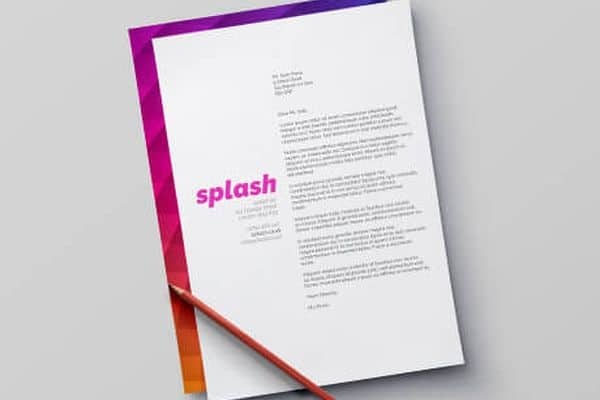
The layout becomes the strongest point in attracting people towards your design. The company logo is the most important element of the letterhead. Place your logo at the top left or right corner so that it remains constant while people look at your letter. Give unique and classy borders to the letterhead to make it look complete. Place the contact details at the end. Also, use classy fonts in headings and simple fonts in other details to shift the focus to the brand logo. This will help you keep your brand highlighted, making it easier to remember.
4. Use Right Details:
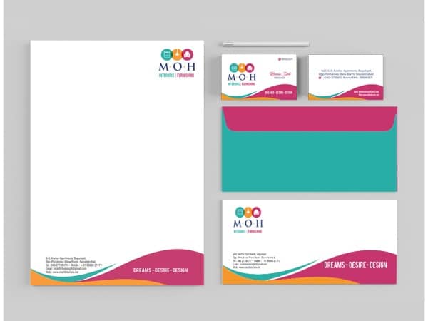
You should include only the necessary details. Consider who will use the letterhead. This will help you understand which details to include and which ones to leave. For example, if the letterhead is for the director’s secretary, it’s appropriate to include contact details of the secretary’s office. Also, include alternative contact details to make sure you don’t miss any opportunity. There are certain legal details that generally need to be included in the letterhead. Make sure you have them covered.
5. Create a Uniform Stationary Set:
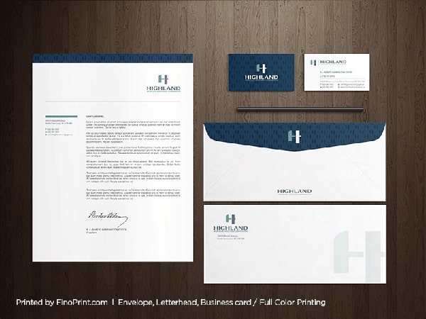
Creating a uniform stationary set can help you set yourself apart from your competitors. Decide how much detail to be added in the letterhead and fix them as standard details. This will make your work look organized and professional. Also, this will display the consistency and uniformity of your design. You can create your design or use default templates from different websites. Also use a good quality paper material for printing, like glossy or textured to make the letterhead look attractive. The quality of paper is a reflection of the company’s quality standards and practices.
6. Choose the Right Software:
When it comes to designing a letterhead people generally choose Photoshop. Photoshop allows you to design letterhead, but it does not provide some advanced features. On the other hand, Illustrator and InDesign are the best for designing letterheads as they have in-built support for setting up bleed, and provide print-ready PDF files. They provide topography controls to design elements and re-position them effectively. Also, make sure to print your letterheads with 300dpi to avoid blurring or pixelation.
7. Pick a Header:
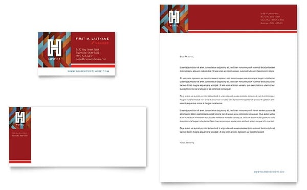
You should pick a header that brings out the design of the letterhead. There are a variety of headers related to different categories. Therefore, select a relevant header. Build a strong, creative header to display your company’s vision and purpose. Do not use a lot of images as the letterhead should also look simple and have more space for the message. If you want to make your brand memorable, design a simple yet attractive style for your header.
8. Choose a Theme:
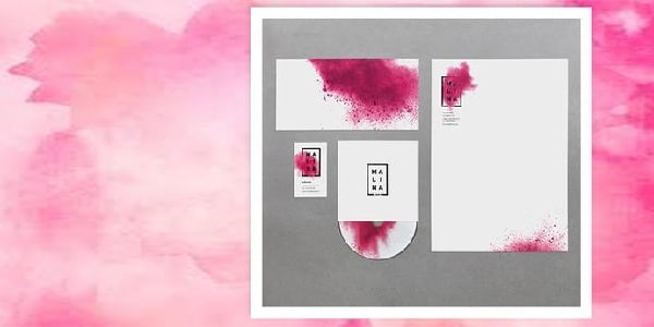
A great way to enhance the look of your letterhead is by refining small elements in your design. Small elements like shape, color or a photo can improve your letterhead. You can design your theme by building on a color scheme to make it look cohesive. Create a theme and design all your company collaterals and merchandise with the same theme. This will engage your customers and improve branding. The same theme in every stationery and communication tool will pass a message to the audience that the company is maintaining consistency in branding.
9. Add a creative border:
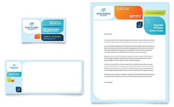
Use borders to add a style to your letters. Don’t restrict your design to the monochromatic layout for the border. With modern printers able to print to the edges of the sheet, it has become easy to include a stylish border. Creative use of colors and patterns can add a small attractive element to your letterhead. But make sure to include colors and patterns in a restricted yet elegant manner. Borders should not distract the people from the content in your letter. They should provide a frame for your text content. You can compare a border to a photo frame that helps people focus on the picture in the frame.
10. Use Special effects:
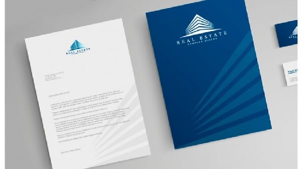
Design letterheads with special effects to enhance the look of your letterhead. You can add geometric patterns in the background for a simple and structured look. You can also use special printers for adding effects like foil blocking, die cutting, embossing, etc.
A well-designed letterhead acts as a backbone for the brand to spread its message and essence to the people. Spend some extra hours and make sure to design an exclusive letterhead that will frame your message and create a great impression. Also, keep in mind to add some small elements that shape the letterhead effectively.
The post Letterhead Design: 10 Things to Keep in Mind appeared first on Line25.
Source: https://ift.tt/2Yg3IbD

No comments:
Post a Comment