Mood boards are great tools for all sorts of projects, from interior design to team projects to fashion to even engineering projects.
What is a mood board?
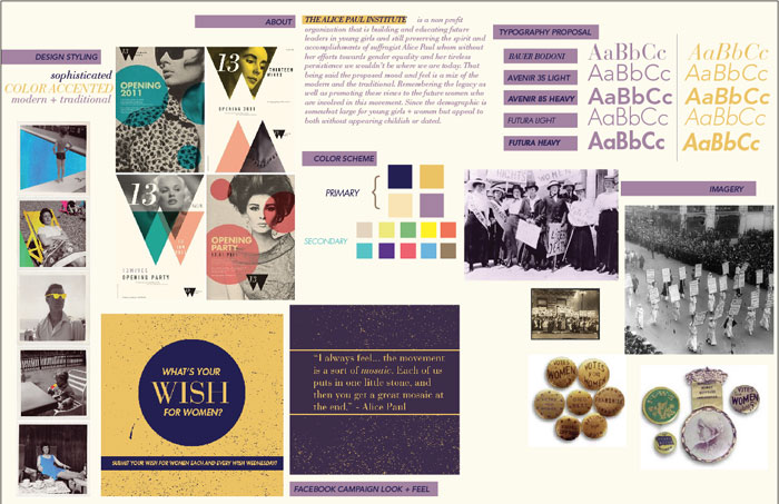
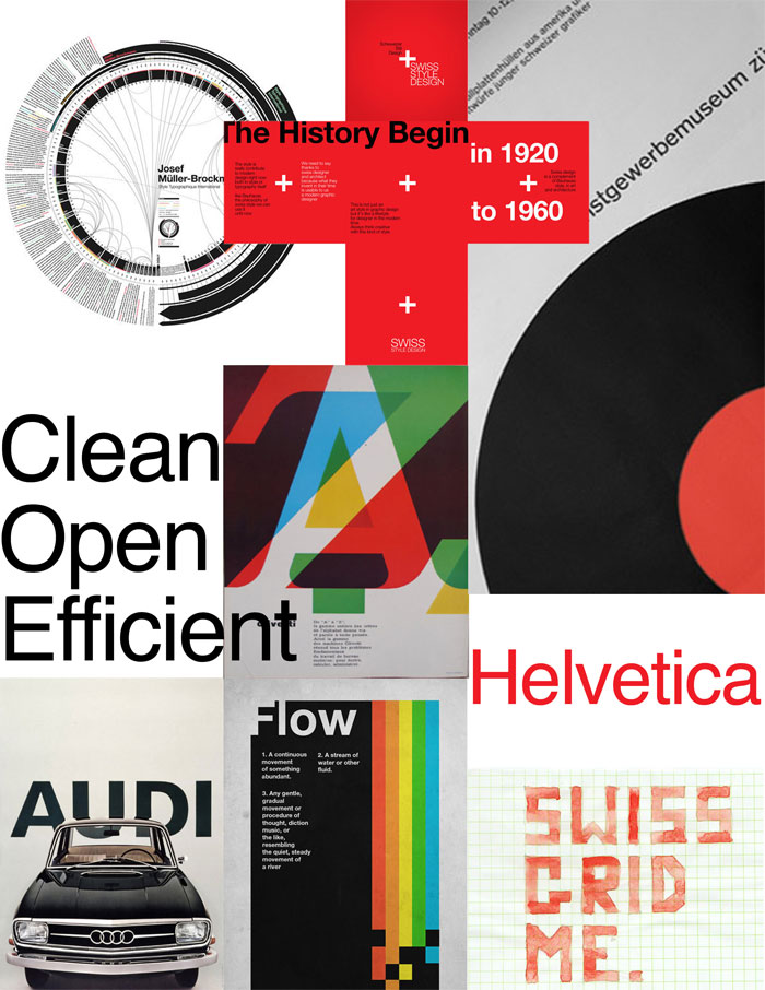
A mood board is an accumulation of images, colors, fonts, and words that inspire you and, well, set the mood you’re going for.
You can use a mood board to get an idea of what feelings you want to evoke in your audience. It’s a great way to keep track of where you want to go. You can use it to keep certain elements on hand as your project progresses. A mood board also serves as an inspiration board for any time you get stuck.
Mood board design is not a set thing. There are a lot of formats and applications out there you can use to create your mood board. Creating your mood board is very personal and project-dependent. You may find that one format works well for one project while it’s completely wrong for another.
Take a look at our mood board guide to learn how to create a mood board that works for your projects.
How to Make a Mood Board
Treat your mood board design like an unassembled puzzle or the ingredients of a recipe. It will contain elements that will come together to form the final version of your project.
Start out just by assembling images, fonts, and whatever else that fits with your project. Sometimes contrasting images may work well right next to each other, drawing out the mood you’re looking for.
You want your mood board to offer inspiration and direction. It should evoke the forms and feelings of your project.
Structure
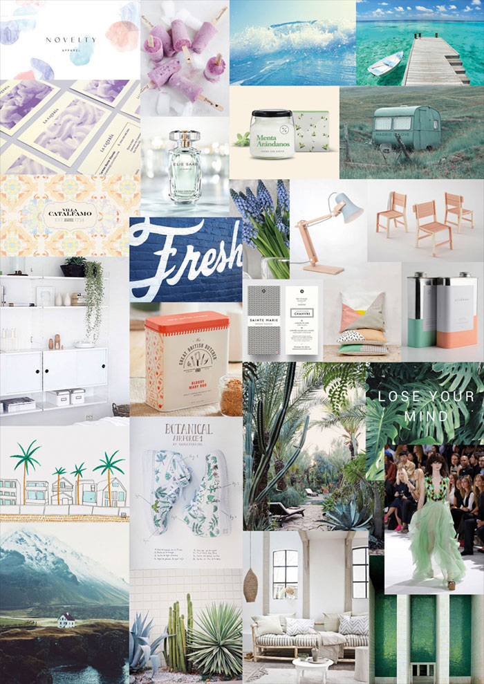
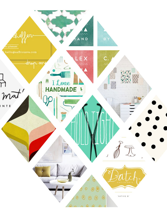
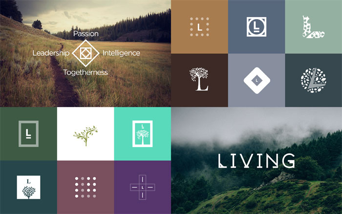
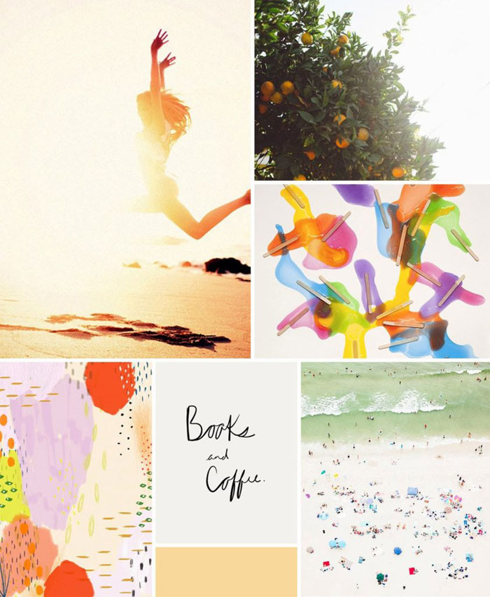
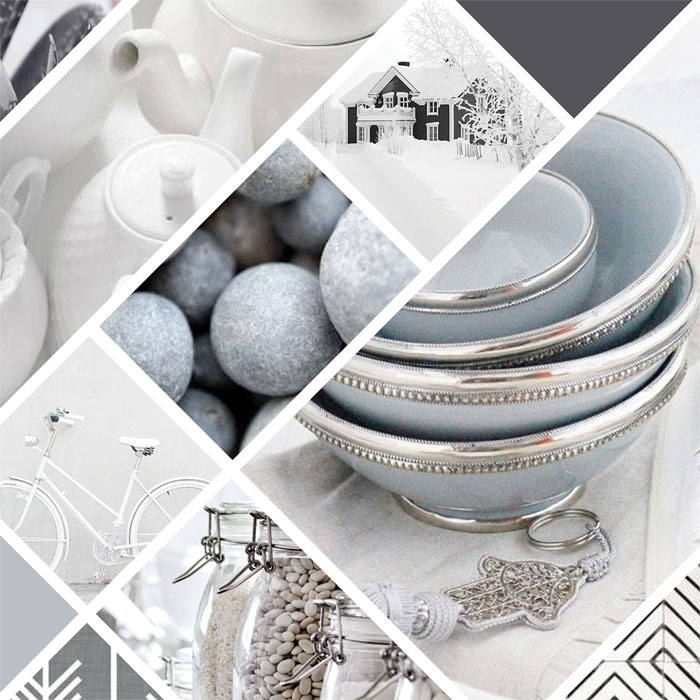
The structure of your mood board depends on your purpose and your mindset. You can have borders to separate images or you can have a wild collage. Regardless of what kind of mood board template you choose, it should remain consistent throughout.
If you choose to use borders, make sure they are equal in size. Balance and a sense of flow are very important to a good mood board layout. This is not a decoration, it’s a tool that you’re using to help complete your project.
Digital or Physical?
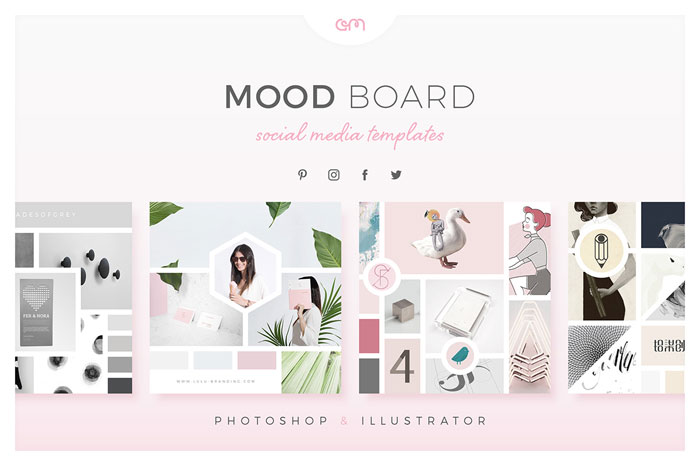
A digital mood board has its advantages. Mood board maker software is easy to find and use, allowing for you to easily arrange the board how you want. If you find your layout isn’t working, you can completely rearrange it with a few clicks.
Adding things to a digital mood board is a cinch. You can freely experiment with a digital mood board with hardly any effort at all. Digital mood boards are easy to present and share.
However, a physical mood board might be a better option because it gets your message across. There’s more drama to a real object and it projects a sense of reality that might be more motivating and inspiring.
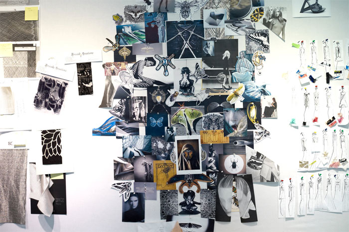
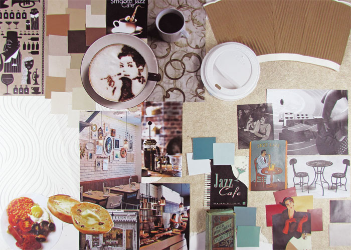
Certain industries, like fashion or interior design, benefit a lot from having a more tactile mood board. Getting a sense of how objects, especially fabric, look in the real world can be a big help for communicating the message.
Text
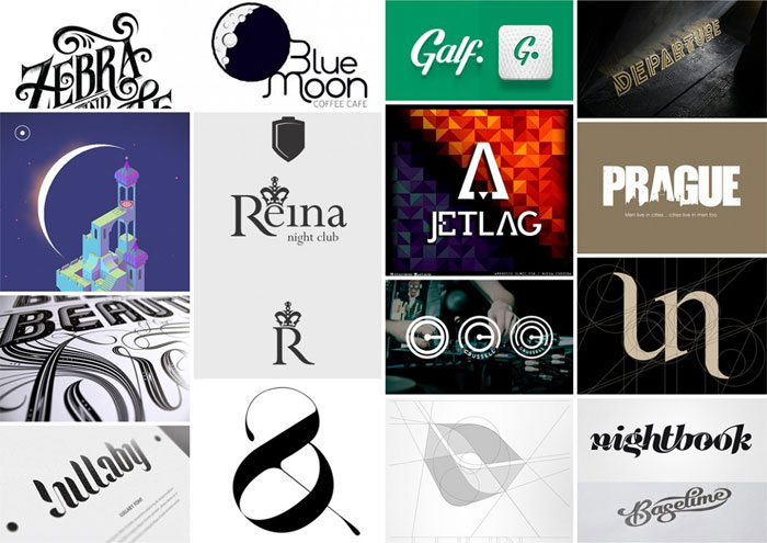
If you’re using text on your mood board, make sure the font helps get your message and mood across.
If you’ve got quotes, phrases, or words, choose font that accents the words or presents them in the tone that you’re going for. Be creative and see what you can find. There are a lot of great fonts that can lend your mood board’s text the right flavor.
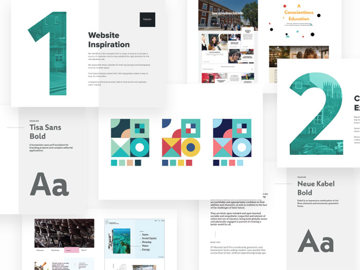
If you are working with text as a part of your project, like you do in web design, include the fonts you want to use on your mood board.
This can also help you make sure all the fonts you plan to use work together well. Use it as a reference as you go along, too. Small design elements like font types can sometimes get lost in the midst of difficult, large projects.
Color
Remember that color communicates feelings. Dark tones will not communicate an upbeat mood, even if your moodboards are covered in flowers.
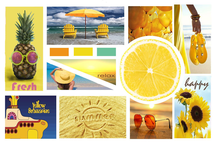
If you want your colors to communicate a certain mood, consider adding objects that are that color and evoke the mood. For instance, a swatch of yellow paired with some bananas has a very different feeling than the same swatch paired with a yellow street light.
While a sense of color may come from the objects accumulated on your mood board, feel free to add color cards or fabric swatches, especially if you’re looking for a very particular shade of a color. This makes for a useful reference, especially if you aren’t using that color yet but will be doing so as the project progresses.
Textures
Add items with texture to communicate feelings, even if your project doesn’t involve fabric or anything textured. Use plush fabric to convey the feeling you want your project to evoke. Consider using a bit of metal for a harder, structured feel.
This might be just the addition you need on the mood board to communicate the right sense of your final project. The ability to add textured items is one of the great aspects of creating a physical mood board.
Types of Mood Boards
Free Collage
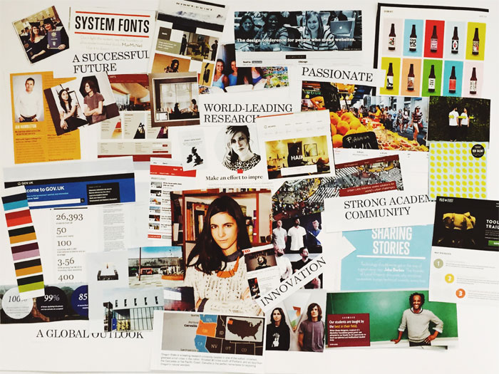
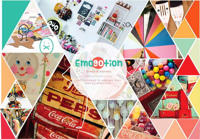
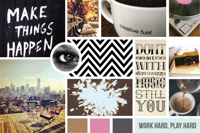
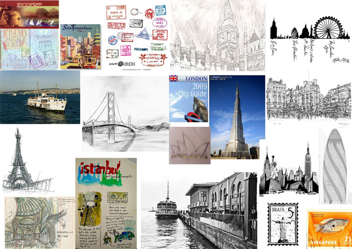
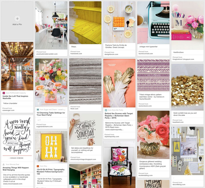
This is a very basic, almost unstructured kind of mood board. A designer will collect together free high-res images to use in a project. Many people use this kind of mood board early on in a project or use it to get an idea of possible future projects. These collections can be used later to create more structured and/or specific mood boards.
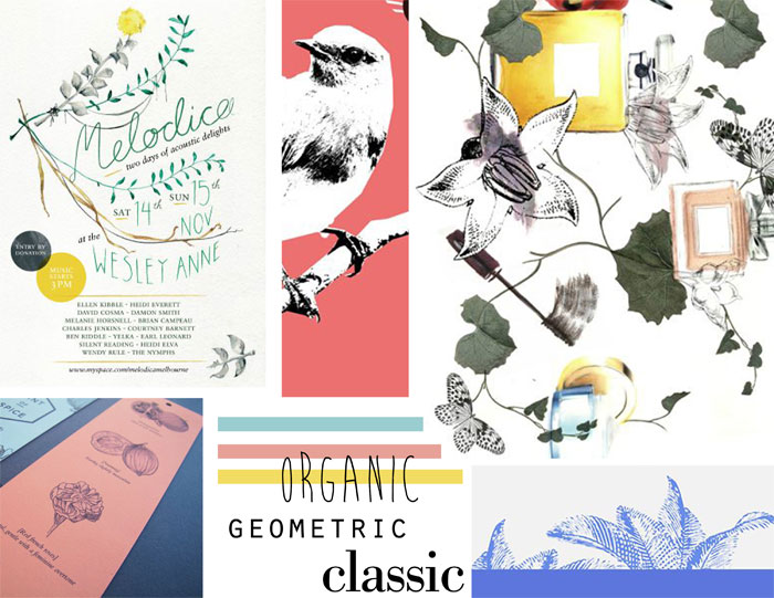
A free collage can quickly and effectively communicate a mood. Don’t restrict yourself just to photos. Use illustrations, fonts, color swatches, anything and everything that will help communicate the mood. A free collage is a sort of visual brainstorming session. It can be vague or specific. This is a great tool to use and keep around if you are looking for inspiration.
These are the easiest and fastest kinds of moodboards to create. It’s not the most detailed kind of mood board and isn’t very useful for determining or explaining relationships. Expect to use a free collage as an early form of your mood board that you might never present to a client, especially if they are more detail-oriented.
Make sure you don’t destroy it if you do have to create a more structured mood board. The free collage can be used to give you inspiration for fitting solutions to future problems or provide a good boost to kick you out of a creative block.
Reference Collection
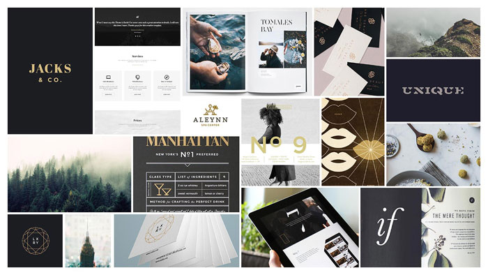
You can also use a mood board as a reference collection. This is a great way to keep track of different elements you have used, plan on using, or are even currently using. Some great mood board examples and mood board makers for reference collections are Behance and Dribbble. These kinds of mood boards are great for both design teams and for client presentations.
They can quickly communicate what the project’s direction and mood are. A reference collection doesn’t just have to include colors, fonts, images, or phrases you’re using, but can also include images that you are looking to emulate.
Clients often like reference collection mood boards since they almost instantly get across the feel the designer is going for. These are often cleanly structured mood boards.
Template Board
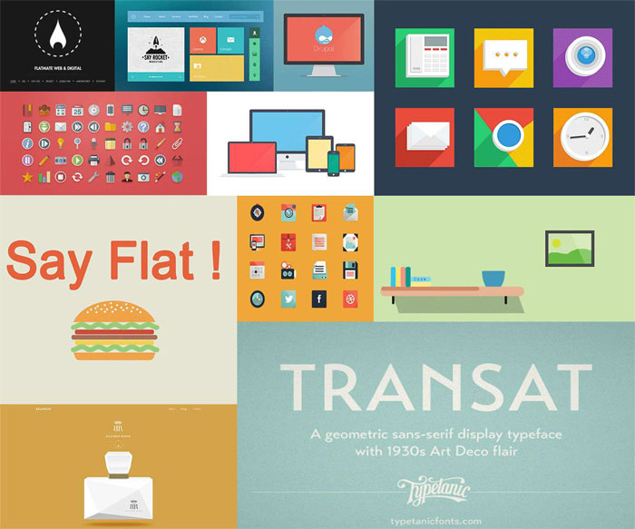
These are mood boards that showcase wireframes and prototypes. They aim to show off the structure and ultimate visual hierarchy of the final project. The elements won’t be as detailed on a template board as they will on the final product.
Various components are variously shown as illustrations of photos to present the overall layout. You can use images so they match the final color palette. This is a much faster option than prototyping since there aren’t any details.
These are favorites of UI/UX designers. If that is your niche, a template board is probably a good way to start using mood boards. This can be hard because they seem like frivolous wastes of time, but they can improve your whole creative process.
Uses for Mood Boards
Experiment with Visual Hierarchy
It can be hard to sort out the right relationships for the elements of your project. You want to make sure your project has the best visual hierarchy to capture attention, hold it, and communicate your project’s message. Every project has a different way of doing this.
A mood board is a fun and interesting way to experiment with visual relationships. UI/UX designers will use samples on their mood boards to help them out. Use it for sorting out your fonts and colors. Make sure colors work together.
Rearrange, add, or subtract elements. Prioritize or deemphasize different things. Create guide to help you understand the best way to present your project.
Save Time and Energy
Mood boards are typically pretty quick to make. It might take you only a few hours to create a useful one that you can happily present to clients. They’re also easy to edit. This way, you won’t be spending time creating more detailed, conventionally structured presentations. You won’t be stuck editing highly detailed prototypes and can quickly move on to the next stage.
Inspiration
We all get creative blocks. You can’t just wait for inspiration to strike, however, especially if you’re working on a deadline. A mood board can offer a way for you to easily pursue inspiration instead. You can use one you’ve already made to give you some ideas or add to it to get the creative juices flowing. Create a small new one if you need to and see if it helps.
Creating a physical mood board can be a particularly nice way to find inspiration. Use objects around you. Tactile objects and physical motion can be a big boost to creativity. Several design firms have begun offering materials to help their designers do just this. It’s had a positive effect, inspiring designers and also relaxing their tired brains.
Better Communication with Clients
Projects at abstract stages can be very hard to explain to clients. A mood board can be a great way to do so. You can better clarify exactly what you’re going for with a design and so avoid miscommunications about different interpretations of styles.
Especially for projects with a strong visual component, a mood board is a much better way to communicate, as well. Everyone always says “show, don’t tell” and mood boards are all about showing. Words can fail to really communicate a look. Visuals are more reliable guides. They can even help you better understand your own ideas and find the right words you will need to use at some point.
Brainstorming
If you don’t have specific directions from your client, you can use a mood board to decide on the style of your project. You won’t need to build new prototypes this way, which is a time consuming and often expensive project unto itself.
If an idea goes nowhere, you haven’t expended too much effort, since mood boards are so easy to create. Feel free to use a mood board to test out ideas.
Involve Clients
Open your mood board to your clients to get them more involved and gain more of their trust. You can do this at the earliest stages of the project. Mood boards allow for even non-designers to give their input without very much effort.
Just ask for a collage of images and colors, or even references if they have some in mind. This will also allow you to get a sense of their tastes and preferences. You might find that an outsider’s point of view will give you new ideas and perspectives on your designs.
Tips for More Effective Mood Boards
Look Beyond an Image Search
It can be tempting to just use Google or Bing to find images for your mood board. It’s certainly easier. If you’re working on a digital project, it might even make sense. However, don’t feel constrained by image searches.
Look around at the world around you. An image search will give you things you were already looking for, but the outside world will offer you unexpected sources of inspiration. Keep your eyes peeled, or even go looking. A perusal of old library archives or a walk through your neighborhood can offer you whole new avenues of inspiration to put on your mood boards.
Take Pictures
Since real-world inspiration is everywhere, don’t hesitate to take pictures. After all, you’ve got a camera on you at all times with your phone. Whether you find a suddenly inspiring piece of architecture, a bird in flight, or a cool-looking sign, snap a picture of it for use on your mood board.
You’re not looking to win any photography contests with these pictures. You just want to capture the emotions the image invoked in you. You want to get a sense of themes and feelings for your mood board.
Curate Your Mood Board
Don’t just throw things at a mood board to see what sticks. This might be a good way to get inspiration at very early stages, but it will quickly result in a confused mess with no unified theme. Curate your mood board.
Figure out what items work well together and help convey the message you want. While it’s very fun to go and collect images for your mood board, you need to think of yourself as a curator more than anything. This will make it much easier to interpret and explain your mood board, even for yourself.
Select the Right Format
Are you presenting your mood board in person? Or are you emailing it to your client? This is a very important factor in deciding whether you create a physical mood board or a digital mood board.
In many ways, a physical mood board allows for more wild creativity. You can add more different kinds of things to it, including textures and actual items. It can offer an extra emotive kick to a presentation.
Digital mood boards need to be more tightly curated as they are often the main way a theme is communicated to a client. Everything you add is a digital image or text, allowing for less diversity in actual content (though it can certainly look like different content).
Create a Central Focal Point
Make sure you highlight key theme images. Once you decide on what those images are, everything else can be used to accent and emphasize them. Make these key images larger than the rest. This is a subliminal trick and a clever use of visual hierarchy.
The large image will trigger questions and prompt people to scan the rest of the board to answer them. The supporting images should provide the answers to the questions people will ask about the larger ones and help clarify the message.
Use Tactile Elements
If you have a physical mood board, use it to its best by including tactile elements. Foam board is the traditional material for mood boards for a reason, even though it is not easy to cut or spray mount cut-out images.
It adds a tactile element that enhances the mood board’s effectiveness at presentations. Don’t knock traditions. Try out this foam board technique to see why it’s still in common use as a mood board material.
Present the Mood Board Yourself
The mood board is a reflection of your creative processes and you are the one who understands what it’s communicating best. Try to be involved in the presentation of the mood board to your client. Do it yourself if you can. No one else will be able to explain it as well.
Make sure you watch the faces of the people you’re presenting the mood board to. Verbal cues are not as informative. Your mood board is about emotions, so look to see what kinds of expressions it generates. You’ll get a much more honest understanding of what the reaction is to the proposed mood of the project.
Many managers will be happy to not do extra work, so don’t worry too much about asking. It’s a great opportunity and is the only way you can be sure that everyone understands your mood board correctly. If you don’t care for public speaking, embrace it as a chance to learn.
Keep It Loose
Don’t lock down yourself or your client into a style. Keep your mood board loose. Don’t let things seem too final. This can put you in a creative straitjacket and may receive a negative reaction from your client just on impulse.
A mood board communicates the mood of the project. It’s not a step-by-step plan. Don’t change something meant to inspire to something meant to lock you down.
Use Text
While we think of mood boards as purely image-based, don’t underestimate the value of few well-placed words or phrases. They can tie everything together to the theme perfectly.
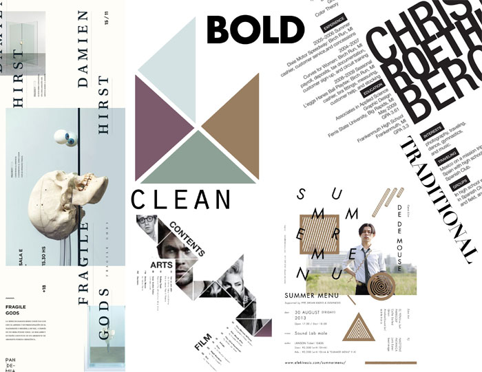
Add in some big, bold words that capture the mood you want for your mood board. This is also a great chance to experiment with fonts. Try to put the words you add in a font style that draws attention to the tone or theme you’re going for.
Don’t Be Subtle
Moods boards are all about gut reactions. You shouldn’t hide your theme or ideas. There’s very little nuance here. Have fun and be bold. Design your mood board to clearly and bluntly communicate your message. Enjoy the creative opportunity. The final project may be much more subtle, but you’re not prototyping here, you’re mood-boarding!
Test it Out
See if your mood board works for a test audience before presenting it to a client. See if they have the reactions you’re looking for. They shouldn’t be asking too many questions about what things mean or why they are on the mood board. If an element on your mood board prompts too many questions, you may want to remove or replace it with something that does a better job.
Ending thoughts on mood board design
A mood board is a great tool for any kind of design project. It will not only help with your creative process, but it will also make communication with your clients much easier. So break out the foam board and get moodboarding!
If you liked this article about mood board design, you should check out these articles as well:
- How To Brand Yourself: Tips And Best Practices
- How to identify Good Design in 6 steps
- Banner Ads: Creative Web Banner Design Ideas to Inspire You
The post Mood board design: How to create a mood board appeared first on Design your way.
Source: http://ift.tt/2FAUfCx

No comments:
Post a Comment