The trend of applying breathtaking textures in printed design is slowly replicating within websites and mobile apps. Therefore, a deeper knowledge of how to apply textures in web design can be really helpful for every designer.
Textures are highly welcomed in the web world because they provide versatility. Websites using textures are opened to almost every design solution and they rarely fail to attract attention.
The trend, however, is not new: the beautiful textures of our time derive from simplified patterns, vintage, and grunge textures. Development enabled designers to use textures in various manners and to enrich users’ experience with refined-looking and personalized websites.
Furthermore, a well-chosen texture combined with the right typeface is simple and time-efficient; and it can direct your creativity towards a unique and very successful website.
What is a texture?
Generally speaking, a texture is just a creative design element. As simple as it is, texture can turn into a ‘design beast’ and it can make your website more interesting and richer.
The texture is not just a visual tool: designers associate it with feelings and they treat it as a mean which transforms 2D into 3D and adds some ‘real life’ look to the items.
Textures are the future of background images and patterns
It is not rare for people to confuse textures with patterns or background images. However, they are completely different, and they can produce completely different effects within a website. Therefore, you should compare them and discover the best solution for your brand and your website.
- Patterns, for instance, are small, replicated and recognizable.
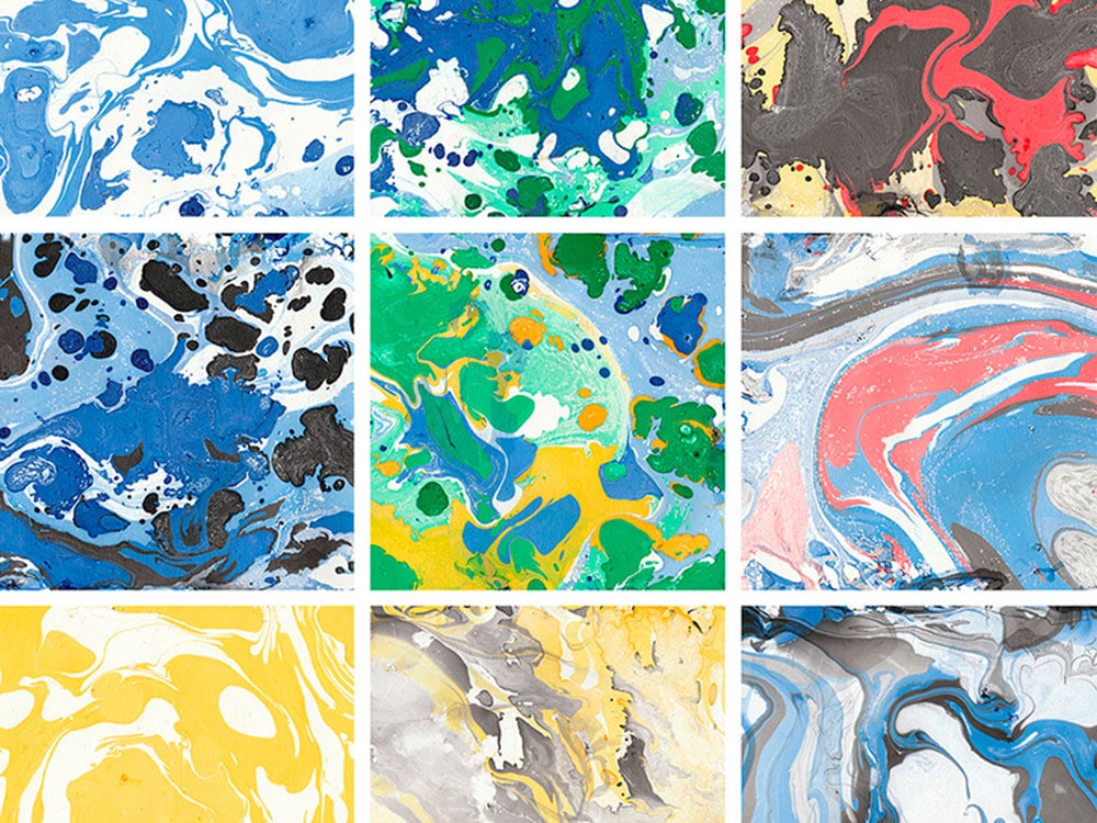
- Textures are far more complex, and they may seem random because their purpose is also to be repeatedly used.
- Background images are something completely different: they don’t repeat themselves, and they are wide and very detailed. They are also diverse in the sense of imagery, they vary from drawn sketches and illustrations to clear and sharp photographs.
Functionality
The texture is not simply a design tool, it is a design principle! The reason is that it gains more and more meaning every day, and it is applied to all types of websites/apps.
Textures produce realistic and tactual feelings and they build a strong relationship between the user and the design. In fact, thanks to textures we are able to associate the website with some real-life item or experience.
Textures give importance to the website elements: they grab attention and they direct it towards a particular heading, icon, title or action button. Basically, textures highlight the most important elements of one website.
Minimal textures are applied to highlight a particular portion of the content, and they are supposed to guide the visitor towards it. Using texture in a careful manner can point out the key elements of your brand.
Making textures work in the service of your design
To start with, the texture is a mean which can provide originality and uniqueness for your website/app. It can make it sharp and attractive, and it can intrigue users to visit it. With proper application, the texture will take no time to provide stunning layouts and to make your website popular.
You can look at your competitors’ websites. For example, if you have a T-Shirts website, see if your direct competitors are using textures on their websites. If not, you can use textures on your website to stand out from the crowd.
The reason for that is that textures seem more realistic than other design tools; and are therefore memorable and invoke emotional reactions from the users.
Properly structured information
The texture is a visual guide for your visitors. The same as shapes, boxes and borders, texture can do some logical separation of content. In this aspect, it is important to combine them with other similar methods; and to install it within the website architecture in a manner which can strengthen efficiency.
According to satisfied users, texture websites invoke better feedback, as they look more interesting and they provoke positive mood.
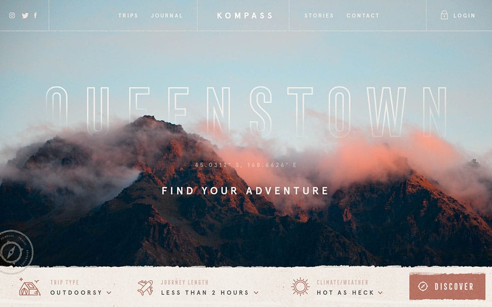
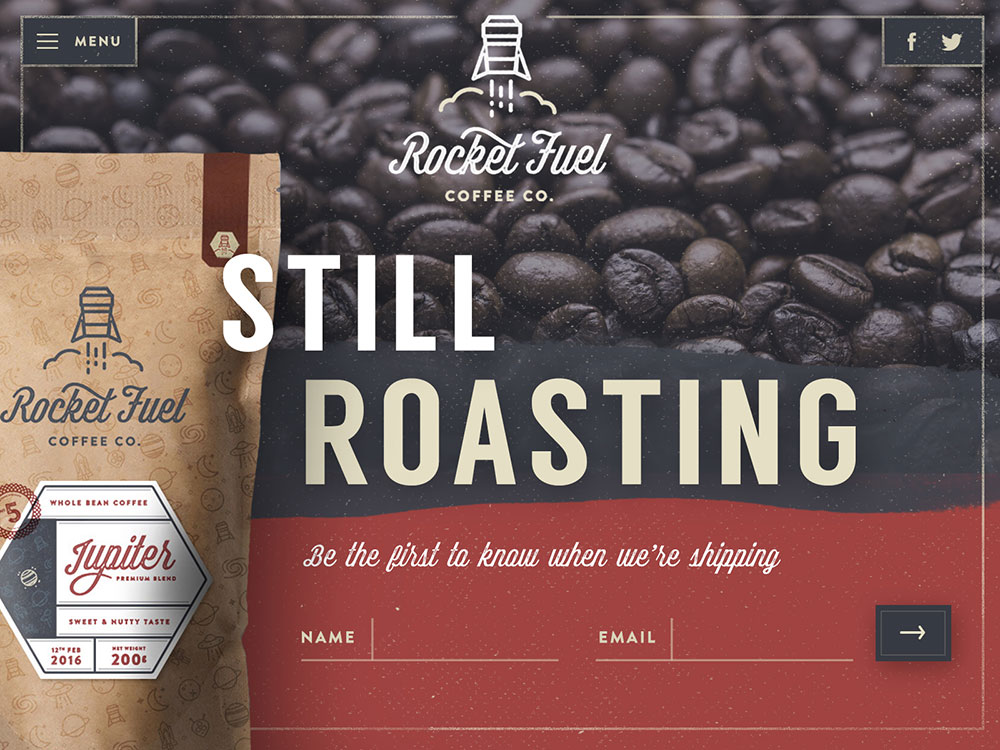
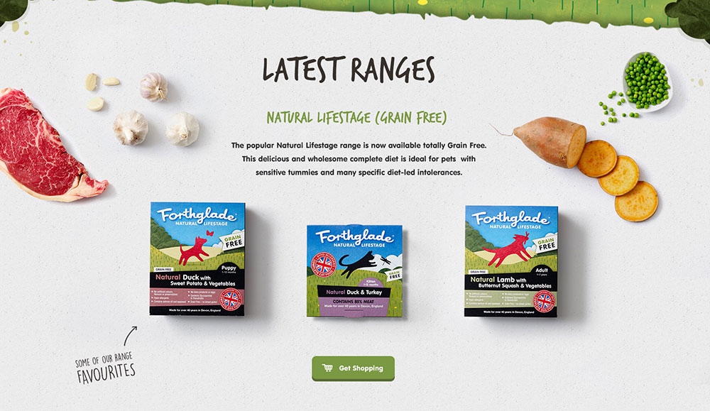
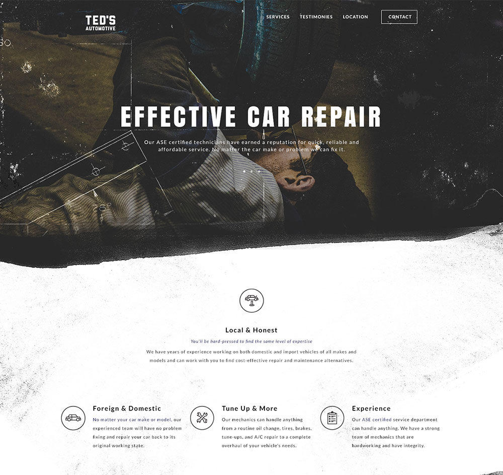
The texture may appear in many different forms and versions: it can be achieved with typefaces, combined patterns, photos, sketches, and illustrations. For simpler websites, even a tiny piece of texture can do the work.
The best way to start applying them is to consider outstanding websites which use texture. We could draw inspiration from their textured backgrounds, catchy headers, and footers, content boxes, typefaces, or even sidebars. Texture enriches the visual dimension of items for every style and design.
Creative and picky designers can really benefit from textures: they can produce beautiful masterpieces and add individuality to their websites. However, we should not exaggerate because we are risking creating a mess which can hardly be adjusted to further modifications.
A well-executed background texture can serve as a great substitute for plain and boring designs, and it could grab attention towards elements which would otherwise be overlooked.
The essential tricks for applying textures in web design
As we already mentioned, the texture is all about the personal dimension of user experience. Its purpose is to inspire warm and welcoming feel.
Here are some tricks on how to achieve this:
Don’t sacrifice legibility
As good as your texture may be it cannot substitute clear and readable content. It is not uncommon for designers to apply sharp textures which leave no clear space for text. It is the literal shortcut to failure because users are not able to understand the message you’re trying to convey them.
Keep it simple
Effective design relies on functionality, rather than too much detail. Find a simple texture type which matches the requirements of your website; and make sure users have no trouble to understand the basic message.
Focus on your audience
As in all other design branches, you have to do research and to target a particular audience. Then, you have to analyze their expectations and to offer something that is familiar to them, so that they will never be confused.
Be brave
Experiment with different designs: the more you do it, the better the quality of your website will become! Your audience likes innovation, as long as it serves the right purpose and it stands in the right place. At the end of the day, you never know what creativity can bring you.
Accept nothing but excellence
Simplicity is desired, but you can always think of few ways to make the design more interesting. If dealing with a single color, use small and catchy details. A sharp contrast is also very recommendable.
Keep your efforts effect-orientated: as experience shows, ‘getting lost’ with textures is not difficult. You can always forget yourself and keep applying more and more details, which usually leads to devastating effects.
In order to avoid this risk, we recommend you stay focused on the results you want to achieve; and to provide textures which make this experience more interesting without disturbing its performance.
Make sure there is consistency
If you opt for more than one texture, make sure you choose only such that look consistent. If not able to find textures that match, you can at least use monochromatic color schemes and you will achieve the same effect.
Read about layer masks
Layer masks are useful tools which ensure time-efficiency and adjustment.
The most important feature of your texture should be attractiveness: choosing a beautiful texture to be applied on all of the pages is the shortcut towards an attractive website. Eye-pleasant texture can draw attention to all particular aspects of the websites and it can motivate users to return.
Create your own resource collection
Before you start, make sure you have a wide archive of resources which you could use long-term. Analyze and organize all of the files and arrange a backup plan for them.
Convince your users
Regardless of the texture type you’re applying, make sure it complies with the expectations of your users and the style you’re trying to promote.
Start with a winning homepage and replicate the style on all other pages, so that users will trust your brand and your content.
Final thoughts
Finally, textures can provide uniqueness for your design project. It will create particular looks and it will inspire particular feelings, as expected when developing the concept. Both patterns and textures make web design look more real and strong.
Generally, a well-executed texture solution should produce a fulfilling effect; and it should invoke a pleasant ‘wow’ reaction by your users.
In fact, you should provide a fascinating first impression for every user; and to keep him satisfied until the very end of his interaction.
The main trick is to be able to estimate the potential effects of your website; and to decide which the appropriate textures to impress your future visitors are.
The post How to Use Textures in Web Design appeared first on Web Design Blog | Magazine for Designers.
via http://ift.tt/2pblU68





No comments:
Post a Comment