Website typography is a new form of art. Using typography well helps to create an atmosphere for a website and gives identity to a brand. Using fonts well shows viewers that they have come to the right place.
When a designer blends fonts well and creates a harmonious feel for a site, the brand comes together. This encourages viewers to explore further.
Traditional fonts safe for web such as Arial or Georgia have been used by web designers because they are simple and easy to read.
However, services such as Typekit and Google Fonts have drastically increased the range of fonts open to designers. Another way of adding a unique or interesting feel to your website is to design using handwritten typography.
Handwritten typography adds creativity to a site. In recent years, it has become an increasingly popular choice for web designers. Handwritten typography adds a personal touch or flair, giving a site an original and custom-made feel.
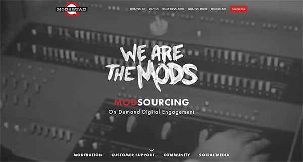
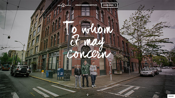
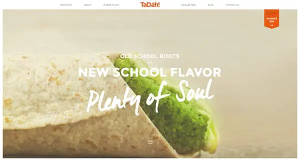
Hand-drawn elements are used to add emphasis
Designers often use hand-drawn fonts to give a website a personal touch. However, these fonts are used sparingly.
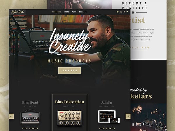
Hand drawn fonts are used to draw attention. The rest of the copy is clean, simple and easy to read. Very often it is only headers, navigation panels or search boxes which use hand-drawn fonts.
When hand-drawn fonts are used sparsely and accurately on a page, they bring flourish.
Handwriting in design
As hand-drawn elements of a website become more and more sophisticated and subtle, many designers are creating fonts which imitate handwriting.
These fonts are created to be clear and legible. They can range from calligraphic writing to a more casual script. Designers often use script fonts instead of sketched fonts.
Keep your writing user-friendly
When designing a website with handwritten fonts, try to work with your user in mind. Handwritten fonts can be very distinctive. However, as a designer, keep in mind how usable they are. Is it clearly legible?
Will your readers or visitors be able to read your font well enough to negotiate your site? Is the font legible enough for them to find what they are looking for?
Minimalism and hand-drawn typography
Minimalism uses simple designs with exquisite detail. As a result, hand-drawn typography is often an excellent way of creating a unique product. Small details in hand-drawn typography are able to pull a design together to create an exquisite result.
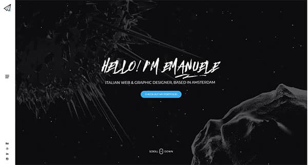
With the emphasis on clean lines and simple statements, handwritten typography can add an aesthetic element to a minimalist design.
Adjust the style to your content
Designers often use handwritten fonts as a way of bringing attention to the body of content on a site.
Handwritten sketches might be placed in the background. They can be used to draw attention to areas of text or give insight into a topic that appears on a page.
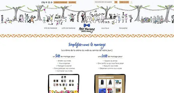
Combining hand drawn text and illustration
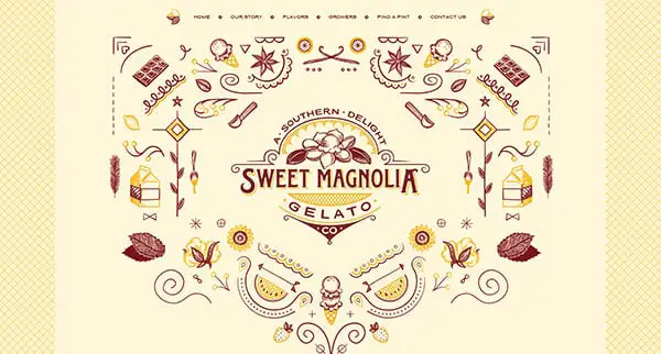
Hand drawn typography might sometimes be combined with striking hand drawn illustrations in order to add visual impact. The result is often vibrant, colorful and innovative. This creates an aesthetic, unique site which is visually appealing to viewers.
When designing a site with different hand-drawn elements, designers work towards keeping the site both unique and easy to navigate. The goal is focusing on keeping the site usable so that viewers know how to navigate it or find the information they need while keeping it attractive. This often takes a lot of skill.
Hand drawing communicates
When adding hand drawing to a site, a designer is able to give a clear idea of the brand. This is because hand drawing is unique, versatile and able to design a specific brand or product in mind. The message it gives across is therefore tailored to a specific product or purpose. It is, therefore, able to give a more emotional message.
Some designers use hand drawing to communicate a strong or shocking message. This type of design aims to provoke a response in the reader or viewer, often making them think. An artistic website with hand-drawn art is often able to create this impact.
As a designer, you also have to ensure that your website is easy to navigate so that the simplicity of the site forms a juxtaposition to the emotion triggered in the viewer.
A designer is an artist who takes a number of different decisions in order to communicate with a reader. Hand drawn art can often provide a very strong medium.
Different styles of text used to create a message
When working as artists, designers use a number of different texts to communicate with their viewers. Here are five new trends in web typography:
Slab serifs
Slab serifs are frequently used in the field of design. They are solid and are strong, bold and authoritative. This gives them the feeling of reliability or trustworthiness. Some slab serifs include Egyptian Slate and Serifa.
Scripts
Scripts are a trendy element in web design. Scripts have the appearance of hand lettering. In the past, they were often used in wedding invitations.
Scripts have different styles of the font such as the formal calligraphic lettering style, such as English or Snell Roundhand. Casual style fonts look more like regular handwriting and include Black Jack and Zephyr Script.
Scripts are a great option for website design because they bring something new and naturalistic to the digital world. Using them on a website gives a down to earth feel.
Mixed Fonts
A designer uses mixed fonts when combining two or three fonts. Combining fonts can give a page vibrancy if a designer works carefully.
Some designers combine different types of fonts based on the feeling or mood each one brings. Others combine textures. Each font can be given a specific purpose.
When designers combine different fonts, there is a need to work carefully. This will ensure that the page does not become cluttered.
Hand drawings for logos or headers
When hand drawing is included in logos or headers, it immediately attracts a viewer’s attention.
Hand drawn elements create a personal feeling to a site. A designer might include a hand-drawn element in logos or headers as these areas gain a lot of attention from viewers.
If you include a lot of hand drawn elements within your site, it makes sense to include them in logos or headers as well.
Hand drawn elements create emphasis
Many designers use hand drawn elements on their sites to create emphasis. Headings, call to action buttons and navigation menus.
Hand-drawing in navigation
The navigation menu is one of the most crucial aspects of website design. Giving the site an artistic element will make your navigation menu a unique quality.
However, it is still important to keep navigation menus standard. This way, viewers are able to find their way around a site easily and intuitively.
Heavy use of hand drawing
Using a great deal of hand-drawn typography or illustration on a site can often make a site seem overcrowded or cluttered.
These sites will often have a niche audience who they appeal to. When sites use hand-drawn elements in moderation, they will appeal to a large audience.
Summary
In the past, handwritten typography was often associated with children’s products or services. However, these days they give a creative element to a variety of websites.
As a designer, you can use hand-drawn typography to build a brand or create a niche audience for a site. We hope this brings inspiration for your next design project.
The post How to Use Handwritten Typography in Website Design appeared first on Line25.
Source: http://ift.tt/2pg9nyS



No comments:
Post a Comment