Over the years, blogging has become an attractive profession that helps people to earn some good income by spending a few hours inside their home.
The success stories in the industry have brought many new bloggers into it. While some of them just love sharing their insights and experiences, some others take it seriously as a profession. But, most of the newcomers into blogging miss noting the critical aspects that can tarnish their blog reach.
The most important aspect is a professional outlook for the website. If you are a blogger, and your blog looks messy and unprofessional, people do not wish to spend their time reading you. A few tips can help you to make your blog design look professional.
Efficient use of Fonts, Line Spacing, and Whitespace
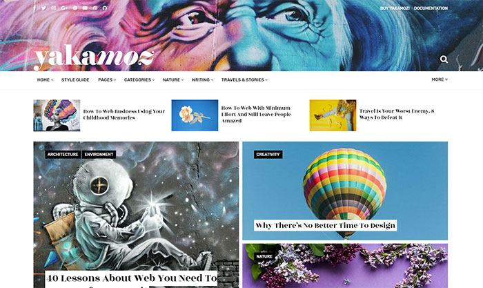
The type of font you use, font size, line spacing, and the overall whitespace in your pages are playing a major role in making your blog looks professional.
When it comes to online reading, Sans-Serif font is the ideal choice. The font size should start from at least 16pt, but it produces the best result at 20pt+.
While coming to line spacing, you can choose an ideal one from the range of 0.8 to 1.8 based on your font size. Also, you should allow comfortable whitespace to ensure that the text is not looking over-crowded. If you can leave plenty of whitespaces, it helps your readers to focus on the content better.
Customized Theme
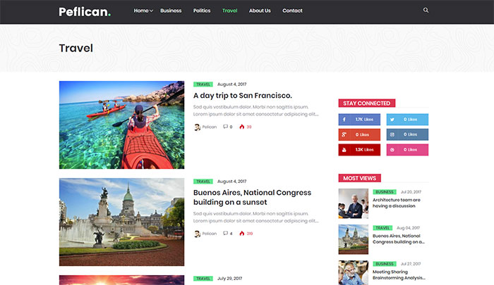
A customized theme based on your niche is another excellent option to make your blog looking superb. If your blog is a CMS platform like WordPress, you have numerous theme options to choose based on your category of writing.
Even if you are designing your blog, you can get theme packages online for purchase. But, if you are planning to make the theme yourself, look at the color palates used by big brands and learn more about it before concluding one for your blog.
You can also refer the meaning of different colors before setting something for your blog. Importantly, you should ensure that your blog follows a consistent color scheme.
Take care of Excessive Ads
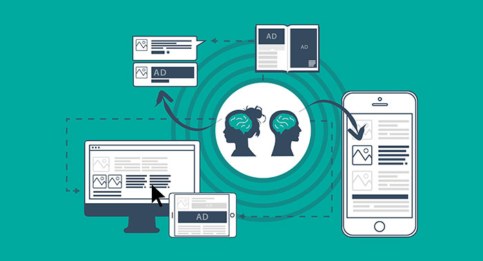
Many people make the mistake of over-monetization attempt through excessive ads. It can be described as an attempt kill the blog.
Some bloggers set their primary objective with the blog as revenue generation. If you need to grow your blog and make it popular, you should set quality content generation that engages the readers as your primary goal. It will help you to get more readers, and that translates more revenue on a consistent basis.
Therefore, you should follow a strategy of minimal ads, and the ads should be relevant to your content topic. The ad placement in your pages is highly important; pop-up ads and ads between paragraphs can annoy the readers.
Create a Logo
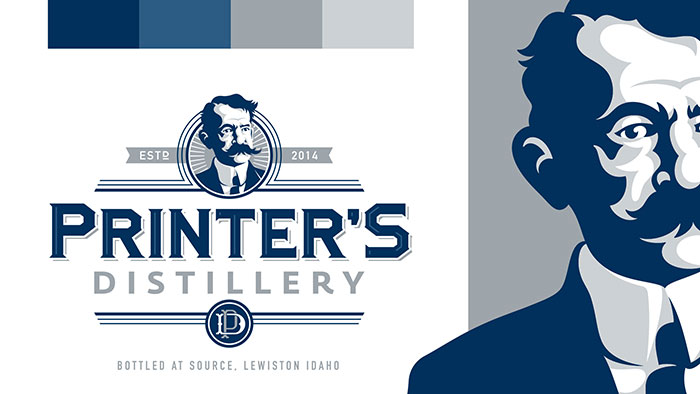
An impressive logo is the initial step towards branding as it gives a standout appeal in a crowd. If you want to give uniqueness to your blog, your choice is designing a logo for it. You have to include the logo in your blog to make use of the visual appeal of it.
It is also useful when you want to market your blog through social media or other channels. The logo would give you a unique identity for the blog across different platforms. If you are not comfortable with logo designing, you can access an online logo maker and design the logo using the self-guided procedure set by the platform.
Informative, Educational, and Engaging Contents
Providing informative, educational, and engaging contents should be your top priority. People sometimes write for the sake blogging, and often blogs are written not in an interesting way.
You should ensure that your content is offering something valuable to the readers by providing some key insights, answering some of their queries, addressing their concerns, and prompting them to think in the right direction. Finally, you should not be specific about daily a post or so as your focus would be shifting from quality to quantity, which is suicidal.
Conclusion
Developing a professional and engaging blog is a work of art, and you should dedicate your hours for it with the right passion.
Keep in mind that the readers are spending a few minutes in your blog from their busy lives as they need some informative and quality content. You should focus on respecting their needs.
The post Top 5 Tips for Making Your Blog Design Look more Professional appeared first on Design your way.
Source: https://ift.tt/2J20Zvj


No comments:
Post a Comment