You see brochure design examples everywhere, airports, metro stations, on the street corner or, targeted, in a doctor’s office, a hotel or a restaurant.
A lot of effort goes into making quality brochure designs, starting from a sketch that leads to a design and ending with the text that goes in it and has to be very carefully written to transmit the proper message.
We’re leaving the text part to copywriters to do their best with, but the brochure layout is left to us and we must make a pretty damn good job to attract the possible clients that get to see the creative pamphlet design.
For us to have made a good job means producing an excellent, creative brochure which will be one of the best on the market.
A small but very informative leaflet, mainly called a brochure design usually aims to promote or advertise services and products, companies and events.
Brochure design is one of the best possible ways to cram a small piece of paper with all the necessary information about the subject being advertised.
Creative brochure design and felicitous text will easily catch attention and give a hint to some actions, desirable by the person or company, depicted on the brochure cover itself.
Promotion of goods and services cannot be restricted to only one tool. Most of the famous companies and organizations usually deliver core information about themselves in all the possible ways.
They employ internet resources like advertising, billboards, letters, and brochure designs, of course. An attractive brochure or catalog design, along with other marketing tools, can communicate a message to potential clients, assisting them to identify with a brand or product.
This is why many companies distribute marketing brochures almost everywhere and it really works. If you want to succeed in selling something, you should take into consideration the fact that some people have different prejudices.
Some of them will never consider online shopping and are sure that all the advertisements on the internet simply spam.
Others would think that radio advertising is not reliable. Things get better when it comes to creative design ideas such as brochures or even booklets, especially well-designed ones.
Paper is something most of the population on the planet are comfortable with, and so most people usually don’t consider it to be something suspicious and unreliable. This makes brochure designs an excellent way to communicate with clients.
So you want to know how to create a brochure design?
Tips for learning how to create a brochure design that rocks
Know What Your Reader Wants
There’s one famous quote: if you want to catch a thief think like a thief. The situation with potential customers is very similar.
If you want a customer to come to your office, to buy your goods, to use your service, the first thing you should think of is the information your customer will be interested in.
You can be the best in your city in your field, the best in your country, but all the benefits you can offer are risking to remain unnoticed unless you represent them in the right way. Your pamphlet designs should, therefore, begin with looking at your business through your clients’ eyes.
Once you have taken your clients’ perspective into account, fill your brochure layout with the information your customer is most likely to be interested in.
That is to think thoroughly about all the key points concerning your goods and services and provide answers to the most crucial questions in the logical sequence of thoughts which may arise in mind of potential customers. This is an important step in creative pamphlet design.
Visuals in a marketing brochure
Recent studies have shown, that we perceive 80% percent of information around us only visually. This fact leads to the conclusion that one of the most important parts of your brochure layout is a photo or illustration.
Your brochure cover design should be attractive and be inviting, able to grab attention at a glance and to make the customer interested in reading the information you want to deliver.
It goes without saying that quality and resolution of graphic materials should be as high as it’s possible nowadays. One more tip: if you want to promote your company on the whole or to launch the brand it’s worth placing the emblem of company or motto where it can be easily noticed.
Colors should be bright and eye-catching, but should also correspond with the ones used in the brochure images, to make your pamphlet designing look more organic.
Bear in mind that in marketing different colors deliver different messages. So make sure the shades you choose to correspond with the aims you pursue. Violet usually implies luxury and opulence, while blue and all its hues represent intelligence.
One more important thing is the brochure graphic design and format. If you want to advertise a funeral service, it’s better to create a modest leaflet, while promoting spa services implies luxurious look that will invite you to indulge yourself with pleasant relaxation you deserve. Your booklet design would, therefore, be linked to your business goals and the services you offer.
Think of simple statements
Everything is good in moderation. In your attempts to make the marketing brochure as noticeable and eye-catching as possible it’s important not to overdo your design and clutter your brochure. Bear in mind that your corporate brochure should be created for the average person who may need a simple explanation of your services. Your business brochure should, therefore, be simple and easy to understand.
Brochure layout and fonts also matter. Although many people often try to stand out so much that a simple design often gains more attention. Many designers and agencies often use the same design strategies for a huge amount of projects while making creative brochures. Go for a unique design and ask for a pamphlet sample from your printers to ensure you’re happy with your choices.
Designers often use a standard approach because professionals notice objective laws common for all the brochures and other types of advertisement they produced.
One type of font attracts attention at a glance and another is so blatant that it rather distracts. However, even while using frequently used layouts or fonts, you can still offer up a unique product if you brainstorm brochure ideas with your designer.
Readability in a brochure design
The leaflet shouldn’t simply be good-looking and bright; it also should be readable and informative. The brochure template is supposed to cover the most important and relevant information. Brochure backgrounds should contrast to your print to ensure legibility. Keep your choice of fonts to a minimal when brochure designing to keep your page clean and legible.
It sometimes happens that a brochure is quite big. In this case, it’s better to include a list of contents in your catalog designs. This will simplify navigation when making a brochure.
Motivate your reader to look inside your creative brochures
The leaflet should be inviting and understandable. Keep your catalog cover design simple. If you scare away the customers with complicated and alien terms from the very first page, you’ll fail to promote the product. Try to invent a statement or a phrase that will make even an average man interested in the thing you advertise through your professional brochure.
People are always looking for some benefits, so try to introduce some discount or special offer on the front page so that the reader has at least slight interested in looking inside the brochure.
As soon as you’ve attracted their attention, they’re on the hook. Now you can familiarize them with everything you considered to be important concerning your product.
Describe your product in the marketing brochure
While describing your product it’s necessary to outline obvious benefits of your products in your company brochure design. For example, if you describe a hairdryer, it’s not enough to tell that you can dry your hair with it.
You need to explain what it is that sets your product apart from the competition. This is as true for a travel brochure design as it is for a college brochure design. Well designed brochures should always include this aspect.
Make it Personal when making a brochure
While delivering a speech to the huge audience eye contact is inevitable. But printed advertisement doesn’t include personal interactions. Best brochure design practices will communicate your message on your behalf.
While considering different brochure ideas, it’s more effective to address your audience with warmth. If people are addressed this way they feel some sort of their uniqueness, individuality and perceive it as a friendly conversation rather than intrusive, irritating advertisement.
Talk about your reader’s needs in your creative brochure
No matter how much you like your business and your company, professional pamphlet designs will should speak to your audience. People want their problems to be solved and solutions found. You could collect pamphlet samples or explore catalog design ideas to explore successful brochures.
A creative pamphlet which is well constructed will keep your audience interested.
Brochure design inspiration
There are times when every designer feels uninspired but there are more than enough brochure design examples to draw inspiration from.
As professionals, we all appreciate professional flyer design ideas that are completed to perfection. Enjoy this great collection of product catalog design inspirations!
3rock Corporate Brochure
adidas Creative Brochure
Anchure modern brochure design
Attitude Brochure
British High School of Art and Design Brochure
Cool brochure
Cultural events tri-fold brochure
Tri-fold brochure
CHP modern brochure design
Contemporary Slovenian Writers
Creative Brochure Genesi
Deep Funk Records Tri-Fold Brochure
Elmwood Spa – cool brochure
Entre Elles Tri-Fold Brochure
Fabriquem Emocions modern brochure design
Festival event brochure
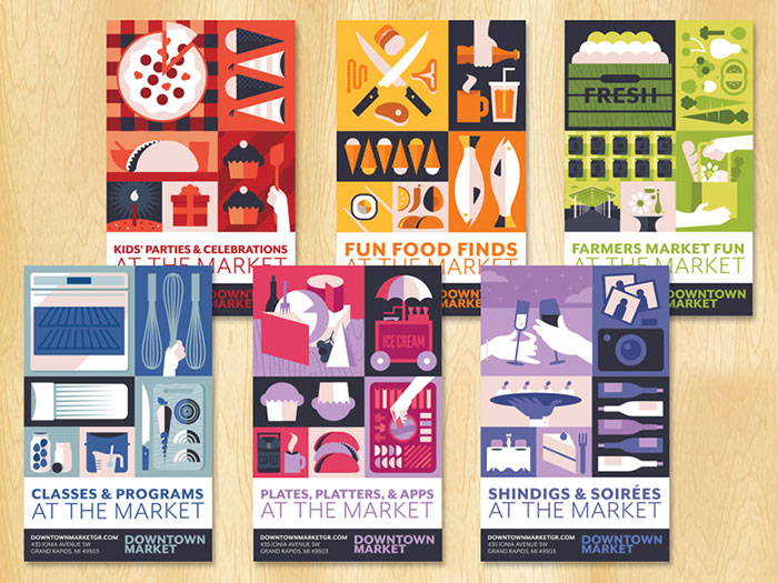
Farmers Market Tri-Fold Brochure
Water Company Brochure
Hardware Store Brochure
hopefulvoyeur.com Brochure
Hotel Jetta modern brochure design
IamExpat creative brochure
IdeoLab Brochure
IKEA Tri-Fold Brochure
Iride professional brochure
Kung Fusion creative brochure
Leporello Street Art modern brochure design
Lifestyles modern brochure
LifeSynch Capabilities Brochure
Martial Arts Academy Brochure
MCA – A5 Brochure Design
MineralKat creative brochure
Moma modern brochure
moreYELLOW creative brochure
MV Teachers modern brochure design
Nick Cave
North Star Fund professional brochure
Rebrand – modern brochure
Retro Barbershop Brochure
Reynolda Village
Segna Libri modern brochure
Simpson’s Brochure Pack
Suikerbosrand brochure design
Tessuto Fashion modern brochure design
THSC professional brochure
TVNZ 7 creative brochure
TWHP 2010 EPIC Awards
Unicer Corporate Brochure
Vertex professional brochure
Vespa brochure
Volkswagen creative brochure
Xceed professional brochure
Yahoo Search Marketing Brochure
If you liked this article about creative brochure design, you should check out these articles as well:
- How to make an album cover: 50 album cover design examples
- Calendar Design: Tips To Design Your Own Calendar
- Concert posters: Design, Ideas, and Inspiration
The post Brochure Design Inspiration (64 Modern Brochure Examples) appeared first on Design your way.
Source: https://ift.tt/2ut5Q57

No comments:
Post a Comment