You might know how difficult it is to design a great app.
After all, one in four apps is abandoned by users after their very first launch.
After 72 hours, just less than a quarter of users will still make use of an application. The other users will have dropped the app.
As a designer, you, therefore, understand how important it is to get onboarding just right.
So how do you manage this? How do you create an onboarding experience which will guide your users on how to use your app? How do you share what is special and unique about your app with your users?
In the short time before many users abandon your app, how do you get them to see how beneficial your app can be? You just follow app design trends or do you actually put some thought in the process?
What does ‘user onboarding’ mean?
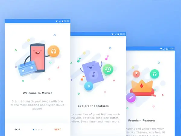
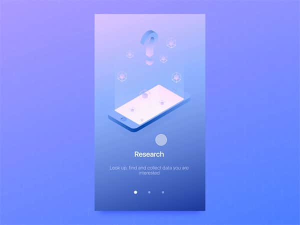
Although you may have heard the term ‘user onboarding’ before, you might not know what it actually means. User onboarding means showing your user how to take part in a number of tasks on your app. Once these tasks are complete, your user will understand the value and purpose of your app.
This means that you show your users how to use your app so that they will be able to achieve the maximum benefit from it. This helps them see the value an app has to offer.
When people think of onboarding, they often think about how to use a screen to learn more about a mobile application.
They may even think about functions, such as how to change settings, send replies or retrieve information.
This article draws on techniques and practices from some of the most inspiring mobile applications. Learning more about onboarding will help you to retain your app users.
Get to know your customers
When customers download your app, they do so because they see the potential it has. Some might have learned about your app from a friend. Others may have stumbled across it in an app store. When you take a user through their onboarding experience you will show them the true potential of your app.
Although onboarding will show the full promise behind your app, you will need to explore the process through the eyes of your user. This means establishing your buyer persona. You’ll need to explore why your user identified with your app in order to reveal the full promise in the onboarding process.
Consider who has downloaded your application and why they chose your product.
It is only when you get to know your clients that you will be able to construct your onboarding process to meet their goals and desires.
Show your users your app’s value
When you guide your user through your app, your goal is not simply to just inform your user. Instead, you will need your user to feel the value your app offers up. It is the experience rather than the intellectual understanding that you need to share.
Once your user feels the value offered by your app, he will experience an ‘aha’ moment. The value of the app will become clear, and your user will use the app in future. In order to prevent your user from abandoning your app, you need to create that lightbulb moment very quickly.
Give them the feeling of success early on and your users will be willing to put in the effort to learn more.
Keep your onboarding process simple
When you show your users how to use your app very quickly, you will increase your user retention. Almost three-quarters of mobile application users share that it was the quick onboarding process which helped them commit to their app.
The onboarding process should, therefore, be as simple as possible.
Keep your user information to a minimum and only walk your user through the most essential features. This will help them to effectively navigate the app.
You can always show your user additional features later on. You could do this by means of friendly introduction emails. If you need to, you could also include later onboarding sessions, where you explore more complex features.
Your first user experience should, however, be quick, simple and undemanding. If you ask your user for personal details, keep them to a minimum. Remember to explain why you would need any information.
Give your users the choice to skip
Some people find technology simple and easy to use. Such users may not want to be taken through an onboarding process. Instead, they might prefer to delve into the app and explore what it has to offer.
The ability to skip the app might actually increase your app usage. Music video app Vevo found that allowing users to skip a guided tour of their app increased their user logins substantially. Sign-ups increased by over 5%.
By allowing your users to skip your onboarding process, you’ll be able to see which option works best for your current clientele.
Keep your users informed
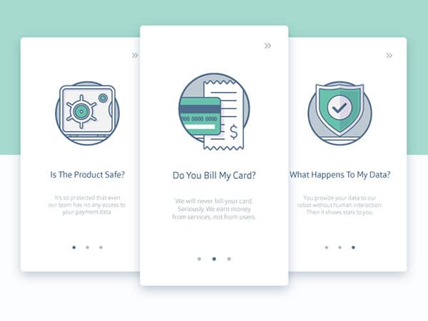
Current research shows that if you keep your users informed of push button notifications or the reasons behind information requests, you will increase your user rates.
When they learn why you are being asked for permissions to access your information, payment details or locations (in order to show you products available in your area) users will trust the app to a far greater extent.
More than 4 out of 5 mobile application users explained that this information is important to them.
Show your app value quickly
When your user downloads your app, he wants to know that it will meet his needs and fulfil its potential. By showing him via your onboarding process that you can meet his needs, you will encourage him to use your app.
One of the greatest reasons that users abandon an app is that it does not meet their needs.
When you walk through your onboarding process with your user, always show how the app will benefit the user rather than show any features the app has. The goal of the app is to meet user needs.
Offer incentives to your users
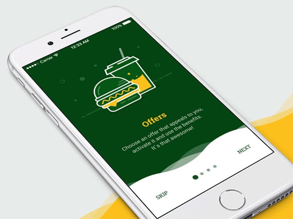
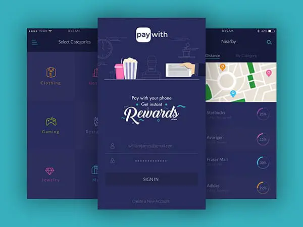
After your user has downloaded your app, you could encourage them to keep using it by offering an incentive. This could be for taking part in an onboarding process, subscribing or making a purchase.
You could offer a discount on a product, cover shipping costs, offer up a reward or give your users access to additional features.
Delay your sign-in process
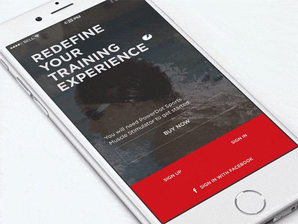
If you want your new users to explore your app without any hassles, let them see what is available before asking them to sign up.
Applications such as Airbnb allow users to explore accommodation options, see which dates are available and find out the discounts offered for extended bookings. They are only asked to sign up when they actually choose to book their chosen accommodation.
When users know what an app has to offer, they are more willing to subscribe.
Approach users using multiple channels
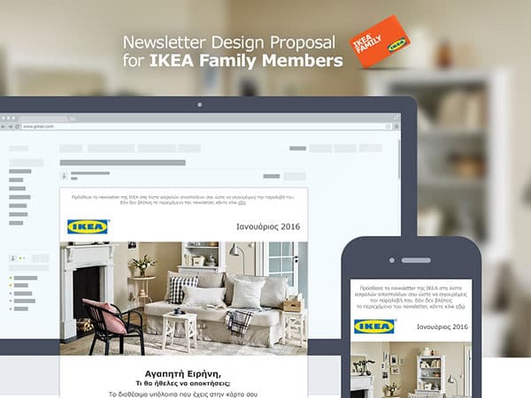
Once your user has downloaded your app they can take part in an onboarding experience. However, this does not need to happen only inside your app. You can use multiple different channels such as emails, messages and push notifications to help users explore the app’s value.
If a user has explored elements of the app, you could send a message sharing what they have achieved, and what could be done next.
Keep your messages simple, encouraging and precise. Include a call to action. Limit your messages so that your users don’t feel spammed, but do encourage them to take part in new experiences.
Summary
In a digital world, a mobile application is often an incredible marketing tool. Apps offer users the opportunity to explore new information, keep in touch with a service provider or purchase products. Every company wants to keep its users engaged. Your mobile application will be ineffective if your clients abandon it before discovering its worth.
Your mobile application, if used effectively, can assist you to grow your userbase. However, this means little if your user doesn’t return.
Onboarding assists you to share the value of your application in order to retain your clientele. Keep onboarding simple, prompt users to explore new aspects of your app and share what your app has to offer. This way you will keep your users coming back.
The post How to Get User Onboarding Right in Your Apps appeared first on Line25.
Source: https://ift.tt/2tAcbJt

No comments:
Post a Comment