So, what are B2B websites? B2B websites are business-to-business websites. They are designed to sell a company’s products and services to business customers instead of retail customers. They are actually quite common, though naturally your average customer sees very little of them.
A typical site is focused on selling products and services to customers like you and me, while a B2B website is focused on selling products and services to businesses. B2B websites typically have medium-to-long selling cycles. The best B2B websites have a sales team that engages with the site’s customers in order to facilitate sales.
Here is a quick guide to making some great B2B website designs.
Important Elements of B2B Website Design
Most consumers engage with a B2B website by finding the B2B website using a search engine. Good search engine optimization are key for smart B2B website design. You’ll need to develop a keyword strategy and work on some on-page search engine optimization techniques.
The best B2B websites are built on a content management system. Drupal and WordPress are two of the most common. A content management system helps to tie all the elements of the B2B website together.
B2b websites are often optimized to have full e-commerce capabilities or to capture sales leads. Those optimized to capture leads frequently use landing pages that integrate with CRM as well as marketing automation systems.
Those B2B websites with full e-commerce capability give customers the opportunity to purchase products and services online without involving sales. These also tend to integrate with order fulfillment, backend inventory, and accounting systems.
It’s important to remember that 94% of buyers on B2B buyers conduct online research before they make any purchases. It is vital for your B2B website to make a good first impression. This is the best way to make sure the site can generate leads and sales. The best way to hook site visitors and keep them in tested is through clean B2B website design and intuitive functionality.
Think about some of the following stats:
- 48% of people identify a website’s design as the biggest factor in deciding a company’s credibility.
- If given 15 minutes to view the content, two-thirds of people would rather read a site that is beautiful and well-made instead of a plain website.
- 38% of people stop looking at a site if the content and/or layout are unattractive.
In light of this information and the key elements of B2B website design, here are some tips and tricks to help you make an effect B2B website.
Tips and Tricks for Good B2B Website Design
Keep a Professional Tone and Appearance
Many business websites, whether they’re trying to appeal to consumers or other businesses, are becoming more creative and casual. This offers a lot of flexibility and design freedom, but you shouldn’t take it too far.
You need to make sure your B2B website includes a high and consistent level of professional, including site organization, language, image quality, and just about every element of the website design.
Keep Navigation Simple
Every website has a very specific user goal. Users typically expect to solve a problem, learn some new info, or make purchases. Make it easy for site visitors to find what they are looking for to accomplish their goal. 76% of website users say the most important part of website design is how easy it is for them to find what they want.
Your navigation design should highlight your products or services, your contact info, and a clear call to action.
You should get rid of unnecessary links that distract visitors from the B2B website’s main goal, which could be lead generation, sales, or brand awareness. Every other piece of relevant info should be organized within a clear hierarchy that makes the most sense for your company.
Use High-Quality Product Images
Most companies use their website to either sell a product or service or use it to generate interest in their brand. This means that you should showcase what you have to offer on the B2B website with high-quality images.
If users can’t see clearly what you’re offering, they will not trust either the company or your products, meaning that you will lose potential customers. Take the time, effort, and resources to make sure every image of your product is high-quality and professional.
Use Clear Language
Avoid using marketing talk. B2B website buyers want you to get your point out quickly. They understand and expect technical and industry terms. Your target audience are subject matter experts. They won’t fall for gimmicks.
Make sure no element of your design detracts from your proposition. Visitors need to know what you do within the span of a few seconds. Otherwise, they’ll leave to find a B2B website that does communicate clearly and quickly.
Use Parallax Scroll
Parallax is a visual tool that creates a 3D effect on a website. The foreground moves at a faster pace than the background. It is more engaging than normal scrolling and no other design tools have offered the same level of engagement to date.
While some people believe that using parallax design causes issues with search engine optimization, the actual cause of those issues is overuse and misuse of the design. Also, parallax design is compatible with mobile in spite of rumors to the contrary. Just make sure you have a good developer who can set up the parallax design properly.
Create Quality Gated Top-of-the-Content
A good way to provide lead-nurturing details is to only allow visitors access to premium content after they fill out a form. You need to make high-quality gated content for these prospects early on in their exploration of the B2B website.
This content needs to be consistent and authoritative. It should aim to educate your target audience. This kind of content can help your B2B website get quality inbound links and organic traffic. This will boost the website search engine ranking, increasing brand exposure.
Showcase of B2B websites
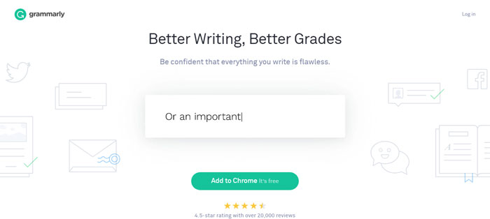
Grammarly
Grammarly is great site for a lot of reasons, some of which I’ve already discussed (long scrolling, functional minimalism, and animation). But the biggest reason is the use of flat design. Not just flat design, but design that fills up the entire screen. The laptop on their site uses flat design, which helps with load time and responsiveness for mobile devices.
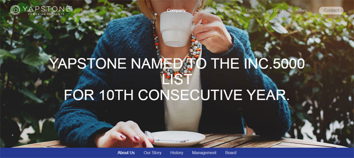
Yapstone
Why we love it: Captivating photography. Site is due to its screen-sized, beautiful photography. But it’s not just the content, it is how the photo was composed. It truly is incredible what quality photography can do for visits and conversions.
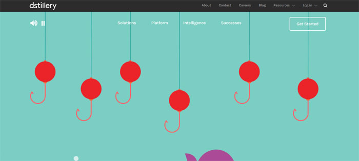
Dstillery
Why we love it: Long scrolling (to the next level) .It is a complete and total myth that users don’t scroll, and with mobile usage surpassing desktop, long-scrolling pages are one of the most popular design trends today. Long scrolling helps to increase the user experience on both desktop and mobile while giving the company a chance to tell a story, their story.
Pulse 220
Why we love it: Card layout. Popularized by the mobile movement, card layouts are a great way to concisely present content in an organized and user-friendly way. Pulse 220 uses the card layout a couple different ways: to present case studies and their team.
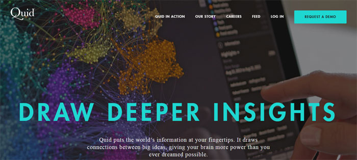
Quid
Why we love it: Functional minimalis. In 2015, we saw trend toward minimalism–in other words, using only the essential elements on-page. Minimalist design is particularly helpful in decreasing load time and increasing readability–in Quid’s case, it also helps you scan through the site and still leave with an understanding of their product.
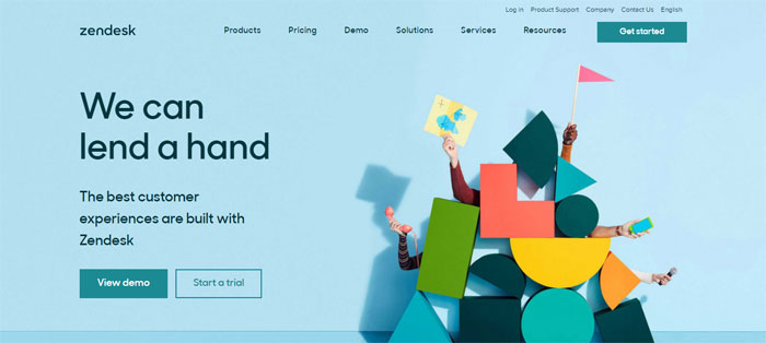
Zendesk
Why we love it: Advanced animation. Motion attracts attention and Zendesk has done a phenomenal job adding in subtle, yet advanced, animations across their site.
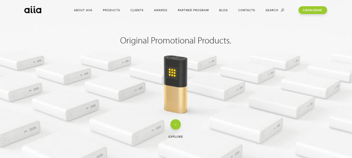
Aiia
Aiia offers branded promotional products for corporations. This website is excellent in showing that gadgets don’t have to be ordinary. The catalog is showcased right on the front page, each product accompanied by a short description prompted by a mouseover. When you click on a product, a full screen promo clip is triggered. It’s intuitive and informative!
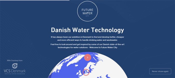
Future Water City
If you’ve ever played SimCity this website design will look familiar. FWC provides water infrastructure solutions. The site is basically an interactive map of a city block which explains how water circulation works. By following the stages of water flow, you are brought to individual landing pages that explain in a game like manner, each step of the process and how FWC solutions factor in.
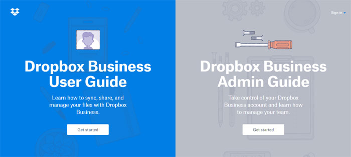
Dropbox Business User Guide
Dropbox is a well established brand. Their business user guide is set up as a separate B2B website. The website is a great example of a material design approach. It reads like an interactive book with screen turning animations and sections that are easily accessible from the table of contents. It’s incredibly interactive and user friendly. This is an excellent FAQ solution for a business service!
MUV Interactive
This website is designed to sell a product that’s used to control visuals during group presentations on various types of displays. When you first enter the site you encounter an animation that changes it’s view angle depending on your cursor.
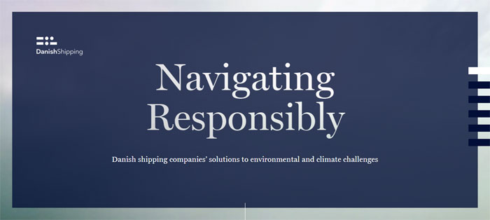
Danish Shipowners Association
DSA is an eco-friendly certification service for sea going vessels. This website offers a great use of illustration and animation telling visitors a story while revealing eco-data on ships that travel popular marine routes around the world. This site uses excellent design elements to bring users through 6 distinct “chapters.” It’s design is intriguing, yet tells their story well.
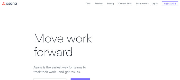
Asana
Asana’s site is excellent because it directs visitors exactly where they want them to go. It’s clean, simple to navigate and offers no distractions. Prominently displayed on their homepage is a giant call-to-action waiting to convert visitors into consumers of their products.
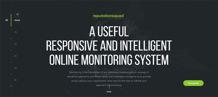
Reputation Squad
Reputation Squad is an online business monitoring solution for medium and large-scale companies. They use several mouse sensitive animations and while decorative, offer visitors a sense of control, which is exactly what you’d expect from a monitoring service.
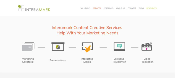
Interamark
It’s critical to show your user all the services you have as quickly and efficiently as you can, so users don’t have to scroll down the page searching for it. Interamark managed to do this by laying out icons and small headers with all their services above the fold so users know exactly what to expect as they scroll down to read more.
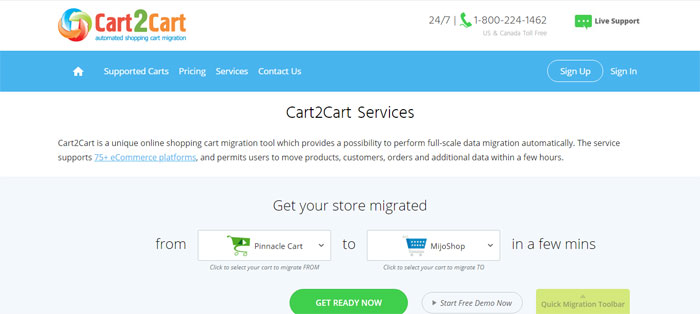
Cart2Cart
Before going into the variety of services they offer, Cart2Cart put a section which visually shows you what their software has the ability to do – migrate your store from one platform to another. This initial CTA gives users an exact idea of what they can expect and whether or not the store options they’re looking for are available.
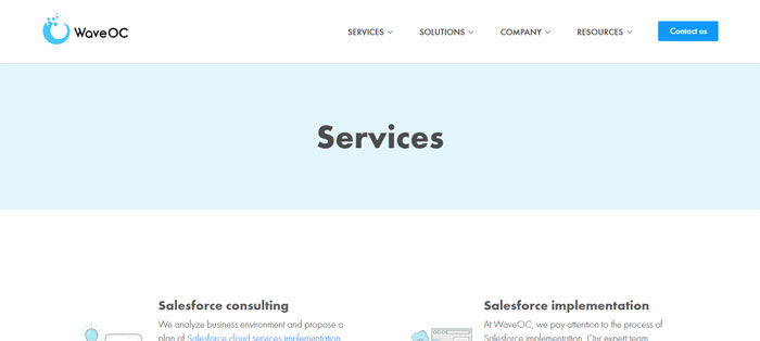
WaveOC
Unlike the previous two examples, WaveOC took a much more visual approach to their services page by adding in graphics for each service option to add context to each option, before you even start reading.
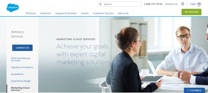
Salesforce Marketing Cloud
Salesforce Marketing Cloud services overview page does a clean job of showing their service categories without overwhelming the user with too much information.
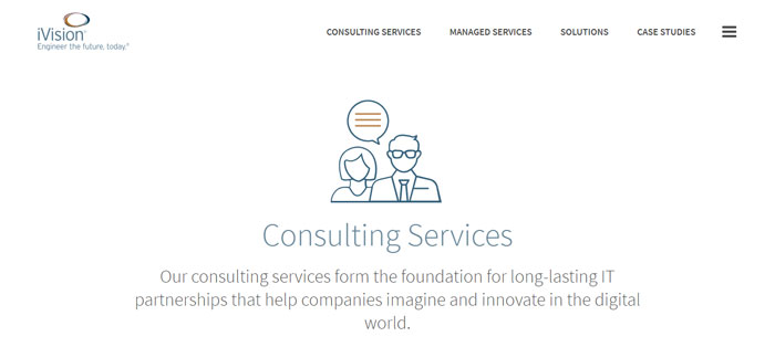
iVision
Sometimes you’ll find yourself overwhelmed with the amount of services you offer and you may struggle to know how to outline them for your users to understand. iVision knew exactly what to do when they were assembling their services.
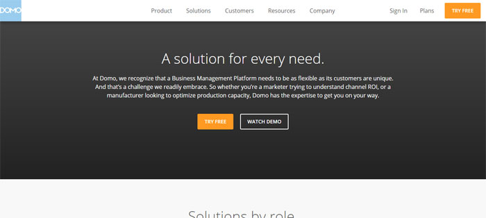
Domo
For some, your services page could be a great place to segment the visitors by their role, industry, platform, job title, etc. Domo did just that on its solutions page (which I still consider being a variation of a services page).
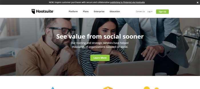
Hootsuite
Many of us talk about how our services can impact the present without acknowledging how they will continuously ensure your customer’s success in the future. Hootsuite made sure this strategy did not go missing on their services page.
Ending thoughts on a b2b websites company
B2B websites are well worth the effort to design well if your target audience is other businesses. The expectation re different than they are for other consumers, but these companies are very serious about finding the best use of their money.
If you enjoyed reading this article about b2b websites, you should read these as well:
- Awesome Websites: 31 Top Notch Designs To Check Out
- Top 30 Most Captivating Preloaders for Your Website
- A Guide To Usable Portfolio Websites For Digital Designers & Creatives
The post Creating B2B Websites: Tips and showcase of B2B website design appeared first on Design your way.
Source: https://ift.tt/2yv4IQP







No comments:
Post a Comment