Monochromatic colors and designs are extremely appealing to the eye. This is because of the several different shades, tones, and tints of a single hue of color. Monochromatic designs are both interesting, appealing, and successful in terms of a cohesive idea and design that will represent a brand in a positive light. Today, we will discover a list of monochromatic web designs found all over the internet today, for inspiration, and to prove that you don’t need every color under the sun to produce quality work.
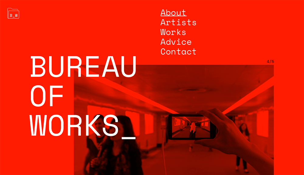
Bureau of Works
Bureau of Works uses multiple shades and hues of a bright color of red all over the website, allowing for white text to become highlighted, and the images that are included in the website to become recognizable as their brand. By using this technique, people will automatically associate the mix of red hues and simple, white text with the brand of Bureau of Works, which is exactly what you want when creating a monochromatic website: you want the audience to recognize the brand that you are developing a website for.
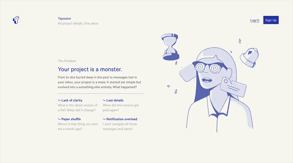
Tap Water
Tap Water‘s entire brand is centered around the idea of simplicity. Part of the services that they offer to the public have to do with organizing and simplifying your life in order to create a more relaxed and easy to navigate inbox and project details, ultimately improving your professional life. Knowing that simplicity is their target idea, their monochromatic web design fits in perfectly. By using light and some dark blue shades, along with highlighted blue texts, this web design is simple enough to convey the message that they will do their job of organizing and simplifying your life.
Orbit
Orbit is a service that offers technology in artificial intelligence, something that is on the rise, but not yet that many people can offer as a service. Their service specializes in language and the understanding and adapting to conversation, and along with their animated web banner, the entire website is comprised of deep purple shades and tones, allowing for an overall beautiful and interesting design that will leave emphasis on the white text, ultimately emphasizing their services and business ideas that will get to their audience in a flow of color and accuracy to their brand.
Blackbox
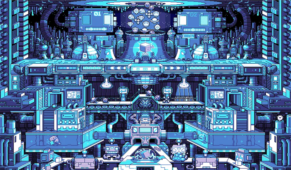
From the creators of Cards Against Humanity, Blackbox offers a service to creators to have a platform for selling things such as merchandise to their fans. Along with a very fun, cute and interesting animation at the forefront of their web design that is also monochromatic with blue shades and tones, the website also uses white space and blue text to emphasize their services. By having an interesting animated design when you first enter their website, I believe that this successfully conveys the message of their brand to the audience, all with monochromatic colors.
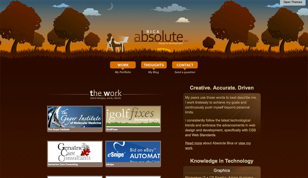
Absolute Bicca
By going for an orangey/burnt auburn monochromatic palette, Absolute Bicca is able to convey the idea that their calm, serene and professional web development site has just what you need. With a straight-forward portfolio of images showcasing the work they’ve done on the first page, Absolute Bicca uses the monochromatic palette to their advantage, which further emphasizes their work in their online portfolio.
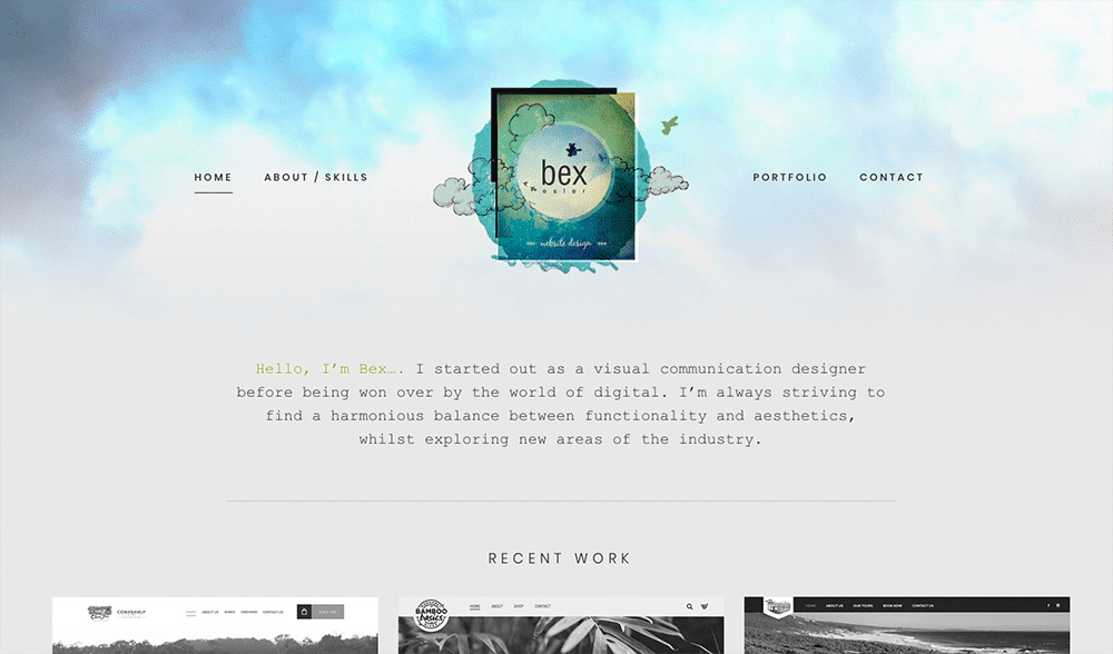
Bex Esler
Bex Esler is a web designer, who uses a unique design to showcase her online portfolio, and promote her services. Most of the website is in black and white, with a small amount of blue tones that begin to manifest in the clouds behind her logo, possibly translating to the idea that she will bring color and creativity to your visions of web design. An overall very interesting and not overwhelming design, this website is a minimalistic idea for a monochromatic web design.
The Invoice Machine
This website is what the basic monochrome web design usually entails. This is because it is variations of the color grey, varying to extremely dark shades such as black, to white. By using these colors, the design is able to convey the idea of professionalism, focus on the product or service, and a straight-forward approach to business, which is part of the brand.
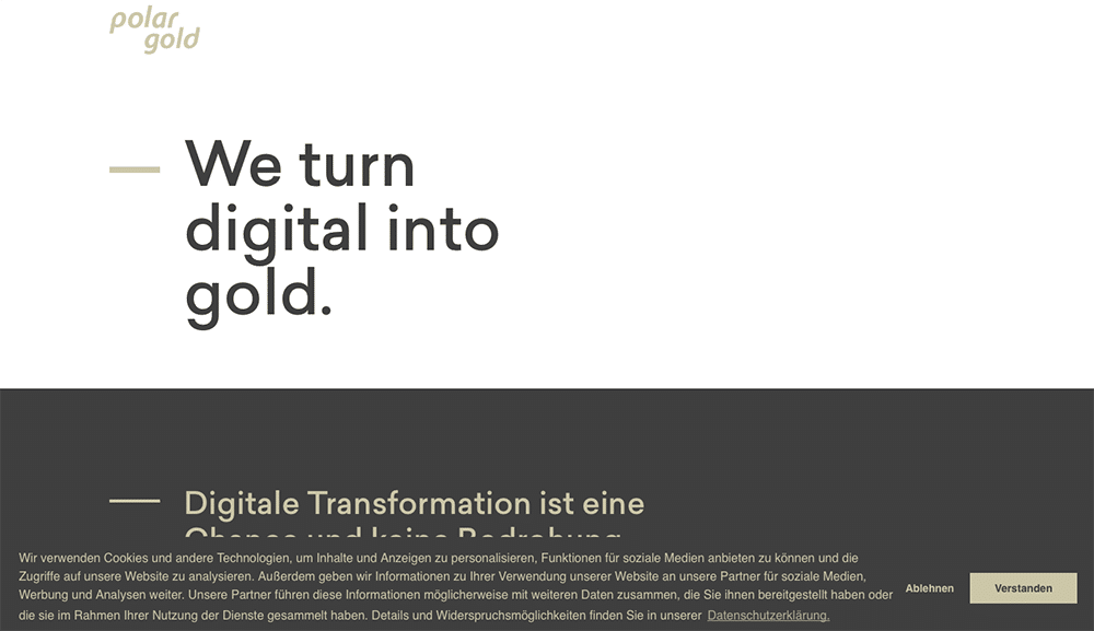
Polar Gold
Much like its’ name, Polar Gold uses various tones and shades of the color gold to promote their website. With their use of white space in order to emphasize their text, the overall web design is successful in its use of simplistic design so as to not overwhelm the users, as well as using a cohesive palette of colors to convey the idea of a well-rounded brand.
Urbanoff
Another portfolio website, this web design makes great use of grey monochrome tones, as well as an excellent use of white space in the design of the text, to bring attention to it, as well as not appearing too overpowering so as to allow the eyes to flow throughout the entire design as well.
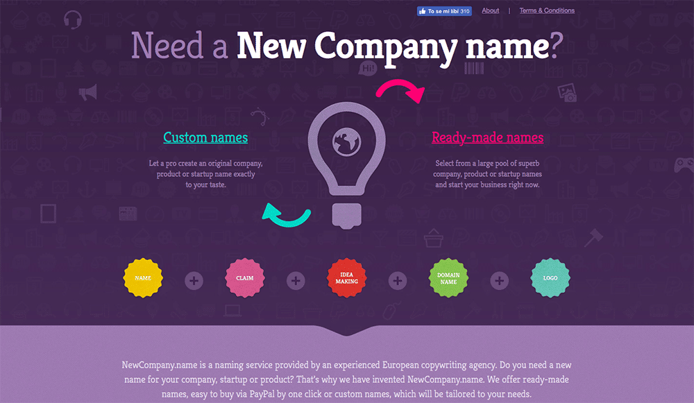
New Company Name
Although not entirely monochromatic with the exception of some colored buttons, New Company Name, along with their animated and fun web design that is purple monochrome shades, doesn’t beat around the bush in terms of letting their audience know what they are all about, which translates to their web design and use of colors.
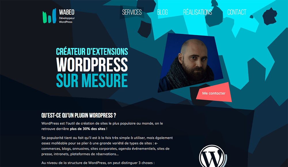
Wabeo
A creator for WordPress plugins has created an animated website design that is different shades of blue, and is a great example of the design in the background and the text colors working together to create a symbiosis between the designs. Along with additional animations that help bring life to this website design, Wabeo is a great example of a successful monochromatic website design.
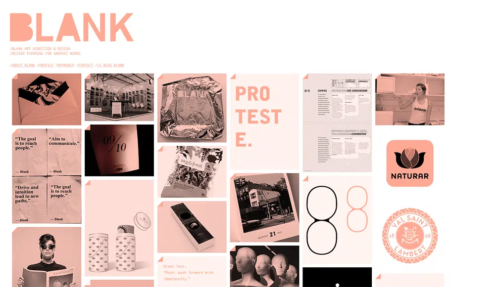
Blank
No, I didn’t leave that title blank, that is the name of the website. Blank offers some beautiful website designs, illustrated by the use of pink monochromatic colors and an engaging animated design that proves for a successful use of color, as well as design working together to become a successful website design overall.
Monochromatic colors can be beautiful and eye-catching all on their own, and if you thought that in order to be relevant when creating successful web designs meant that you must use every color of the rainbow, these designs would prove you wrong! Proven time and time again simplicity is key in web development and design.
The post 12 Monochromatic Web Designs That Inspire appeared first on Web Design Blog | Magazine for Designers.
via https://ift.tt/2QU7t3i




No comments:
Post a Comment