Graphic designers have a difficult job when it comes to creating things like logos and other designs for a person or company. They need to make sure that the design they create is exactly what their client wants, not to mention that it needs to be good. In order to know if a logo design is actually good, it needs to be tested out in the real world, by real people deciding if they love the design enough to give their business to that company or person. A good design for a logo features a unique design, great typography if needed, and an interesting color scheme. Today, we will go over some tips for creating eye-catching logo designs that will be sure to leave a lasting impression on both you and any potential client.
Be in tune with what your client wants
It can be hard to understand exactly what a person wants artistically when they don’t have the means to manifest their vision physically in its entirety. That’s where a graphic designer comes in. They need to see the clients’ vision, and be able to create that vision from possibly vague instructions. This is where it’s important to know what the clients’ brand identity is; understanding exactly what the brand is all about can help to have a better idea of where to start. Take the amazon logo as an example: it is entirely simple, yet the meaning is imperative for their brand. Amazon wanted to become the place for people to be able to shop for anything and everything that they needed, which is why there is a golden arrow that points from “a” to “z”. Simplicity is key, but so is being clever and unique when creating.
Color is imperative
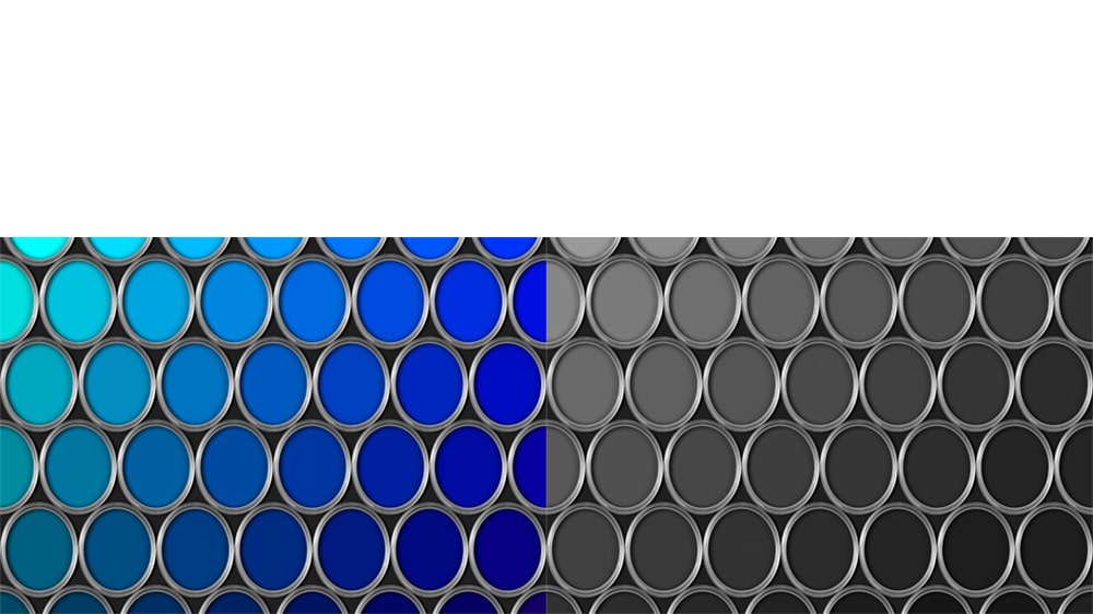
There’s a rule in graphic design when creating things such as logos, and it even applies to traditional art- start your design in black and white. Having the proper dark against light is important because it gives depth to your piece, whether its a painting on a canvas, or a digital logo. Color is supposed to be the last thing to incorporate into a design, yet some people make the mistake of starting with color. Don’t get too excited and slap on colors at first, because you will be setting yourself up for failure. The colors you chooses are important, too. Red can be considered angry or passionate, blue can mean sadness, and green can stand for life. What colors you choose are important and help to convey the message you want to send to the audience when they view the logo.
Unique ideas and designs will only benefit you-don’t use someone else’s ideas
A lot of logos nowadays have the same design. This means that designers look at other logos, and create another logo in the same light. This is where they fail. Come up with your own ideas, your own designs, and especially, create your own typography. Using ready made text from Photoshop won’t make your logo unique in any way. Use your head, jot down ideas, and create something that has never been seen before-you will be glad you did. It’s frowned upon and doesn’t leave you with any credibility if you create a logo that looks exactly like someone else’s, it will actually only hurt you, and you will possibly never get another design job again. Artists take things like this seriously, because it was originally their idea, and someone is making money off of their hard work. So be unique, and you will get more jobs, and create great designs!
Simplicity is key
The more simple your design, the more recognizable and easy to understand it is. Sometimes, all you will get is a glance at your logo from the general public. But if your design is simple yet interesting, settle yet memorable, the better the chance you have at having created a successful logo. If there is a lot going on in a logo, such as bright colors, a lot of heavy text, and designs all packed into one logo, that logo is going to be ten times less memorable than a logo that uses simplicity to its’ advantage. Think about things like McDonald’s Golden Arches. Their logo is incessantly recognized in the blink of an eye all over the world, but it is also one of the most simple designs out there today.
Take the time to draw out several ideas before you open a new Photoshop file
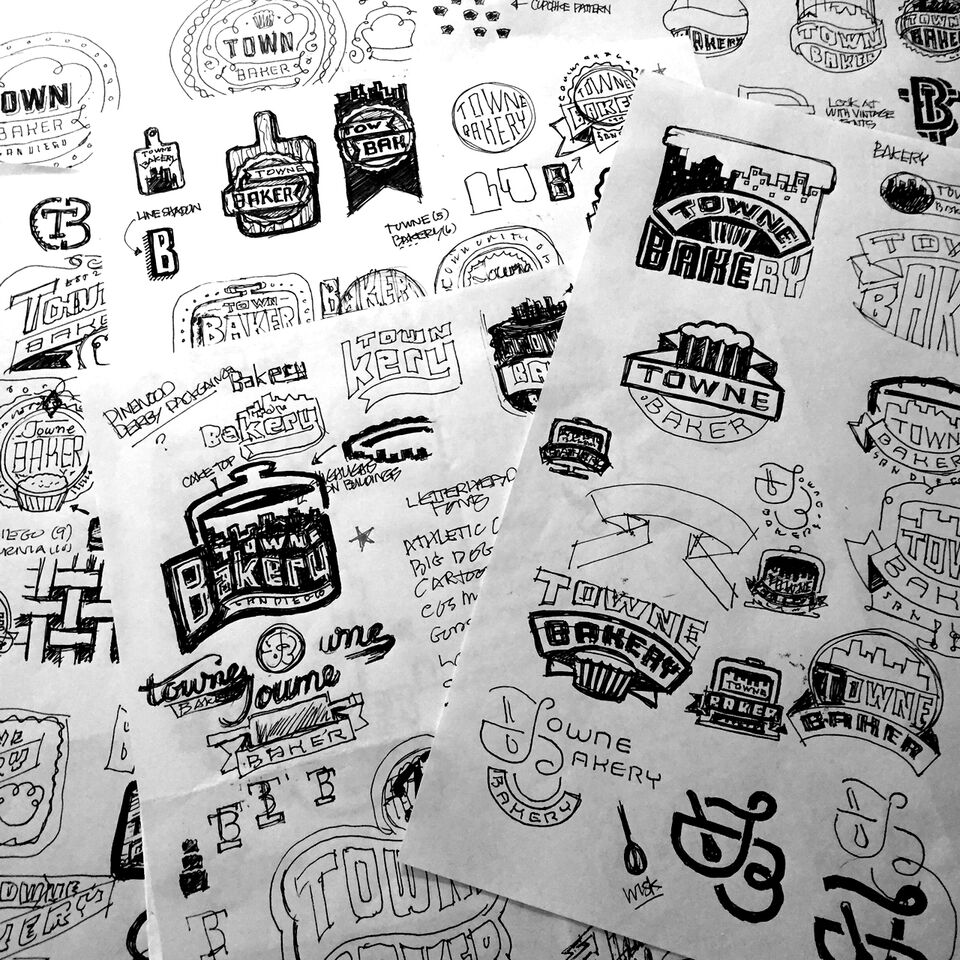
It’s in any designer’s best interest to take a pencil and paper and jot down ideas before deciding to start a design on Photoshop with no real concrete idea in mind. You can draw 10 mock up logos, and decide that you only want one part from two of those mock ups to be used in the final product. Also, you can use those rejected mock ups for future projects, where the design may be more usable. Either way, most people think that designers have an easy job, just creating logos and marketing designs, but a lot of care and time goes into them. From the initial idea,to learning and researching about the brand to understand exactly what it’s about, to drawing out pages and pages of designs, to finally deciding on one and fleshing it out digitally, possibly creating a unique typography, to finally adding the color, it takes a lot of work ethic, time, and attention to detail. Being a designer isn’t the easiest job in the world, and by using these tips to tweak your logo making process, you can create successful logos that will be viewed by the masses.
The post Tips for Creating Eye-Catching Logo Designs appeared first on Web Design Blog | Magazine for Designers.
via https://ift.tt/2NzwHoI


No comments:
Post a Comment