Design is everywhere. It’s in your room, your house, the streets, billboards, stores, even your car. It’s no surprise that a gargantuan amount of the design industry is all over book stores. Book cover designs can range from illustrations, to digitally created designs, all of which are important for the author or publishing agency’s brand. When any author releases a series of books, it’s imperative that the design on the book cover is interesting, unique, and will get picked up and bought when the beautiful design on the cover and the ideas and stories in the pages of the book work together to ultimately sell as many books as possible. Today, we will discover 15 brand-tastic book cover designs, and realize why they work and are successful.
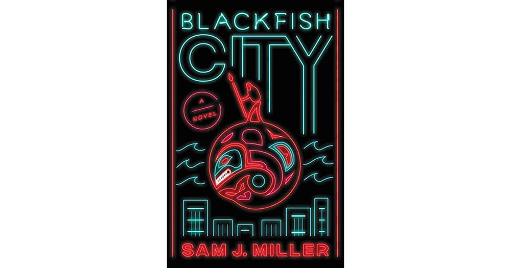
Blackfish City
Sam J. Miller is an author that wrote an entrancing sci-fi story about a woman in a fictional future society in which the sea-levels have risen, emphasizing what our future may look like due to how the environment is being treated presently- and this amazing story needed an equally amazing and eye-catching book cover to match. The perfect symbiosis between the beautiful neon sign inspired design, and the amazingly unique and fast-action story is sure to get any reader excited to purchase and read this book.
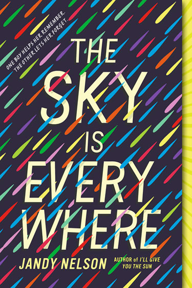
The Sky is Everywhere
Jandy Nelson wrote a book about a young teen girl who is simultaneously dealing with the death of her more outgoing and popular sister, and new romances in which she’s never dealt with before. The cover design is both fun, colorful, and works together with typography, using lighter colors to emphasize the text, while also placing the colors both in front of and behind the text in order to give a sense of chaos, which is translated in the overall story of the book, and the design of the cover.
Everything Leads To You
This book cover design is interesting because it utilizes typography as it’s front runner. With text that pretty much takes up the entirety of the space, it creates an interesting design that keeps your eyes flowing throughout the entire cover, working with the main image which is a photograph of a woman with her back turned, and a white opaque frame on the image that allows for even further emphasis on the text. Sometimes manipulating typography can work to your advantage when creating a design such as this.
Making the Climb
With a straight-forward design, this book that is about a man climbing a mountain called Mt. Kilimanjaro, a more simplistic design utilizing white space to its advantage is imperative.
Space Opera
This book cover has another interesting spin on incorporating neon sign designs for the typography, which in turn stand out against most other books, making sure anyone is intrigued and wants to pick this book up to see what it’s about. This is why design is so important, because the better, more unique, and eye-catching your design is, the more sales you will make, eventually creating a successful design business.
Walkaway
Using a brightly colored background, this design uses the juxtaposition of the white and black colors of the text and main design to draw attention, while keeping a simplistic, minimalist like design.
Area X/Borne
Both of these designs are book covers for stories written by Jeff VanderMeer, a brilliant mind who was the inspiration for the movie Annihilation. I am including two of his book covers, due to the fact that they are awesome. Area X uses a juxtaposition of life from leaves of a tree, slashes through with one thick, red line, creating an X. Borne utilizes a beautiful, unsettling, and colorful design of a mutated plant that is featured in the book that is both unique in nature, as well as eye-catching for anyone passing by it in the book store. These amazing designs paired with these intense sci-fi stories, there is no way you can’t pick it up!
Do Androids Dream of Electric Sheep?
I stopped at this book cover to look at it, and realized that was part of the design. They created an unsettling, yet beautifully created book design that will leave you wanting more. By using soft white text that is spread out over the cover, with a blurred image of a white, emotionless face meant to look like a robot, it feels as if when you focus on the face in the background, the text in front blurs, and vice versa. This design pairs perfectly with the content of the story behind the book cover.
The Time Machine
A story written by H.G. Wells has an interesting, yet simple design for its’ book cover. Using a sort of illusion of depth, this design seems closer at the left edge, and spirals into a bright light that has an illuminating effect, due to the dark background and colors on the cover. This design, matched with the amazing writing of H.G Wells, makes for a great symbiosis.
The Art of Poetry
This book cover is the exception when it comes to “loud book covers are better”. Poetry can be a beautiful collection of words, and I believe that this is paired with the serene design on the cover. Making you feel calm, at home, and relaxed, anyone can pick this book up and believe that the design on the cover will mirror the content inside.
Against Happiness
This brilliant book cover design is extremely simple, yet so clever and interesting. With a bright yellow background that is sure to call for attention, the text included on the cover is in the shape of a sad face, in sync with the title of the book.
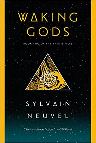
Waking Gods
This book cover caught my eye, and that is because of the great typography, and the design of the illustration featured. Part of a series of books with similar designs, the bright yellow of the text and illustrations go well with the gradient of dark blues that represent a night sky in the background, making for an overall interesting cover design that feels cohesive in nature.
Vengeful
This brilliant book cover utilizes the “V” in vengeful for the design, and in turn creates an eerie design using black and red colors, which feed into the sinister content of the book itself.
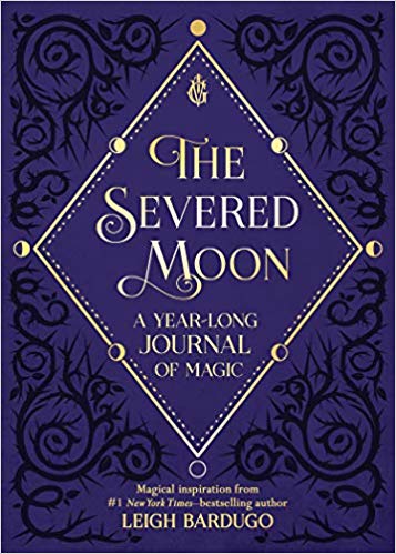
The Severed Moon
This book, obviously about witches and magic, is able to use these qualities to create a design that uses ideas from magic, such as the phases of the moon, the typography, and the colors, and in turn a fantastic book cover is created, that will draw the attention of book lovers who drool over stories like this.
The post 15 Brand-tastic Book Cover Designs appeared first on Web Design Blog | Magazine for Designers.
via https://ift.tt/2pqNcWF








No comments:
Post a Comment