Every website must aim to provide a rewarding site experience so that the users are compelled to engage with it. Along with website engagement, the conversion rate of your website is significant in growing your business. An effective strategy is to improve the design of your website. According to research, 46.1% of people decide the credibility of a company based on the website’s design. So, here are some useful tips for designing websites for striking a conversation and fueling conversion.
1. Create an attractive website:
Visually appealing websites attract more user engagement. So, you should make your website appear symmetrical, organized, and aesthetically pleasing. According to the adobe, 38% of people lose their interest if the website has unattractive content or layout. So, the structure of your website should be logical, content should be easy to absorb, and its purpose should be obvious.
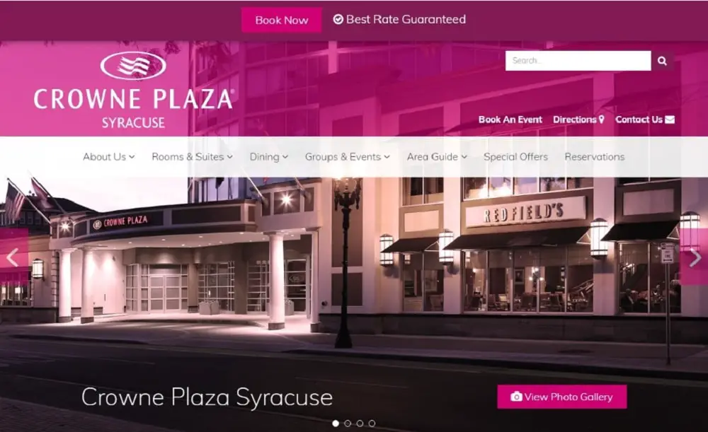
To design a website for high engagement, first establish a visual hierarchy. A visual hierarchy will determine the relative importance of elements on your page to users. People tend to focus on bolder and larger page elements. You can add white space to make certain elements stand out. White spaces also help users move between ideas smoothly. A cluttered page leads to visual fatigue because users get confused where one idea ends and others begin. Also, try to use visual focus as it attracts the attention of people. Images work well in drawing people’s attention to a page. However, always remember to choose visual elements that go well with your text and enhance the message of your website.
2. Give your users some context:
Storytelling allows you to create an emotive experience for your website. Most of the brands only discuss the benefits and features of their services or products. However, you can stand out by providing your audience with memorable interactions. For compelling storytelling, you should avoid stocking up several images and only use the ones that portray your business authentically.
Today people prefer to watch videos instead of reading, so give them what they want. A welcome video is a great idea to introduce your brand properly to newcomers. On the other hand, explainer videos provide more insight information about your service or product.
One more way to integrate interactions on your website is by using graphics. Data visualizations, charts, and graphs are essential for demonstrating your credibility and supporting your value proposition. According to Nielsen Norman, info-graphics are liked and shared by people 3 times more than any content. The last thing to remember while telling a story is the text you have on your website. So, while writing content, you should always compliment the storytelling and guide the users properly through your site. You should also include relevant keywords in your subheading and heading to signify the relevance of your web content.
3. Make your site responsive:
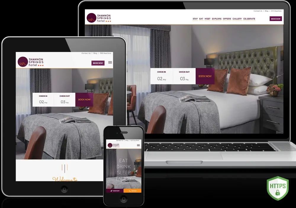
The mobile experience of your website is just as valuable as the desktop experience. According to statistics, mobile users account for 51.2% of total global internet traffic. Brands that have mobile responsive websites experience more engagement and increased SEO rank. On the other hand, brands with poor mobile websites see a significant fall in engagement and SEO rank. It is seen that users don’t return if they have to battle with overlapping page elements, pinch and zoom, and endure large blocks of text. Similarly, search engines are characterizing these sites as not mobile-friendly. A mobile responsive website design minimizes the frustrating elements that destroy the user experience.
You can make your site mobile friendly and responsive by adjusting the button sizes to be actionable and legible on smaller devices along with minimizing the text with bullets to emphasis on the user-benefits. You can also simplify your web page by increasing the negative space, using minimalistic images and cutting out unnecessary elements. Also, offering a navigation bar on all the pages is a great idea to streamline access to key content. You can even make these changes using free WordPress plugins that are specially designed to make your site mobile responsive. After you have made your site mobile responsive, it is suggested to take a mobile-friendly test to find out the mobile responsiveness of your website.
4. Increase the speed of your website:
Having a mobile responsive website isn’t enough. You should also consider making your site faster for increasing engagement on your website, site rank, and conversions. If your page loads slower than competitors, you will experience a fall in engagement. According to a survey conducted by Google, 53% of people lose interest if the loading time of a mobile web page is more than 3 seconds. Likewise, 47% of people expect a web page on the desktop to load within 2 seconds. So, the bounce rate increases with the decline in page-load speed. A mere 1-second delay in load time results in a 7% reduction in conversions.
You can increase your website’s speed by compressing images, minimizing HTTP requests, enabling browser caching, and reducing the server response time. There are great plugins available for optimizing images on your WordPress website. It is also a great idea to remove unnecessary resources, reduce the number of plugins, eliminate or reduce redirects, optimize all the images, and reduce file size with gzip compression. For furthering speeding up the load time, you can add managed hosting and SSD and change the position of CSS and JS on your web page. In addition to this make sure to check the speed after making these changes.
5. Use Hick’s Law:
Hick’s law is beneficial for web designing. It states that the time taken by an individual to make a decision is proportional to the possible choices he or she has. In simple words, if you increase the number of choices, the decision time will increase as well. According to a famous study, only 10% of people were interested in a table with 24 flavors of jam as compared to a table with 6 flavors of jam.
In web designing, you can use this law to boost your conversions by restricting the number of choices given to the user. You should first eliminate the navigation bar on your website. This is because a higher number of links kill the excellent user experience of your website. However, only removing the navigation bar won’t help. You should also consider removing other unnecessary choices like a product review, sharing a blog post on five different platforms, posting a comment, displaying more relevant products, and more.
The best way to solve this problem is by using a full-screen welcome page on your website. A welcome gate will cover the entire screen, limiting the choice available to the users when they first enter your website. This will minimize distractions while maintaining the functionality of your homepage. If the users want to access more options, they can simply scroll. Hence, make a note to design every page with an objective and stick to it.
6. Add appropriate negative space:
In terms of web design, negative space refers to white space (empty space). While positive space is where all the essential elements are present on your website. Regardless of the name, negative space is very significant in web design as it makes your content readable and usable. Negative space does not only refer to significant elements like space between header and content or space between sidebar and content. It also includes small elements like space between lines of text, paragraphs, or letters. So always pay attention to both forms of negative spaces to make your site legible and easy to read, ultimately increasing conversions.
To increase the negative space on your web page, you should consider factors like font size, line-height, paragraph length, and more. So if you are using a small font, you need to add more space between the letters to make the text readable. Also, remember to set your line-height 150% of the font size. In simple words, smaller the font, higher the line-height. One more trick you could use to add negative space is to try to break a large paragraph into a few smaller paragraphs. You should also add some space between the larger elements like header, body, footer, sidebar, etc.
7. Follow the Rule of Thirds:
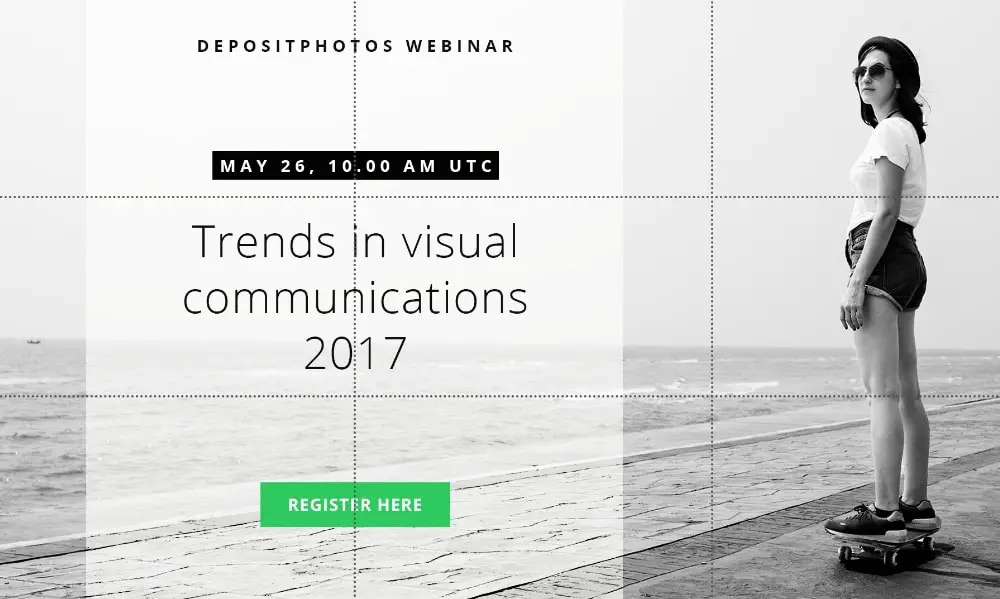
This rule is a famous photography principle that can be used for web designing. According to the rule of thirds, you should visually divide the website page (image) vertically and horizontally into 9 equal squares. As per this rule, strategically the four intersections in the middle are places of interest. Elements create the most impact when they are kept on these points. In web designing, you should place the most significant elements at these intersections to get them noticed by people, boosting your conversions.
Popular web developers place elements like the start button, hero image, and call to action button on 4 four middle intersection points. Also, they never place their navigation bar on these intersection points. This helps the visitors stay focused on the main call to action. Furthermore, using this rule is not necessary. However, it does help you place essential elements in the right place. One simple way to use Rule of Thirds on your web page is by capturing a screenshot of your web page (just your header section or above the fold as no one looks at the entire length of the page initially), and dividing it in 9 equal squares to get a more practical picture.
8. Use colors smartly:
According to designer TOM Kenny, color is the most underrated aspect of web design. However, it can play a significant role in conveying the meaning of the band, the overall mood of the website, and increase its usability. Different color combinations can induce different reactions and emotions. So, while deciding a color combination for your website design, make sure you opt for a combination that displays the emotion that you want to convey through your brand. One easy way to do this is by creating a Pinterest board with images that you think match your brand’s vision. Then you can upload these images on Adobe’s color wheel to get a color scheme that is created automatically based on the uploaded photos. You can play around with different shades to figure out what works for you.
Once you have your color scheme in place, the next thing to consider is contrast. Using proper contrasting color can highlight your headline, call to action button, navigation bar, and text. In simple words, your button and font colors must be in high contrast with the background. Also, the elements you want to highlight must be in a color that is attention-grabbing but not in stark contrast. You should check the color wheel to figure out proper contrasts for each color. The colors opposite to each other are perfect contrasting combinations that people acknowledge.
9. Use High-Quality Images:
One thing that can drag down the user experience of your website is low-quality images. It doesn’t matter how amazing your article, if you don’t use good quality images in your designs, no one will look at your content. Quality of images can make or break your website. Bright local conducted a study and found out that 60% of people are more interested in the search results that include images. Also, another 23% are more attracted to a business that showcases an image. According to another study conducted by Skyword, it was found that content, including compelling images, get an average of 94% more views.
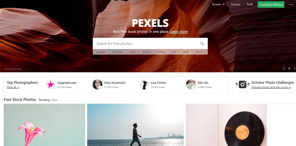
So, you should avoid using irrelevant, lifeless stock photos and use high-quality photos that feel personal and develop a positive association with your content. Most people are attracted to brands that feel familiar. Hence change the images on your web page that appear stuffy or corporate. You can source high quality and personal images for free from Death to Stock, Unsplash, StockSnap, Little Visuals, Pexels, Gratisography, Picjumbo, and Superfamous Studios.
Design your website in a manner that all your users have a intuitive and fluid experience. This will ensure that they have a great experience on your website. They will stay longer and interact with more pages and this will also increase your chances of getting more engagement and growing conversions.
The post 9 Tips to Design Websites for Striking a Conversation and Fueling Conversion appeared first on Web Design Blog | Magazine for Designers.
via https://ift.tt/2ybKzwo


No comments:
Post a Comment