It is rightly said that colors speak louder than words. The visual stimuli very finely guide human beings around them, and it makes a larger impact over them compared to any other aspect. Selecting the perfect color combinations for a website is an integral part of the entire branding process. Usually, people consider it as an aesthetic decision. But in a real sense, colors have a direct relation with various emotions of customers or target audience. Hence everything we do is guided by visual stimuli.
Creating an appropriate color palette for your website will allow provide it a professional look. You will be able to attract more visitors to your website. Once on the website, a consistent and effective color palette combined with compelling content, will keep your users on the web page for a longer period of time.
Here you will get a quick hands-on guide to create the perfect color palette to design your website.
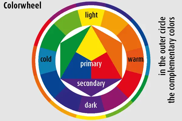
The Famous Color Wheel:
Just remember the famous color wheel that you learned when you were in school. Yes, it will form the base of your color selection exercise.

As you can see in the above wheel here are the various color combinations that you can choose:
1. Warm colors like yellow
2. Cool colors like blue
3. Complementary colors which are exactly opposite to each other forming a contrast i.e. yellow and purple
4. Analogous colors like yellow and red that are just near to each other.
Hence combining various colors from this wheel will result in a newer combination, which will help you decide upon a good color scheme. Color theory is nothing but art or an eye to match and combine various color combinations to come out with the best design.
Color Psychology and Brand Value:
It is magical but authentic that how the various colors in our lives influence the underlying emotions of humans and instigate them to take actions based on it. If your color palette is correct, it can motivate your customers to form certain connections and associations with your brand. Hence the color scheme of the website that you will decide upon should be such that customers can build a long term relationship with it. The color scheme of the website should highlight your brand ethics beautifully, value system and corporate identity. For example, if a company displays ethics of peace and truthfulness to customers, it can use more of white color. Or if a company is into kids products colors like baby pink and light blue can be used, that can display cool and soft feelings.
Target Audience or Demographics:
Whom are you catering to? Who will use your products or services? What is their age group? What is their gender? What are their preferences? Well, there are certain aspects or parameters of demographics that should be taken into consideration while creating your color palette. For instance, if you are a men’s garments brand, your websites can be darker, or navy blue color as men will prefer this color over any other. Alternately, if your brand is a cosmetics brand, you may choose hues of pink or purple or orange as it’s a whole girl thing and girls prefer such cool funky colors. If your brand is an insurance company, choose warm colors as the target audience will be of the senior age in the majority.
Brand Recognition:
Research suggests, “Color increases brand recognition by 80 percent.” It is human tendency to associate brands with their colors.

We all relate the famous brand of McDonald’s with its colors, i.e. red and yellow. Now, what if the company changes its color combinations to some other color? Will we remember it or will we only remember the previous color?
Hence create a strong color combination of your logo or your website so that customers can associate and recognize your brand with those colors.
Color Affects Emotions:
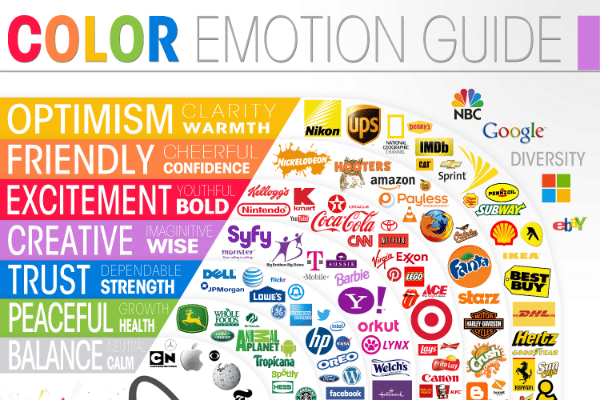
Humans experience different emotions with different colors. It will become easier for brands to connect with their customer if they understand the emotions behind their purchase behavior. Similarly, the color palette that you will form for your website should consider the emotional values of customers. For example, if you are a financial company you would be portraying values like trust and authenticity; hence you can make use of colors like blue or red, little darker colors to show confidence. On the contrary, if you are a salon, customers would love to see colors like white, light pink or other cool pastel colors as they will connect it with luxury and relation. An organic company will use colors like green to display its brand purpose. Following diagram shows various brands who used the emotional parameter to choose their color palette:

Let go of Biases:
Do not think or consider your preferences while choosing colors. Do not select those colors that are your favorites. You may like the color purple, but if you are a men’s brand, then it may not be a wise idea to go for that color.
The 60-30-10 Rule:
Use this rule and you will be able to choose a perfect color palette for your website:
• 60 percent of a dominant color
• 30 percent of a secondary color
• 10 percent of an accent color
Breaking color combinations in this way will create a good harmony and color balance in your website and also will it highlight what is important.
Hence you don’t need to be a famous artist to choose the right color palette for your website. Just keep in mind the color wheel, the ratio rule and the psychology and emotions behind each color and you will be on the right path. Keep in mind your audience and your brand values and then see how beautifully you can come up with a perfect color scheme for your website. Creating a perfect color palette will help you increase your website users and improve conversions. If you are having trouble getting started, try out these color palette generators.
The post Creating the Perfect Color Palette for a Website appeared first on Line25.
Source: https://ift.tt/328AsWO

No comments:
Post a Comment