Comic Sans has established itself as a font that is often misused by casual designers and has thus gained a negative reputation sometimes. But under the right conditions, it can be a very functional and useful font. In some cases, it is even used in an ironic way or in a way that it looks harsh. In this article, we will find what the best fonts similar to Comic Sans are.
First designed in 1994 by Vincent Connare, the sans-serif font was made for Microsoft. It was used in the library for Microsoft’s software, and has been an instant hit. Its primary use, or the primary way it was intended to be used was in comics and in cartoons, and it would often appear in speech bubbles.
But why is Comic Sans so revered and popular, despite wearing a negative tag at times? That is primarily because it is so often used (and misused), and it receives negative attention. But casual designers and amateurs absolutely adore it, because it looks like a fun font that can add some friendly character to the project. Many people even want to eradicate it, and campaigns were even formed to do so.
But the font continues to thrive, and it is still a fun and casual font that can be appropriate, although in minimal uses. Here are some of the best fonts similar to Comic Sans that you can use in fun projects.
Fonts Similar to Comic Sans
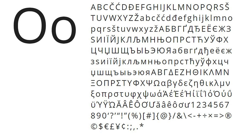
Open Sans
The friendliness and neutrality of the Open Sans font is something that makes it a very popular choice. It was designed by Steve Matteson, who is the type director of Ascender Corp. Open Sans was and remained one of the more popular fonts that have been used as an alternative font, or on its own. The greatest thing about it is that it has five weights to choose from and the italic versions. It can be an alternative for Comic Sans.
National First Font
The National First font is one of the best fonts similar to Comic Sans.
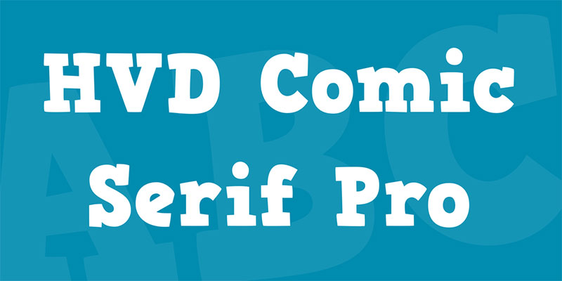
HVD Comic Serif
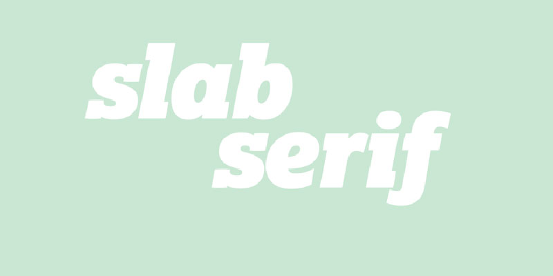
The HVD Comic Serif has a very easy-going character. It was created as a fun font, and it can be used as an alternative to Comic Sans. The two fonts have a lot in common, most notably their character and the whole vibe around both of the fonts. The slab serif letters are designed to make you relax and to have fun.
It is quite a strong and heavy font, but it does share plenty of similarities with the Comic Sans font. The x-height of the font is slightly above the median, which makes it appear quite heavy.
DK Au Revoir
This font is certainly full of character. It is a handwritten font that does have a fun character, but can sometimes have a very serious attitude. It includes all the important characters and symbols that are needed for many languages. This font is certainly at its best at larger sizes, especially with sizes above 24 pixels.
Lato
This font from 2010 was designed by a Polish designer. But it has since exceeded all expectations and has become one of the essential fonts to have in your library. It has semi-rounded details and letters, which gives it a warm feeling, and also it gives feelings of stability and trustworthiness.
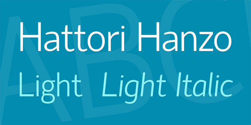
Hattori Hanzo Light Italic
This light italic font is also a great alternative for the Comic Sans font.
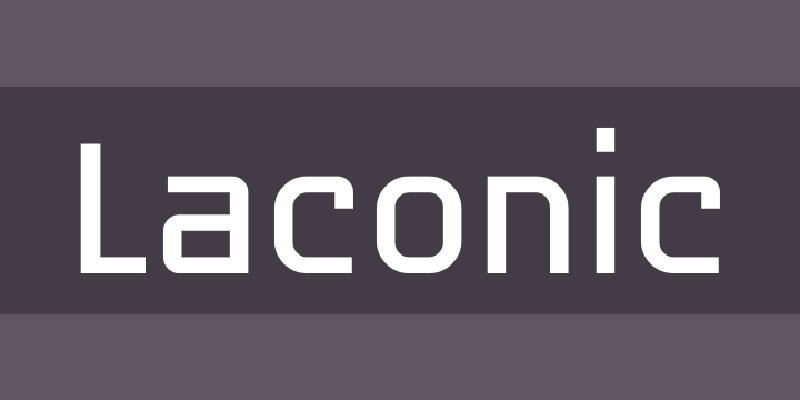
Laconic
This font features the preciseness of an old-style typewriter font with the elegance of modern sans-serifs. This combined makes for a great font with proportional glyphs and exquisite precision.
The great thing is that you get all the weights included in the download. These weights are light, regular, bold and shadow. You can use and combine these weights to create something unique and lightweight, but also very modern.
FF Layout
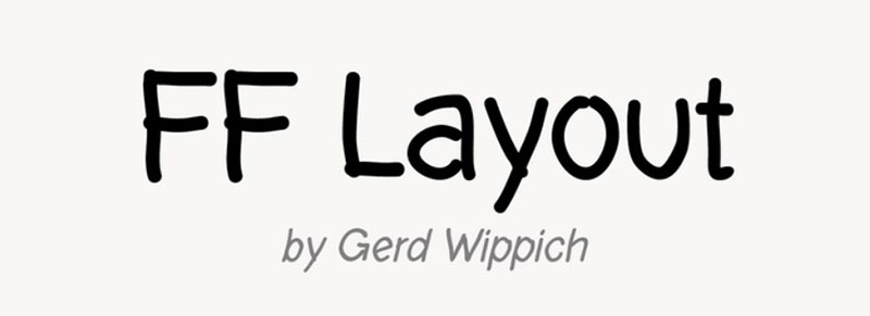
1996 was the year that this font was created. GerdWippich designed this font as a more fun font that can also be used as an alternative to Comic Sans. It is certainly best utilized in more festive projects and with a more fun connotation, rather than more serious projects. It has seven various weights that range from light to bold.
Varela Round
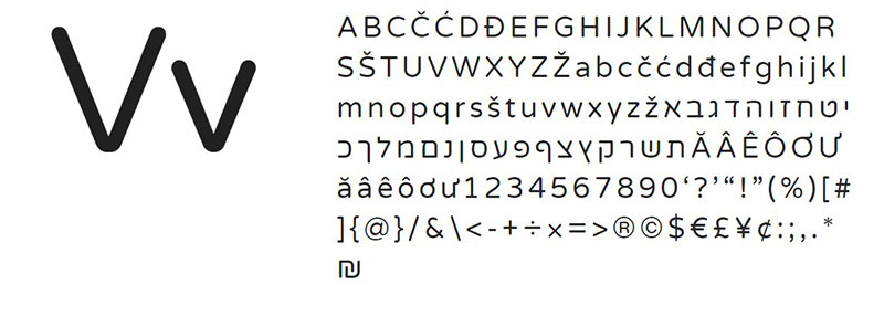
This is the rounded version of the Varela font, which is already a well-known font itself. It has rounded corners and smooth edges, which makes it a good versatile font, as it can work in various sizes. While it is at its strongest for headlines, it is certainly also very useful for printed projects. It has one weight, but that weight is made in such a way that it can be freely used in various different ways. It can work as a headline as well as body text, making it a great alternative for Comic Sans.
Ubuntu
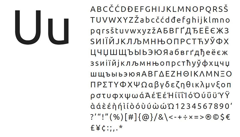
Named after the Linux platform, the Ubuntu font was made with that platform in mind, but it certainly shares some similarities with the Comic Sans font.
COMIC NEUE
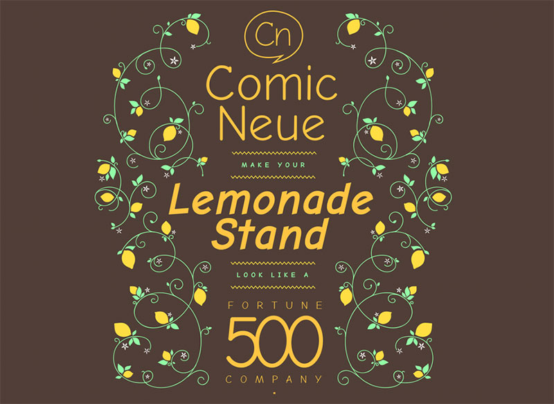
The name of this font suggests a similarity to the Comic Sans font. That is because it actually is quite similar to it, but it has a more modern twist to it, incorporating some of the more modern features. That certainly makes it more appropriate to use in projects, as you can avoid using Comic Sans which can bring onslaught from other designers, and use this font instead.
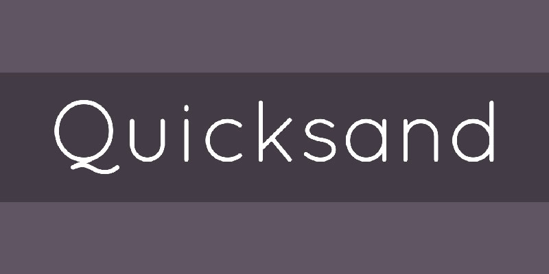
Quicksand
This font is a display sans-serif font that was designed by Andrew Paglinawan as a font that can be used primarily for display and headings. It has three weights, and the font is heavily influenced also by some geometric sans-serifs that were popular in the early 20th century, especially in the 20s and the 30s. But this font largely improved the features of those fonts, as it has much better legibility and much clearer conveys the text. You can also combine it with another font for better effect.
Asap
Asap is a good alternative for Comic Sans. The name of the font means “as soon as possible”, and it was created by Pablo Cosgaya in the hope of creating a font with the same glyph width for each and every style, making it a good font to use in various styles without the need of reworking. There are two weights with corresponding italics, which is not a lot, but certainly enough, especially for creating headlines and subheadings. Pairing it with another font makes sense.
Suplexmentary Comic
Featuring a much wider design than Comic Sans, this font is a good alternative to the original, but it is still one of the better fonts similar to Comic Sans.
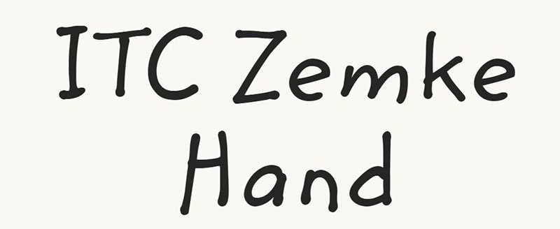
Zemke Hand
The creator of the font, Deborah Zemke, based this font on her own handwriting, managing to create a very fun and cheerful font. This font is fantastic for being used in various comics and children’s stories, because of its fun character.
Lexia
The versatility of this slab-serif is unbeaten on this list. It is one of the more versatile fonts similar to Comic Sans, and that is because of its extended library of weights that you can use. Not only that, but the Lexia font tends to focus on details a lot, which brings a very warm feel to it. That makes it one of the best fonts similar to Comic Sans, and it can be utilized in many ways.
Albus & Friends
This font is great for dialogue-based stories, as you can add talk bubbles and clouds.
MVB Calliope
Last but not least is the MVB Calliope font, which is a good font to use as an alternative to Comic Sans as it creates a perfectly-flowing rhythm.
If you enjoyed reading this article about fonts similar to Comic Sans, you should read these as well:
- Fonts similar to Helvetica (Awesome alternatives to use)
- The 50 best free fonts on Font Squirrel you must have
- The Amazon font. What font does Amazon use?
The post Fonts similar to Comic Sans that you can use in fun projects appeared first on Design your way.
Source: https://ift.tt/3cfX1Om







No comments:
Post a Comment