Any logo that you see represents the unique way a company is introducing itself. Many of the ones we see are actually part of different cultures. They can be shown in different parts of the world and people are going to associate them with a certain brand.
Adobe Systems is an example of a company that has been the leading developer of creative programs. The Photoshop logo shows the app they created. This one helps many users edit their digital images and we think that you heard of it until now.
Let’s explore how this company built some of the best editing programs together with the history of its Photoshop logo.
How did the app get its logo?
![]()
First of all, Adobe Photoshop is an image editing software that was created for photographers and designers. It is part of the Adobe Creative Cloud services and it allows its users to design websites, mobile apps and many more.
On top of that, it is also a powerful tool for photography. It helps you enhance pictures and look them professional. Some designers also prefer it because you can create 3d artworks in it easily. It offers great tools that can be learned with practice. Because of the powerful use, it has many consider it the best program you can get when it comes to editing.
What is the history of the app and Photoshop logo?
This program was actually created by two brothers, Thomas and John Knoll. They had two passions technology and art. Their father inspired them because he was a photographer most of the time. But when you visited his basement you would discover early home computers.
Thomas was more passionate about photography and he was learning a lot about this domain. John was more focused on technology and he worked with his Apple II computer.
When their dad bought the first Mac model, they were both impressed by what it could do. Funny enough, the flaws that this model had are the reasons behind this popular application that is on almost on any computer today.
Until we reach the Photoshop logo and its details the Adobe logo also needs a mention. The company changed its main logo only once. The designer that made it was Marva Warnock and she was the wife of the cofounder. It consisted in Adobe being written with caps on a gray background together with Systems incorporated under it.
The current one is derived from the original 1982 logo on a red background. The adobe is still kept but it is located under it in black. They look simple and memorable.
The Photoshop logo details
As you might probably know until now the Adobe Photoshop is a well-known graphics editor. It was created by Adobe Systems. The Adobe Photoshop logo has a two-letter concept.
This was done by the company’s graphic design team. It shows a P and an s that stand for the app.
The shape of the Photoshop logo
When we check the shape of the Photoshop logo, we can see a simple square box that has been used. What is cool about this kind of shape is that they can be placed anywhere and keep a balance. So basically, you can use them very easily.
They are good enough to make any logo be more fit and balanced. So, this is one of the reasons why the team went for this Photoshop logo design.
Adobe Photoshop logo colors
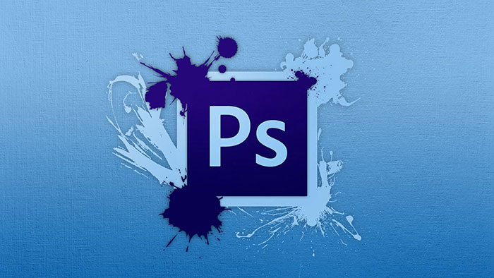
The Photoshop logo has just 2 colors being used in its design. We are talking about the night sky blue and an American blue. They look nice together and people can recognize easier the app when they see it.
Photoshop logo font
If you were wondering if creating a logo in Photoshop is possible, the answer is yes. Funny enough, we are discussing the Photoshop logo, which shows a software where other logos can be created.
Getting back to its font, the one used is called Myriad Pro. The designers of it are Robert Slimbach & Carol Twombly. They focused a lot on design details and proportions where they were creating this font.
Myriad Pro has clearly open shapes that make it great for text typography. On top of that people can read easily when they see it and it also has a variety of weights and widths. This is why many designers have used it actually in different popular projects.
Photoshop logo evolution
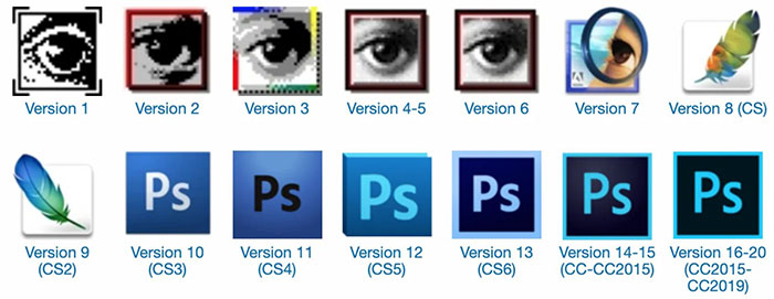
When it was first launched, the Photoshop logo was quite hard to spot. However, the big change that came in 2003 changed that. Let’s have a look at a time calendar of its road:
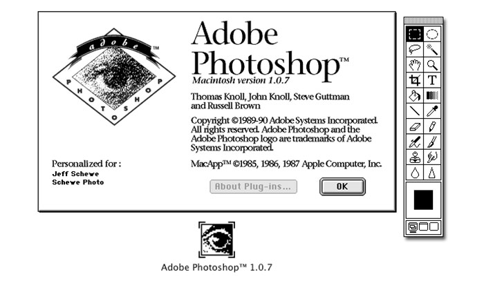
Photoshop 1.0 gets launched in 1990 for MAC
Photoshop 2.0 is launched in June 1991
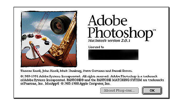
Photoshop 2.5 appears in November 1992
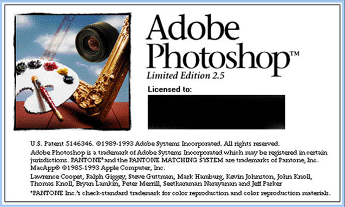
Photoshop 3.0 gets launched 2 years later in 1994
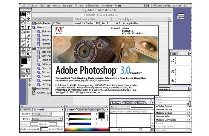
Photoshop 4.0 appears in May 1998
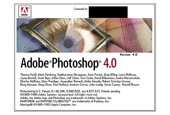
Photoshop 5.5 is launched in February 1999
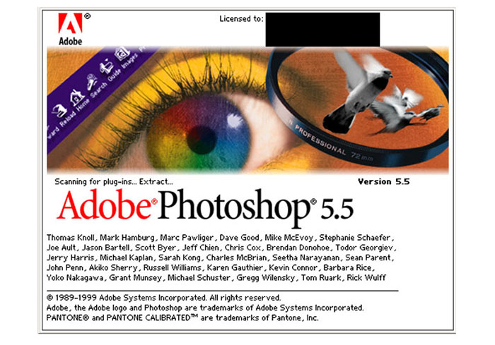
Photoshop 6.0 celebrates the year of 2000 and gets launched
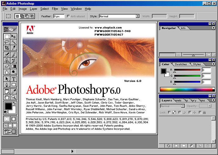
Photoshop 7.0 is released in March 2002
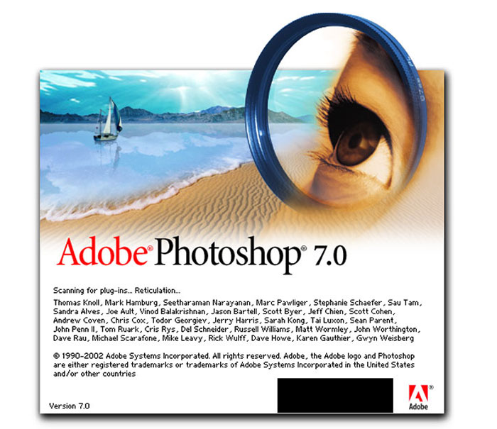
Photoshop CS4 takes over in October 2008
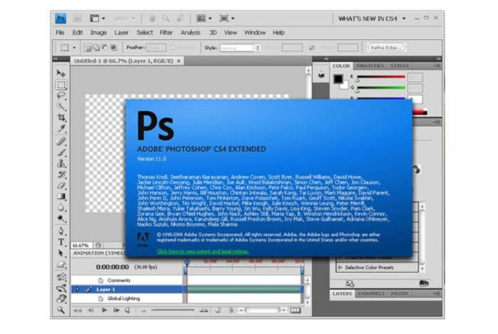
Photoshop CS5 is launched in April 2010
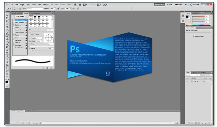
Photoshop CS6 appears in May 2012
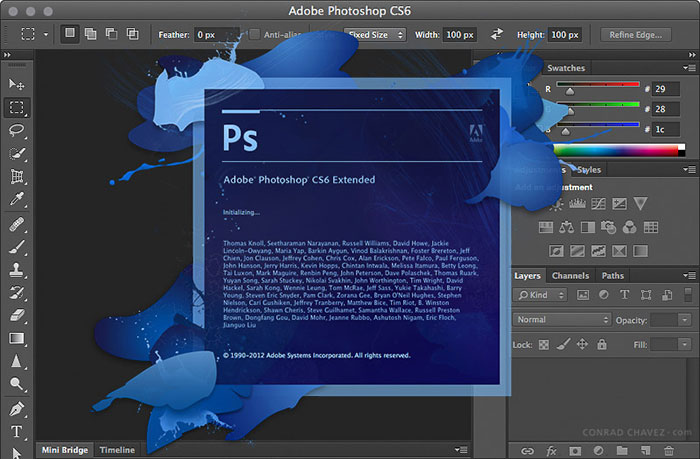
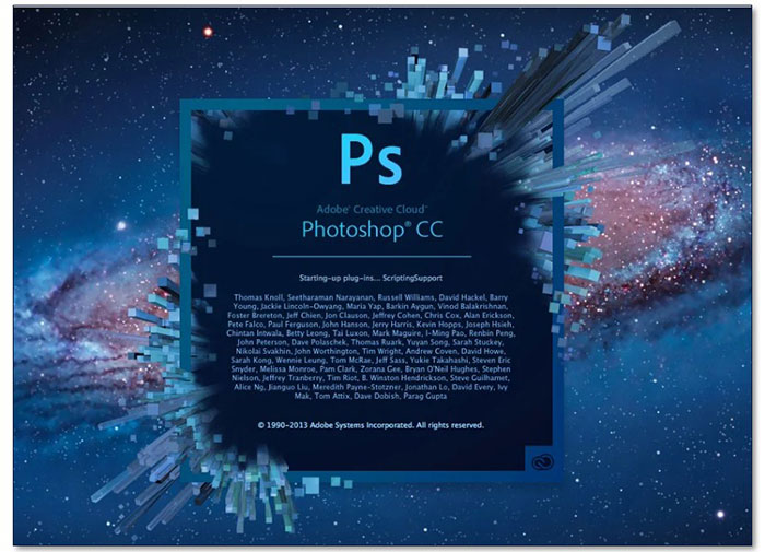
Photoshop CC appears in May 2013
Old Photoshop logo
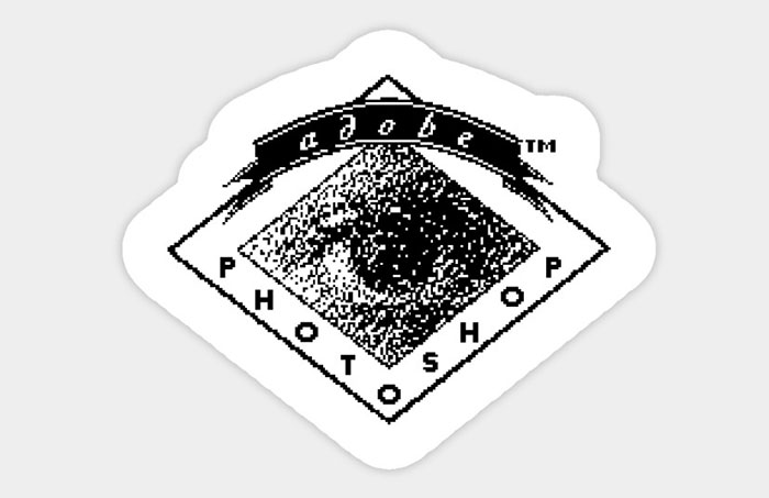
This version of the Photoshop logo is a simple one. The role of it was to get the attention of users and stick to using this program. It seems that they did a good job.
Today and Tomorrow
Even though Adobe has been on the market for more than 20 years it still continues to bring great programs like Photoshop. As the Photoshop logo was rebranded and many people are still using it, we can confirm that this company is doing a great job with their products.
Ending thoughts on the Photoshop logo
In conclusion, the Photoshop logo has a long ride until now and we are excited to see what the future brings. As it is one of the leading apps in the creative industry people will always remember it no matter what the future is going to bring.
If you enjoyed reading this article about the Photoshop logo, you should read these as well:
- The Amazon logo, its meaning and the history behind it
- The Starbucks logo and its evolution since it was first created
- 10 Important Qualities to Look for in a Logo Designer
The post The Photoshop logo and how it evolved over the years appeared first on Design your way.
Source: https://ift.tt/3cbgGyR


No comments:
Post a Comment