Parallax scrolling needs no introduction when it comes to discussing the most appealing design practices. Generally, Parallax Scrolling is widely witnessed on WordPress websites. It is an effect where the background picture moves at a slower rate than the foreground elements. This gives an illusion of having three dimensions in a flat two-dimension surface. Many games have been using this trend for a long time However, it has made its way in web design relatively recently and gained massive popularity. It is so widespread that you most likely have seen it somewhere when you surfed the web, even if you didn’t know what it was. The concept of parallax scrolling works on creating an illusion that looks appealing and unique. It adds aesthetic value to web design and draws attention to the content on the parallax scroll, which helps highlight valuable content from the clutter.
This design trend originated when the flat design trend picked up. Before the flat design trend, realism design was trending. With this trend, the emphasis would be on drop shadows, reflections and other such tricks to create a sense of depth and three-dimension look. Flat design was overly two dimensional, and such tricks wouldn’t work with them to create a three-dimensional look. Seeing this gap, parallax scrolling came up as a concept to introduce three dimensions to a flat design.
In order to understand parallax scrolling in greater details, we should first look at why it is a practice worth investing in.
1. User experience improves significantly:

Some people hold the view that parallax scrolling is an additional feature that adds complexity to UI without any contribution. However, it is not true as micro-interactions and animations make a great difference to create engaging user interfaces as compared to flat user faces. It holds excellent value is user experience (UX).
2. It helps the process of storytelling:

If we had to narrate a story to another person, we could do it effortlessly. However, having the same ease and flow of storytelling in website design can be very challenging. To connect the dots and ease the transition and keep the audience hooked is often tricky. Parallax scrolling helps with this problem by creating an engaging and immersive experience for the story to flow. Since there is a difference in the speed of the background and foreground elements, pacing the elements efficiently can improve the storytelling experience significantly.
3. Significant reduction in bounce rates:

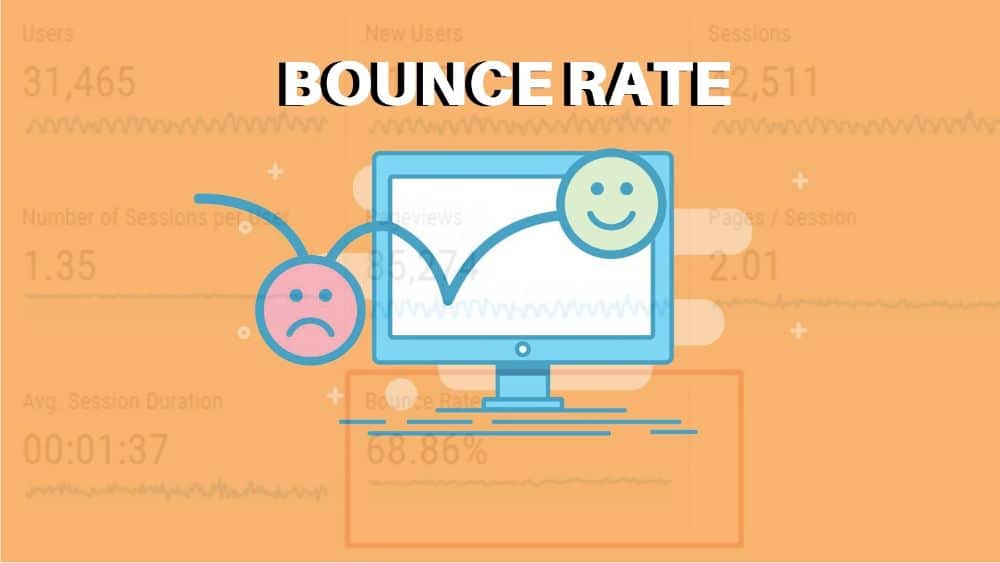
Bounce rate refers to the number of people who click on the website and click back button on the tab before thoroughly going through the website. Frequent and high bounce rates can affect SEO ranking significantly. Parallax scrolling websites have significantly lesser bounce rates as most of them are single page scrolling sites. The dynamic experience that users get from witnessing parallax scrolling keeps them engaged.
Now that we have covered the advantages of using parallax scrolling, we can discuss the various kinds of parallax scrolling techniques available to web designers. There are two broad categories for parallax effects. Scrolling based Parallax effects and Mouse based parallax effects.
Scrolling based parallax effects are parallax effects that you’d experience when you scroll down through a website. Each type of parallax scrolling caters to a different need and purpose. Some of the parallax scrolling effects are –
1. Parallax Background Scroll:
It is one of the oldest yet effective ways of using parallax scroll. Using this, when the user would scroll on the website, the background image would change. This helps tell compelling stories with style.
2. Parallax Vertical Scroll:
Parallax Vertical Scroll is ideal for websites where you want the users to feel that the website is moving with them, by using floating elements that would move at different speeds. This can be done in multiple layers as well.
3. Parallax Transparency Effect:
Parallax Transparency Effect is a smooth effect where the text or image slowly fades when the user scrolls down. It would also fade back in when the user would scroll up.
4. Parallax Horizontal Scroll:
Parallax Horizontal scroll creates a sense of movement horizontally when the user scrolls down the website. The elements on the left come closer to the centre. This creates a sense of movement.
5. Parallax Scale Effect:
Parallax Scale Effect lets the user create a zoom in and zoom out of tunnel effect. The zoom is proportionate to the aspect ratio, so it creates a unique illusion that looks cool. It feels like a warping effect that takes the user to another dimension.
Now that we have discussed the different variations of parallax scrolling effects, we can move on to discussing essential design practices to keep in mind while designing a parallax scrolling effect for your website:
1. Always remember your website’s primary objective:

Parallax scrolling is fun and can get captivating. Not only for viewers but the designer as well. This should not translate to having a website that has an impressive parallax scrolling effect and no focus on content. Parallax scrolling like other design elements should work as visual cues that should guide the visitor to the places you intend for them to be at. It should help achieve the business objectives like selling a product, disseminating content or generating leads.
If you overly use parallax scrolling without any context or purpose in mind, you might get impressed spectators on your site, but they wouldn’t translate to effective leads or converts. Make use of parallax scrolling to increase the chances of what you want the user to do. An excellent hack for this is pinning a compelling yet subtle CTA at the footer of the page. This way, when the users would scroll through the site, they’d see the parallax scrolling in action. They would also have one or two constant buttons that are static and omnipresent. This would draw the visitor to click on the button to see what happens.
2. Don’t overuse the parallax scrolling effect:

Parallax scrolling effect has a certain wow-factor attached to it. It breaks for the mundane and stagnant nature of any website that creates sudden interest in the visitor’s eye. Since using parallax scrolling makes the elements of the website move at different speeds, finding the right balance between fun and chaos is essential when using parallax scrolling. If the website has many fast-moving elements or too many moving elements as well, it could get overwhelming for the visitor to keep up. It would throw off their visual guide all over the website and create confusion.
3. Make prototype parallax scrolling effects and test them:

It is always a good idea to build an interactive prototype before finalizing on it in the development stage. This helps the designers test out their parallax scrolling effect before making it live. The designers should test the effect on usability and user experience. Since parallax is so versatile and different in its approach, it can affect different people in different ways. It is easy to deviate from useful parallax to creating parallax scrolling effects that cause distraction. Hence thoroughly test it with real users who are objective and has a sense of web design. Also, test it with a general audience since they are the ones for whom you’re making the effect.
4. Plan the content for mobile use:

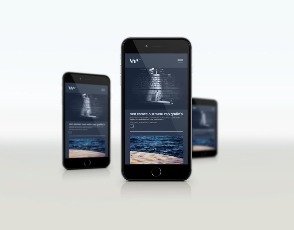
Surfing the net is not restricted to computers anymore. Instead, more than half of the users prefer browsing on their smartphones and tablets. Google also has changed its search engine results based on which regulates and ranks the websites differently for mobile as compared to desktop. This means that if your website ranks well on desktop browsing, but has an unfriendly mobile design, it wouldn’t rank up high on Google when you search it through your phone. Parallax scrolling is not mobile-friendly. Tablets do support it to some extent but not mobiles. The practical solution for this is not to use parallax effects for your mobile site.
The basic layout of your site should be designed in such a manner that it is easily translatable to mobile. Any section that overlaps and overflows should be watched out for. The backgrounds should not conflict with the legibility of the content. For the mobile site, only keep the bare necessary design elements. This would help you two ways – the users using the browser on their mobile might be using mobile data. Having a lighter site would help them load the site faster and spend lesser data browsing through your site. It would also not affect your SEO ranking that way.
5. Responsiveness of your website:

We don’t have network connections that take minutes or hours to load a website anymore. Everyone has access to the internet at the speed where users could be on one website for a second and switch to another in another passing second. With this ease of speed comes the ease of options. People browse through several websites each day. If your website doesn’t load relatively fast, they won’t stick around to wait for your website to load and show its amazing parallax effect. Parallax is a heavy trick and even when you optimize it; it would take a hit on page loading time. It becomes your duty to optimize it as much as possible if you feel like keeping the parallax scrolling contributes significantly to your website.
Now that we understand all aspects of parallax scrolling and how to make the most of it, let’s look at some of the websites that have successfully implemented parallax scrolling in their website design efficiently:
1. The story of The Goonies:
This website used a dedicated parallax scrolling effect to highlight the classic movie The Goonies. It uses immersive parallax scrolling to talk about the movie plot and other details such as the director’s name, date of release, character profiles, and more. It is created using WebFlow and works as a tribute to the classic movie. When you visit the website, the first interaction uses Parallax Scale Effect that helps the user feel as if they are travelling inside the story with the website. Each parallax effect is used to direct visual cue for the visitor, and it is effortlessly done. It also uses audio for an immersive storytelling experience.
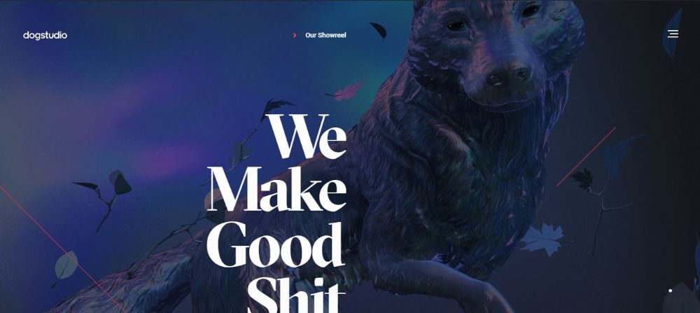
2. Dogstudio:
Dogstudio is a creative studio that blends art, technology and design. To showcase, this they have cleverly designed their website. The centre of the website has a dog that would scale and rotate as the user keeps scrolling through the website. The light on the dog also keeps changing when you hover the Mouse over their recent projects. There are also mouse-based parallax effects. In the start of the webpage, if you hover your Mouse to the left, the dog inclines towards the right and vice versa. It is an effective use of parallax scrolling.
3. Firewatch:
Firewatch is a game created by Campo Santo. There is a website for promoting this game that makes subtle yet most impressive use of parallax scrolling. When you visit the site, you are treated with a banner image that looks immersive as it is. When you scroll the website down, the image and the contents move up, creating a simple yet effective parallax scrolling effect. The website uses 6 layers to make it as smooth as it is. The rest of the website is static, where all the content resides. This helps you read the content and get to know about the game without feeling seasick with overly done parallax effects. They use a parallax effect to capture the attention, then provide relevant information to capture the visitor’s interest.
Now you know why parallax scrolling is a design trend that is so popular in today’s time. It has many advantages that web designers can exploit. There’s no scope of repetitiveness with another website due to the many variations of parallax scrolling available. The websites mentioned in this list also cover how the effect can be used entirely for the storytelling purpose or as an additional element to enhance the feel of the website. Understand why and where you would need to use parallax scrolling in your website and make use of it. Don’t force it in just for aesthetical value.
The post Your Guide to Parallax Scrolling appeared first on Web Design Blog | Magazine for Designers.
via https://ift.tt/324HtIp


No comments:
Post a Comment