In this article, we’ll learn about book cover design. It’s an important design project that you’ll surely end up in the future.
You wouldn’t be honest if you said that you don’t judge a book by its cover.
If a book has good graphics, good quality covers and an eye-catching font, it’s bound to sell more copies.
Despite what some might say, book covers aren’t actually in decline.
And, with the internet enabling effective and fast exchange of documents, feedback and ideas, people are sharing their favorite book covers across the web.
The concept of book cover design
Before you even begin with the book cover ideas, before you get into designing a book cover, you should be aware of the message you’re sending. What’s the book’s value proposition? What will the target audience look for in the book? Success and achievement, passion and romance, revenge and murder?
When you’ve got the motivation, emotion and incentive figured out, you can easily generate a lot of book cover ideas, or visual metaphors that will determine the typography, colors, imagery and the book cover layout.
If you want to design your own book cover, or if you just want to add a few things to it, below are a few book cover design ideas and things that you should keep an eye out for.
Read the content, and understand it
This might seem obvious to some, and pointless to others, but this is actually a crucial part, and many book cover designers will agree. Of course, life might get in the way, and you can’t always get your hands on the manuscript, or you can’t afford to read all 500 pages before the brief is due. In these situations, do your best to try to understand the content.
If available, Google synopses, read reviews, and try to figure out what is happening in the novel, as well as the themes, characters etc. You should have as much information as possible, because you can’t go and design a book cover without it.
Identify the content’s key areas
Now that you are pretty much familiar with the content, you should pick it apart. See what are the key characters, motifs, ideas etc., and see how you can visualise them when you’re figuring out how to make a book cover. Think about it – was the book noir-like? Maybe a monochromatic palette is suitable here. Do you have a recurring symbol or object that you can visualise?
A few book cover designs tips
Grabbing attention and generating excitement is the main goal of any cool book covers. The cover is one of the best, if not the best, tools in your arsenal. Therefore, you should create something that will create interest and stop people in their tracks. The cover is the hook which helps you promote your book.
The genre is important
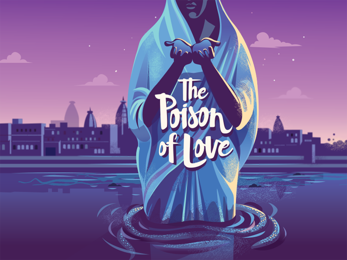
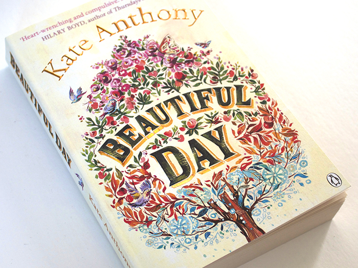
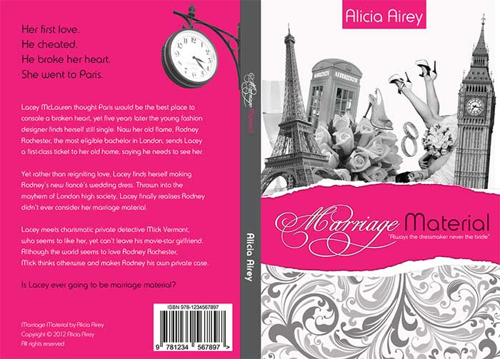
When you want to create a book cover, it should show the genre of the book. A good book cover will talk to the readers through the choice of book cover fonts, the book cover background, and the metaphor.
If the book is a non-fiction, the cover should communicate the tone. The book cover explaining the scope of the book is actually a very cool thing, and it allows the reader to manage his or her time.
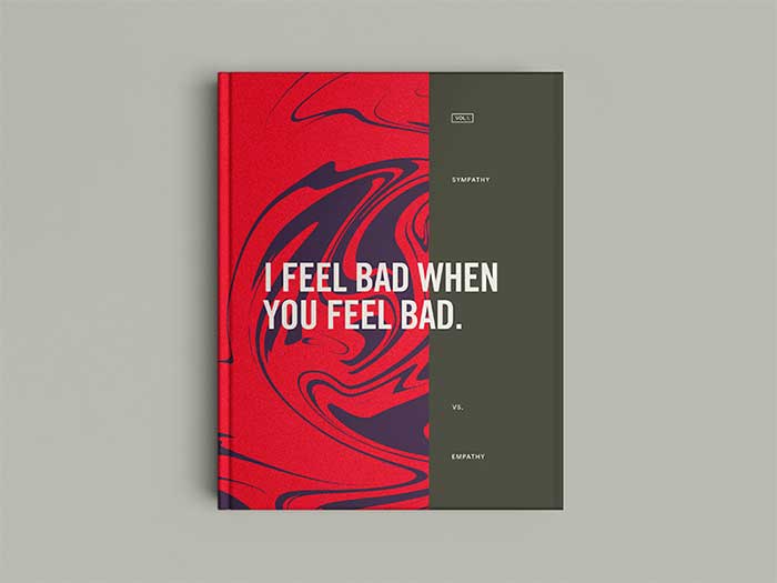
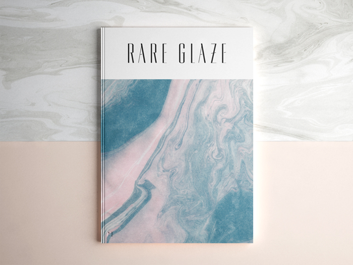
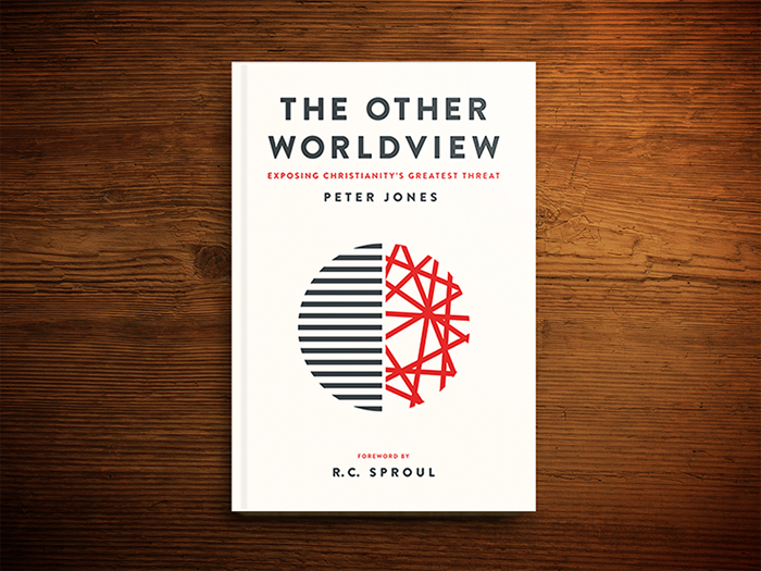
Minimalism in book cover design – less is often more
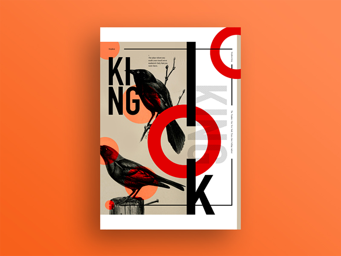
The minimal style is timeless, from an old book cover you may run into, to modern book back cover ideas, it’s everywhere. Put a title that’s big and easy to read. Your cover will usually be seen on a screen first, rather than the shelf. This is a very well-worn cliché of cover design.
Review a thumbnail image of the cover as well. Does the book cover size fit here? A lot of people buy books on a Kindle or mobile device, so the cover should be clear no matter where it’s viewed. Anticipate the look in grayscale as well.
Don’t use Comic Sans or Papyrus, anywhere. These fonts only work for a humor book, or if your goal is to make a cover that professionals will be laughing at. Avoid special styling and font explosions as well. A cover shouldn’t be using more than two fonts, and you should steer clear of using caps, italic caps etc. Avoid shaping the type as well.
Using your own, or your children’s artwork is another major ‘no’. There are only a couple of exceptions here, but you shouldn’t be counting on them, and this will very likely turn out to be a horrible idea. Avoid cheap clip art as well, such as the things that come free with Microsoft Word or other similar programs.
Go with quality stock photography if you really have to. And, don’t stick an image inside a box on the book cover, as it looks very amateurish. Gradients are another thing you should avoid, especially if you have a cover with a rainbow gradient. Garish color combinations won’t work either, as they will make everything look freakish instead of capturing people’s attention.
Know your reader before designing a book cover
All books are written for a target reader. If it’s a murder mystery, then the reader would be a murder mystery fan. However, in all genres, there are various readers.
You should be targeting the reader that is most likely to buy the book, that is what matters. Knowing the demographic of the reader lets you create a cover that has type and graphics that grab the reader’s eye, and sends the message that the book is right for them. This might seem like a no-brainer, but it’s much more difficult to do than say.
For example, putting a graphic, instead of a photograph, on a Photoshop book, is a mistake. Amateur Photoshop users will want to work with a photograph, and using a graphic instead might be a mistake with them. Keep that for an Illustrator product.
See if you have a central image you can use
Do you have an image or symbol that’s recurring? Find a way to incorporate it into the cover. Whatever was profound enough to make it into that many pages, will be profound enough to get on the front of the cover.
Look for metaphors when creating the book cover design
If your theme is about failing, then trying again, why not represent that on your book cover design? Your background can be a crumpled piece of paper that is flattened smooth for a fresh start. Your readers can immediately reflect upon the theme before they even open the book.
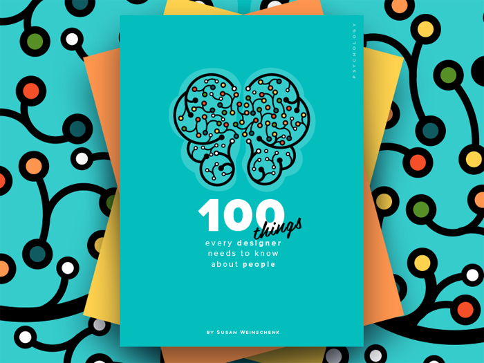
Focus on a single image
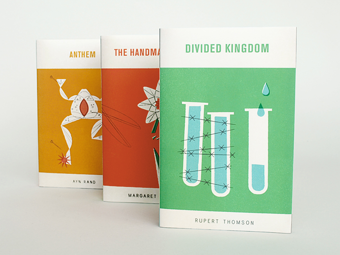
If you have plenty of symbolism, or more themes, don’t get carried away by trying to represent everything. Less is often more, and that will undoubtedly apply to your book cover design. Space should be used wisely, and be cautious with simple imagery. Keep the focus on a single image, as you don’t want to be overwhelming or confusing.
Choose colors that fit well with your story
Is your story actually a dramatic thriller? Bold red, deep ocean blues and sinister black are the colors to go. Is it a read that can be taken to the beach? Use jade greens and cool blues to give it a laid-back vibe. There’s actually a whole science behind color psychology, and you can make use of it for your cover design.
Use contrast for an eye-catching cover
If you’re having problems with your color scheme, try to take it back to basics and go with black and white. A classic contrast will help your cover pop, and is both classic and timeless. The monochromatic color scheme can result in a great way to keep your words and fonts at the front, and the image will become a part of the background.
Text is important, and you shouldn’t forget that
Just like the color that represents the story should be chosen carefully, you should choose a font that matches it as well. Do you have a mostly-female audience? A scripted font with a feminine flair is the way to go. Men prefer a bold, simple text that is easy to read. The biggest factor in the success of your book is actually the audience, so your cover should be tailor made to appeal to them.
Reviews matter
Do you have a good review from someone who is well-known in your field? Just put it on your cover! Even if it simplifies your book cover design in other aspects, having the popularity of someone who is well known verify that you have a good story or content is well worth it. Their name will lend credibility, especially if you’re a first-time author.
Add a teaser or subtitle in the book cover design
A good way to attract attention is to give your readers a short glimpse of what they’ll find between the covers, and that is easily done with a teaser or short subtitle. It takes much less time to read than the synopsis, and immediately draws in readers. The text should be smaller than the title, yet clear. It should be easy to read, but shouldn’t jump out at readers.
Consider the format
Different designs work better for one format than the other, and using the same cover for your print version as the one for your eBook is a mistake. For example, the eBook cover is often viewed in a thumbnail, meaning that the title and image should be clearly visible.
One genre might emphasize certain things more than the others, but you should keep a main focus that the browsers can easily spot when they’re looking at a small-scale version of your cover.
The print covers, on the other hand, give the viewers an up close view of the design, and thus require a different, more delicate approach. This shouldn’t mean different images for both versions, but you should tweak some elements to better suit the format.
Show, don’t tell
This is a piece of advice for writers, meaning that they should show through words, feelings and senses, instead of going with too much exposition. So, how do you apply this to design? Simple, just don’t be too blatant and too literal.
The depicting of antagonists, protagonists, faces, etc., is a common thing with old cover designs, as the designers wanted to illustrate the characters in a scene from the book. Your cover should be thought of as a movie trailer.
Sometimes you’ll see the trailer and go away, because you saw all the plot points. However, if the trailer is a bit more mysterious, you’ll want to see more. That’s how the cover should look like, without giving away everything. There are a few tips on how to achieve that.
Use symbols in the book cover design
If you want to avoid being too literal, experiment with symbols that represent a larger concept or idea. Set the mood and tone for your book. When you walk into the romance section at a book store, how do most of the book covers look like? Now imagine the crime novel section and ask yourself the same.
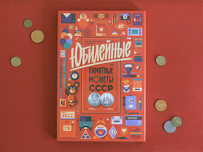
There’s a major shift in the use of typography, imagery and colors. The genre is very important, and it gives the consumers a glimpse of what they should expect when they open the book.
Be open minded and general
The more general your idea is, the more likely you are to create a professional design. If the idea is too detailed, creating a professional design may be difficult. For example, if you want a woman and a man on the beach, that’s pretty general and can be used very well. However, if you want them to be of specific ages, hair color, clothing and ethnicities, things get much more tricky.
Manipulating the images to an extent is possible, but keeping things general is a good idea. Try to be open minded too, and come up with more than a single design concept. This keeps your designer’s options open, and lets them go for a design that can suit everything best.
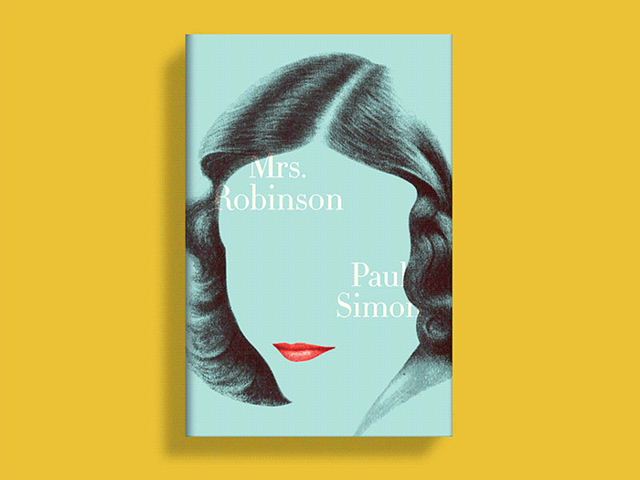
Don’t show your character in too much detail
Showcasing your main character on the cover is tempting, but it is seldom a good idea. A lot of readers would prefer using their imagination for this, and it might be very difficult for your designer to find a stock image that will match your expectations of your character’s looks.
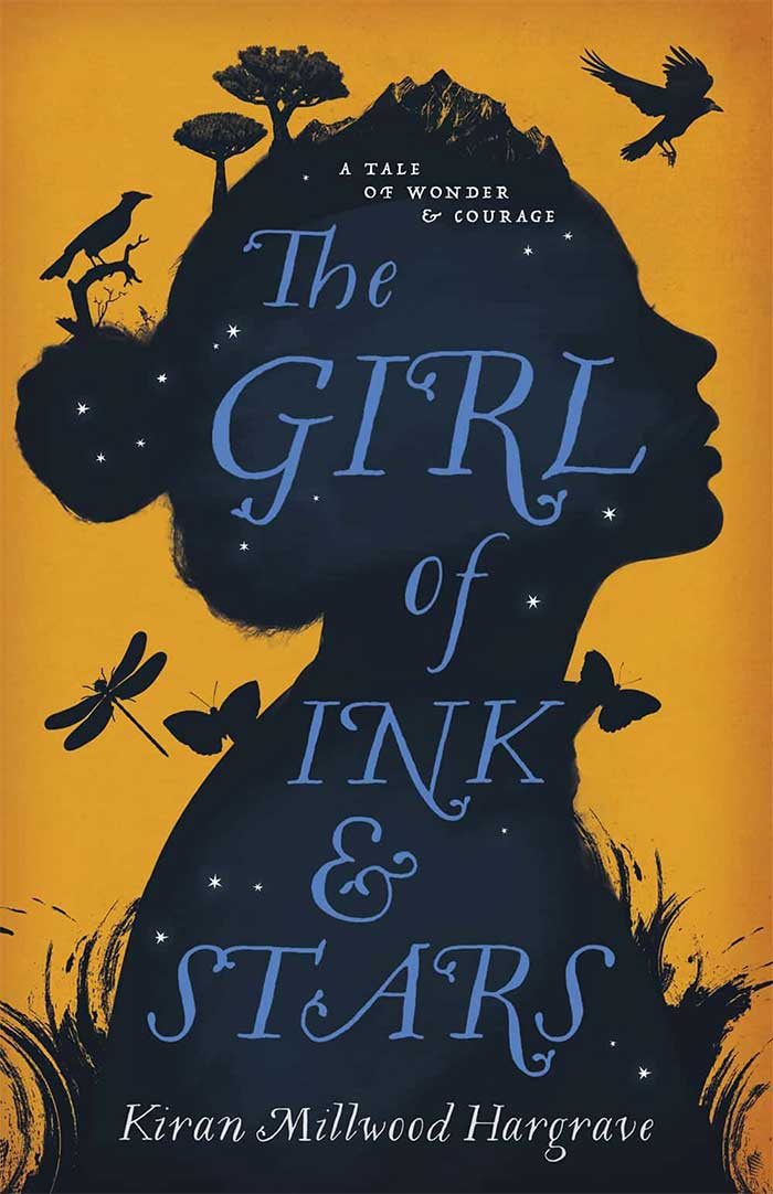
If you think this is actually important, consider using a silhouette, or show them in a small part, or from behind, as this doesn’t reveal the whole character. These are all alternatives that will spark interest, and not limit the readers’ imaginations.
Be strong, simple and symbolic
A specific scene is often difficult to assemble when you’re using stock images, so refrain from this. The front cover is the first thing most, if not all, readers will see, and without the proper context, it might not make any sense even if you have a specific scene.
Being iconic or symbolic is much better, and coming up with a simple idea that is easy to understand is much better. Most people will see your book as a tiny picture, or out the corner of their eye if they’re in the bookstore. Regardless of which one it is, a strong, symbolic cover will grab their attention easily.
Browse stock images and research at your local book store
If you’re finding it hard to come up with an idea, do some research. Go to your local bookstore and take a look at books of the same genre. This may give you ideas or suggestions for your own design. Once you have an idea, browse for stock images on the web.
Don’t forget about the technical details
There are a few technical things to keep an eye out for. Copyright issues are something you should be aware of. If an image is copyrighted, using it without written permission isn’t something you can do. This may delay the production of your book, and choosing a licensed image, or an image you have taken yourself, is much easier.
The images must be in a high resolution as well, usually no less than 300 ppi if you’re using it for the cover, and they must be in a size suitable for their use. If you’re submitting a finalized design, production delays can be easily prevented by submitting it in a layered Photoshop or TIFF file, where the text is on a separate layer from the images.
The back cover is informative, pay attention to it
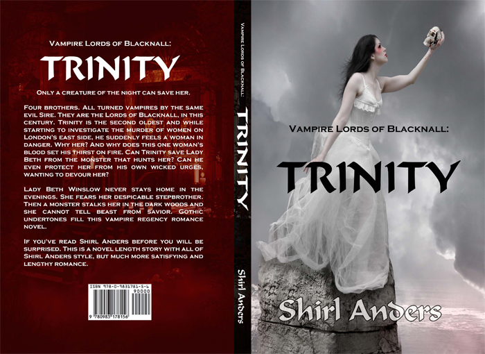
Even though the front cover is a great eye candy which tells your reader that the book is worth a second glance, that second glance is at the back cover. It should be an infomercial that validates the excitement the buyer’s feeling, and assures him that the book is well worth the investment.
How to do a book cover design wrong
Looking at bad designs is a good practice too. There are a lot of them, and you can see what are some of the things you shouldn’t be doing. Overthought and overwrought typography is the main offender here, but using stock imagery is another close contender. Be careful with the fonts and images.
Showcase of book covers
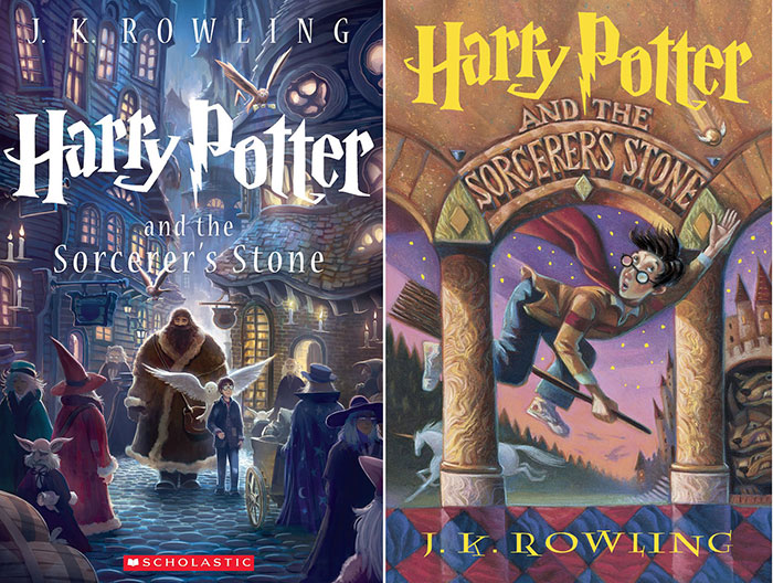
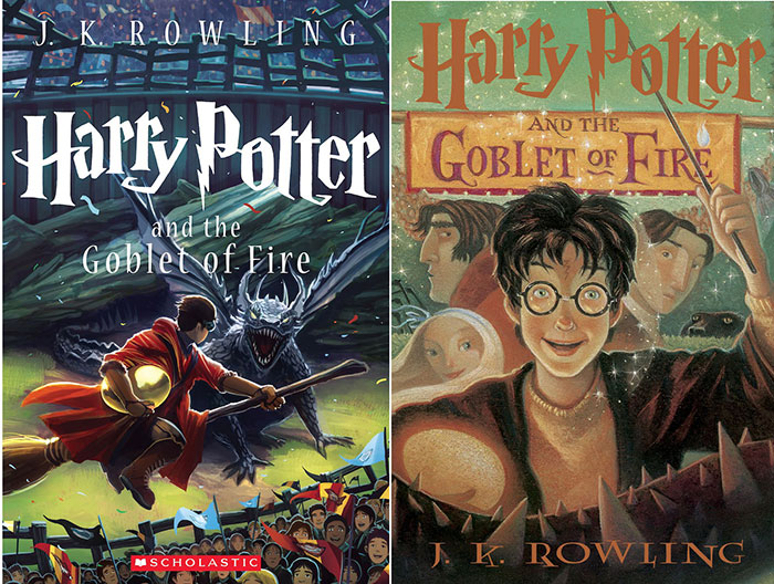
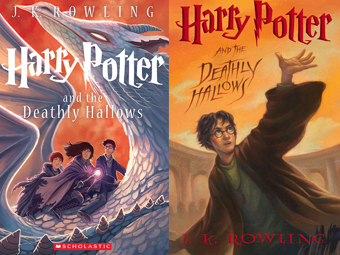
Harry Potter book cover
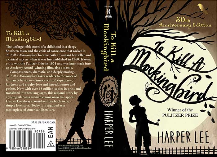
To kill a mockingbird book cover
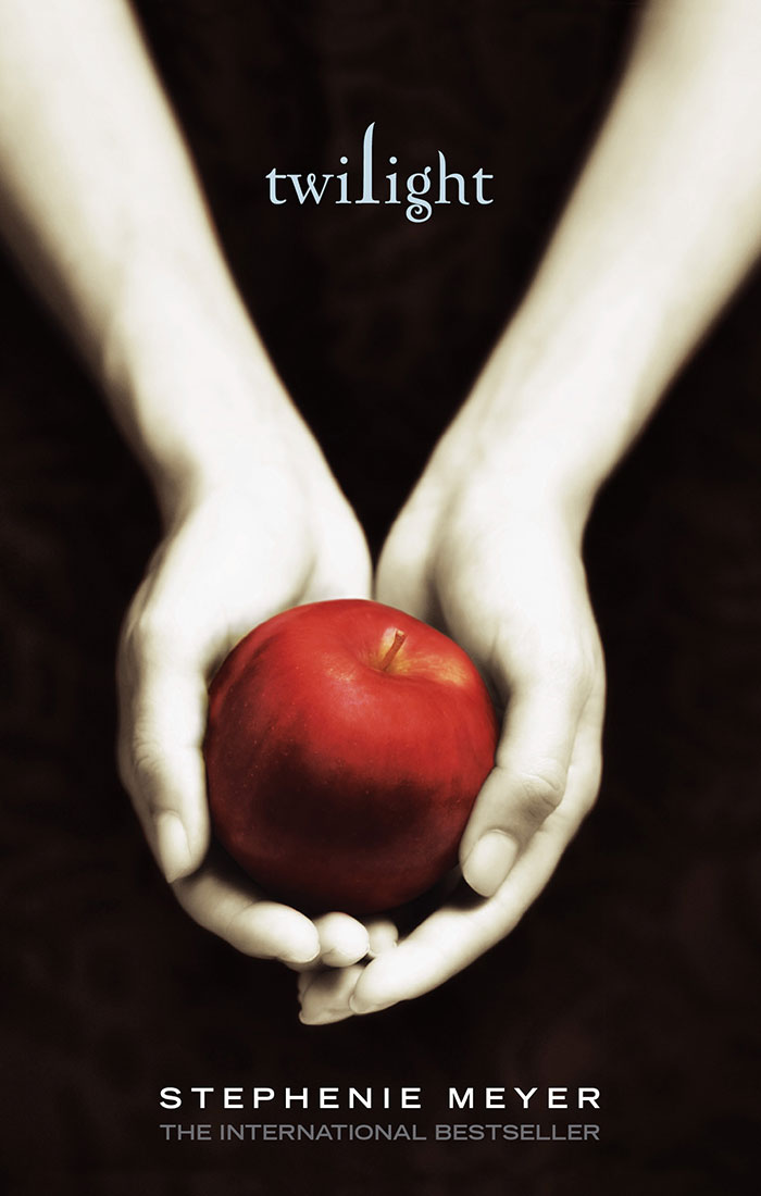
Twilight book cover
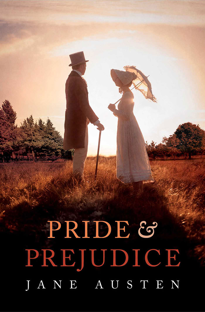
Pride and Prejudice book cover
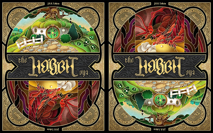
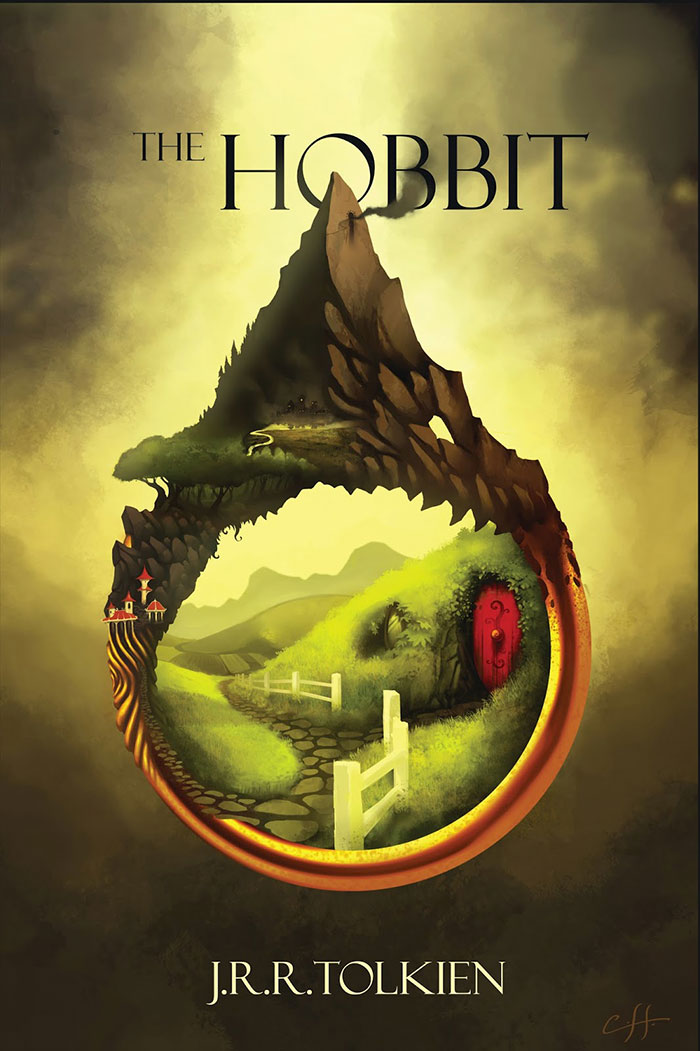
The hobbit book cover
Frankenstein book cover
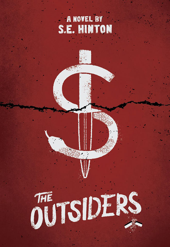
The outsiders book cover
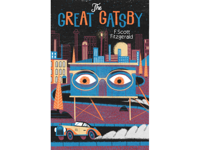
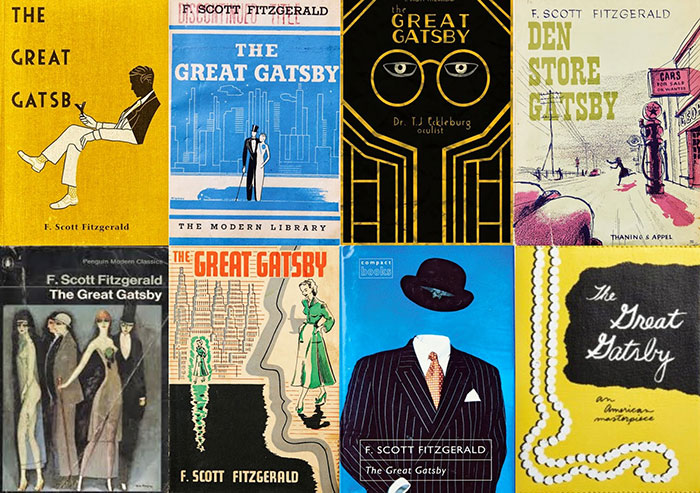
The great Gatsby book cover
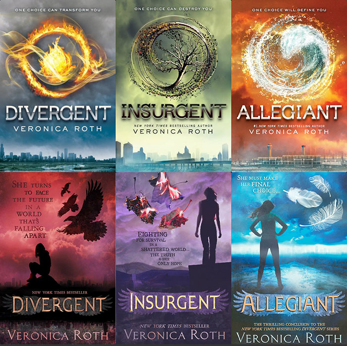
Divergent book cover
The hunger games book cover
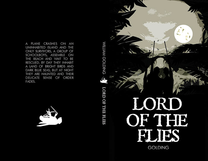
Lord of the flies book cover
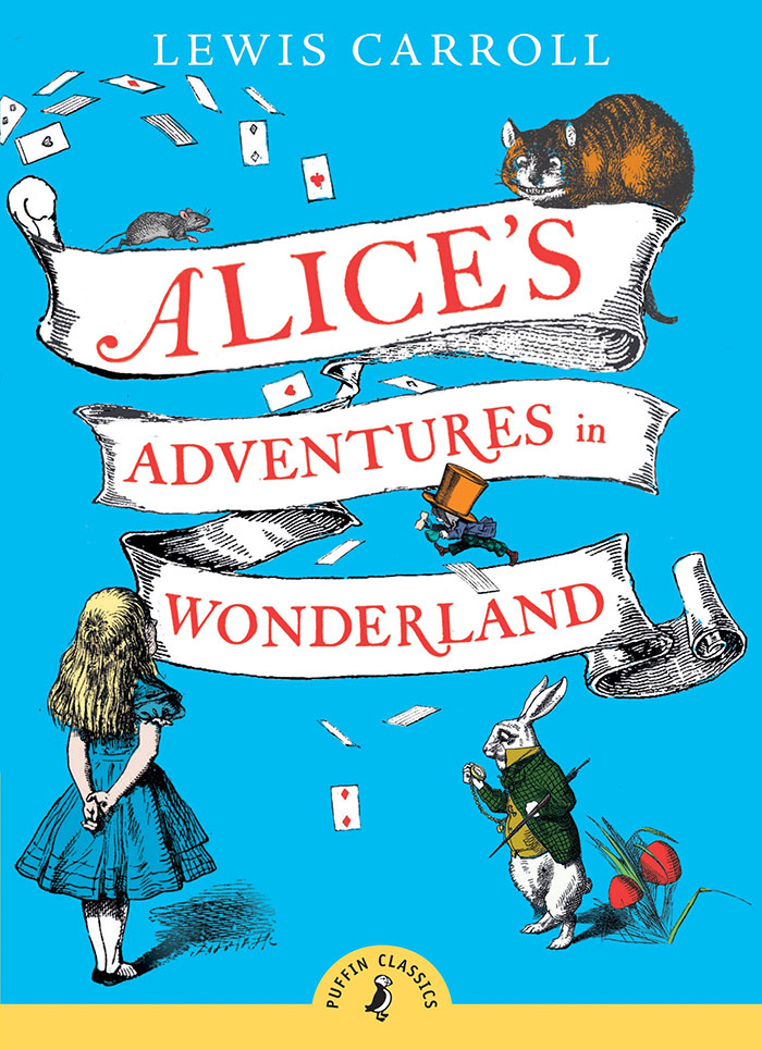
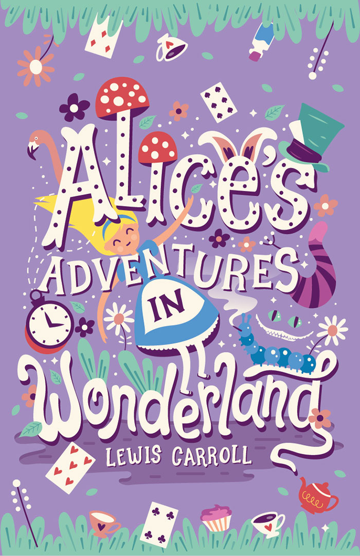
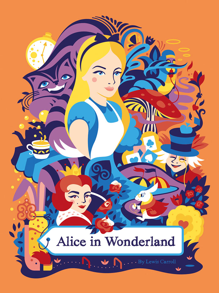
Alice in wonderland book cover
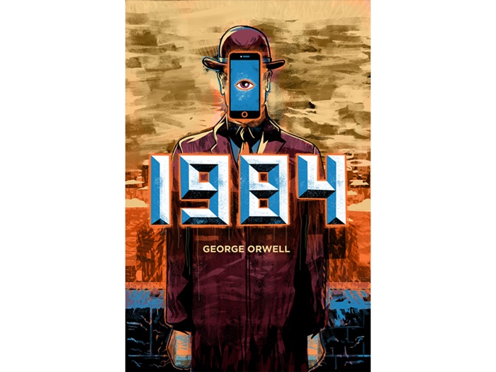
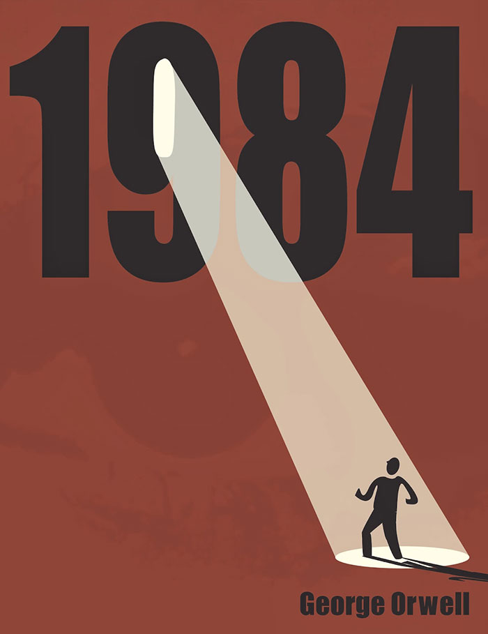
1984 book cover
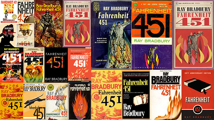
Fahrenheit 451 book cover
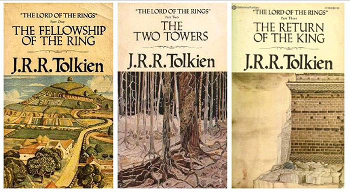
Lord of the rings book cover
Romeo and Juliet book cover
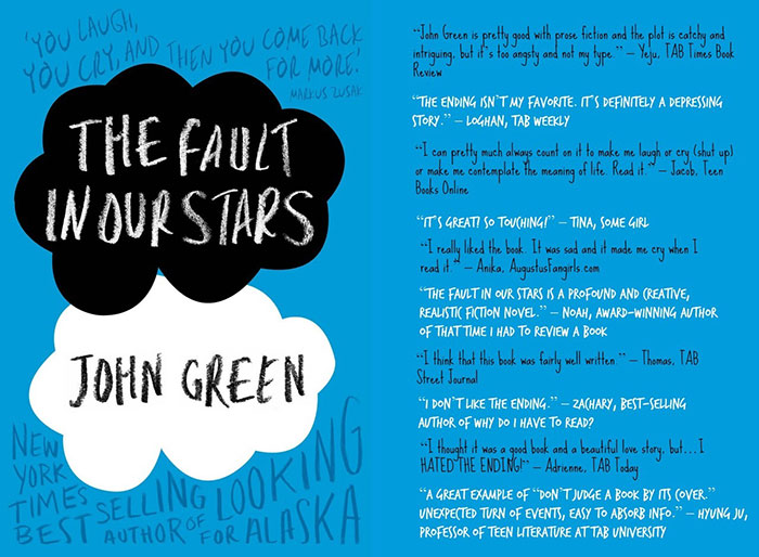
The fault in our stars book cover
Ending thoughts on book cover design
Few people think about how the book covers come into life, most of them just thing you’ll call an artist and he’ll get it done.
Authors themselves, or family members or friends may also get it done, but for a successful and effective cover, you need expertise.
You’re visually representing the whole book in a single image, which is a hefty job to take on. Keep these things in mind.
If you liked this article about book cover design, you should check out these as well:
- How to make an album cover – 46 artwork examples
- Graphic Designer Salary: Junior, Senior and the Average Annual One
- Bird Logo Design: Examples and Bird Symbolism
- Book Cover Archive
- The 10 Best Book Covers of 2017
The post Book Cover Design: Ideas, Layout, Fonts, And How to Create One appeared first on Design your way.
Source: http://www.designyourway.net/blog/graphic-design/book-cover-design/























No comments:
Post a Comment