A user interface is the means by which a computer and user create interactions. Users program the computer to carry out specific tasks. User languages can be text-based but are mostly visual languages.
If you’re creating User Interfaces, you should be anticipating how users may use the app.
It means creating an interface, which has all the elements a user might need.
This interface has to be easily understandable so that a user might carry out the tasks that need to be completed. Designing a user interface means bringing together concepts from visual design, interactive design and information architecture.
A good user interface doesn’t require a learning curve. Instead, a user will be able to interact using terms they already understand. Presenting a user with concepts that are already familiar enables an intuitive ability to navigate a system.
Defining the user interface
A user interface is the visual part of the computer operating system. By engaging with this interface, the user is able to instruct the computer to carry out a task. This is done using the visual information which is presented on the screen.
The three main types of user interface are:
- Commands: These are the instructions or codes which belong to a computer or its software.
- Menus: The user can choose commands from a list which is displayed on a screen.
- Graphical User Interface (GUI): Commands are carried out by using icons displayed on a screen.
Designing an effective user interface is beneficial for a number of reasons:
- A well-designed interface is easier to use.
- This makes it less expensive because it reduces training costs.
- With an effective user interface, fewer people will struggle, which reduces support costs.
- The more intuitive and efficient your user interface, the more your users will enjoy it, increasing reputation and job satisfaction.
How to create an effective user interface
Be precise
A good user interface needs to be clear and concise. The shorter and more familiar a label or instruction, the easier it is to understand.
Designers like short instructions to follow and users often won’t read wordy instructions. Therefore, precise instructions are less confusing.
Include the following elements:
Input Controls: these include list boxes, drop-down lists, radio buttons, checkboxes, text fields, buttons, toggles and a date field.
Navigational Components: Tags, icons, sliders, and a search field.
Informational Components: A progress bar, message boxes, and icons.
Containers: Accordion to expand or contract information as needed.
Writing a computer interface begins with language or code. Establishing how the users will interact with an interface enables a designer to use code to create an effective application.
Establishing how users will use the product is important. Users vary in their ability to make sense of computer language.
Some are more technically competent than others, some use their own language, and others may not speak our language.
Design with the user’s language in mind
If design, icons, and typefaces matter, so does the language of the user. All interfaces need language or copywriting so that users may interact.
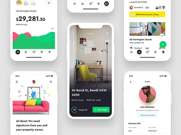
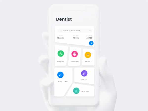
Think of a mobile dashboard. With so many elements in a dashboard, everything must be in a logical place on the screen and have a pretty clear function.
Keep this language conversational. Provide clear labels for actions. Keep messages simple. This enables your users to interact easily in a way which is familiar and friendly.
Make language visible
Be consistent: Keep screen layouts, instructions and navigation systems consistent. When the same rules apply, a user becomes familiar with how to navigate a program or application. This makes the process efficient and easy to understand.
Stay simple: Use the least number of cues or visual elements. Simplicity, clarity, distinctiveness, and emphasis means that every time a user engages with a system, communication will be quick and responsive.
Communicate: Match your computer interface to the ability of the user. Ensure that it is legible, easy to use, has clear typography, that the symbolism used is easily understandable, and that it is attractive. Visible common language assists with communicating your message.
What makes common language visible?
The following techniques can be used to make it easy to communicate messages to a user:
- Layout: formats, proportions, and grids assist with showing a user how aspects of a page group together, and make content easy to read.
- Typography: select fonts to ensure the best readability. Size and width are important, particularly for mobile devices.
- Color and texture: convey complex information such as emphasizing a log on button or giving insights into how navigations are grouped together. Contrasting colors on a user interface can assist with a call to action.
- Imagery: icons, signs, and symbols show a user how to engage
- Animation: dynamic, moving pictures. Important for video related imagery.
- Sound: vocal or musical cues, such as chimes associated with a message.
- Visual identity: unique rules that lend consistency to the interface.
Create consistency and a way to correct errors
When designing, in order to speak the user’s language, it is important to be consistent.
Once a user has got the hang of a certain tool or technique, it will be possible to interact with the interface again, if the same codes, buttons or icons have the same meaning throughout.
Remember to allow your user to correct mistakes or undo a procedure so that if they do make an error, they are able to correct this quickly.
Use copywriting to give personality
It is often helpful to bring a personal touch to the interface so that users can relate to the site.
Share information about the person behind the business, and use a narrative style in order to create a sense of warmth and familiarity. Stating information about a product, and the process of creating it often helps to create a feeling of quality.
Keep your users informed
Although you may have kept your designs simple, efficient and consistent, creating a common language between users and your audience can still be a complex task.
Even if you’ve stayed away from technical language, your users might still struggle with the interface. Ensure your system can engage with your user, sharing what is happening, any errors, how to proceed further, or what changes have been made.
If your user interface can point out the next steps in a procedure, this will reduce frustration for your user.
Encourage your users to engage rather than sign up immediately
Once you’ve created your interface, you’ll want to bring users to your interface. However, instead of asking users to sign up immediately, it may be helpful to allow them to use the site as a way of exploring how it provides value.
Once users begin to realize how to interact, and the benefits they get from doing so, they will be more likely to sign up.
A sign up always requires handing over information, and some users may be reluctant to do this. Encourage users to engage with a site gradually, creating and customizing applications and products until they realize the value the site has to offer.
Make it efficient for what the users need
A good interface allows you to perform the functions you expect from that type of interface (i.e. dashboard).
To do that, you should first figure out what the users want to do with your app. Don’t guess, because that is a big mistake. Perform usability tests with people outside your design team and see how they are using the app, what satisfies them and what’s missing.
Then, identify how the app should actually perform. Integrate those functions in your next design iteration, and make sure that the users now reach their goals with your app.
There isn’t a choice about doing this or not. The moment when you decide not to implement features that some people are asking for is the moment you will start losing users.
Ending thoughts
Designing an interface is easy. Designing an interface that your users will understand well and that satisfies them is something else altogether.
You will see how you’ll end up balancing too much explanatory info, for example, with the minimalism that makes an app look cool. What do you choose? Offering lots of information, so that the users won’t be confused, or keep it minimalist to get a few praises from your fellow peers?
It takes quite a bit of time to reach a perfect balance. Also, every app is different, hence the solutions for the problems it has are different too.
The post How to Create a User Interface That Your Users Will Understand appeared first on Line25.
Source: http://ift.tt/2DD5hGv

No comments:
Post a Comment