Face cards are something that we take for granted. The playing card design is something that we never look too much at. However, when we see one that is well designed, we are pleasantly surprised.
We can find design inspiration everywhere we turn, readily available to transform into a master piece.
The commercials we see, the cars we drive, the cinema posters of long awaited movies – they all have a design lesson to teach, and if we give them a second look, we may come up with our own ideas.
In this occasion, we will discuss playing cards.
A standard deck of cards is to be found in nearly any American household, which takes us to the subject of playing card designs being taken for granted.
Yet, the fact we don’t appreciate the ubiquitous playing card design doesn’t make it any less perfect, and doesn’t justify the fact we know nothing about it.
Playing cards of today have inherited their looks from the French Renaissance cards. Their appeal was first interpreted in 1800, by a not so popular artist called John Cazenave.
Cazenave was also the first playing card artist who inspired Charles Bartlett to improve his work and spread it among wider audiences around 1830. Two decades later, Philadelphian artist Samuel Hart took over the idea, and began printing playing cards in larger amounts.
A historical overview
Playing cards in many different shapes have been around ever since the 9th century, and can be traced to several regions in China. Their first appearance in Europe is usually connected to the 14th century.
At this time, Europeans were designing two popular patterns: The French Parisian and the English Rouennais, the later being far more impactful on how playing cards look nowadays.
It was also the French to have created the four standard card suits (spades, clubs, hearts, and diamonds). Originally, this concept belongs to the Italo-Spanish deck, where the suits were clubs, swords, coins, and cups. With time, the much simpler French design prevailed, as it was cheaper and easier to manufacture.
It was no longer necessary to use the standard woodcut method, and numbers could be inserted with stamps, similarly to cards of today. Yet, the French deck court cards still needed woodcut illustrations.
This already shows us the value of playing cards design – we see amazing graphics created specifically to be replicated in an affordable way.
Playing cards observed from a different perspective
While playing, did you ever appreciate the design of playing cards? Most of us didn’t, and yet – we should have.
Playing card designs are the role models of aesthetics balanced with usability, and that makes them almost perfect.
In order to draw inspiration from playing cards, leave all knowledge aside, and look at them as if it was your first encounter.
The symmetry
When it comes to symmetry in design, there is no better example than playing cards. The basic principle has been wielded in a magnificent way, and there are two reasons for that.
To start with, symmetry helps make cards more attractive, as the viewer’s brain finds symmetry very appealing, and relate it to both nature and art.
More importantly, cards’ symmetry is functional, and prevents us from holding cards upside down. This may sound less important than it is, but think how it would be to play cards or pick them up without such functionality.
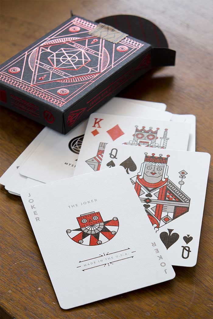
Numbered cards make this much simpler, but symmetry is still present (a reversed one, however). These cards are called court cards, or as modern users like to call them, face cards.
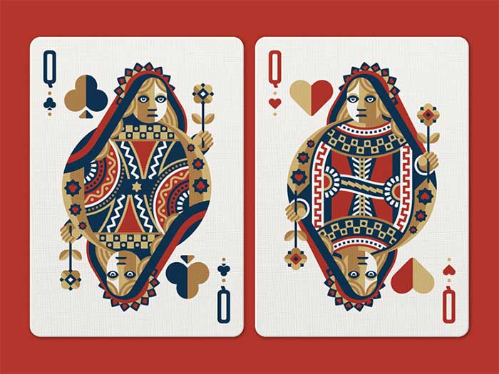
In their original shape, court cards contained character illustrations in their first length. In order to improve them, mid-19th century designers thought of reversed symmetry.
Face cards usability
Symmetry, nonetheless, is not the only design hack artists came across while thinking how to improve cards. There are also other design characteristics that make cards functional, including the suit display with repeated icons that inform us on the card’s value. Such bonus indicators are even more valuable nowadays, when there is no typography to indicate the cards’ meaning.
The playing cards with corner indices (numbers or letters) arrived in America around 1875. Thanks to the moderated design, players were able to hold the cards with a single hand, and were impressed by such usability.
Prior to this advancement, Jack cards were usually called ‘Knaves’ or ‘Knights’, which prevented the letter ‘K’ from appearing to both cards. This is why they were renamed to Jack, and the players’ best interested was taken into account.
The face cards’ Royal family
How many face cards are in deck of cards? Playing cards continued to evolve, and eventually caused the generic royal figures to take on particular personalities. Designers chose and ascribed a well-known royal figure to each face card – kings Charles, David, Julius Caesar, and Alexander the Great.
As for the other face cards in a deck, there was the queen, namely Pallas, Rachel, Judith, and Argine; the Knaves/Jacks, respectively, La Hire, Ogier the Dane, Judas Maccabeus (Lanselot), and Hector.
You may still come across an old deck with these names printed on the cards. However, the characters are not standardized in new decks.
Interesting and intriguing facts
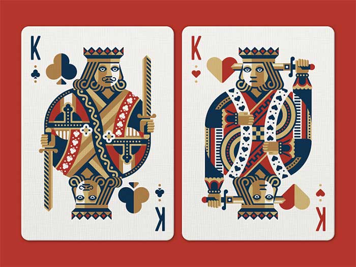
Not everything about face cards is known to the public. Taking a better look, you would notice that the King of Hearts doesn’t have a moustache, and he’s illustrated as if he was trying to kill himself!
For some experts, this detail was used to illustrate the blurry and unresolved death of Charlemagne. Looking at the King of Diamonds, on the other hand, we’d see he holds an axe unlike other kings that hold a sword.
All mysteries, however, can be explained with a very simple story. With playing cards being reprinted over and over again, the original artworks slowly lost its integrity. The King of Hearts no longer had a moustache.
Also, the King of Diamonds is not the only one carrying an axe – now, this weapon is held by both red kings, while the sword is assigned to their black counterparts.
Single-eye Royals
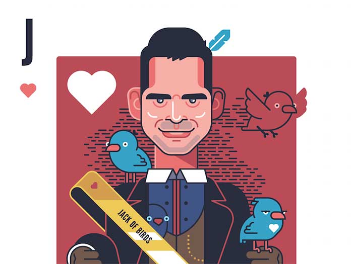
Another fact that attracts attention is that the King of Diamonds, Jack of Hearts, and Jack of Spades are all depicted as profiles, namely you can only see a single side of their faces. This is why they’re often called one-eyed royals or one-eyed Jacks.
The remaining face cards royals are more front-facing, and you can see both of their eyes regardless of the direction where they’re looking. In certain games, these attributes have a special meaning.
Last, but not least, there are only 4 face cards (all black) where the character is looking to the right. The remaining eight all look at the opposite direction.
The Ace of Spades
In many card games, the Ace of Spades has a special meaning. This rule was first introduced in the 15th century, while Kings were still considered to be the most valuable cards in a deck. The Ace, on the opposite, had the lowest value.
Under the ruling of King James I of England, it was decided to give Ace of Spades insignia with a special law, to confirm the payment of taxes. As a result, many companies embraced Aces of Spades on their official logos, and many are still doing the same.
At the beginning of 1860, the Ace of Spades lost its leadership thanks to games such as Joker. Joker was named after the German game ‘Jucker’.
English face card designs
The English face card pattern is internationally accepted, and believed to originate from Rouen (France). We can trace it back to 1516, when cards showcased well-executed and highly credible images of elegant personas, whose heads are turned back over their shoulders, and we can only see their profiles. The same principle was used for the Jack of Hearts.
Unfortunately, these designs didn’t make it through in their original form – the images were soon disfigured due to poorly informed and unskilled copiers, foremost English artisans to whom we own modern card designs.
The bad copying distortions
Here are some interesting facts:
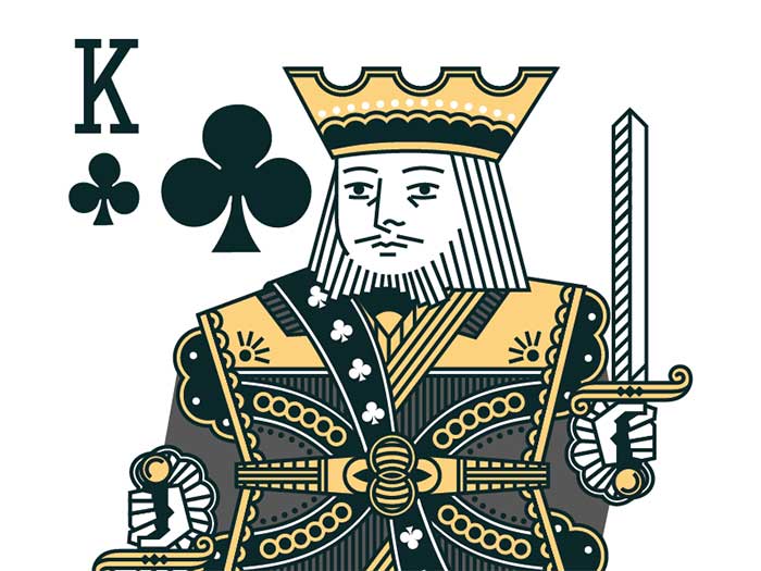
- The King of Clubs’ right hand with an imperial orb was removed (the orb’s decoration covered the fingers). Another notable change is the transformation of the crowning Lorraine cross into a wilted-lettuce-like object.
- On some of the pioneer Rouen cards, we can see the Jack of Clubs with a large and fine feather in the cap, which soon started resembling a leaf. The arrow he held was slowly deformed, and eventually started looking like a strange object.
- The Jack of Hearts was given a leaf instead of the long and obscured sword. The hilt was slightly deformed, and ten completely transformed into a natural stick with the leaf on top.
- The King of Hearts’ axe was replaced by a sword, and his moustache was removed.
- With time, the King of Spades lost his right hand, but the weapon remained as it was always held in the left one.
- The only queen to hold a sceptre was the Queen of Spades, and the sceptre changed once it was cut in 2 parts by the frame.
- The Jack of Spades received a moustache, and had his spear transformed into an undecipherable and unclear object.
The 1800s updates
The English playing cards design underwent many transformations during the 19th century, in particular the second and the third quarter.
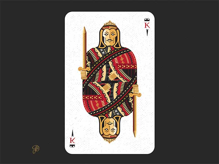
- The most notable the design is the double-ended one, thanks to which face cards no longer had to be turned to see them clearly. However, this change imposed the need ot represent personas with no arms or legs, as a result of which the King of Clubs’ orb is no longer supported but suspended in mid air.
- During this period, the suit sign was permanently placed on the bottom right and the top left corners of the cards. This change was applied to the Queen and Jack of Diamonds, and the Queen and Jack of Diamonds, as players thought it was challenging to have 6 courts with right-positioned suit signs while holding all cards in a fan. Nevertheless, certain card makers continued producing unturned cards.
- Cards also received indices on the bottom right and top left corners. Thanks to them, the suit became visible even when holding cards in a fan, an innovation that was very useful for the games typical for this period (Whist, for instance, when payers have to hand 13 cards all the time).
- The 19th century was also the time when cards received indexes, added by putting miniature cards in the left-hand corners. The change was refused due to its negative, obscuring effect on the left-corner, and the indexes were thus replaced with letters, while the miniature cards were left out.
- The redrawn version of the design is neater, but its style is still the same. The realism attempts were all completely abandoned.
- The standard 52-cards deck of today is reminiscent of the four French suits from the 15th century. We have the (♣), diamonds (♦), hearts (♥), and spades (♠), all resembling the items they stand for, but are nonetheless deprived of the lavish motifs of their predecessors, and thus easier to reproduce. The pips were even back then significantly different from each other, standing for symbols associated with the country’s culture and tradition. We can find all types of icons – sorcerers, gobblers, birds, stars, and more, all with a symbolic meaning that reminds instantly of tarot decks. Yet, the pips stand for diversion and not divination as tarot cards, but still feature some of the best 16th century iconography related to mysticism, alchemy, history, and astronomy.
- According to historians, the 4 suits in playing card decks were introduced to showcase the 4 different classes in the medieval society. The chalices and cups (today’s hearts) symbolized the clergy; the swords (today’s spades) stood for the military and the nobility; the coins (modern diamonds) were the symbols of merchants; while batons (our clubs) represented the peasants. Yet, not all decks were categorized in the same way. Early German hunting cards, for instance, also had bells, as bells represented jesses of hawks, and symbolized falconry which was at the time a sport reserved for the wealthiest. This is why bells were more suitable for Rhineland’s nobility (and German nobility altogether). In France, on the other hand, the upper class was represented with diamonds, having in min that this was the shape of churches’ chancels, and a common mark on aristocratic graves and monuments.
Ending thoughts on face cards
This article aims to help uninspired designers to give everyday objects a second look, and to think of them more creatively.
Face cards are great examples, as there is plenty of logic and history behind each and every one of them.
If you liked this article about face cards, you should check out these as well:
- Book Cover Design: Ideas, Layout, Fonts, And How to Create One
- Graphic Designer Salary: Junior, Senior and the Average Annual One
- Japanese Graphic Design: Beautiful Artwork and Typography
The post Face Cards: The Intricate Playing Card Designs appeared first on Design your way.
Source: http://ift.tt/2rXdyDC

No comments:
Post a Comment