Have you ever wondered what is graphic design? In this article we’ll look at the graphic design basics.
Graphic design is, simply put, where the art of aesthetics and the science of communication meet.
It puts an emphasis on visual communication by making use of a range of elements and various media in order to promote a specific message.
Most of us may have given up on this when we originally started, because we maybe weren’t that good at drawing on paper. However, the tools that we have at our disposal now may help us overcome this.
You can always benefit from learning graphic design as a marketer, even if you don’t really have a formal education. In that case, you enter the world of DIY education, where you have recommendations that revolve around “learn Illustrator and Photoshop”, or “read books about the graphic design basics”.
And, sure, they may help, but balancing between learning the fundamentals, navigating the new tools, and trying to develop a personal style can be tough.
Graphic design tools
A graphic designer’s responsibility is to arrange and use various graphic design elements on different types of media, anything from a poster to a website, and that’s often done with the use of graphics software programs.
- Adobe Illustrator has support for high-level vector graphics, and scalable arts. It’s best used for building icons, related pieces and infographics.
- Adobe Photoshop has a lot of specialty editing tools, as well as filters, that let you adjust photographs, or other image files
- Adobe InDesign is a frame-based program that helps you compose all elements of a designer’s work into a single file with a given layout
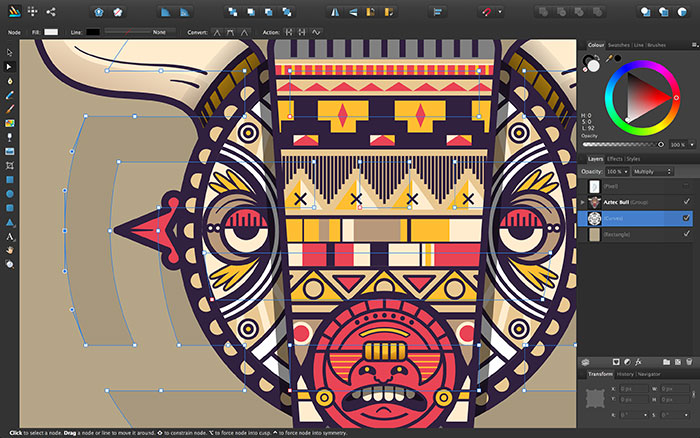
If you’re a designer on a budget, investing in those tools might not be something you want to do, and you can get alternatives such as GIMP, Inkscape or Affinity Designer.
The use of graphic design
You are actually exposed to the professional designers’ work every day. Anything from a stationery template, to a complex ad campaign starts its life with a designer and his application of the art and science behind his craft. Professional design is something that gets inside even in the most humdrum of places.
For example, you would be surprised, but the Federal Highway Administration actually has detailed technical specs for all signs, and they’re all specified with precise rules such as the layout, spacing, and the typeface, or even the placement and angle of arrows.
Creating beautiful design is actually much more than an inspiration, or an idea, and this is something that is absolutely in the basics of graphic design.
You will need to know the graphic design basics if you are to succeed. You can spend years studying nuances, but there are a couple of basic graphic design tips that you should know before you start.
Even amateurs who want to learn graphic design to maintain their personal blog can utilize these things for more professional pieces.
And, if you aren’t looking at “graphic design for beginners”, but you’re instead someone who wants to make some money with this, you still must know them. It’s true that rules are made to be broken, but to break the graphic design basics, you must know them first.
Line
The line is the first, and most basic element of any design. When you’re drawing, a line is the stroke of the pencil or pen. In graphic design, it’s any to points that are connected.
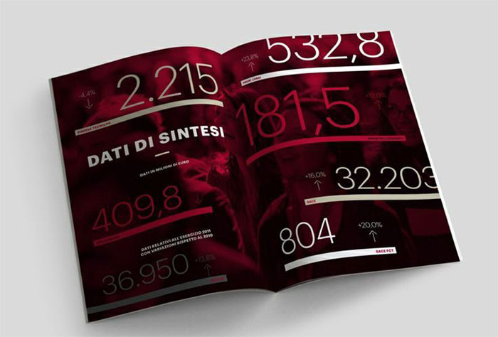
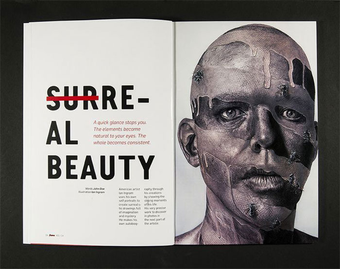
They are useful for anything from dividing space, to drawing the eye to a certain location. For example, a magazine will use a line to separate headlines, side panels and content.
Color
One of the most obvious elements of design, color can either stand alone as a background, or it can be applied to other elements such as shapes, lines, typography or textures.
It will both tell a story about the brand, and create a mood within the piece. And, every color says something different, so you can even use combinations to further alter that impression.
Shape
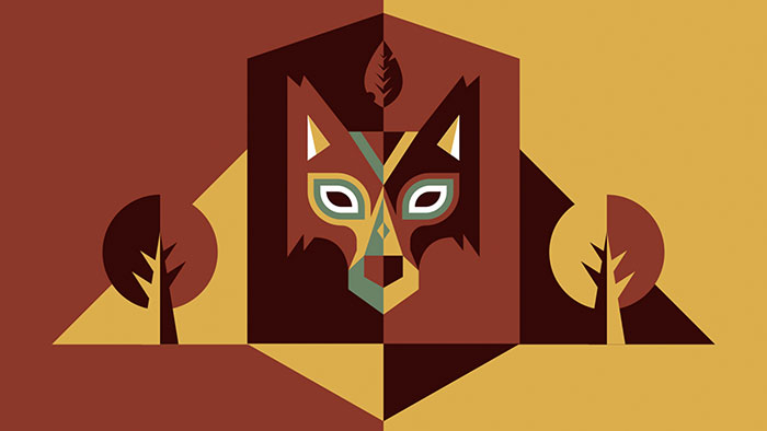
Regardless of whether they’re geometric or organic, shapes add interest.
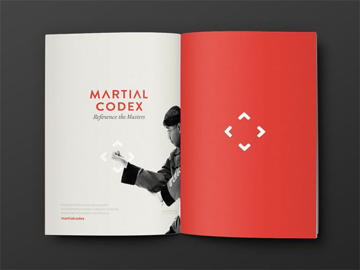
They’re defined by boundaries, like color or lines, and are commonly used to emphasize one portion of the page. Ultimately, everything is in shape, and you must keep in mind how the shapes, or the elements of your design, are interacting.
Space
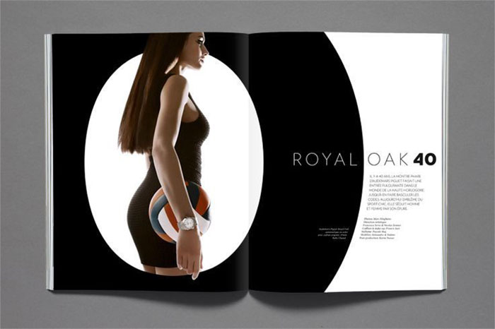
One of the most misunderstood and commonly underutilized aspects, is negative space.
Those blank spaces, regardless of whether they’re white or another color, add up to the overall image. Negative space can be used to create shapes, just like any other element.
Typography
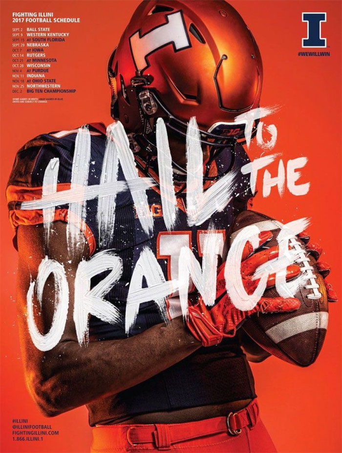
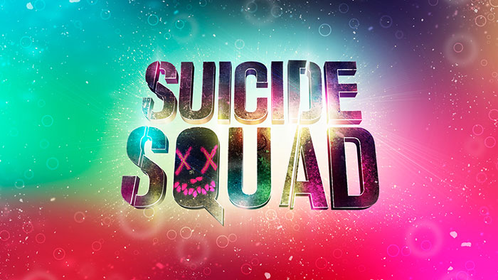
This is perhaps the single most important part of web and graphic design.
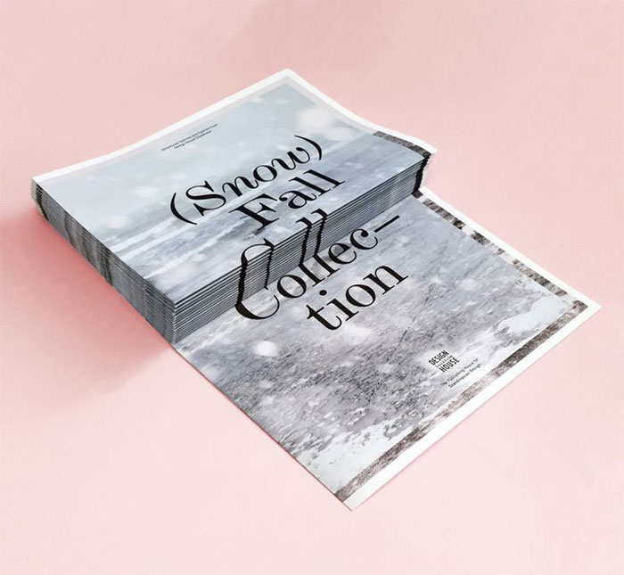
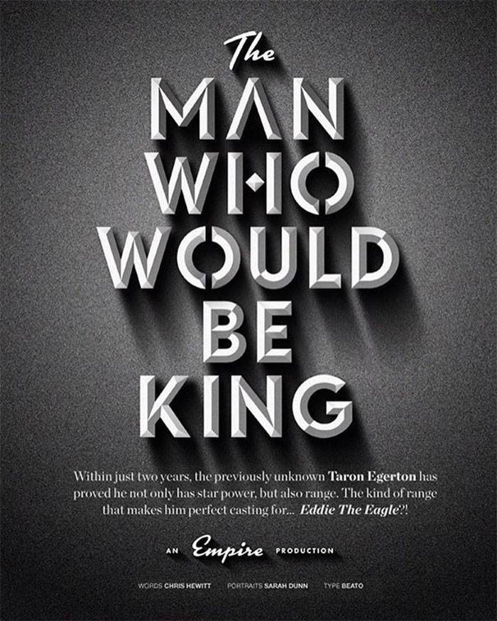
Just like the shapes, colors and textures, the font will tell your readers if you’re a playful food blog, or a serious online magazine. Sure, words are important, but their style is equally important too.
Scale
Playing with the scale, or size, of your objects can both add interest and emphasis.
If you have a symmetrical website where all ingredients are similarly sized, it’s boring.
However, the amount of variation usually depends on the content within. Some subtle differences may suit professional content, but if you have a creative enterprise, go for bold ones.
Emphasis and dominance
Sure, you can talk about emphasizing one thing or the other, but the sheer element of emphasis has much more to do with a color, style or object trying to dominate another, for that heightened sense of contrast. All of this will be intriguing, and create a focal point.
Balance
As far as balance goes, there’s symmetry, and asymmetry. Most designers will opt for asymmetry, mostly due to the eye-catching nature, but you’ll find that symmetry also has its place. Every once in a while.
Harmony
Harmony is the graphic design’s main goal. So yes, it’s important. When all the pieces of your design work together, you get harmony.
You shouldn’t have anything that is superfluous, and a good design will always be just enough, but never too much. Before you write off the project as complete, make sure this is present.
Textures
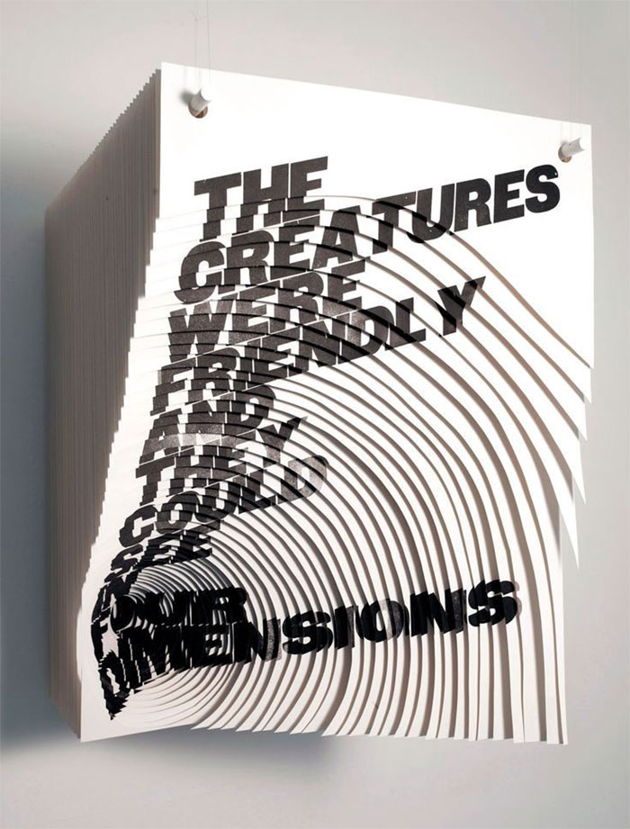
Thinking about texture when that piece you’re working on is never going to be touched sounds funny, but a website and graphic design will often rely on the impression the texture makes.
It gives the two-dimensional surface a three-dimensional appearance, and helps you build a truly immersive world.
Even though not very popular a few years ago, textures are now very commonly used. They compete with, and often replace, single-colored backgrounds.
Textures often look similar to solid background colors, but analyze them a bit closer, and you’ll find small, yet effective differences.
Those texture styles will include anything from paper and concrete, to fabric and natural elements, put among smooth or flat colors.
The textures can also range from being very subtle, to being pronounced. And, they’ll work with pretty much anything. Even if they don’t really seem important, they can have a huge impact on the website.
Tips for learning graphic design
Keep an ear to the ground
As a marketer, you know how much you can learn from influencers. Well, 49% of the people trust someone they know above anyone else for recommendations, and in this digital era, this very well includes influencers.
Influencers are actually individuals that have an online presence which influences the target audience’s opinions and behaviors.
They’re often willing to share the secrets to their success, and if you try to listen to them, as well as engage with them, you will find that you’re much more familiar with the online design world. This helps you stay on top of trends and discover inside tips from other experts.
How to engage? Start talking to them on Twitter or Instagram. You can never know who could respond to your questions, and absolutely any positive connection only helps you learn more.
If you follow along, and join the exchange, this will lead to you becoming a big part of a design community that will constantly support you.
What should you do right now?
Make a targeted list of influencers on Twitter, so you can see their insights without having to go through a sea of other profiles. If you have a HubSpot software, you can use the Social Monitoring tool for this. You should add a variety of influencers, from people who are well-known amongst designers, to those who inspire you personally.
And, put a few whose work you don’t like. That might seem counter-intuitive, but it will help you figure out why exactly you don’t like it, and thus, help you figure out design.
Collect work that inspires you
Once you’ve decided to learn the graphic design basics, you should begin building a catalog of sorts, of work you consider to be successful. This can be as simple as making a Pinterest board, or saving items to a folder on your PC or Mac.
Just like that list of influencers, a catalog of work will help you figure out trends, both present and past, as you start recognizing patterns.
You should also begin to understand your own interests and style preferences. For example, if you’re constantly saving infographics, you could start looking into resources to learn how to create some.
Getting inspiration
Familiarize yourself with Behance and Dribbble. They will showcase a lot of high-quality work from leading designers, and these designers often give you insight into the design process.
This is key when you start working on your own creations. Set aside some time in your day and review those sites.
One way to make this and not have it impact your workload every day is to use Panda, an app that replaces the New Tab in Chrome, with a stream of content from various sources such as, you guessed it, Dribbble.
Even though some might find it a bit distracting, this kind of app lets you find and save something you find eye-catching every time you open a new tab.
Dissect the whole process
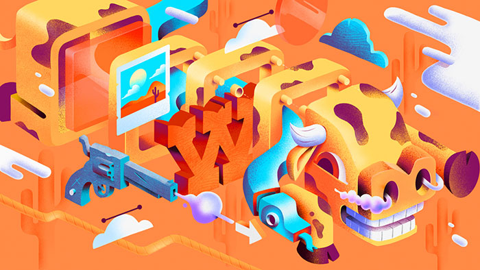
One of the key moments you may have is that point when you recognize that every icon, infographic or illustration you’ve ever seen is actually the product of someone’s mastering on how to combine lines and shapes.
You can’t say that things like meshes in Illustrator don’t play a role, but when you look at the fundamentals, most of the designs are built up from the simplest of shapes.
When you’re analyzing the whole process behind a design, you will begin to understand the pieces that are combined to produce that piece. Depending on your skill level, you may know some of the tools used, or which aspect was actually created first.
But, that shouldn’t stop you, as examining a design’s construction lets you flex your creative muscles a bit. You will also most likely find that:
- You know much more than you actually think you do.
- There’s more ways to get the desired result.
- Once you begin identifying holes in your knowledge, you know where to explore to narrow the gap.
Free graphic design resources
A quick way is to download some free PSD or vector resources, and start digging through the various layers so you can see how that object was constructed.
Get specific with the online search queries
At some point, you’ll hit an obstacle, and start thinking “Wow, how do I do that?”. Others have most likely wondered that exact same thing, and you can learn this from something as simple as a YouTube tutorial with some careful and active following along. The key?
Being specific with your searches, so you find something that is truly relevant. For example, “how to create an icon” gives you really broad results. On the other hand, “how to create a flat icon with a lot of shadows”, is spot on.
Don’t be afraid of getting feedback
Everyone is scared of criticism, at one level or another. You’re afraid that your ideas might get shot down, and you’ll be back to square one. You must learn to accept constructive criticism, regardless of how difficult it is, as it is paramount to becoming a better designer.
Ending thoughts on this graphic design basics article
Sure, there are hundreds of rules and principles when it comes to creating stunning designs, both on and off the web. Above you have some of the graphic design basics that will help you get on the right path to creating professional and beautiful designs.
If you liked this article about graphic design basics, you should check out these articles as well:
- Book Cover Design: Ideas, Layout, Fonts, And How to Create One
- Graphic Designer Salary: Junior, Senior and the Average Annual One
- Badge Logo Design Ideas To Use As Inspiration
- Graphic Design on Wikipedia
- Graphic Design projects on Behance
- Graphic design ideas on Pinterest
The post Graphic Design Basics: Tips for Beginners appeared first on Design your way.
Source: http://ift.tt/2E54wah








No comments:
Post a Comment