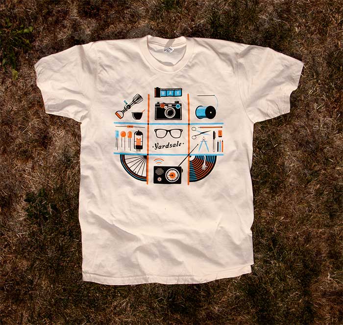
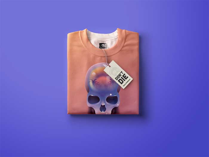
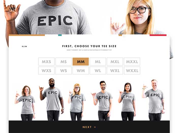
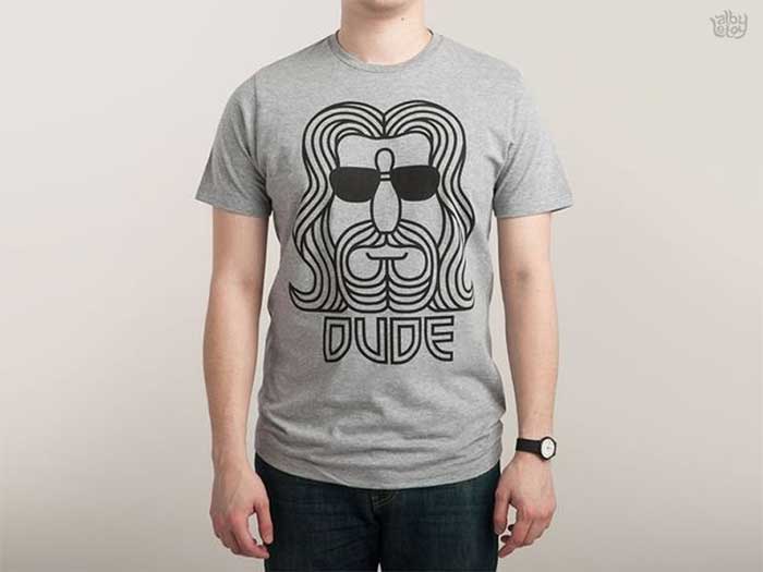
Are you in need of a few T-shirt design ideas? Cause there are some cool ones in this article.
Ever since their rapid rise to popularity in the 1960s, t-shirts have been more than just clothing.
They’re worn by everyone, and they’re pretty much the new billboards.
They’re better than the old kind, because they’re mobile, and they give you the credibility of the approval of whoever wears them.
They’re the perfect place if you want to get viral advertising and precious brand recognition. But, that only works if you have a good t-shirt design.
A few key design considerations
The base of your t-shirt is the shirt design that it displays. You want it to represent your brand, and you want it to stand out. That isn’t easy, as there are almost as many t-shirt designs as there are t-shirts. Here are four things you should consider if you want to design your own, or if you’re just looking at t-shirt design ideas.
- Look at it as a piece of art. The street can be a gallery as much as any museum, so creating a cool t-shirt design that will spark a conversation is a good idea.
- Whoever is wearing your t-shirt, is introducing you to potential clients. Use it to show people who you are, and what you do.
- Consider how your t-shirts will be worn. Ideally, for street-strutting moments, you’ll want something sleek, and not something that will only be seen by the wearer’s other half.
- Sure, you want it to seem cool and exclusive. But if you want to get the most wear out of it, make sure the design is applicable to as many target markets as possible.
… and 5 practical things to keep in mind
In addition to the theory, practicality is also required. There are limits to what a printer can do for your budget, and these limitations when you want to design a shirt are best addressed at the beginning. Here are a few of those technical considerations when you want to see how to design a t-shirt.
- Simplify the line, color and texture. They’ll all come into play, and all have an influence over the possibilities and budget. More complex designs cost more, and a simple t-shirt design can look good too. Solid colors, clean lines and less shading are the way to go when you want to design a t-shirt, especially on a budget.
- Everything is easier if you have fewer colors. Speaking of which, use Pantone, your designer will be thankful.
- Don’t want to sound like we’re repeating ourselves, but avoid imagery that is hard to print, such as subtle gradients and fine details. They’ll only give you a headache, and the end result won’t look anything like your design, even if it does cost a fortune.
- For a bold impact, add dark outlines. That will be REALLY BOLD. Sorry for yelling.
- The t-shirt design size should be drawn to scale, exactly like it will be printed on the t-shirt. Don’t let the printer do the rescaling, unless you want to be disappointed. The t-shirt design dimensions aren’t something you want to be having issues with.
Sure, your definition on how to design t-shirts may be nothing more than your logo on a chest pocket. However, if you want it to stand out, you want to be creative and you need T-Shirt design ideas. Keep the technical limits in mind, and play with the design.
Explore your concept and take your time
Make a sketch, go out for a walk. Make a few variations, eat something, and do a full brainstorming process. Afterwards, sleep on it. Then do it all over again. Sure, if it comes to you straight away, that’s amazing, but other options should be explored just in case.
Imagine how it would look like on a shirt
A design on screen and a printed piece can be vastly different. Mock it up on a photo of a model, even print it out if necessary and put it on an actual tee. Of course, your artwork should be created at actual size.
Keep things simple, but don’t neglect details
Attention to detail is something everyone appreciates.
Seeing a well-executed masterpiece on a tee can look stunning, and you can study that for hours. However, some of the most classic, timeless designs have been dead simple, and the message is conveyed through the simplest form. Get in the middle, and delivering a successful design might prove to be a struggle.
Consider your target market
This is important. Who are you designing for? Male or female, young or old? You’re making something you want people to wear, and like any good marketer, you should write down who you want to attract to your design. Who they are, what other brands they like, what about them, everything, and start from there.
Keep the humor subtle
If you want a humorous design, it shouldn’t come across as a low-cost joke shirt. Even some of the most successful loud, in your face designs have subtle humour.
Color matters more than you think
The t-shirt color should be used effectively, and you should go for complementary colors.
If you’re using Illustrator, turn on Global Colors – it’ll save you time and it’s a life saver. Halftones are also good if you have a restricted color palette.
Properly prepare your artwork
When screen printing, use CMYK colors – the printers will love you. Outlining text and expanding strokes are another thing they’ll love, and there are plenty of other tutorials regarding this, depending on whether you’re using Illustrator or Photoshop.
Find a good printer
Even though your design is finished and prepared properly, the tee is only as good as the printer. Give it to a reputable company, or give your local guys a call, but taking time to learn about the type of tee you’ll be printing on is important.
Sizes, weight, labeling options, cost etc., they’re all things that affect the final product. Sure, this takes a while, but you should end up with a company that wants to treat your tee as an end product, and they’ll handle your work carefully.
Educate yourself
If you want a good understanding of basically anything, studying and understanding its context is important, and that is also the case for tees. They’ve come out of every subculture ever, from skateboarders, street art, general pop culture etc. This is where T-Shirt design ideas play an important role.
Stay ahead of the game
Inspire yourself with the latest trends, but don’t copy them. By the time you’ve seen that t-shirt already produced, designers are already moving on to something else and you won’t know it.
Use PMS colors
You might be used to CMYK and RGB, but for accurate colors using a silk screener, go with PMS colors. Color separations are both easier and more accurate here as well. The printer shouldn’t charge you extra for color matching, as you’re actually doing them a favour by being more particular with your colors.
Convert your text to outlines
Your artwork may require a custom designed font, and when you’re sending it off for print, a substituted font is the last thing you want to see. If you convert the text to outlines, regardless of the computer where the artwork is opened, the text will be shown as an image, thus eliminating the need for any substitutions.
Your artwork should be created at actual size
The printer’s judgement isn’t something to trust without discussing it with them. The vision you have of your end product might not match with what your printer has assumed is your vision. The safest way to defend yourself is actually creating the artwork in its final size. If you don’t know what size you want to use, get a ruler and slap it to the shirt you have on you. It may sound dead simple, but it does work.
Use vector art as often as possible
This isn’t an argument about vector and raster, but a suggestion to go with vector as often as possible. Color separations are much easier, and the small details will be much cleaner when printed. This is also a general rule for everyday jobs, but shouldn’t be an automatic in all situations.
Expand the strokes
If your colors are properly set to PMS swatches, the color separations software shouldn’t have any problems. This is more often a human error that happens because strokes might be overlooked.
Half-tones should be set with PMS colors
Sometimes your budget, or design, may require halftones to save on how many colors are printed. The best way to achieve this is to slide that color scale down, to a percentage of the PMS color, thus leaving the color separations software to handle the rest.
A few tips on creating an inspiring t-shirt design
Make it feel comfortable
Before you even think about the design, make sure the shirt is comfortable. Choosing a material that is cheap and uncomfortable will result in people buying the shirt but not wearing it. Do you want your customers to think that you’re low grade, or high-quality? Your base shirt should be something that customers want to wear over and over again.
Choose a color scheme
Next, review your color palette, and come up with the right hue. Darker colors are usually more expensive to print, and certain colors may have limited availability. Common colors may include black, white and grey, and red and navy are also good choices. Picking well-known colors may be good for appealing to your target audience, you shouldn’t be neglecting your brand’s color scheme. Keeping the number of colors down is another thing to try, as complex color patterns aren’t only more expensive, but they may not appeal to your audience’s taste either.
Reduce, and then reduce some more
For a screen printed design, less colors can keep prices low. If the artwork is complex, or has too many colors, ask for a digital print, that should net better results. You should also identify the custom ink colors in order for the printers to be able to match it. As mentioned above, use the Pantone Matching System.
Expand and outline
Forgetting to outline your elements is a big mistake. As mentioned earlier, not every computer will have the font you chose, so outlining it is a good option. Outline all your objects, and expand the borders and strokes for things to remain proportional.
Make a mock-up
This is the key to a beautiful shirt. Once your design is done, print it and hold it up to a t-shirt. It should look at the scale of your design, so you know whether or not it works on a t-shirt. If you have someone holding it up on their chest, several feet away from you, can you still make out the images, as well as read the words? You should know what works and what doesn’t before you even think about printing it on the t-shirts.
Ask for help
At the end of the day, if you’re having problems, the screen printing company undoubtedly has designers, and you can go ahead and ask them to give you an engaging design from your rough sketches. They may also offer help when you’re choosing colors, as well as offer some additional tips.
Ending thoughts on T-Shirt design ideas
T-shirts are a key part of any casual ensemble at work, and they’ve been ‘in vogue’ for around half a century.
They’re an easy and quick option, and they are also a great way to get noticed. When you look at them from a business standpoint, a great t-shirt design is a great advertisement, since you can turn customers into a walking billboard for your company.
If you liked this article with T-Shirt design ideas, you should check out these as well:
- Poster Printing: How To Print A Poster Flawlessly
- Book Cover Design: Ideas, Layout, Fonts, And How to Create One
- Japanese Graphic Design: Beautiful Artwork and Typography
The post T-Shirt Design Ideas That Will Inspire You to Design a T-Shirt appeared first on Design your way.
Source: http://ift.tt/2DNfVyl


No comments:
Post a Comment