In order to understand the recent developments in Japanese graphic design, we should examine the unique synthesis between modern Japanese styles and their western equivalents.
Then take into account all popular movements such as Rimpa, the Kano School of Painting, and the ukiyo-e woodblock prints; and compare those to the highly influential western Art Nouveau, Bauhaus, Constructivism, Futurism, and Dada.
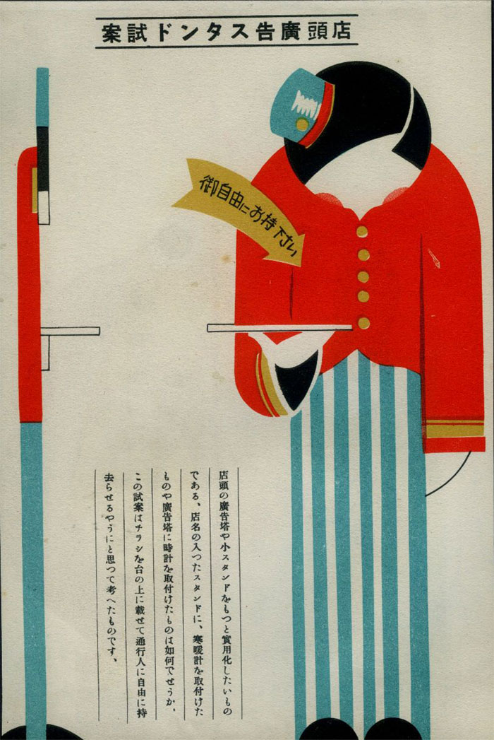
A detailed analysis of the history of Japanese design would be impossible without the teachings and publications of Gendai shogyo bijutsu zenshu (The Complete Commercial Artist) from the period between 1928 and 1930, focused on all efficient techniques that marked this discipline.
The Gendai publications were the first attempt to introduce western world’s design rules to Japanese visual communications, which makes their role even more important.
Graphic design was first acknowledged as a separate discipline in the late 19th century, and within the ‘dezain’ rubric (the transliterated version of the English ‘design’). This is the word Japanese people used to distinguish graphic art from zuan (design) and shogyo bijutsu (commercial arts).
The same as in the western world, Japanese graphic designers questioned the difference between art and design only after the introduction of modern printing technology. At the dawn of the 20th century when mass-produced designs were more or less accessible to everyone, it became extremely difficult to pinpoint pieces that can be qualified as art.
The ‘artistic designers’ category emerged more or less at the same time, led by inspired ‘pure art’ (junsei or junsui geijutsu) creators who had nothing against using their virtuosity for the purpose of commerce and advertising.
Yet, it is hard to speak of a strict distinction at the time, as artists focused strongly on preserving the merits and artistic values of their work even while practicing commercial art.
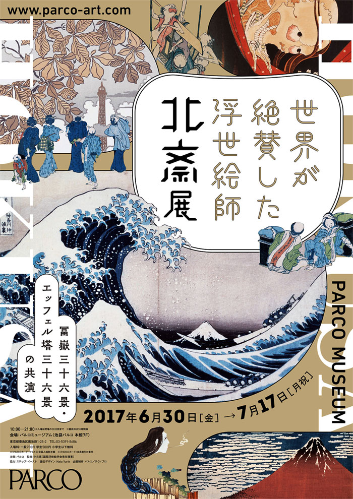
The period between 1615 and 1868 is known as the Edo period, when ukiyo-e prints were the only forms perceived as commercial art, and targeted towards commoners rather than devote art collectors.
Translated, the Japanese graphic designs known as ukiyo-e are ‘pictures of the floating world’, and represent mass-produced and widely distributed images of everyday Japan and highlights of its cultural achievement. As themes, Japanese designers often use well-known celebrities and beauties, worldwide famous landscapes, their folk stories, or their heroic tales.
For the purpose, many Kano school artists were hired to decorate the castles of feudal lords (daimyos) with these commercial prints. A high-quality collection of premium surimono prints witnesses to date the poetry and peaceful life during the Edo period, again as a result of the work of popular artists who designed for commercial purposes.
The list includes the famous Ogata brothers Korin(1658 -1716) and Keznan (1663-1868) who designed textile, prints, and ceramics in the Rimpa School, and Maruyama Okyo (1733-1795) who crafted the beautiful Echigoya kimono textiles.
Rimpa designers were also inspired by the imperial court’s earlier yamato-e pictures collection (the Heain period art, 794-1185), which all illustrate traditional Japanese literature (the tale of Genji, or Tale of Ise, for instance), and can be recognized by their delicate, curved outline that makes them different from the Chinese kara-e angular outline.
They also come with fluid forms and opaque colours, and make it possible for kimonos, fans, and pottery look as elegant as they are.
The teachings of the Kano school
Today’s Japanese graphic design was mostly influenced by the Kano school professionals, whose art was mostly patronized by Muromachi’s shogunate (1333-1568).
The founder of this school was Kano Masanobu (1434-1530), a trainer and ink painting professional who guided the works done within the Shōkokuji Temple, and for the needs of the Chinese Southern Song and Yuan dynasties in Kyoto.
The ink paining style he adopted belonged to Zen painter monks, but underwent serious changes throughout the years due to the dominant patronage and influence of secular experts such as Ashikaga shoguns (1228-1573). They were the official frontrunners of this style for over 400 years, and most of them mastered their own branches and versions.
Looking at Kano’s landscapes, we’d notice distinctive and very symbolic content – the animals and the plants are all represented with auspicious and allegorical meaning. The lines are firm, strict, and executed with Chinese ink, and the colors are bright and welcoming.
Yet, one can still see the Japanese arrangements and sensibility in all figures. This explains visually how the Kano school influenced today’s art forms, in particular, the woodblock prints.
The Kano effects can also be felt in the Japanese rigorous and on-point artistic training, where students are required to copy meticulously and in detail original pictures from Kano books. Once they’ve mastered the copying skill, they’re entitled to call themselves Kano designers, and it is only then that they can develop their own style and make their own books.
Students like these in the past used to be chosen by town authorities and wealthy commoners as machi-eshi, namely the artists that will paint genre scenes and decorate public spaces. Other Kano artists chose to deal with woodblock prints, and it was them to export this tradition to the Western world, and possibly to inspire the entire Art Nouveau movement.
Another important event in the development of the Kano style is the reinstating of the 15 years old Tennou (Emperor) as a political leader in Edo in 1867. Japan’s Meiji Ishin (Coup d’état) was led by Choushuu (Yamaguchi prefecture) and the Southern Daimyos of Satsuma (Kagoshima), and the name Meiji was selected to give young Tennou Mutsuhito the ‘enlightened rule’ over the state.
His 1868 charter oath promised Japanese people freedoms much alike modern democracy, namely direct participation in the administration, political reforms, and dedicated search for wisdom and adoption of worldwide practices. The next year, he unformed domestic administration, and simplified and reduced the high ranks of samurais.
The teachings of the Rimpa school
The highly decorative style of ‘Rimpa’ painting , which flourished during the Edo period (1600-1868). was named in the nineteenth century after one of its leading artists, Ogata Kôrin (尾形光琳, 1658 – June 2, 1716).
It embraces bold, graphic renderings of natural motifs and formalized depictions of fictional characters, poets, and sages with literary connotations—as well as eye-catching compositions that cleverly integrate calligraphy and image.
Historically Rimpa originated in 1615, when Hon’ami Koetsu in collaboration with Tawaraya Sotatsu, founded a community of artists and craftsmen in Kyoto, under the patronage of a wealthy merchant of the Nichiren Buddhist sect persuasion. Their aim was to revive the classical courtly tradition and the Yamato-e painting style.
Both artists came from families of sword-smiths, who had served the imperial court and the great warlords. Sotatsu, produced commercial paintings, decorative fans, folding screens, and decorated paper with gold or silver backgrounds.
Koetsu who did painting in the flamboyant aristocratic style of the Heian period (794 to 1185) as well as calligraphy, lacquerwork, and the Japanese tea ceremony then inscribed poems on Sōtatsu’s decorated papers.
In the early Edo period, the western style became popular and consequently, Rimpa were shunned by artists and academic art institutions. However, it was incarnated in the Genroku era (1688-1704) by brothers Ogata; Korin and Kenzan, sons of a prosperous Kyoto textile merchant.
Korin’s using a rich color pallet and hue gradations, rendered nature as an abstract phenomenon eccentrically decorated with gold and pearl. The rimpa style was reincarnated once more in the nineteenth century by Sakai Hōitsu (1761-1828) and his students such as Suzuki Kiitsu (1796-1858), staged a Rimpa revival which grew out of copying Kōrin’s works.
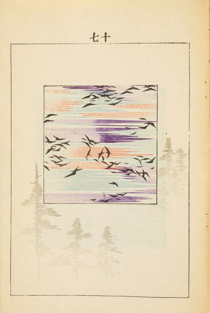
The later Rimpa artists concentrated on the flower, or kachōga (bird-and-flower) subjects, often influenced by the new naturalistic wash style of the Maruyama and Shijō schools.
The effects of Western styles
It wasn’t long before the Meiji government recognized the power of painting and the arts for its society, and for Japan in its new role as an international unified power.
Just as the Tokugawa had set up the Institute for the Study of Barbarian documents (Banshoshirabesho) to understand the colonial enemy which threatened them, the Meiji government had a political and practical rather than aesthetic motive in promoting the arts; this was to gain foreign currency through exports to pay for the huge cost of modernization and to present herself to the world as a cultured and ‘civilized’ nation.
The Iwakura Tomomi Mission of 1871 had a huge impact on the arts in Japan. A group of government officials traveled all over the US and Europe with the aim of changing the unfair treaties and studying western administration systems. They brought back over 500 foreigners to assist in the modernization which had come to mean westernization, many of whom taught at Tokyo University.
They had studied western tastes and brought back specialists to assist in the arts and crafts. This catering to westerners tastes for the International exhibitions was to shape the face of Japanese crafts, but this adaptation to foreign market demands was not new to the Meiji period.
The 1873 Vienna Exposition introduced categories of ‘Fine’ and ‘Industrial’ or technical arts, thus differentiating between arts and crafts, which in the Japanese language were considered the same up to this time. Consequently, the words ‘bijutsu’ and ‘geijustsu’ were created to convey these respective meanings.
The use of such terms may have influenced the craftsmen who, feeling the elevated status of ‘bijutsu’, attempted to distinguish their work from the caegory of industrial arts by rendering them elaborately more decorative in accordance with the European tastes prevailing in that time.
However, the simpler more understated ‘wabi’ style remained faithful to an authentic Japanese austere aesthetic. To sum up, Meiji crafts morphed into an opulent decorative style rooted in Chinese designs and motifs.
In the 1893 exhibition of Columbia Japan for the first time participated in both’Fine’ and ‘Industrial’ art categories. The introduction of Western cultural values led to a dichotomy in Japanese art, as well as in nearly every other aspect of culture, between traditional values and attempts to duplicate and assimilate a variety of clashing new ideas.
This split remained evident in the late 20th century, although much synthesis had by then already occurred, and created an international cultural atmosphere and stimulated contemporary Japanese arts toward ever more innovative forms.
Two Bostonians, Ernest Francisco Fenollosa (1853–1908) and William Sturgis Bigelow (1850–1926), who came to Japan in quick succession in the late 1870s and 1880s were instrumental in the introduction of Japanese art into the west. They also impacted the Japanese style in a significant way. During their time in Japan, they conducted surveys of Japanese antiquities and acquired art with intense energy.
Their Boston Museum of Art collection, encompassed a broad range of periods and genres, from eighth-century Buddhist images to paintings by medieval, early modern, and even Meiji-era artists, as well as ukiyo-e prints, Buddhist sculptures, swords, textiles, and more.
At the time when many Buddhist treasures were being discarded or sold in a misinterpretation of the Separation Edict of 1868, where Shinto became the state religion, Fenollosa made a great effort to preserve national treasures during the period of Haibutsu kishaku (廃仏毀釈) (extermination of Buddhism) which peaked in 1871.
Fenollosa who served on Japan’s Imperial Art Commission from 1886–89, became a strong advocate and patron of Kano Hogai after meeting him in 1883. With the endorsement of Fenollosa in 1888 Kano Hogai painted Hibo Kannon (The Compassionate Kannon), which unlike traditional Buddhist paintings was intended from the outset for public display in art exhibitions rather than as an object of veneration for a Buddhist temple.
Mid-Meiji Expressionism
By the mid-Meiji era the government’s enthusiasm for its wholehearted adoption of western cultural values was subsiding and in the context of promoting a policy of conservative nationalism, a shift of attitudes towards Japan’s own cultural heritage was encouraged.
In 1898 two professors at Tokyo School of Fine Arts (東京美術学校 Tōkyō Bijutsu Gakkō); Yokoyama Taikan (横山 大観, 1868 – 1958)and Okakura Kakuzō (岡倉 覚三,1862 –1913 – also known as 岡倉 天心 Okakura Tenshin)because of their disagreements with the school resigned.
Okakura who studied under Ernest Fenollosa was one of the principal founders of the Tokyo School of Fine Arts, the first Japanese fine-arts academy, and a year later became its head. Yokoyama and Okakura founded the Nihon Bijutsuin (日本美術院, Japan Art Institute.
Born in Tokyo’s port city of Yokohama in 1862, Okakura was first educated by American missionaries and began reading English before Japanese. But, by age 8, his father moved him to a Buddhist temple where he learned traditional Japanese culture amid the monks’ daily regimen of robes, rituals, and green tea.
The Japanese boy raised on The New Testament and Methodist hymns found himself immersed in the sayings of Confucius and playing the 13-string Koto. His great passion was for the art of Japan that was being tossed aside for the Western art and culture. While he wanted to preserve the Japanese traditions and develop a notional Technique, he wanted the Japanese style to become more Expressionist. He wrote:
Moreover, as our new position, the following three objectives must be the aims for young painters: we must develop our Technique more and more following traditional rules, we must place importance on order and not make outrageous paintings, and we must represent “Expression”.
Taikan agreed with Okakura, and wrote an article to explain his painting Chouhou he wrote:
” When people gather in a temple to listen to the same Buddhist sermon, the meaning is different from person to person. Depicting this was one of my principal objectives when I painted Chouhou, I wanted to show the difference. Even if various People, for example, a woman, a farmer or a samurai, listen to the same preaching, one person will listen with faith, another incredulously and another without understanding. I planned to depict these various states in the guise of contemporary people”
Japan’s war prints
The conflict between Japan and China was a result of the parties’ wish to control Korea. It began with the uprising and skirmish of pro-Chinese groups against the Pro-Japanese ones in Seoul and soon resulted in the embarking of armed forces from both sides.
The official combats began in Phungtao on July 14, 1894, and it took only a year for the Japanese army to defeat Chinese forces. The official end of the Sino-Japanese war was marked with the Treaty of Shimonoseki, according to which China was supposed to make few territorial concessions (mostly islands with Taiwan included) and to reimburse Japan with large indemnities.
One way or another, it was clear that Korea would belong to the Japanese hemisphere, which was a beneficial outcome considering the systematic and massive modernization of this state following the Meiji period. There was no way for Chinese forces to defeat Japan’s strategists and Western armory and technology, nor the particularly strong and nationwide enthusiasm.
The main visual communication means of this period were woodcut prints, and their main goal was, as expected, to glorify combat achievements and to underline Japan’s military dominance and aggressive expansionism. Compared to them, Chinese warriors were presented as primitive barbarians, old-fashion fighters equipped with spears, facing in fear the aggression of Japan’s modern rifles.
As the Meiji period was arriving at its end (somewhere around 1912), Japan was already dominating Asia in all aspects. Peace, however, didn’t last too long, and it was Russia to interrupt it. They leased Port Arthur from China in 1898, and it took them 2 years to occupy Manchuria using the Boxer Rebellion as an excuse.
Their plans now entailed expansion towards Korea, and despite their efforts to arrive at a peaceful solution with Japan, Japanese forces attacked Port Arthur in 1904. The result was a harsh Russo-Japanese war fought both on sea and land, with Japan being the dominant side in most of the land led battles.
The final battle, nonetheless, was the one fought at sea, where Japanese forces managed to block Russian ships from entering Port Arthur. To end the war, the rivals signed the Portsmouth Treaty mediated by US President Roosevelt, with Russia agreeing on Japan’s dominance on Korea, and leasing long-term the Liaodong Peninsula. After only ten years, Korea became an official province of Japan.
War prints, however, remained popular even after the Sino-Japanese War and the Russo-Japanese conflict. On prints from this period, you will see defeated Russian soldiers littering a battlefield, and strong Japanese men confronting their enemies with swords, bayonets, and rifle butts.
This time, however, they’re attacking elegant Russian cavalry with good-looking uniforms, sending a message of respect for a decent enemy, and an enhanced sense of modernity and equality.
The basics of Japanese graphic designs as we know them today
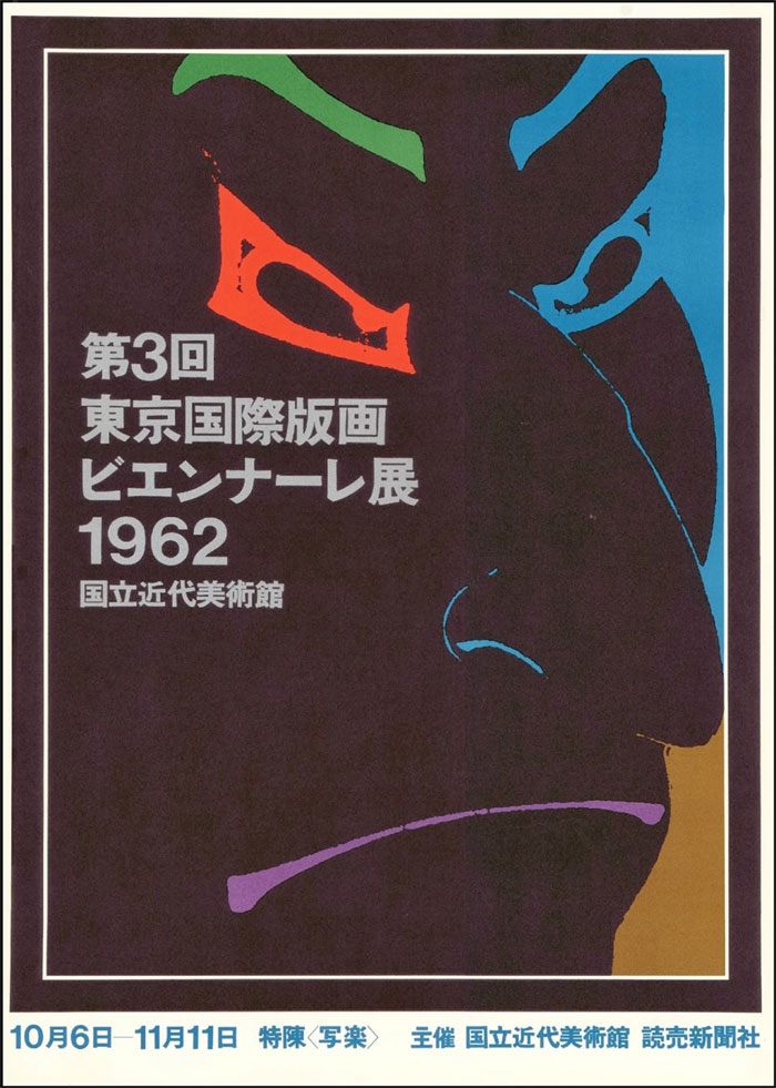
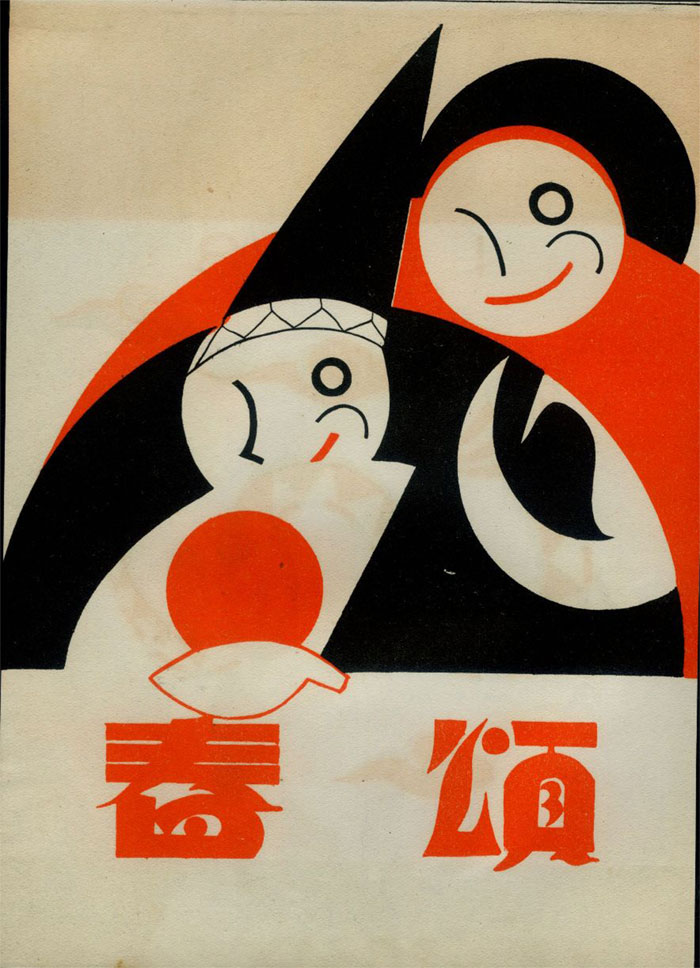
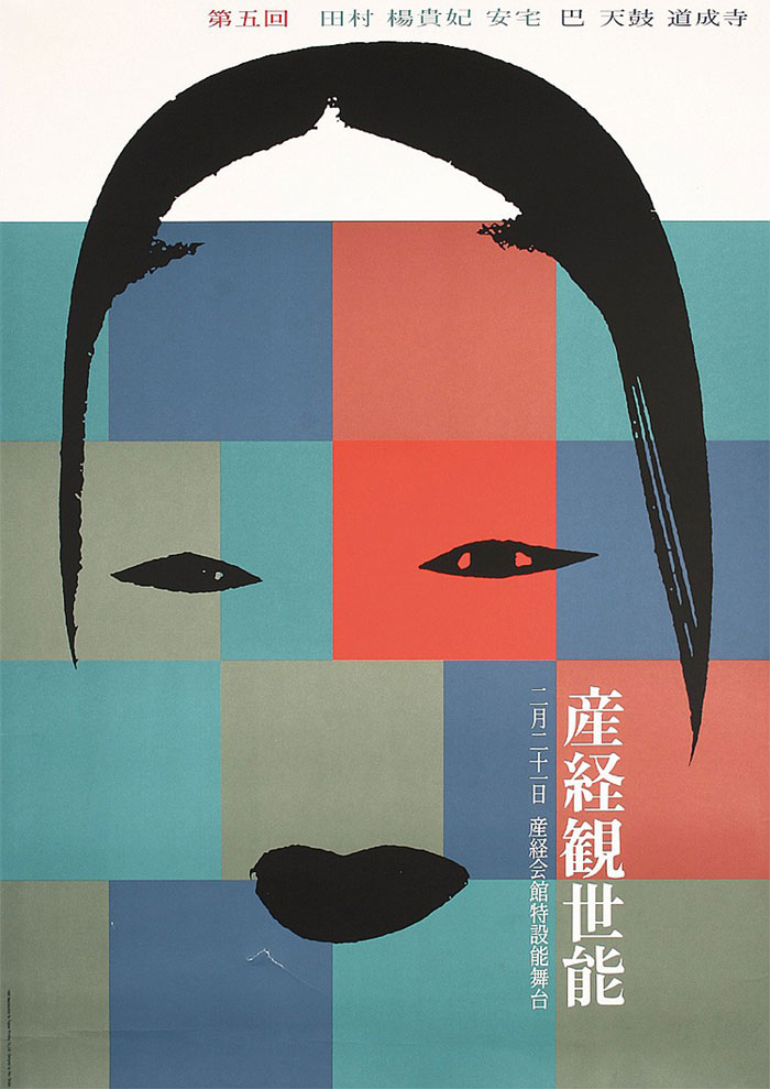
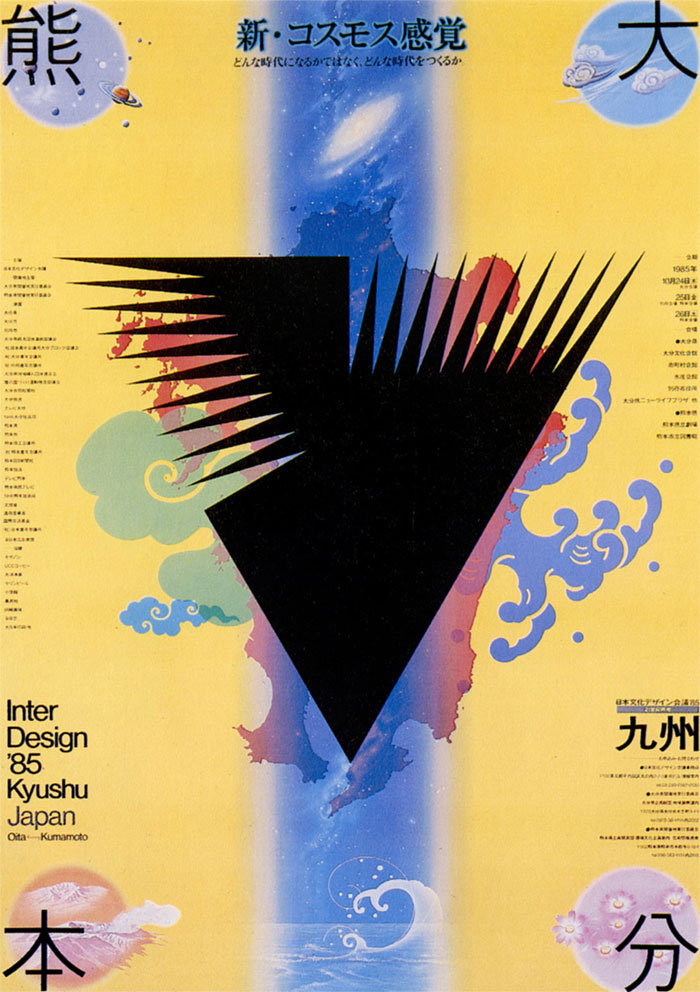
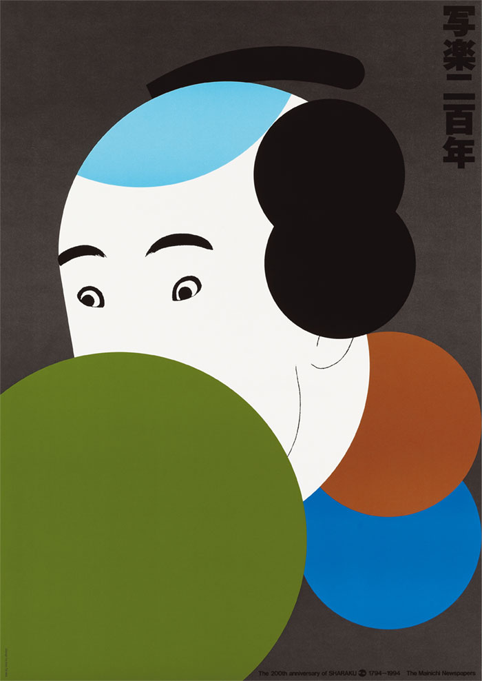
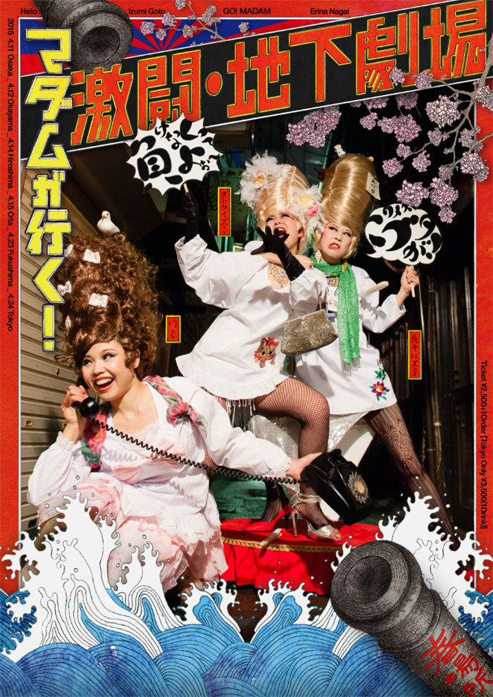
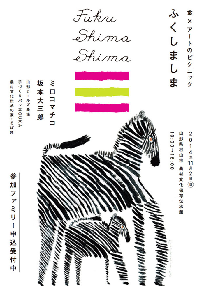
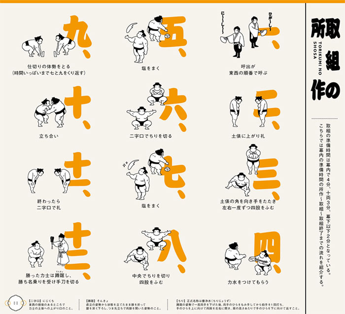
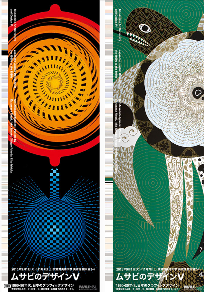
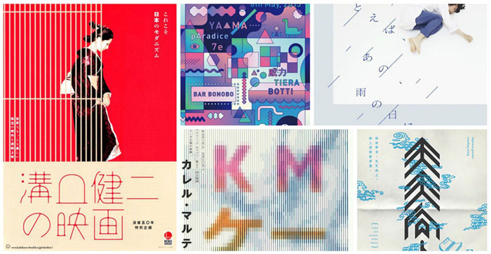
The typical elements of Japanese graphic designs are strong colors, visualized personalities, and overdone character designs, all densely combined on a single outline. They cover more or less all meaningful techniques a designer should consider to get inspired.
We did some research and pulled off the leading visual design techniques, and we are ready to examine those with you. Stay tuned for more knowledge, inspiration, and valuable references!
A brighter palette
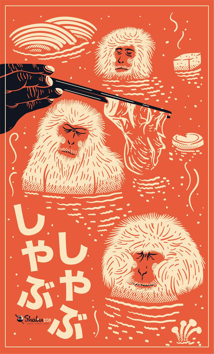
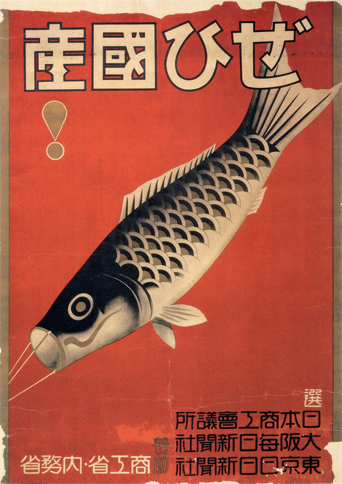
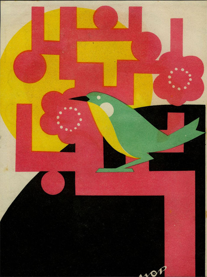
The first thing that will capture your attention on a Japanese design is the teeming palette that brings it to life. Japanese graphic designers focus on warm reds, gold, and even black, but a deeper look through their archives reveals an even richer spectrum of colors.
Japanese culture does rely heavily on the use of color. Waking on the Harajuku streets, for instance, or the vibrant surrounding of Shibuya are the best examples for that. Japanese people are simply in love with warm hues, and they make this obvious in their graphic artwork.
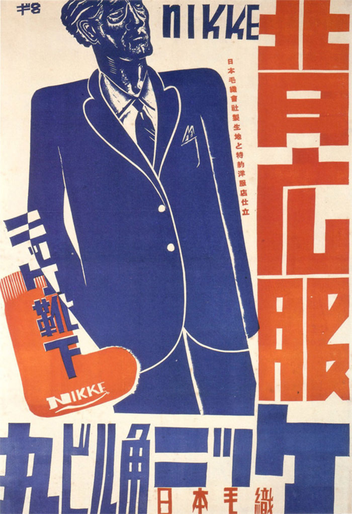
The secret of Japanese graphic design’s success is that craftsmen are not afraid to overdo their work. Instead, they’re deliberately making colors clash so that the result would look more vibrant, and so that it would never go unnoticed.
Lingual mash-ups
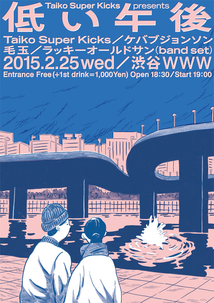
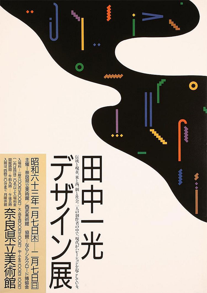
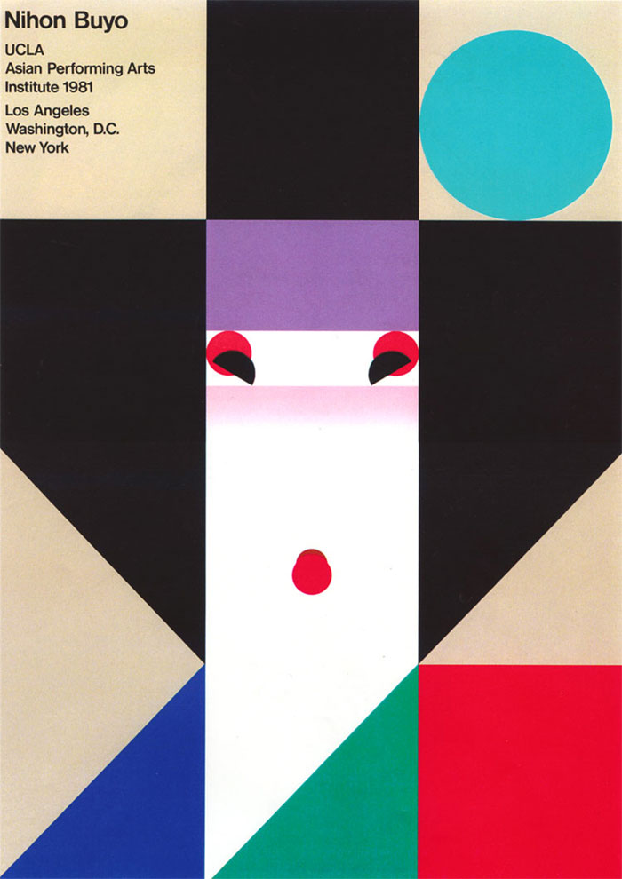
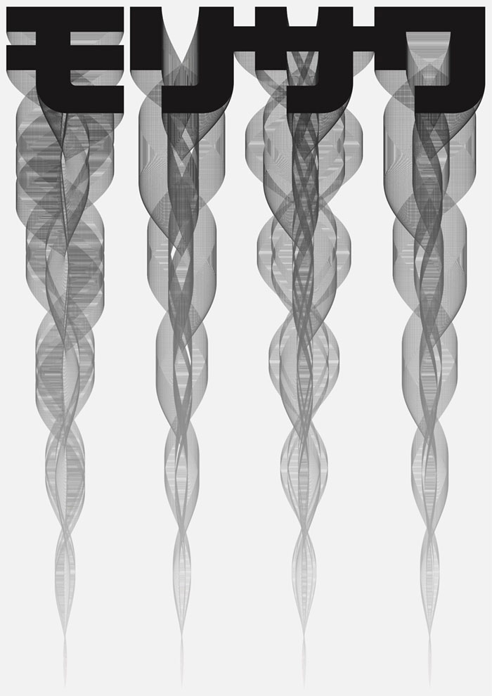
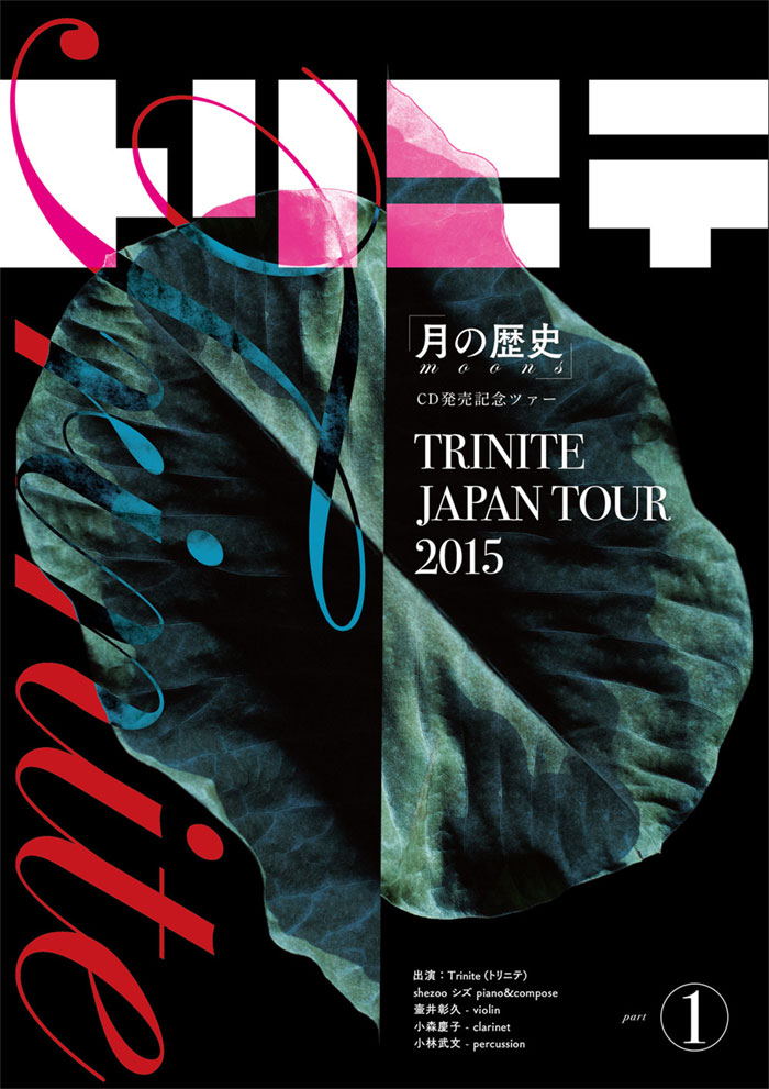
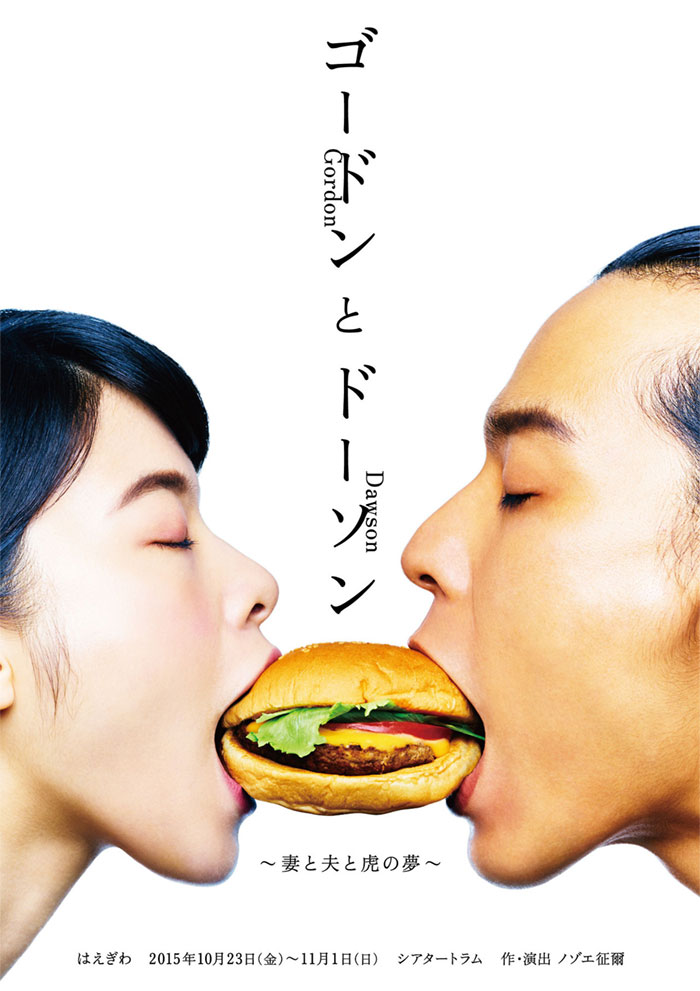
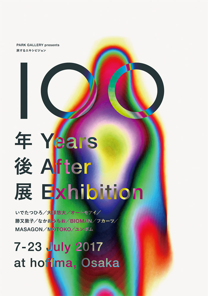
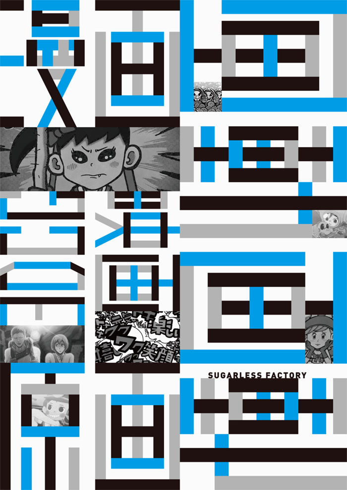
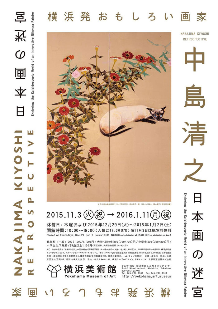
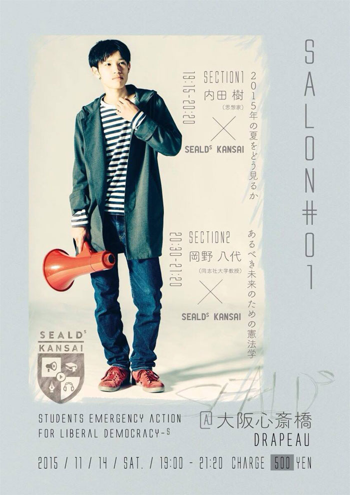
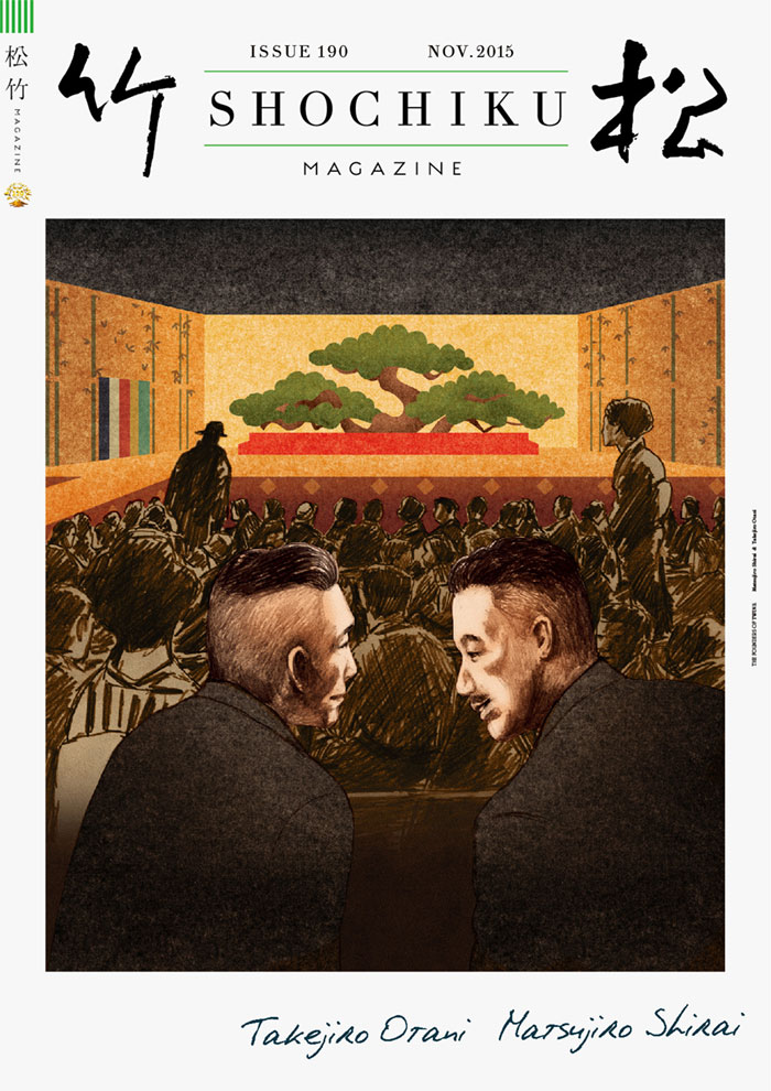
Japanese graphic design has another valuable secret to reveal, and that’s the unique combination of Roman and Japanese typography. The two languages may be as different as it gets, but putting them on the same sheet looks intriguing and irresistibly engaging, and not only for bilingual people!
Custom typography
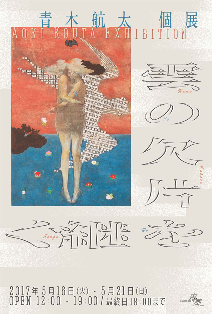
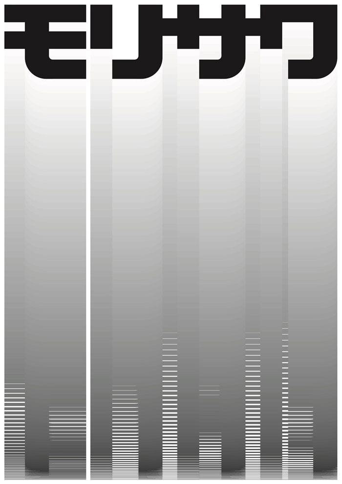
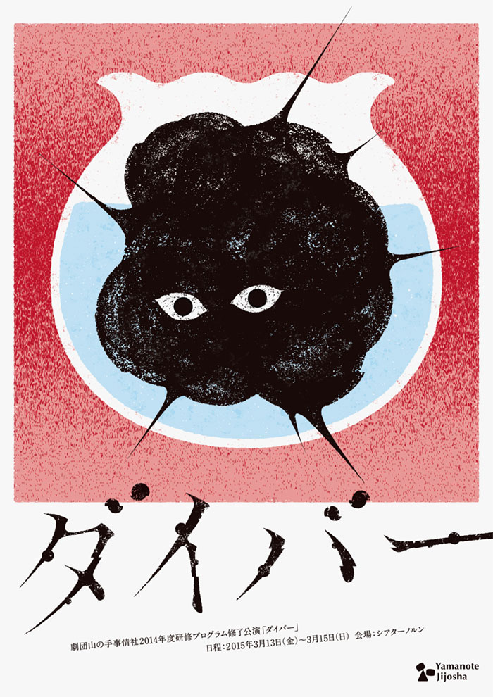
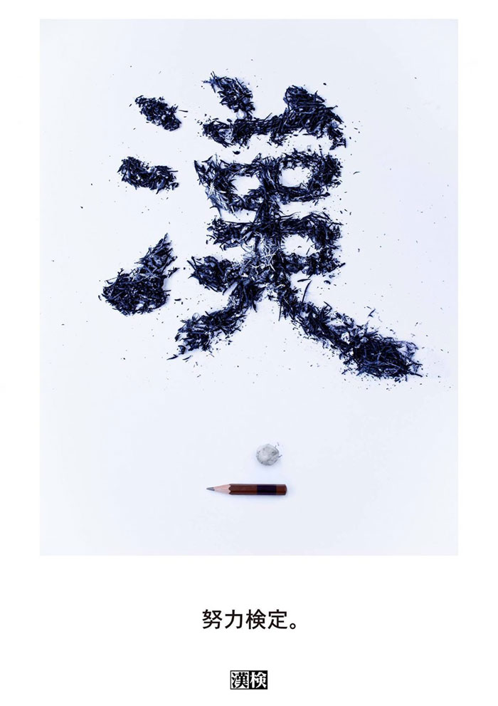
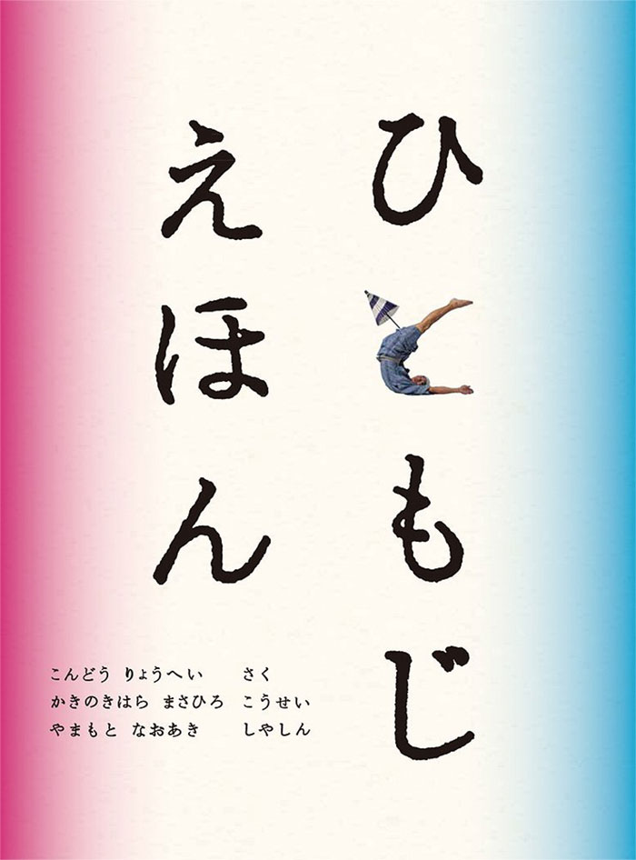
Japanese typography is more complex than the western one due to various reasons, but designers out there certainly found a way to turn it to their advantage – a very common practice is to custom-create typography for a design project, and make sure no one will ever create something similar.
Brush strokes
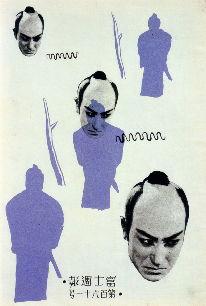
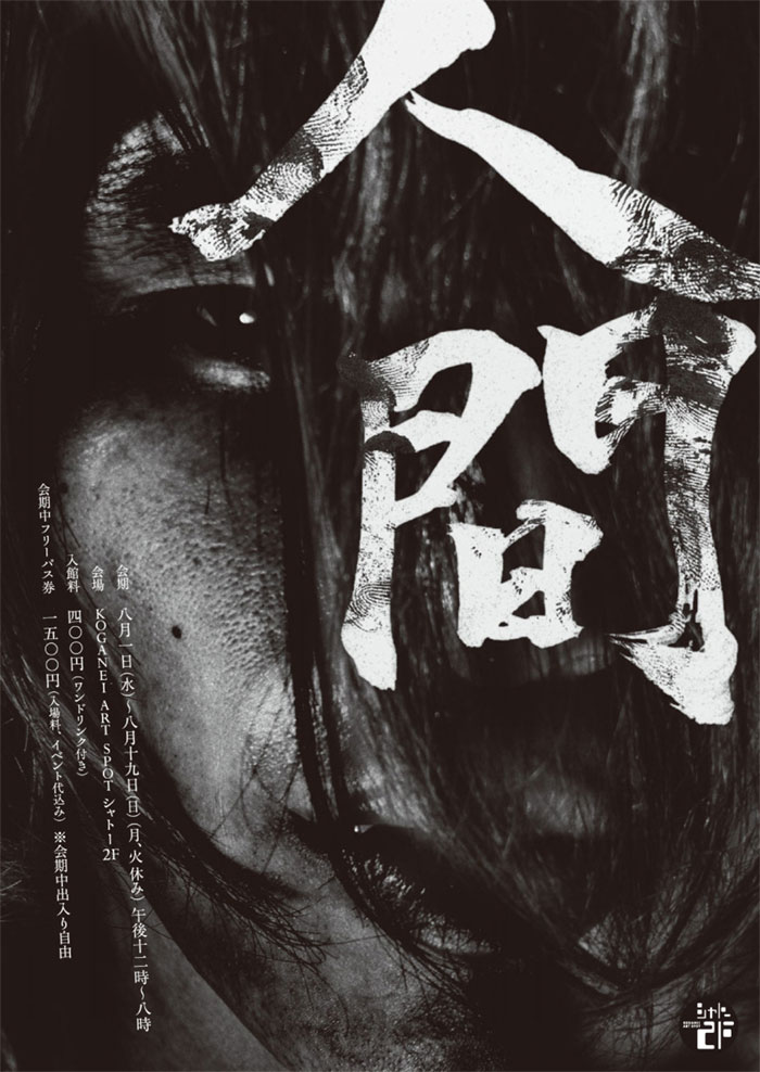
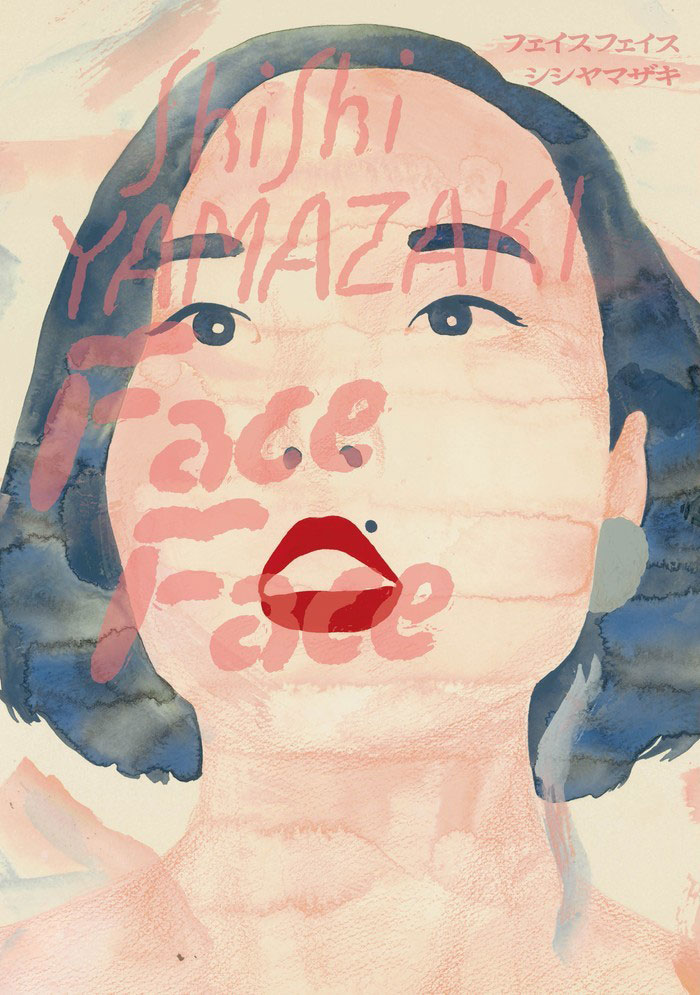
Brush strokes are also quite common in Japanese graphic designs, and can even be considered as recurring motifs. They are used to resemble a connection to traditional calligraphy practices and united in a separate art discipline known as Shodou.
Shodou art can be qualified as crud, streaky, and even messy, but that’s what makes it special. Lines are drawn in a way that helps them flow into each other, and the final products never need corrections.
Gradients
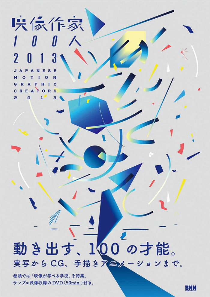
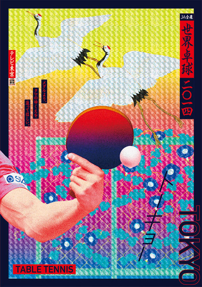
Japanese designs make heavy use of gradients – you will often see subtle and warm colors bleeding and fading one into the other, helping backgrounds become more lively and intriguing.
Floral and organic patterns
Floriography, or as Japanese people call it Hanakotoba, is the science branch devoted to studying flowers. Better yet, it is one the most important facets of Japanese culture. The people in these country associate flowers with their feelings, ideas, and symbols, and therefore include them on all types of designs.
A pink flower, for instance, stands for the curing of illness and discomfort; white represents elegance and virtue; while red, as expected, indicates love and passion.
Circular shapes
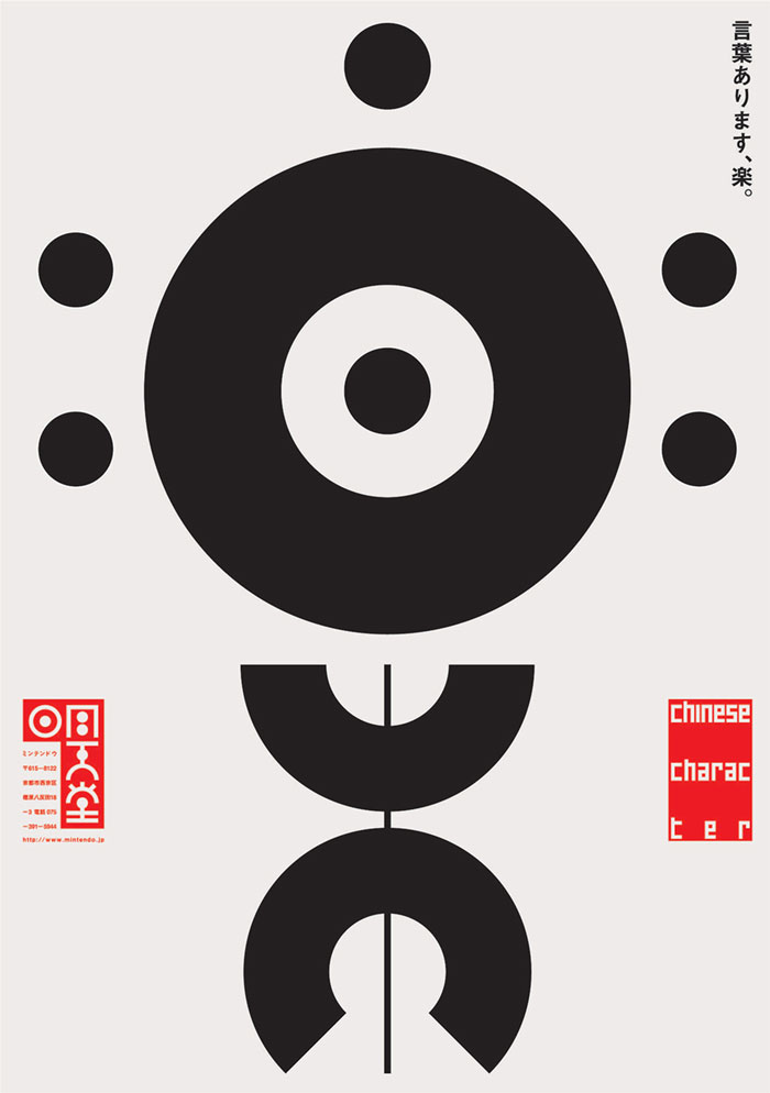
Looking at the Japanese flag, this one is not that difficult to understand – circles and rounded shapes are everywhere across Japanese graphic designs!
This is all because Japanese people think of circles as inherent symbols of harmony and balance. Even their official coat of arms and most common motif – the Mon – has a rounded shape.
‘A culture of cuteness’
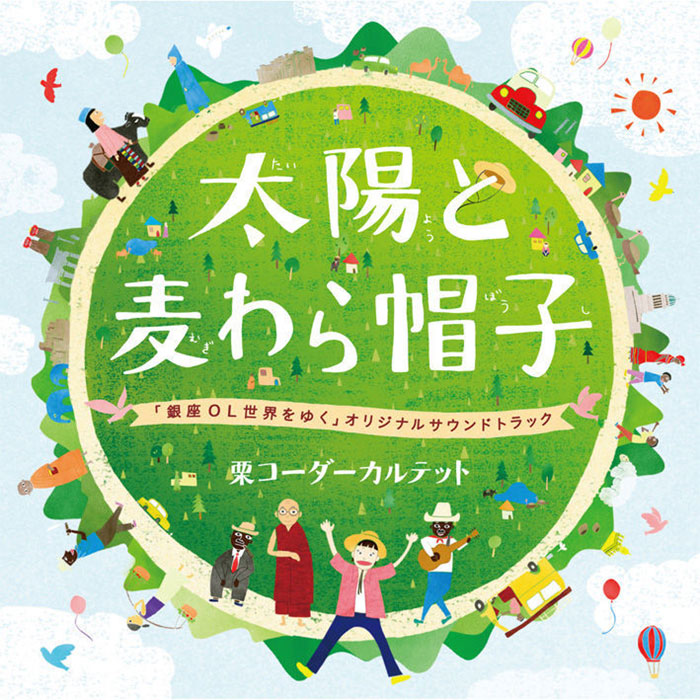
For many people, the mere mention of Japan invokes a feeling of cuteness, which may as well be connected with their engaging cartoons and soothing colors.
The culture of cuteness (kawaii, as they call it) plays a major role in Japanese graphic design, both within the state and everywhere around it. We can see it in their adorable online animations, TV shows, and retail commercials, as well as on all professional branding designs.
Japanese designers use cuteness and playfulness to revive their work and to give it a unique, personalized touch regardless of what it represents. Such designs are the exact opposites of Western’s cool, sleek, and sophisticated branding.
Information density
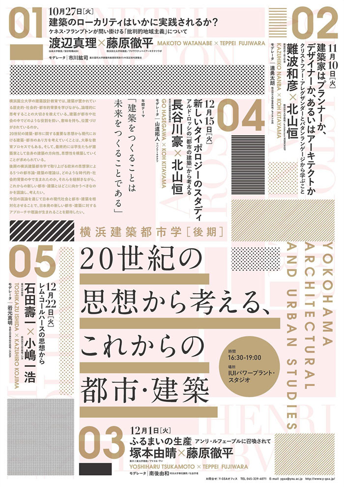
Looking at popular Japanese designs (web works, in particular), you will be surprised by the amount and density of informative content they pack on each and every piece. The Japanese design virtue is all about content!
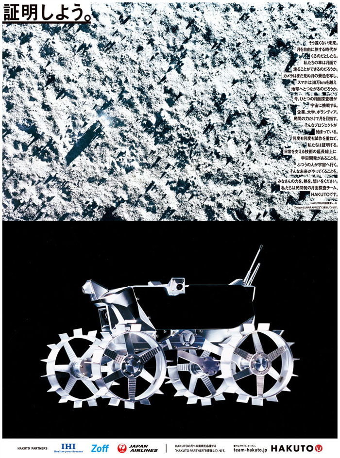
So it seems that mainstream Japanese web design has really little to do with Western’s prominent minimalism.
One may choose to look at density as a drawback or an advantage – while Western posters, for instance, are the role model of cleanness and neatly conveyed messages; they all look pretty similar to each other and lack the diversity of Japanese designs.
Putting things into perspective, we will also understand the difficulty of being a do-it-all Japanese designer – these people need both some domestic and foreign expertise to create products that work for both worlds.
Speaking of well-executed Japanese graphic design,
1. The writing methodology
a. To write in Japanese means to master several different character systems: Kanji, which derives from Chinese characters; Katakana, the most used of the three; Hiragana; and Romaji (derivates from Western alphabets). Traditionally, Japanese people write from the right to the left, and in a vertical direction. Yet, it is not wrong to write from the left to the right, horizontally.
b. Just as it is with Chinese writing, Japanese writers can comprise a sentence with only a few characters. The layout ends up being very different than a Western one, also because of the excess use of spacing.
c. The writing system in Japan was completely free from Western influence before WWII, and thus much more traditional. At the time, people wrote only from the right to the left (horizontally), and many of them still do so today
2. The education of a Japanese designer
a. Japanese culture involves plenty of indirect expressing and ref terms, as it can be seen from classical literature. To be educated in Japanese terms often means being able to understand and use these ref terms and metaphoric meanings, as well as to express idioms and lengthy expressions with as few characters as possible (even a short verse). This helps Japanese publishers bundle a lot of info on their publications without making them look too crowded.
b. Japanese writers are also the masters of ‘reading between the lines’, or the ‘manga’ tradition. What this means is that what they say is often not what they actually mean, and you can only understand it from the context. Thinking in such way has influenced irreversibly their graphic design practices.
3. A unique standard and understanding of beauty
a. In Japan, people perceive beauty in a whole different way. You’d see a serious mismatch in the looks or ideal heights of their models compared to Western ideas, or fail to see that altogether.
b. The differences in beauty perceptions depend most of the time on the social standard, which is why certain taboos in Japan are perfectly justified to use in Western publications and the other way around. For instance, Japanese postcards can never have a black frame, as this is only reserved for funeral announcements.
c. There are also notable differences in typographic and calligraphic rules.
4. Different demographics
a. Japan is one of the countries where people live the longest and that changes automatically the target audience for graphic designs. The 50+ demographics are highly considered in Japanese commercial art, and just as much ignored in Western marketing.
b. Plus, the largest purchasing power in Japan belongs to the baby boomers older than 70, which makes it imperative to design for them.
There is a downside to every good story, and Japanese graphic design is no exception
1. Activity centered in the corporate world
a. Japan’s graphic design arena is reserved mostly for the big players, and it is almost impossible for a small/medium agency to make it past them. This forces on-budget businesses in need of design services to create their own dedicated graphic design departments, or committee boards comprised of sales managers who now little )or nothing at all) in graphic design. What they do is to wrap up a project, hand it over the PPT to an ad agency, and let it modify it upon need. You will see this in all the logos of government publications, energy companies, phone companies, and so on
b. A restricted marketing budget, especially in the case of consumer-oriented businesses that don’t hire creative staff in the first place. Instead, companies prefer to spend on expensive placement, believing it is their main source of income that can’t compare to creative processes.
2. A considerably closed market
a. The clientele that comes from the same industry. A very common practice of leading Largest Japanese ad agencies is to sign contracts with several clients coming from the same industry. The Japanese creators’ community has opposed this practice several times, as it causes smaller and local businesses to remain in the shadow, and entrust marketing to wholesale experts and retailers instead of designers. Their choice is limited, as they can only go to one or two ad agencies to get tips and suggestions.
b. Some serious competition on placement. The leading space for ad placement always belongs to the biggest design firm or agency, which makes the hit off of small and independent firms rather difficult. They have to wait for a secondary (or even third) lease from the agency that already signed a 30-year contract for that space, which makes advertising much costlier than creating a beautiful marketing campaign.
c. Strict advertisement standards. Designers must follow and comply with a serious deal of industry rules and government regulations. A good example of that is EU’s cigarette packages which look just awful! Of course, it is not designers who made this decision, but the regulatory bodies.
3. A serious workload that is not consistent with the employees’ payment
a. What makes the Japanese market so specific and active is the frequent purchase of printed materials (its printing activity comes second in the world, right after the USA). People there still prefer to read their books on hard copies and to send paper greeting cards, which means there is a lot of work to be dealt with, and notably short deadlines to meet.
b. Flyers are often crafted upon popular commercial templates you can purchase for few hundreds of dollars per license, or even get for free. In the Western world, this would equal to accepting a main street business’s flyer designed using MS Publisher. In most cases, such flyers are prepared by junior employees and trainees, considering that most businesses don’t even hire on-payroll design personnel.
c. The fees for that flyer will consequently be very cheap, and the designer in charge of preparing it on a deadline (and with a ready template) is paid less. He may be requested to do some tweaks with colors and fonts, but that’s pretty much how far his work can get.
4. A product not worthy of its price
Certain graphic designs, as good as they may look, have a very short lifecycle and represent therefore a useless investment for the business they represent. This is why companies should go for a design that will last, in particular when they’re small, and can’t afford expensive mistakes.
5. A designer with the right skills.
Not all designers are trained and prepared for Western typography, as popular as it may be. This is why they need help when fixing and handing over Western typography conventions. In general, designs for the Western and Japanese markets are prepared separately and use entirely different materials.
Now, let’s check how that looks from a Western perspective
- Very appealing and competitive design, mostly influential in other creative business fields.
- Usually, a large business oriented towards consumers, as for instance an export-driven firm that has hired an expert designer that can handle both the creative and the promotional part (unlike a standard domestic business that entrusts marketing only to sales professionals).
- As taught by most communication and art publications from the Western world, designs should be backed by a strong investment in order to work in and out of the country.
- Western-style designs give a serious advantage to younger audiences, tackling the differences in understanding between theirs and senior citizens’ perspective. Namely, the Western design relies heavily on demographics.
Ending thoughts on Japanese graphic design
The most valuable lesson we can learn from Japanese graphic design is that experimenting is not a bad thing. Therefore, get rid of the Western ‘less is more’ aesthetic rule, and shake your design up in the service of originality.
Work with bold colors and combine them with traditional Japanese motifs. Try to balance your symbols and types, and to collage elements against any rule you’ve ever encountered in Western design. The result may fascinate you!
If you liked this article about Japanese graphic design, you should check out these as well:
Graphic Design Resume: Best Practices and 51 Examples
Graphic Designer Salary: Junior, Senior and the Average Annual One
The post Japanese Graphic Design: Beautiful Artwork and Typography appeared first on Design your way.
Source: http://www.designyourway.net/blog/graphic-design/japanese-graphic-design/

No comments:
Post a Comment