User-interface is a combination of graphic design and interaction design. It is the field of design, that focuses on creating beautiful experiences for the user. It is the surface plane that connects the user to the device. As a UI Designer, you are in charge of making an amazing sensory experience for all of the users. A UI Designer tries to not just get a brands image across, but to also communicate the functionality and value of the product in an effective manner. It is important for designers to follow guidelines when designing for a device. For a design to be effective, it has to be beautiful, engaging and invoke an emotional response from the user. Let us look at some common mistakes that fail your UI and the steps you can take to avoid them.
1. Unresponsive design
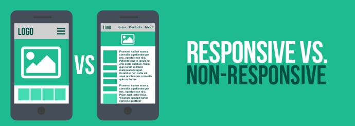
It is important to make your website adaptable to different devices. Most people operate on their mobile devices these days. If you are a web designer who is not able to design for a mobile screen, you are missing out on reaching valuable users. When a user is unable to access a feature of your website on a small screen, they are bound to leave. Responsive design makes your business accessible across all devices. An unresponsive design for your web page limits your possibilities as a business owner.
2. Sluggish and Cluttered Layouts
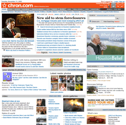
Cluttered websites are frustrating to use. Too many elements in a web page can lead to confusion and users end up missing important buttons and value propositions says The Software House, a full-service design and development agency. This is one conversion less. The users should be able to navigate through your website effortlessly. To make this happen, the user journey should be focused on one single goal — conversion. To improve conversions for your website, you can follow these set of guidelines that will help your web pages successfully convert.
- Use white space to break up the flow of the page. For example use them between images, forms, and descriptions.
- Try to limit the color schemes in your designs. The same rule applies to typography
- Every page should be built around one single action. This way the users are able to know what steps to take and where that will lead them.
3. Uninviting CTA’s
CTA buttons should be designed depending on your audience’s preferences. You will have to understand their buying patterns in order to be able to blend colors and copy perfectly. It is also advised to perform A/B testing to find out which variations work the best.
4. Lack of Contrast
Lack of contrast makes your website look boring. By adding contrast between elements you are able to add emphasis to a particular section of your web page. While browsing through a web page, users like to see the contrast. This helps them read the content better and makes the visual experience a lot more interesting.
5. No social Proof
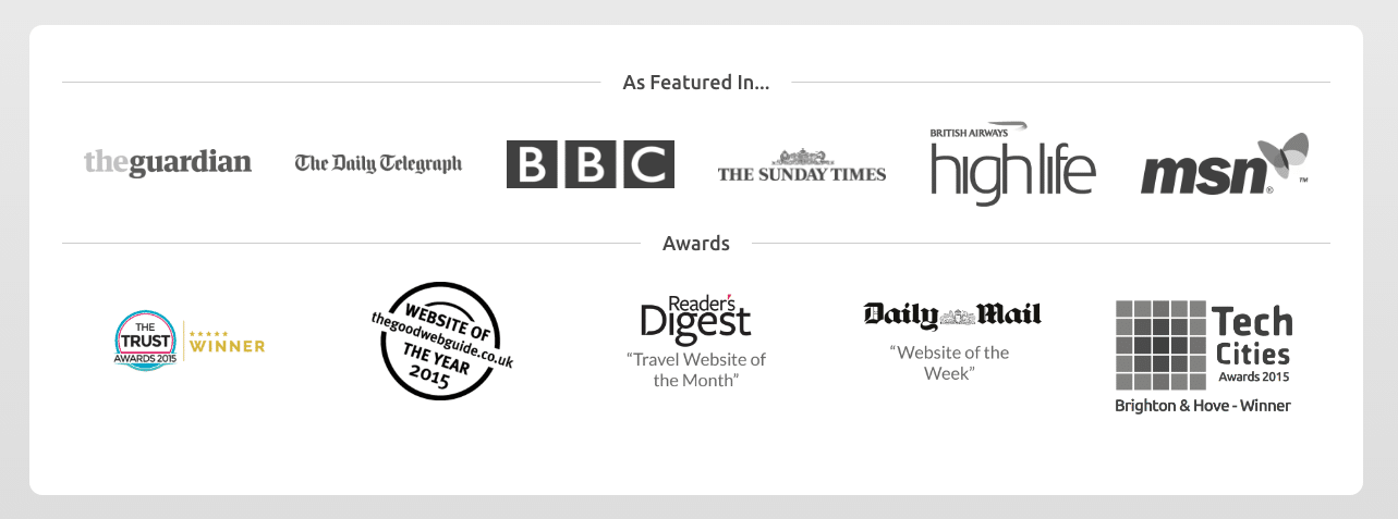
Customer feedback and testimonials are incredibly useful information that helps us gain a sense of trust with your business. They are crucial for branding and sales. No social proof means that there is no real credibility associated with your products, which in turn, effects your SEO efforts and conversion rates. When you include real messages from real people, you are showing that people have purchased your products and services. This eases the mind of a worried customer and is usually a lot more convincing than a product description or a well written CTA.
6. Slow Page loading speeds
Most people expect a web page to load in two seconds. A delay in page load time can lead to decreased customer satisfaction and fewer conversions. Your page loading speed can be improved by optimizing images, reducing redirects and minimizing the use of plugins.
7. Unintuitive Navigation
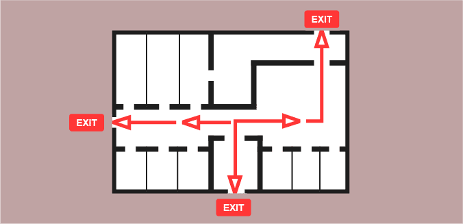
Intuitive design can be achieved with two things — Navigation and hierarchy. By creating an order for the entire layout, you should be able to communicate your brand’s message clearly. Lack of hierarchy can be confusing to the user. When all the elements on your web page are competing against each other, it is hard for the user to focus on a single action. Your website navigation should be designed to be clear. Place them on top of the page or where the user would expect to see it.
8. Generic Imagery
Visuals play a big role in marketing. A generic photo found on a stock website often ends up looking outdated and doesn’t perform well. To set the right tone and mood for a website, it is advised to use unique imagery that accurately depicts your business and services. Having authentic and inspiring imagery will help you win your buyers confidence.
9. Inconsistent Style
If there is a visual conflict in design between various pages of a website, the users are going to feel a sense of disconnection with your product. A great UI should have consistent style and order that makes users clearly understand your brand and its message.
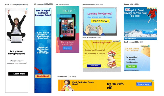
10. Content over ads
Ads are a great way to generate revenue for your site. But you are bound to annoy your visitor if you pay attention to your ads more than your content.
11. Text and Typography
Users don’t end up reading all the content on your web page. To express the most important information, you should break up sections with a good balance of text, imagery, and graphics. Since blocks of text are hard to read, they are often ignored. The idea is to keep it simple. Every copy of the page should be carefully curated.
12. Designing for yourself
Only after you have learned how to apply these rules can you break them. You are not designing for yourself. Work closely with your clients, marketing and sales to find out the best possible solutions.
The post Common UI Design Mistakes That Will Fail Your Website appeared first on Web Design Blog | Magazine for Designers.
via http://bit.ly/2stDm7R




No comments:
Post a Comment