As a graphic designer you will know that a logo represents a brand, but did you know that there are many types of logos?
From word form logos to those which make use of pictures and images, there are many logo styles to choose from.
The types of logos you pick will have an impact on how a business or brand is perceived by clients. This means thinking through your logo styles and design choices is important.
We are therefore here to guide you on logo styles to choose from and the best choice to make in each different situation.
Making use of words and letters
Lettermark logos (monograms)
If you think of a couple of popular brands such as HP, IBM, CNN or even CSI, you’ll see a pattern start to emerge. These brands have shortened their brand names into letters. These letters define the brand. It, therefore, makes complete sense for the brand to use monogrammed logos to create an identity.
Lettertype logo styles use a few letters to identify a company. The logo is simple and often striking in design. The few letters used in this design become immediately identifiable to clients or viewers. NASA provides a great example of monogram style logos.
As this design style focuses on the lettering, font choices are crucial and well thought through. The letters need to be easily identifiable. They also need to be highly legible. You will also need the typography choice you make to send out a clear message about your brand. When building a lettermark logo, the result will be simple, effective and difficult to achieve.
When using letter mark logos, the goal is to create a monogram design. Some businesses use initials for their logos while others use anagrams. Examples include the logo for the television series CSI (crime scene investigation) who use only initials to market the program or clothing designer Calvin Klein (CK) FedEx, however, uses an anagram for the full name (federal express).

Lettermark logo styles are an effective way to create a brand. Using a small number of letters helps a company to create visual impact in a way which is just not possible when the full name is used. They are also great for distinguishing parent company from subsidiaries.
In order to use a letter mark logo style a company needs to be sufficiently well known. If a company is small and clients don’t know what the logo stands for or represents, then this logo style will be less effective.
Wordmark logo design
Word mark logo types are similar to letter mark logo designs because they use typography to create effective logos. Wordmark style logos focus on business names. Coca-Cola and Pepsi use words to display their logos. This logo design style works well when a company has a strong, precise and clear name.
Google provides an excellent example because the name is short, playful and easy to remember. The attractive logo design enables the company to stand out.
As with letter mark logos, typography choice is crucial. The font will need to express the goals of the company. From clean-lined and modern to traditional, familiar and dependable, font choices will make a statement.
Fashion or luxury brands, science labs and futuristic designs are generally clean lined and modern, where the printing industry, legal firms and historical societies use traditional and sometimes calligraphic fonts.
Pepsi, Walmart and Home Depot all use logos to share their brand. This logo style uses text to create a brand identity. The New York Times is a great example of the effective use of text to define it brand.

Sometimes text is metaphorical while other times the company brand might literally declare what it does. This is helpful when a brand is not yet a household name. Using a name is a great option for a company with a limited budget.
The name reveals more than a symbolic drawing or image. Your clients will instantly know what your company is doing with a well-defined word mark logo style.
When to use lettermark and wordmark logos
A letter mark style logo is great for companies with long, complicated names. A condensed logo will assist clients to identify a brand.
Word marks are helpful for companies with short, succinct names. They are particularly helpful for small businesses with tight marketing budgets. This is very true when the name defines the product.
If your business name is distinct enough to stay in your client’s minds and is accompanied by great design, name logos make an excellent choice.
Both design styles need to be excellent and well produced in order to make an impact.
Although these two design styles look quick and easy to produce, they are not. Both need to be well thought through and very legible. It is best to use a professional for these types of designs.
Pictures and Symbols
Pictorial marks (or logo symbols)

Picture or image-based logo designs are different logo designs to those which use space. In a picture-based logo design the symbol stand out as instantly recognizable. Twitter ‘s bird or the very well-known Apple logo are great examples of visual logos which are easily recognizable.
When a brand is established, just a small logo allows customers to realize that they have come to the right place.
When designing a logo, the choice of image is important. The logo should share information about a company or brand at a glance. Your logo design will help clients to identify your company. This image will, therefore, grow with you and your company.
Would you like to use your logo to define the name of your brand, the work you do or the values you stand for? Emotion can also be shared through iconic logo design.
Abstract logo design
Abstract logos are different logo designs to pictorial logos. Instead of being as identifiable as a bird or a target, they are far more abstract. Adidas stripes, the Nike swoosh and Pepsi ‘s geometric designs each make a strong statement that helps to define a brand.
Abstract logo designs often work well as they are unique and easily identifiable. They identify your brand using a small and often unique design. Abstract company logo designs are very visible and easy to identify.
This logo design type can create shapes or designs which span cultures. By using line, color and form you will be able to create a logo which is timeless and creates a clear brand message. Abstract logos are poetic and can be used to create an attractive and very emotional logo design style.
Mascots
A mascot is a fun, creative and colorful way to add inspiration to a logo design. Your logo will become your brand’s spokesperson. Snap, Crackle and Pop from Kellogg’s and The Colonel from KFC are familiar brand logos.
Mascots create a playful, fun atmosphere which is great for appealing to children, teens and families. Mascots increase the emotional resonance a viewer has with a brand.
Mascots often appear at sports events to create a dynamic and vibrant atmosphere in support of a brand or team. A mascot will frequently interact with the audience. As they are so cute and interactive, mascots make sense of the best-looking logos.
When to use pictures and images
A pictorial mark is effective in creating the mood, atmosphere or idea your brand would like to share. It’s most effective for companies that have established brands. If you have a long company name, a brand can share what your company does quickly and effectively. An image is easily recognizable and very easy to market once it becomes recognized. Convey a desired idea or emotion.
Pictorial and abstract marks are often universal, transcending the limits of language. Abstract images in particular transcend cultural boundaries. This helps a brand break the barriers which would otherwise be limiting.
A pictorial mark could be limiting if your brand changes or transforms. If you begin with one product or service and extend to another, your image will limit you if it only reflects your first product. If a company starts out by selling groceries and extends to clothing, their initial pictorial logo showing food products will be very limiting.
Abstract designs are professional, dynamic and innovative but these logo styles must be designed by a professional for maximum impact.
Choose to use a mascot if you are aiming your brand at children or families. A mascot will encourage your customers to interact. This is great for social media as well as live events. A mascot which speaks, dances, talks or looks cute becomes a dynamic logo which encourages customer engagement.
Remember that a mascot is a logo style which forms a big part of your brand. However, you will need more than your mascot to market your business. Your mascot may also not convert well to all forms of media. Consider combining your mascot with other logo styles or techniques for the very best results.
The combination mark
A combination mark brings together different logo styles or techniques to create an effective impact. A combination mark logo can combine a word logo with a pictorial image to create maximum impact.
Think of McDonalds with the Golden Arches and word mark logos combined to create an easy to recognize image. KFC uses letter form logos and a mascot to create an attractive brand.
Using two different logo styles assists you to build a stronger and more easily identifiable brand. People will be able to recognize your business through your name-based logo, letterforms or image. This is an excellent option for a new business.
While people may be able to recognize an image or picture logo after some time, it is often a name-based logo which initially grabs attention. In combination, different logo styles make a big impact. By combining your name with an image, you will assist your viewers to recognize your image “. Eventually, you could market your image alone.
The emblem style logo

When a company name and image are inextricably connected, the logo style is known as an emblem. This style of logo is different from the others because no single aspect will ever stand alone.
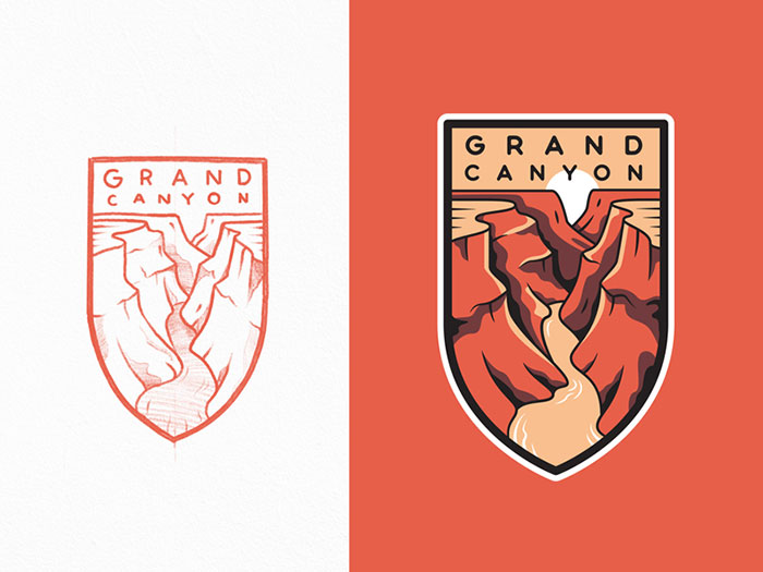
This logo style combines letters or word marks within the logo, often in the form of a badge or a crest. This style of logo often has a very traditional feel and may even include a motto or quote. Emblems have a commanding beauty and are often used by companies or institutions or agencies who draw on a history of collective values.
Some companies, however, have redesigned the traditional logo to give it a modern twist. Starbucks coffee shop uses an updated and very modern emblem as a logo. Harley Davidson have an equally popular crest logo which helps to identify the company. Many car companies who depend on presenting a reliable image use crests as a logo style.

When designing a crest style logo, remember that they can often be tricky, and this is particularly true in a world where responsive design is key. A crest or shield may become illegible when reduced to very small sizes.
Very detailed designs are therefore not the best option if a crest needs to be reduced to small sizes. When it comes to modern logo design it helps to keep the design simple and uncluttered. This will keep the logo design clear, effective and easy to use even in small sizes.
When to use a combination mark or emblem logos
A combination mark is a great choice for a business because it is versatile, unique and commanding in appearance.
An emblem makes a great choice for brands who wish to draw on traditional values, trust and reliability. This style of logo can be converted into a modern design”. Keeping an emblem simple will make it legible and easy to read at a range of different sizes. They are an excellent choice when choosing a logo.
Ending thoughts on the types of logos that are out there
Business logo design isn’t as complicated as it may seem. With four types of logo to choose from, all you need to do is take the process step by step. Consider the name of a business, the logo style which would most suit the business and the current reputation or recognition a business has. Consider the values of a brand and the message you would like the brand to communicate.
A logo forms the foundation of all of your marketing goals. It helps to communicate the message behind the brand. By marketing your logo you’re encouraging your clients to choose your products or services rather than those of your competition.
By choosing from the four different logo styles, you will be able to create a unique, innovative and effective logo which enables your brand to stand out.
If you enjoyed reading this article about the types of logos, you should read these as well:
- Logo maker app examples to try as an alternative to hiring a designer
- A look at the Superman logo over the years
- Logo design ideas that you should use for branding projects
- Logo mockup templates to download and use to present your logos
The post Types of logos that you should master as a graphic designer appeared first on Design your way.
Source: http://bit.ly/2LU9wCu



No comments:
Post a Comment