When it comes to typography in mobile web design, it is best to keep it simple. With responsive mobile design taking center stage, it is becoming increasingly important to prioritize mobile user experience. When it comes to typography, what works on the desktop screen will not work on mobile devices. Mobile screens should be designed keeping aesthetics and functionality in mind. To understand the best practices for the use of type in mobile, you have to delve deeper into the world of typography in both web and mobile design.
Basics of typography in Web design
Typography is the art of arranging letters to make the written content readable and appealing. This can be done in a variety of ways. By selecting typefaces, font family, point sizes, line length, and spacing you are able to play with the overall design of a word. When designing type, you have to keep the tiniest details in mind. The emotive quality of these typefaces helps us express and communicate ideas with clarity.
When a user visits your webpage, content alone will not keep them interested and engaged. You typography choices can have a major impact on the users behavioral patterns. For the users to give your websites copy a read, you have to create a webpage that is easily readable. These are some ways in which typography affects your end users.
Sets the tone and the mood of the site
Typography helps reinforce a brand. The nuances of a typeface invoke emotions that can be used to draw a customer onto your webpage. By playing with different styles, sizes and type, you can convey different traits associated with the brand.
Readability, Scanning, and Accessibility
Readability is the ease with which a reader can consume a webpage. While legibility refers to the spacing and arrangement of glyphs in a word and how easily it can be discerned. By designing type on a screen and giving it the right sense of speed and ease, you can encourage a reader to read through your content.
To allow scanning, you have to format text right. This means that you would have to use header, inline lists and pull quotes.
When it comes to designing for mobile phones, there is a lot that can be done accessibility. This means that you should rely less on big, bold fonts and splashes of color. The idea is to draw the users to your content and it easier for them to read/glance through your message.
Typography for Mobile Web Design
Mobile Design is constantly changing and so is mobile typography. Let’s take a look at some of the best practices and elements that should be paid attention to when designing type for mobile devices.
1. Font
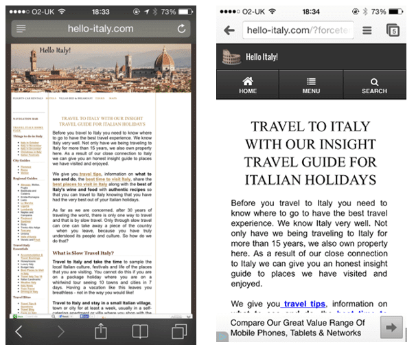
Fonts should be selected with utmost care when it comes to designing for the small screen. Different types of content will need different fonts. Over-decorative fonts may reduce the legibility. So it is advisable to use a clean and simple type that is easy to read and improves the overall user experience of the page.
2. Font Size
The screen size of a mobile screen is limited. So the rules of selecting a font size on a desktop will not apply here. If you use really small text on the design, this will end up hurting the user’s eye while bigger texts may end up breaking the reading coherence. For IOS, user text sizes range from 10-11 points.
3. Typeface, Style, and brand
Mixing several typefaces can make your app seem fragmented and ultimately result in a poor reading experience. It would make sense to use different variants of a single typeface. In addition to this, it is also advisable to use the built-in text style that is built into the system. This will help you take advantage of the various features that come with a specific typeface.
4. Leading, Kerning, Tracking and Alignment
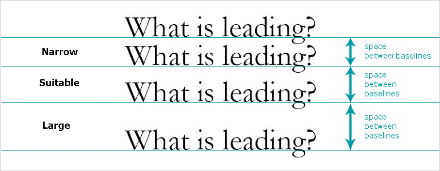
Leading refers to the space between the lines. Mobile screens are smaller in size, so you have to tighten the space between the lines to improve readability and design. 1.4em is the standard that designers like to use as a standard. Another common tip to know is that leading should be 120% the point size of the font.
Kerning, on the other hand, is the design of space between two letters. This has a huge impact on typography. Especially on mobile screens- you want to keep this space as consistent as possible.
Tracking is the overall spacing of the letters of all characters. It is easy to confuse the two. Effective tracking makes the content more readable.
When it comes to aligning text on screens, left justified alignment is often preferred. The key is to leave a clean rag and decrease the inconsistent white spaces between lines. Left side alignment ends up being the best choice because it allows users eye to jump from one end of a line to the next.
5. Line Length
Pay attention to line length and how it impacts typography on a mobile screen. To create a readable and harmonious web page, keep the character per line within 30-40.
6. Space
Space between lines, margins, paragraphs, and letters can help create a harmonious and visually appealing mobile web page. It can also help users better interact with the text. Stick to 10-20% range when designing your text container.
7. Hierarchy
Use headline to grab the readers attention and the body of the text would be more focused on readable content
8. Contrast
You can use different elements in the mobile design to create a desired amount of contrast. The goal is to weaken the contrast as much as possible. This will enhance the readability and the overall user experience.
9. Functionality and Responsiveness
Always keep the function in mind when using a typeface. By using the right type in the right place, you can not only make it look beautiful but also usable. So for example, use a bigger font size on a button that you would want your users to click on.
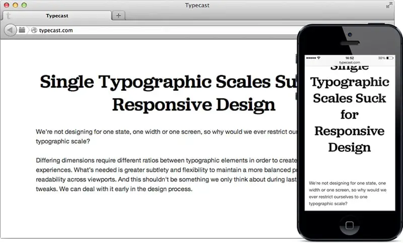
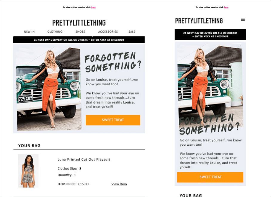
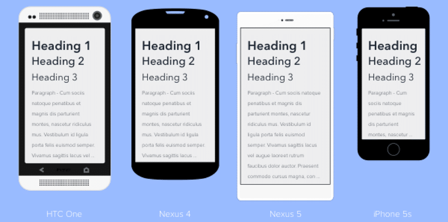
With responsive design taking over mobile screens. designers have started paying more attention to responsive typography. In fact, it is a requirement for designers to understand how the type will look different on different devices.
To recap, here are a few important factors/points to consider when choosing and designing type for the mobile screen. Start with a default system font if you have to. It is your safest choice and comes with features that can help you push the limits of mobile typography. Ditch decorative fonts and user serif or sans-serif font to keep it simple and readable. Add small touches of decoration if you have to but try to keep it minimal in design. Try not to use more than 2 typefaces on mobile screens and make sure they compliment each other. Try to use fonts that are compatible across all devices and platforms.
When it comes to mobile typography, it is best to stick to tried and tested choices that guarantee you the best user experience.
The post Guide for Typography in Mobile Web Design appeared first on Web Design Blog | Magazine for Designers.
via http://bit.ly/2Vp55UB


No comments:
Post a Comment