The Disney Logo is symbolic of childhood fun and entertainment. The Walt Disney logo symbolizes the magic of this great creator. Beginning in 1923, Disney has moved from film and television into theme parks and merchandise. The Walt Disney company logo symbolizes the joy and creativity experienced by children and adults alike.
Disney’s magical entertainment all began with an animated and very playful mouse. In this article, we will look at the history of Disney Inc, how their world-famous Disney company logo developed, and how Disney’s logo played a role in the company’s success.
Back to the beginning – the history of Disney
Walt Disney is regarded as one of the most successful artists, businessmen and entertainers in history. However, he didn’t find success easily. His early career struggles are often used to represent the value of persistence. He is also a lived example of how to rise from failure and seek new horizons.
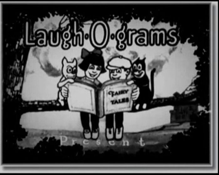
Before Disney, Walt had a business called Laugh-O-Gram Studios. This company went bankrupt in 1923 and Walt had only $20 to his name. However, he was determined not to give up. Using what little he had, he set out to Hollywood to start over again.
With the help of his brother, he was able to produce two animated cartoon shorts, Alice and Oswald the Lucky Rabbit. He didn’t copyright the cartoon animations though and lost all rights to them during 1928.
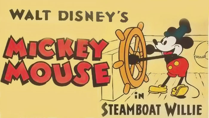
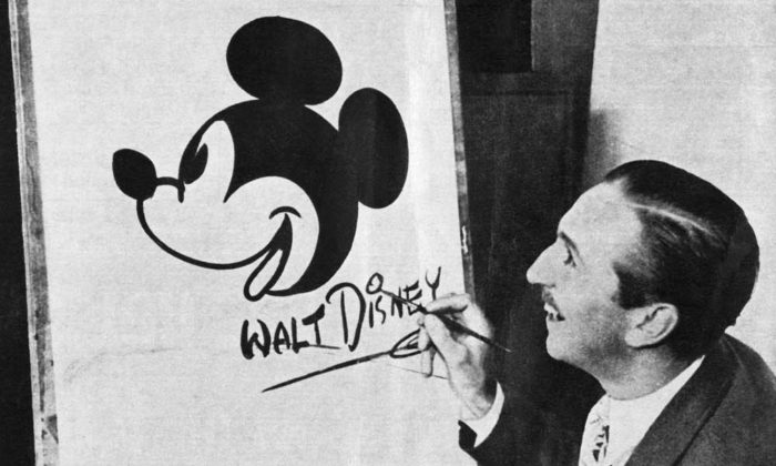
Once again, Walt Disney was determined not to give up. He created a little mouse and a cartoon called Steam Boat Willie. The mouse was later known as Mickey, one of the most famous Disney characters ever. The Steam Boat Willie cartoon was a success and Walt formed his production company Walt Disney productions in 1929.
The beginning of the Disney animation logo
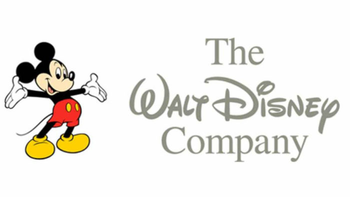
Now let’s explore the history of the Disney logo. When it first began, Disney’s logo showed the profile of Mickey. During television or film shows, the logo would rotate and change colors. Disney’s logo was a tribute to the early animation that the company was producing at the time. This was used for a long time, and was only transformed in 1995.
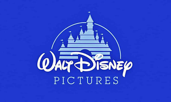
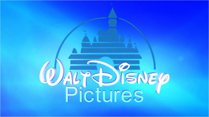
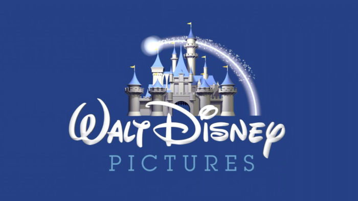
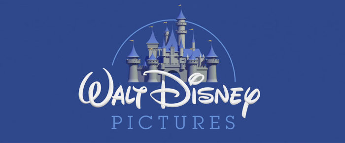
It was during 1995 that the logo went through a transformation. The Disney castle logo was created and became the basis of the Disney logo we know today. This logo contained a light blue castle. The words Walt Disney Pictures was written across the castle.
Walt Disney’s castle logo was used until 2006. After this, the logo was redesigned to produce the beautiful Disney logo we see today.
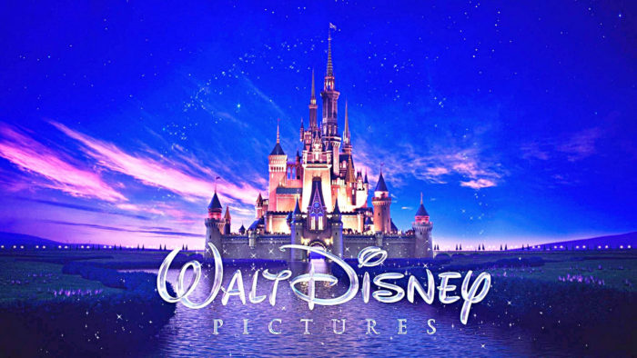
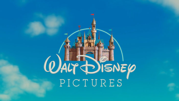
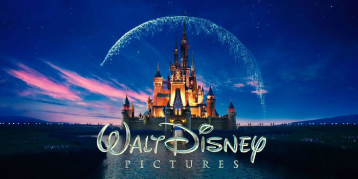
The Walt Disney company logo is impressive and very detailed. An improvement on the old Disney castle logo, it shows Cinderella’s castle in all its detail. This includes windows, balconies, towers and a moat. This logo is immediately recognized as belonging to Disney.
When animated, the logo shows the magic the company represents. As a symbol of advancement, this logo shows just how far the company has come in recent years.
Disney’s logo – all the different elements
Disney’s new logo is aimed at showing the advanced animation that the company is capable of. As a leader in the animation and entertainment field, the logo aims to show off the skills Disney has. The Disney castle animation lives up to the company’s creative reputation.
The Disney emblem not only shows the company’s skills, however. It also shows a fantasy world. By showing a world of wonder, magic and imagination, the logo creates curiosity. What happens inside this magical castle? How do the rooms appear? Who lives behind those doors or stands on the balconies? What is the story of the occupants?
Through the fantasy lands they have created, Disney offers up magical worlds for their viewers to explore. There are new possibilities and alternative landscapes available at every turn. All you need to do is step inside.
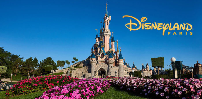
Disney’s logo is displayed at the theme parks to invite curiosity and encourage people to explore the sets. By placing the new Disney logo at the theme parks and Disney world, the company invites its viewers to step inside a real live fantasy land.
Each and every movie begins with the same logo shown at the parks and theme worlds. Viewers, therefore, believe that they will be entering into a magical world, where characters come to life and fairy tales happen.
Disney has thought out every different element of its logo. Aside from the castle, there is the Disney logo’s lettering. The castle is so intricate that Disney needed a great logo which would be easily recognizable without Cinderella’s castle.
They came up with an easily recognizable font. This font, which spells out Walt Disney is easily recognizable and forms an important part of the Disney brand in its own right.
How the Disney animation logo was created
The Disney company logo was created to show the wonder and magic of an evolving fantasy world. Disney company director Walt Disney had a passion for drawing and animation. He believed that his ability to draw and create a fantasy world would only get better over time. Disney was meant to flourish, extending the boundaries of fantasy and possibility even after Walt’s death.
The Disney animation company was always founded out of passion. From Mickey Mouse to Cinderella’s castle, it was founded out of an urge to create magic. Disney land offered a real life opportunity to wander through fantasy land. Disney’s logo shows the detail and passion behind Disney’s animated world.
The original Disney logo, Mickey Mouse, symbolized a love for the first endearing Walt Disney creation. However, the castle logo symbolized a move into a fantasy world. The use of the logo across film, television, fantasy land and Disney’s merchandise enables the opportunity to participate in the beauty, wonder, and magic of Disney.
The Disney emblem symbolizes the passion and love for creativity, joy, and animation behind the Disney brand.
How popular is Disney’s logo?
The Cinderella castle logo has become increasingly popular with both adults and children. Over time the logo has become so associated with the joy and magic of Disney that the logo itself symbolizes the enjoyment yet to come.
Viewers now recognize and identify with the Disney logo pictures. While Disney’s characters are often the reason that the company sells movies or merchandise the logo has become an inseparable part of the Disney brand.
The Disney Logo evolution
The original Disney Logo
As mentioned earlier, the first Disney logo involved a profile of Mickey Mouse. Mickey would revolve and change color if shown in the animation. However, the original Disney logo did not feature on Disney productions for the first 48 years.
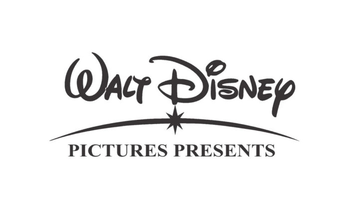
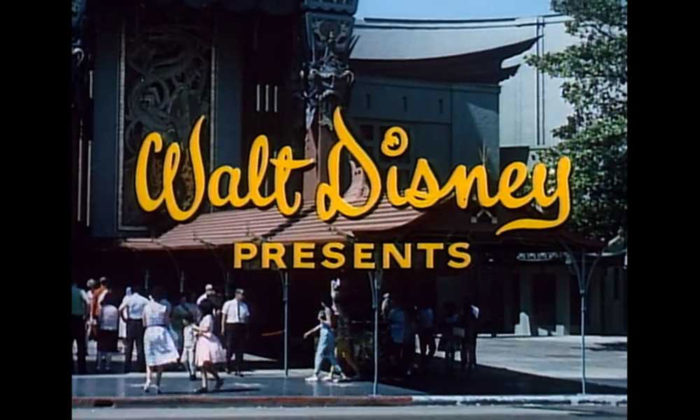
Instead, the ‘Walt Disney Presents’ logo appeared before a movie or film. Later on, this was changed to ‘Walt Disney Pictures’. This remained the same between the years 1937 and 1995.
The first castle logo
During 1995 and 2006, Disney introduced the first Walt Disney castle movie logo. This castle was a two dimensional depiction of Cinderella’s castle. The Disney name appeared in the foreground. The old Disney castle logo was formed by a white line.
The Disney emblem fonts would then appear. Later, the image of Disney’s theme parks would emerge. Both blue and golden Disney logos would appear during this time period.
Enter Pixar – time for a change
As digital technology advanced and Disney was at the forefront of these advances it was time to create a new Disney logo. Disney made a deal with Pixar to create a three dimensional logo for the brand.
The new Disney logo design was created by Pixar. This new logo is detailed with balconies, towers and moving flags. Disney’s font reveals ‘Walt Disney Pictures’ with a star appearing to draw a line, linking the lettering back to the castle.
Over time the image has been adjusted to add more detail. Clouds and fireworks have been included to increase the feeling of excitement.
When Disney entered into an agreement with Pixar to create an animated movie logo, a new dimension was created. The brand also increased the use of colour to add impact. Disney began to invest in its logo designs to express the magic behind the brand.
The bright and colourful logo is accompanied by the slogan Walt Disney Pictures. Both are easily identifiable and form strong representations of the brand.
Disney logo design variations
Disney’s logo design evolved from the classic image of Mickey Mouse to the castle design. The castle symbolised love, romance and a fantasy world which appealed to a greater number of people.
With the development of Toy Story, however, there was a change in the world of animation. Each Animated movie would now have its own logo. Each logo has been created to best suit the animated film which accompanies it.
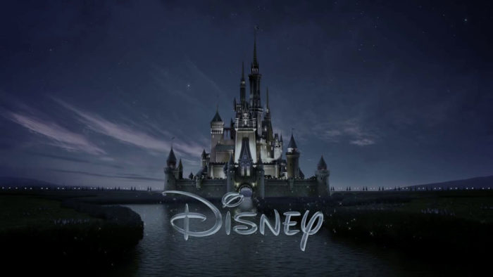
Disney’s new castle logo debuted in 2006 with Pirates of the Caribbean: Dead Man’s Chest. The animation lasted for 25 seconds and made a spectacular debut. Since 2006, the logo has formed a part of the Disney Company with only one major change.
The company dropped the name ‘Walt’ from the slogan ‘Walt Disney Productions’. Disney now stands alone as a brand in its own right.
Since then, the Disney castle has been tweaked to appear unique to each film. It appears as the city of lights in Tron, as Frankenstein’s castle for Frankenweenie and as a Cliffside castle in Maleficent. Perhaps these changes are the result of camera tricks. However, they make an impressive impact for the evolution of Disney logo design.
Why does the Disney movies logo work?
Disney’s logo is playful, imaginative and easily identifiable. It is loved by both adults and children worldwide. There is absolutely no doubt that it works. We could ask why the logo is so effective. The answer would be the company’s willingness to change and evolve, appealing to new audiences all of the time.
The original Disney logo appealed to cartoon and comic strip lovers. However, as the world changed, the image of romance and imagination appealed to a wider audience of boys and girls. Disney’s new animated logo appeals to a creative and evolving audience who wonder at the technology available.
Disney offers up a world of fantasy and possibility and the logo, which adapts with the changing times, represents this goal.
Ending thoughts on the Disney logo
It would not be possible to understand the evolving world of Disney without mentioning Walt Disney, passionate artist and company founder. Walt Disney died in 1966, at the age of 65. He was convinced that the Disney Corporation would grow beyond his imagination.
He was correct. Today Disney is made up of a number of different companies or departments. It includes a film company, merchandising company and theme park world.
People all around the world now recognise the Disney brand. From movies to cartoons and animated shorts, the company is renowned for its role in the movie industry. Disney is a force to be reckoned with and many of its animated characters have taken on a life of their own in the minds of the children who buy their merchandise.
The Disney logo remains a symbol of growth, magic and entertainment. As the company continues to grow and evolve, adapting and adjusting to the society it serves, it remains a force to be reckoned with. Long may it continue to evolve.
If you enjoyed reading this article about the Disney logo, you should read these as well:
- Logo trends 2019: what you should look out for
- Best free fonts for logos: 72 modern and creative logo fonts
- Animal logo design ideas and guidelines to create one
- Logo design ideas that you should use for branding projects
- Logo maker app examples to try as an alternative to hiring a designer
The post The Disney logo: All there is to know about the Walt Disney brand appeared first on Design your way.
Source: http://bit.ly/2S2FkKK

No comments:
Post a Comment