Low poly art is one of the coolest trends happening in the design world today. A low poly portrait has become a cool new way to design. Are you familiar with the term ‘low poly art’?
If you don’t know what it means, think of the word polygon. Low poly art is simply a means of creating a mesh of polygons in order to create a famous face or portrait design.
Low poly design can be awe-inspiring! It can be hard to believe that you are looking at a collection of polygons rather than a very detailed portrait. The result is highly creative.
What is low poly art?
You may not have heard of low poly design, but you have probably seen this style of work. Low poly images are created by placing geometric shapes side by side. The word ‘poly’ means ‘polygon’, which is a 2D geometric shape. The result is often minimalist, dramatic and very effective.
Low poly art began during early days of 3D animation. Creating a low poly artwork helped to speed up the process of animation because it reduced rendering times. This technique is still used today. However, low poly art has become appreciated in its own right, growing increasingly popular as a design trend.
As minimalism becomes increasingly popular, designers, illustrators and video game creators are using low poly graphics to show detail while still fitting in with a minimalist design style.
The history of low poly images
Low polygonal art dates back to the beginning of 3D animation. Low poly art saved time in creating renderings.
Creating a mesh of shapes without too much detail saved a great deal of time. Images were not very detailed or complex. The low poly art style developed as a convenience but it has now become appreciated in its own right.
The details of low poly design
Low poly graphics can be simple or complex, depending on the number of shapes combined to create an image. Some images may use thousands of shapes to create a polygon portrait. However, the majority of low poly art is created using hundreds of images. Designers also have the option to use increased numbers of shapes in certain areas of a design, producing a gradient effect.
When designers work to create a low poly art project, the aim is to give the impression of a 3D artwork. Many designers use minimal amounts of color or shapes, helping the viewer to recognize the object created while keeping their low poly images as simple as possible. The result is that a page often looks crumpled or as though it has been folded origami style.
How to make low poly art
Poly art can be created using an automated program, but the results cannot be guaranteed. Instead, it is better to create low poly images using Photoshop. Manually create your shapes using a grid.
You can then add color, basing your choices on the most dominant colors which appear within an area. When working up close, you may find creating low poly art can feel detailed and even pedantic, but once you zoom out, the results will be stunning.
The secret to creating awesome low polygon art
Decide on your source material
When working to create low poly art, you’ll want a high-quality image to work from. Search for an image with great structure to base your designs on.
This will help you to create effective results. It is difficult to create low poly art from your imagination, so do take time sourcing a great image for inspiration.
Explore the shapes you’d like to use
Most low poly pictures use straight lined shapes to create great images. Although you can work with curved images, this is not usual. Low poly graphics often have very geometric forms and tend not to be organic.
Many designers work with simple shapes such as triangles or polygons. Your shapes won’t need to be the same size, and you can also use shapes with a different number of sides or proportions.
However, the way you combine your shapes will have a big influence on your final result. Choosing carefully which shapes you would like to add to your low poly image is an important part of your design.
Will you use symmetry in your designs?
Would you like to use symmetry when creating a poly pic? Would you like each side to mirror the other? Low poly art doesn’t have to be symmetrical.
You can work on creating abstract art, where your designs are asymmetrical and each side has a different goal or direction.
What dimension will you be working in?
When you create your low poly art, will you be working in 2D or 3D designs? Most low poly art uses 2D design. This is because low poly art often creates the illusion of a 3D design. However, they can work in 3D.
Many low poly art designs give the impression of a 3D form. The image can be very detailed and will stand out from the page. Some designs, however, are flatter and far less 3D.
What will be the context of your low poly image?
Many low poly designs are inspired by illustrations. Although low poly began with early animation and moved into logos, it is now becoming an important element of graphic design.
The combination of different shapes creates striking images. You can use low poly images in many different forms and for both digital and print designs.
How would you like to use this trend?
With low poly art becoming increasingly popular, it is up to you to find your own creative ways to use this technique.
How would you like to use your designs, and what images would you like to form? Choose the color, shading, and textures which would help you to create depth to your designs. You can also play around with depths. Low poly art is great for logos, illustrations, and website designs.
Examples of Low Poly Art
We’ve put together a collection of great low poly images to inspire you while you decide how to do low poly art for your design projects.
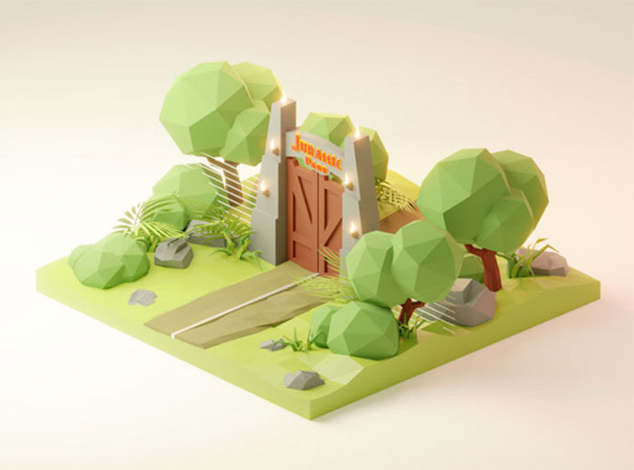
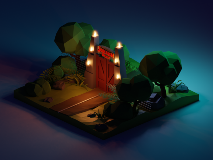
Jurassic Park Night Diorama
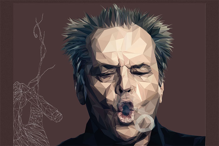
Low Poly Jack Nicholson (Digital Art, Illustration)
A great poly portrait of Jack Nicholson smoking a cigar comprised of 2520 polygons.
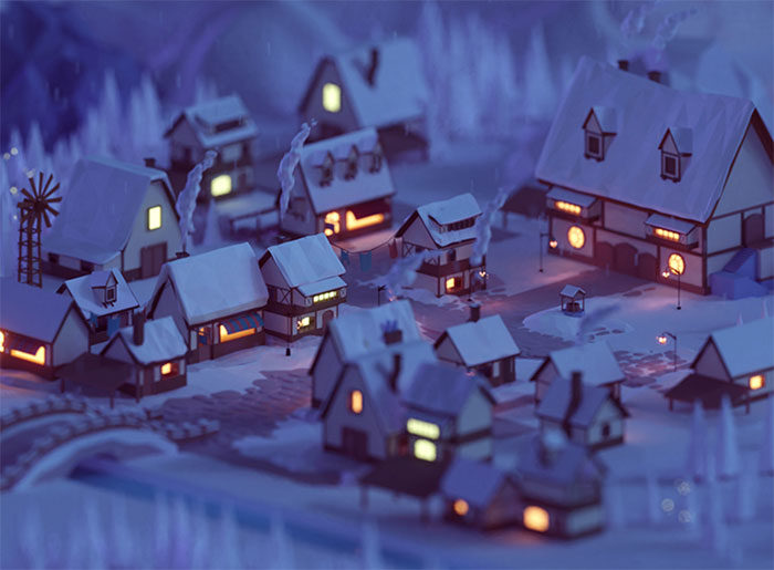
Winter Wonderland
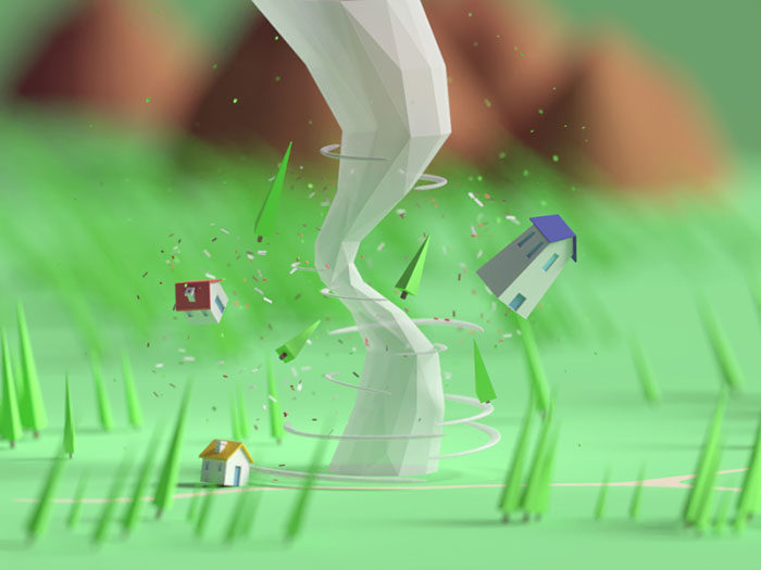
Tiny Tornado
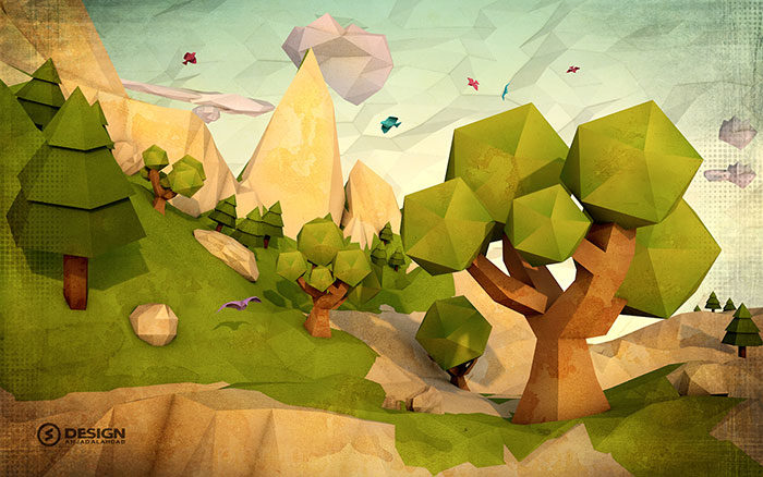
Low Poly Landscapes (Digital Art, Photography)
A series of low poly art style landscapes created using Photoshop and Adobe Illustrator.
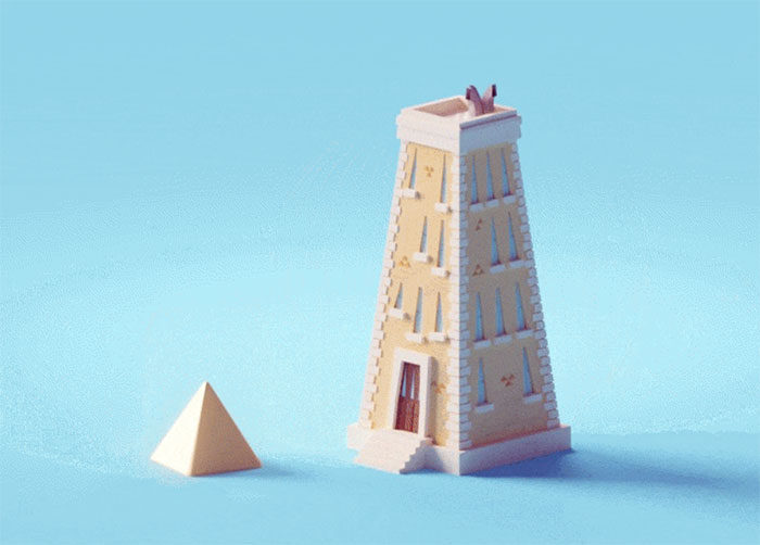
Shapes! (Building Version)
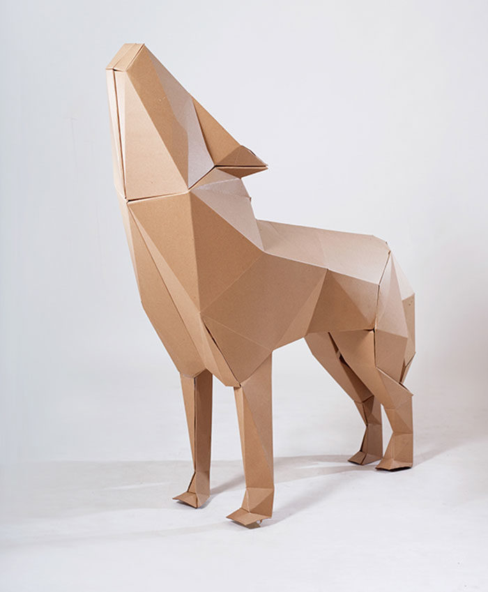
CapaRoja (Red Cape) (Fine Arts, Industrial Design)
This low poly art project is a cardboard installation. This low poly art style focuses on memories of childhood using cardboard polygons.
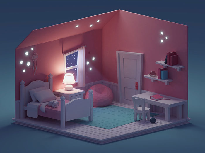
Quick Room Render (Night Version)
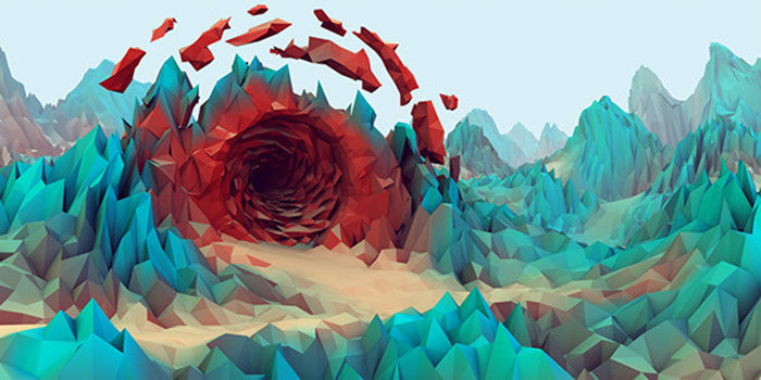
Low Poly Series (Illustration, Landscape Design)
Beautiful low poly art style landscapes.
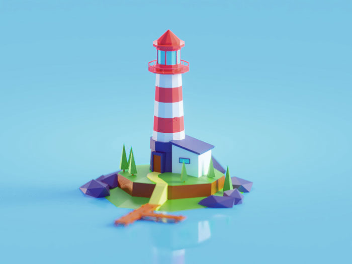
Low poly Lighthouse
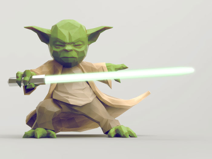
Low Poly Characters (Character Design, Digital Art)
A series of low poly images which create fantasy and action/adventure themes.
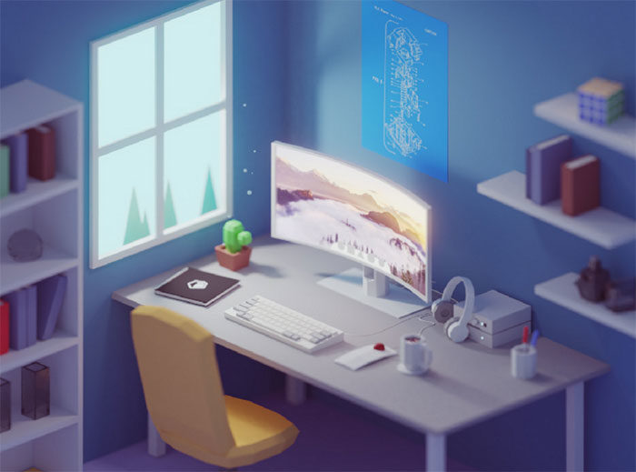
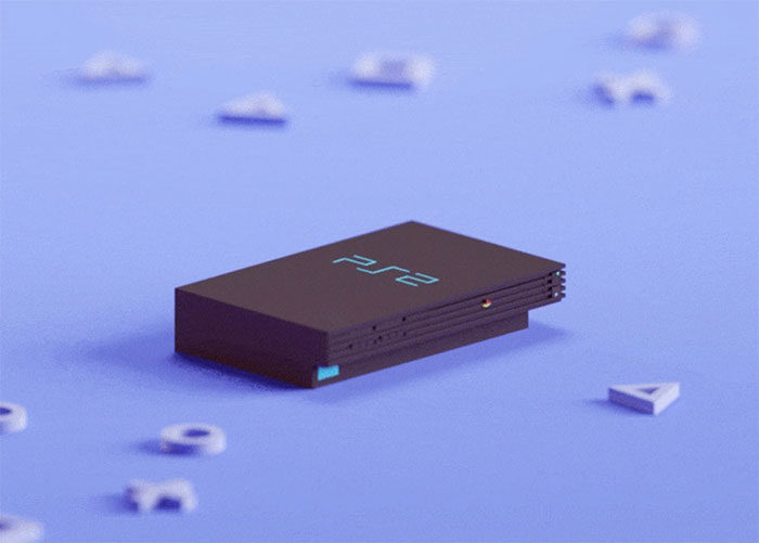
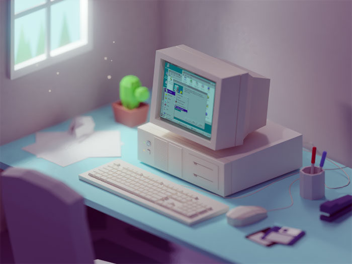
90s work desk
Low Poly Nature
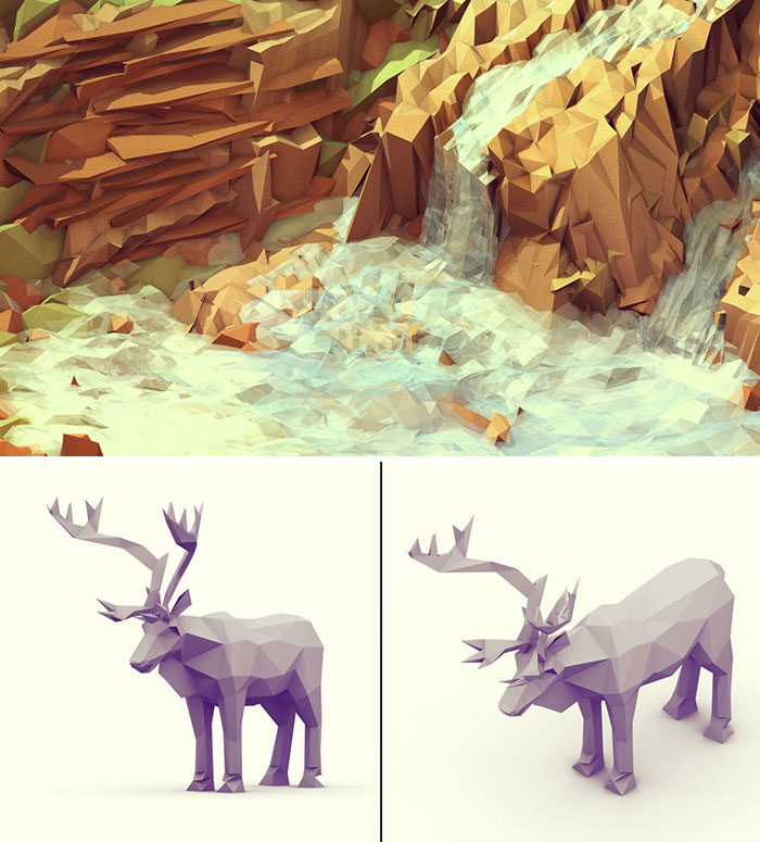
Low poly art has been used to create beautiful images of the natural world, using geometric shapes. The Everywhere Project shows the gorgeous waterfalls of Diamantina in Brazil. You can also see beautiful images of animals commissioned by Greenpeace. These animals formed a part of the ‘Save the Arctic’ conference and were included on banners.
See more of Timothy’s work on his website.
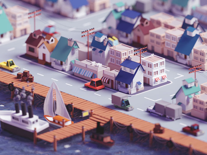
Low Poly City
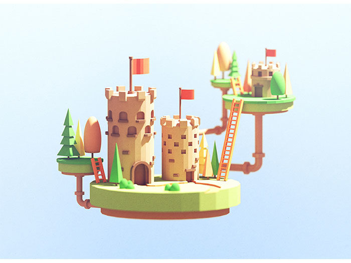
Castles
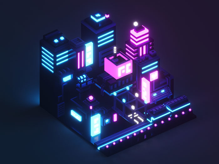
Isometric Neon City
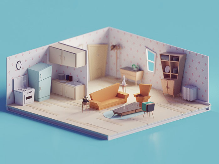
60s/70s Low poly living room
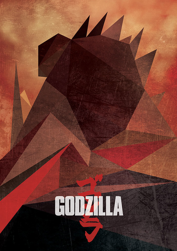
Low Poly Movies Posters (Graphic Design)
Beautiful illustrations can be created out of low poly art and you can see some examples in movie posters for Captain America; Maleficent, The Winter Soldier and Interstellar.
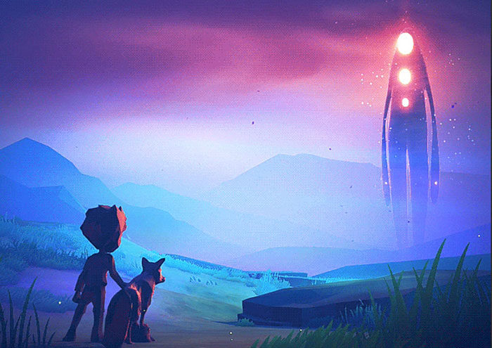
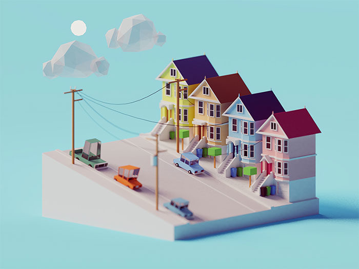
SF scene
Finders Keepers Icons
Elephant
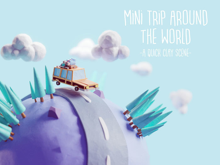
Mini Trip Around the World
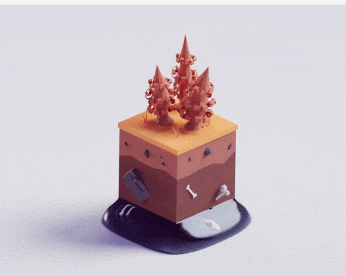
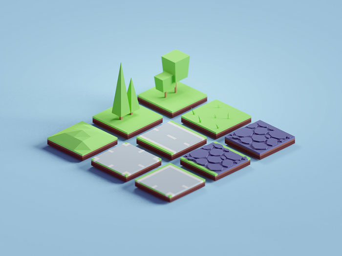
Random 3D tiles
Design and Brending
Final thoughts on the low poly art
If you’re a great fan of low poly art and you want to keep up with trends, you could begin by adding some low poly pictures to your designs. We hope this article has inspired you and that you will enjoy working in this very attractive and vibrant medium.
If you enjoyed reading this article about these low poly art, you should read these as well:
- Geometric logo design: examples you should check out
- Using a red color palette and the various shades of red
- Graphic design trends 2019: What will be predominant this year
- Character Design: Tips On How To Design Characters
The post Low poly art: What you need to know about it (plus cool examples) appeared first on Design your way.
Source: https://ift.tt/2TMaCXa





No comments:
Post a Comment