Where exactly do you begin if you want to create a custom typeface? What are some of the practical methods and considerations you should keep in mind before you begin? If you are looking to create one, you should be able to picture how the type is naturally written. The more you practice it, the better and more creative typefaces you will create. As designers, we tend to get stuck on techniques and details of the craft but the more you create, the more you tend to not look at objects in isolation. This helps you see it in relation to every part of the design. Playtime is an important aspect of the design process. Give yourself plenty of time to come up with something fresh and innovative. If you try to nail it at the get-go, you will not be able to explore the typefaces true potential, so make sure to give yourself a lot of time before you start to put pen on paper.
In this article, we will discuss how to create and develop bespoke and customized typography by looking at some tips provided by industry professionals. If you are new to this discipline, this guide will help you get started on the right path.
1. Start from scratch
Digitizing your handwriting is tried and tested practice. While this might be a good practical tip it restricts the typeface to personal use. Using existing typefaces and basing your design on its outline is not going to help you produce a better typeface.
2. Make fundamental choices
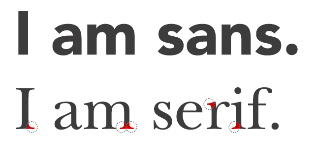
Before starting your design, there are many decisions a designer should make to avoid any conflicts that could arise later on. Is it going to be a serif or a sans-serif typeface? Are you designing it for a long document? Will it look nice and be comfortable at small sizes?
3. Study the basics
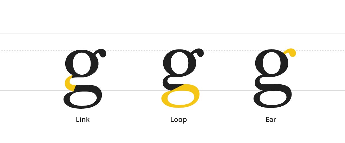
Learning the basic principles of typeface design will help you understand how to create an effective one. What is the difference between ascender/descender? What is the difference between uppercase and lowercase stems? Why do curved strokes appear thinner than a straight one? Understanding the basics will help you get a better overall understanding and make better decisions.
4. Start with control characters
Control characters are characters that help bring other characters in your design into harmony. It can help define the style of your typeface. Once you have established a control character, you can steadily add letters to it to build a word.
5. Invest in good tools
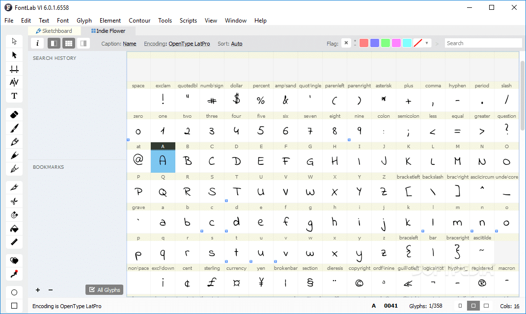
Look into investing in high-quality pencil, paper, and software before you begin your process. Most designers tend to rely on Illustrator to craft their typeface. But it is quite limiting as it only lets you customize and experiment on existing typefaces. If you are looking to create a brand new typeface, there are many tools that are available to type designers – FontLab Studio, Glyphs, and Robofont to name a few. These are popular type based software among the design community and lets you export your work in progress as a font.
6. Draw out some letters
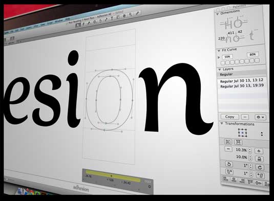
Once you have built some characters, it is time to test them out on your computer. You can import your image onto software like Illustrator or Glyph tool. Use the Bezier curve handles to get better control over your designs. Once you have drawn a few letters, you can start building a word using the software. You should be able to edit the spacing between letters, the curve handles, look into the rhythm of counters and refine the overall proportions as needed. Once you have the letters in place, try out some words by typing it in your InDesign document. With the help of this tool, you should be able to experiment with kerning and leading to finding the best possible setting for your typeface.
6. Scaling
It is important to look at your typeface design in different sizes. So when you are testing out the letters in your InDesign document, make sure to view how the shapes in your design look at different sizes. For some projects, readability might be crucial at smaller sizes. This might take some time to get used to. But the more you practice it, the better you will get at it.
7. Explore different styles, weights, and widths
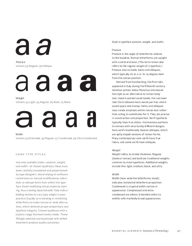
Once you have created the typeface, test it out in different weights and styles. This will ensure that it has different forms that a designer can choose from. Does your typeface come in a condensed version? Does it look good in bolded roman? Try out different possibilities to come up with something fresh and unique.
8. Get it on paper
Getting it on paper away from the confines of a computer will help you see your form in a new light. It is much easier to understand the nuances when you have it on paper pinned to a wall. It is easier to make adjustments and write your notes on paper. This way you are able to make micro adjustments over a long period of time and track your progress as you go.
8. Test out your design
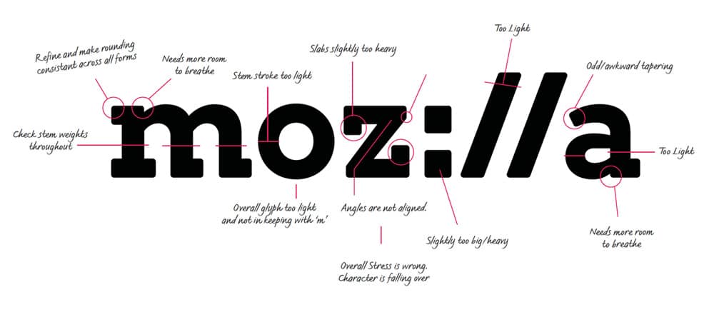
Once you have your design, you can test out its performance by using it in a design project. You could either use this font on a previous design project or as a designer friend to use it in hers and give you some feedback.
Conclusion:
As a designer, you should be able to tell when to customize a typeface when developing a visual identity. There is a big difference between kerning/ leading and tweaking a typeface and completely resculpting a letterform. Make sure you have the necessary skill set and expertise to customize the letterforms before you make that decision. It is worth spending some time learning and appreciating different letterforms and philosophies before customizing a font. This will help you appreciate the design choices on shape, curves, and modification made by different designers and guide you in your modifications.
The post Designer’s Guide to Custom Typography appeared first on Web Design Blog | Magazine for Designers.
via https://ift.tt/2u8uQMq

No comments:
Post a Comment