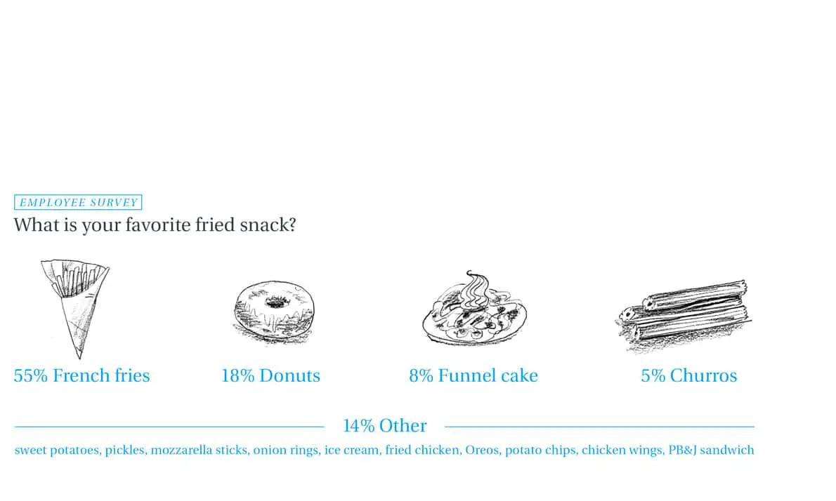
Microcontent is imagery, written copy or videos/gifs that can be consumed in less than 30 seconds. Infographics, video clips, images/illustrations, graphs, text blurbs, memes, short listicles, email subjects, webpage titles are all considered as microscopy. A concise way of presenting data is proven to be more beneficial and effective especially when designing for a fast moving world.
Microcontent is usually optimized for social networks. Single images, short snippets of memes, 6-second videos that can easily be shared on Facebook, Instagram or Pinterest are all examples of micro-content. Different social networks have different aesthetic norms – content should be adjusted to accordingly to fit the norms of a particular platform.
There are two types of microcontent – 1. Small clusters of words that often make up the tiniest bits of the framework that provide information and direction as to how to use a website or an app can be termed as a micro-copy. It could be labeled information or copy on CTA buttons. 2. Images or gifs that lead the user to a URL is also a popular type of micro-content. When designing micro-content, it is important to think of them as fragments. It should be short, easy to understand and inviting.
In this article, we will discuss the two types of micro-content, how to put them together and some website demos that use micro-content effectively. So scroll down to learn more about how best to create better, more usable pieces of content that will make your work better.
Words
Micro-content helps drive the tone, navigational elements and the connection you feel with the site. To use the site effectively, you have to be able to understand the micro-content within each of these elements. The way text inside these elements is written has an impact on the overall effectiveness of the website. This can be achieved by using simple phrases and language, paying attention to verbs and words, considering the tone and making sure it matches the rest of the content, instructions should be clickable. When in doubt stick to commonly used phrases. There is a reason why they work, its mostly because they are easily understandable.
Images
Images should be used in conjunction with words. They should complement each other. Imagery should be used the same way you would use an infographic on social media. It should be broken down into tidbits for sharing purposes. If you are able to use the single piece of content on multiple channels and multiple times, then you are able to drive traffic back to your website. Here are a few tips to consider when creating micro-content based on imagery
1. Use bright Imagery and eye-catching content and should either stand alone or be in a container.
2. Minimize the use of text
3. Cards are a great way to showcase imagery
4. Crop images the right way. You should not be able to see other parts of the micro-content block.
5. Link back to the original location
6. Size content for appropriately.
7. Include the call to action buttons.
Image + Text pairing
Once you have the individual components, you should be able to create image/text combinations. It should be designed in a way to make it easily understandable for the audience. When you break things down into digestible bits, users are able to grasp the idea better. Cards a good option to use on social networks, once the user clicks on the card, they are redirected to the main website where the image and the CTA would have a similar look and feel. Once you start using cards they are easy to reuse – each card can be used as a business card, flier or a postcard. When you have the micro-content ready, you should be on the lookout for places where you can use it. Using it with some tried and tested rules can help make it more effective. Tagging users with mentions on social media, creating hashtags that resonates with the user, missing content types are some of the ways to actually make it work for your business.
Web design using micro-content
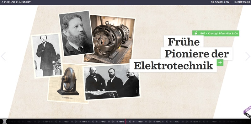
1. 100 Jahre Zukunft
This website examines some of history’s key events. This site provides the audience with complimentary photos and short descriptions.
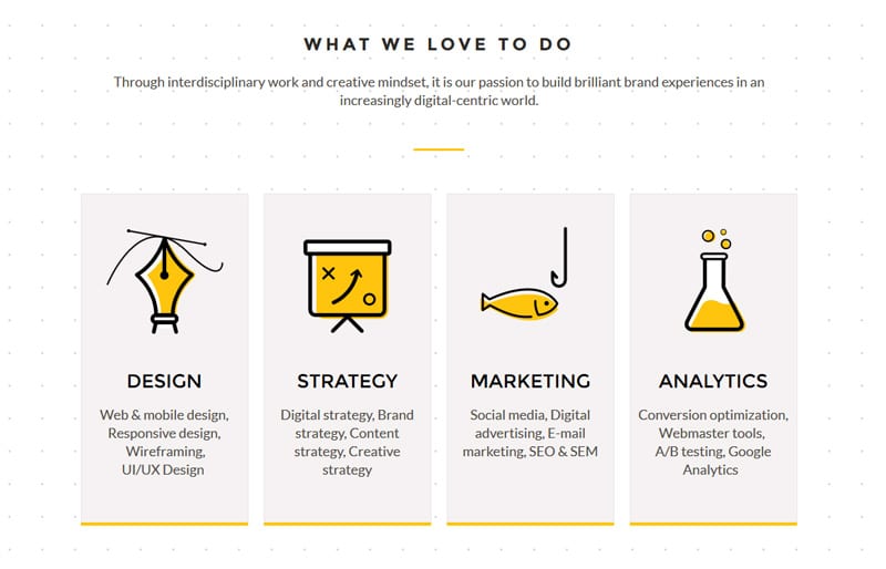
2. Yello
You can find micro-content in their services section. The owners of the site get straight to the point by demonstrating their areas of strength by using interesting illustrations that represent the brand.
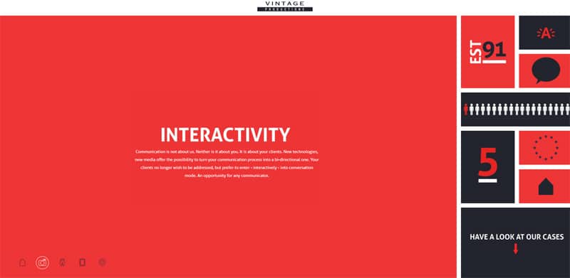
3. Vintage productions
This site employs a mosaic style layout and incorporates animations, and flat style graphics. The front page is filled with short phrases and tiny bits of data.
4. Woodlands ad agency
This site utilizes micro-content in a variety of ways. The tagline contains important information about the client, the testimonial section includes reviews from clients, the footer has small fragments of important information.
5. Swan Lake
Here micro-content is presented using several short videos that let the users get a glimpse into the world of Dutch National Opera and Ballet.
Conclusion
Micro-content shouldn’t be designed as an afterthought. Elements within your website help your users to move around and get a better sense of what your website is all about. Micro-content has carved out a niche for itself and plays an important role in our day to day lives. It helps us express our thoughts clearly and concisely. To get the most value out of micro-content make sure to produce it from an existing work. Make sure to repurpose your content in interesting ways so that you have a lot of elements to share.
The post How to Design Great Microcontent for a Website appeared first on Web Design Blog | Magazine for Designers.
via https://ift.tt/2TOfsDc





No comments:
Post a Comment