Our attention span has significantly decreased over the last 10 years. Users are no longer interested in reading lots of content. So how do we make or design a long form that is effective and successful? Long form content in conjunction with good UX design can solve this issue. Users tend to like a good story and long-form content is a great way to create an immersive and engaging experience.
In this article, we will share a few examples of long-form content that are effective and engage the user while communicating the message. By balancing, space, text, imagery, and various other features, we are able to transform a long-form content informative and a visually pleasing read for the user.
1. Space
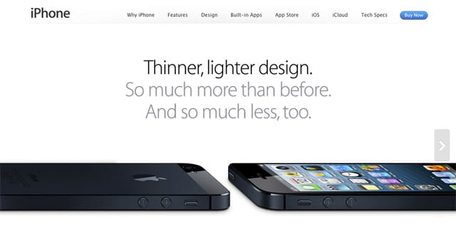
Use white space to make your long-form content less overwhelming. Incorporating plenty of white space will help make your content more scannable and accessible. You could try adding space between the content and edge of the screen (for all device sizes), between lines of text and in between paragraphs, around imagery and other visual elements.
2. Use Illustrations
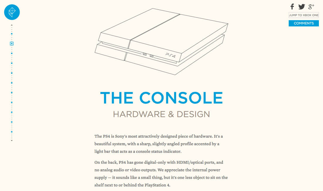
Long forms, when paired with illustrations, can create an engaging form. Illustrations, when paired with text, can be used to create content that communicates a brands message in a compelling way. This technique works really well when you are working with fiction or any other text that lacks a clear visual representation.
3. Placed Imagery
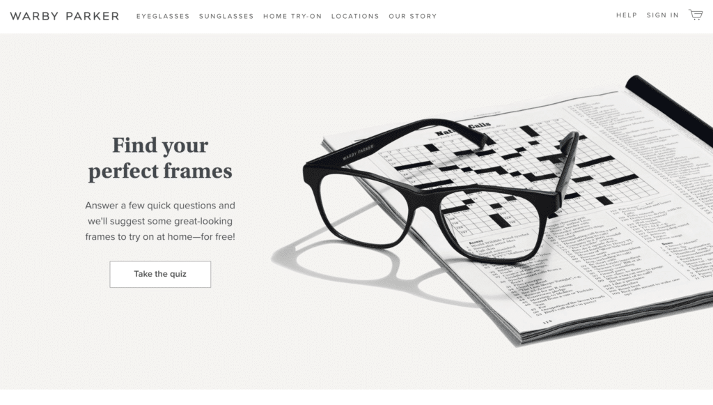
Placement of an image is important when designing a long form. Most long-form usually have a design formula in place. There is a hero image, intro text, large image, subheading, and main body text. It should be designed to be simple, the content should flow well and there should be a good play between the text and the images. The design should also look great on different devices- this means that the reading experience shouldn’t be compromised when switching from a desktop to a mobile device.
4. Intuitive scrolling
Users like to scroll, so ensure that your scrolling actions are designed to be intuitive. If you are looking into incorporating interesting and unconventional effects, make sure to design it such that they are able to use them easily. Scroll experience on a long-form content should be seamless and users shouldn’t have to think about it.
5. Use timelines/milestones
Using milestones on a long-form content can give a user a sense of accomplishment as he or she scrolls their way through the page. Incorporating a progress bar at the very top of the page can show the user the amount of time investment that is needed before they even start reading. You could also break the content into chapters or have a fixed progress/navigation bar.
6. Tell a great story
A good long-form showcases a great story. The best way to tell a story is through a series of graphics/imagery and text. When a story is crafted in a thoughtful way, users find the content to be an interesting read. But sometimes even when the visuals are engaging, it can lead to infinite scrolls which can lead to a very annoying experience. Design long-form content with reason to eliminate this problem.
7. Use animations
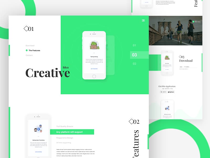
When the content is long, users will need some form of interactive elements to help understand where they are in their journey. Using purposeful animations such as parallax effects, buttons and arrows will help aid in navigation. It is useful to use video animations to break up the text as well. Keeping these animations interactive, the reader is able to navigate his way through the page while not detracting from the reading experience.
8. Use navigation elements
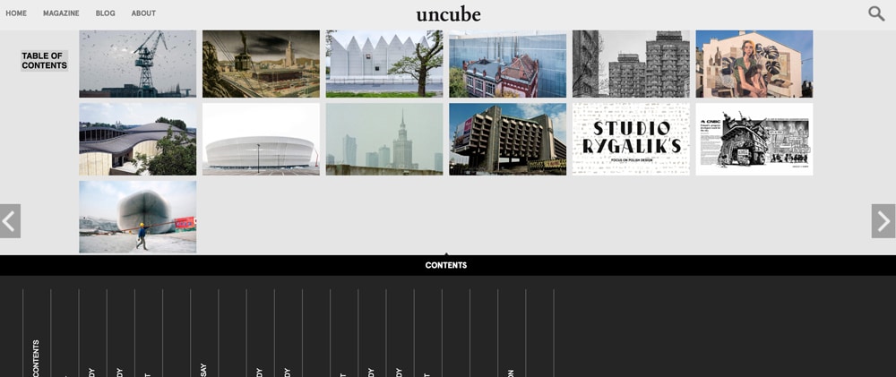
Uncube’s site makes good use of the navigational elements. This site’s architecture is well thought out and leaves no detail untouched. The use of slider arrows are apparent here- it keeps the user scrolling through the pages. The table of content section acts as a progress bar and keeps the user informed as he navigates his way through the site. Header and footer navigation menus also make the site easy to navigate.
9. Use of complementary colors and horizontal/vertical scrolling
Pitchfork is created some great long-form pages in the past and makes use of complementary colors along with horizontal and vertical scrolling to create a bright and exciting design. The site makes use of interactions in a way to make your eyes move down the page to the end of the copy. By playing with animation, depth, layering and complementary colors, they are able to create a long-form content that keeps the user engaged.
10. Long-form is great for SEO
Long-forms are designed to have more copy, so all the additional words in long-form posts can be utilized in long tail keywords making it easier to be discovered by search engines. Since the user takes a long time to read long-form content, Google factors this into their algorithm making it perform better on Google.
11. Long-form increases conversion rates
Long-form content performs better and is more effective than short-form content. When a study was performed to test the effectiveness of the two, long-form content, companies saw their conversion rate increase by 30% when using long-form content. However you don’t want to fall into the trap of having the page long just to serve this purpose, it would make sense to keep it long only when it is appropriate or necessary.
Conclusion
Long-form has a lot of benefits. Some of them are higher search rankings, better credibility, more backlinks, organic traffic, more sustainable content, and more brand authority. This type of layout is not perfect for every design but is a good option if you want to tell your story within your design.
The post How to Design for Long-Form Content appeared first on Web Design Blog | Magazine for Designers.
via https://ift.tt/2IRMluN


No comments:
Post a Comment