Newsletter marketing refers to the practice carried out by businesses of sending product/service based information to subscribers, which generally consist of both potential customers and existing customers, in an email letter format. In today’s time, there are several means and methods readily available to marketers and business organizations. The one that has stood its ground and proved its worth every time is Email Marketing.
It is an efficient method of keeping in touch with existing customers, while also promoting your products/services and reaching out to new customers and potential customers as well. It helps save on high costs of running an ad on TV, print, or radio and lets you reach your target audience quickly and cost-effectively. Newsletters also help increase brand awareness.
This makes it crucial to put forth and create a newsletter that captivates the visitor’s attention. To help you with that, here are best practices for newsletter design we all should follow:
1. Place your Subscription Forms correctly:
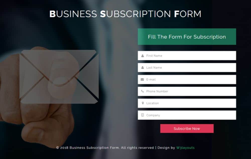
First-time visitors of your site might be impressed with your offerings and work ethic. However, they won’t be able to read your newsletters if they aren’t able to locate your subscription forms itself. Placing the Subscription Form in an optimal place that the visitor doesn’t miss is essential to ensure people subscribe to your newsletter. Usually, adding a little contrast helps Newsletters to stand out and catch the viewer’s attention.
2. Keep the process short and simple:
You might think making an elaborate form for newsletter subscription helps gain vast in-depth knowledge about your clients and potential clients. However, often, too many fields on a form lead to demotivation and exhaustion on the customer end, and they either ignore filling it or leave it halfway. What’s worse is someone could fill it wrongly, which would translate to wrong outcomes and theories which would ruin the point of your hard work. This is why it is advisable to add minimum yet effective fields when designing the form. It should not overwhelm the visitor and be easy to fill. Many companies use an email address to sign up for newsletters.
3. Give the subscribers a brief:
People don’t want to invest much time in understanding the process and what is offered at the initial stage. They want to know if the provided service or product gives them any value for investing their time. Hence giving a brief about what the subscribers can expect emails about, at what frequency or even what topics help customers gain an insight of what to expect, and if it strikes a balance with their demands, they’d not only subscribe but thoroughly engage with the content sent to them. This also helps build trust and transparency, which is appreciated by subscribers.
4. Include other benefits to attract subscriptions:
You can use all the techniques you want to attract for subscriptions, but what generally tends to work most of the time is added incentives. People love to avail as much discount, coupons, freebies as possible. Using this to your advantage, you can come up with offers and rewards that a potential subscriber can get, upon subscribing to your newsletter. The offer can be a coupon code for discounts of shopping from your website, niche-related freebie, or any other such value addition. This offer has to be both eye-catching and convincing for potential subscribers to subscribe.
5. Personalize the Subscription Form:
It is always recommended to have a small snippet of information on your subscriber form that generally emphasizes further on call to action, pushing people to fill the form by addressing them in the most creative manner possible. It can be further taken up a notch by personalizing that message in a way that people feel that you’re directly communicating to them individually. This sense of personalization makes the potential subscriber feel good about themselves and valued. For which the chances of them engaging with the subscription form increases many folds than those newsletters which don’t use a personalized subscription form.
6. Prioritize content before design:
There are tons of email newsletter templates available on the web. The easiest and most approachable way might seem to be just picking one of the templates and replacing the Lorem Ipsum with content that you’ll think about later. This method has no grounds and won’t work most of the time. You need to understand your content first, what you want to say/across, and then adjust the design according to the content to complement it. Content helps understand what the purpose of the newsletter is, prioritize what is essential and what is not. You should always sit down and think of the content of your newsletter before going to designing it. It helps removes ambiguity, look, and feel, which you can then translate to a designer or keep in mind while searching for your template that best suits the requirements.
7. Clarify your objectives and goals:
Even if you’re going to an expert designer for designing your newsletter, or using a DIY tool or even a template, it is always advisable to create a design brief before starting to design your newsletter. A design brief gives you a clear idea and structure as to why you are making this newsletter, what is your goal with the design, and many more parameters. Some of these parameters are, Objectives and Goals; understanding what’s your aim and takeaway with what the design can be. Understanding the purpose of a newsletter is crucial if it’s only to sell a product or provide information. In any case, information that adds value to the customer and hence should always is in the front and center, and sales aspect should be secondary for people to believe that you care about their problems first, instead of pushing your products to them.
8. Identifying your target audience:
Designing has to be done with specific parameters in mind. One such essential parameter you should be aware of and consider is your target audience. Target audiences are the set of people you want to target all your marketing efforts towards, to match with their taste and accordance so they can relate to your services and make use of them. They can be selected on various parameters like gender, age, locality, common interest, and much more. According to the target audience, the design principle keeps changing. Hence it is essential to identify the target audience and then design in a way that is widely accepted by them for maximum conversions and relevance.
9. Work on the subject line:
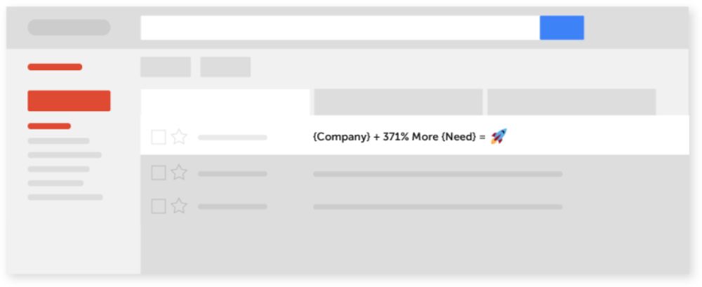
Whenever any person receives an email, they generally browse through chunks of their mail just by reading their subject lines. This is why it is essential to write an attractive, short, and crisp subject line to capture the potential client’s attention. The subject line should have a sense of the call of action that draws the reader to want to know more about the content and take an interest in the subject as well. Writing a high subject line helps by giving a brief idea as to what to expect inside the mail as well.
10. Cater to your audience:
There are different lengths of creativity you can show/use for different lengths of devices. If your client base is heavily depended on Outlook or any other such mailing service, chances are it might not support fancy fonts and design elements, whereas if your clients fall in the majority of using Apple devices, for instance, you have the freedom to use your creativity to the fullest. Hence understanding what the target audience uses, is an essential aspect of designing your newsletter for better optimization and catering to their needs.
11. Optimal use of images and visuals:
If the aim is to make it appealing, interest-holding, images are a must. This rule stands true for newsletters, as well. Relevant images/illustrations or even infographics that enrich the content of the newsletter can be included in the signature or footer element of the mail. Make sure to use such images only if it adds value to the content. Avoid overuse of images or illustrations, which can make it look untidy and clustered. The relevant images can include pictures of your team, the product itself, or any other thing you think adds value. Images have the most memory retention on an average human mind; hence, the use of the right imagery can help reinforce your brand in your audience’s mind.
12. Understand general guidelines and put them to use:
Certain guidelines don’t change for most mailing services. Creating and designing your newsletter while keeping these in mind helps evade unnecessary reworks and best optimize your creative for the required purpose. One such guideline you can use while designing your newsletter is keeping the width of your email newsletter fixed to 600 px. It is the most standard dimension used for the majority of mailing service. This ensures that whatever you include in your design and content aspect of the newsletter doesn’t get cropped or chipped off when a subscriber sees it. All the contents remain intact and safe. If you wish, you can push and experiment up to 640 to 650 px width, anything above that can be risky and cause troubles.
13. Optimize as per Preview Pane:
Not everyone is going to read through the entire mail. Very few people will. This makes it essential to keep a few things in mind when designing your newsletter. One such suggestion is, optimizing your newsletter as per the preview pane measurements. Many people won’t open and read your entire mail but preview it. The problem with this is that the preview plane differs in dimension than the actual mail; hence, ensure your design elements and essential copy fit under the preview pane measurements as well, to ensure the content is still as engaging and clear as it would be if they opened the mail. General measurement of preview pane is around 300-500 px high, which can be used as a guideline for designing your newsletter.
14. Don’t use background images:
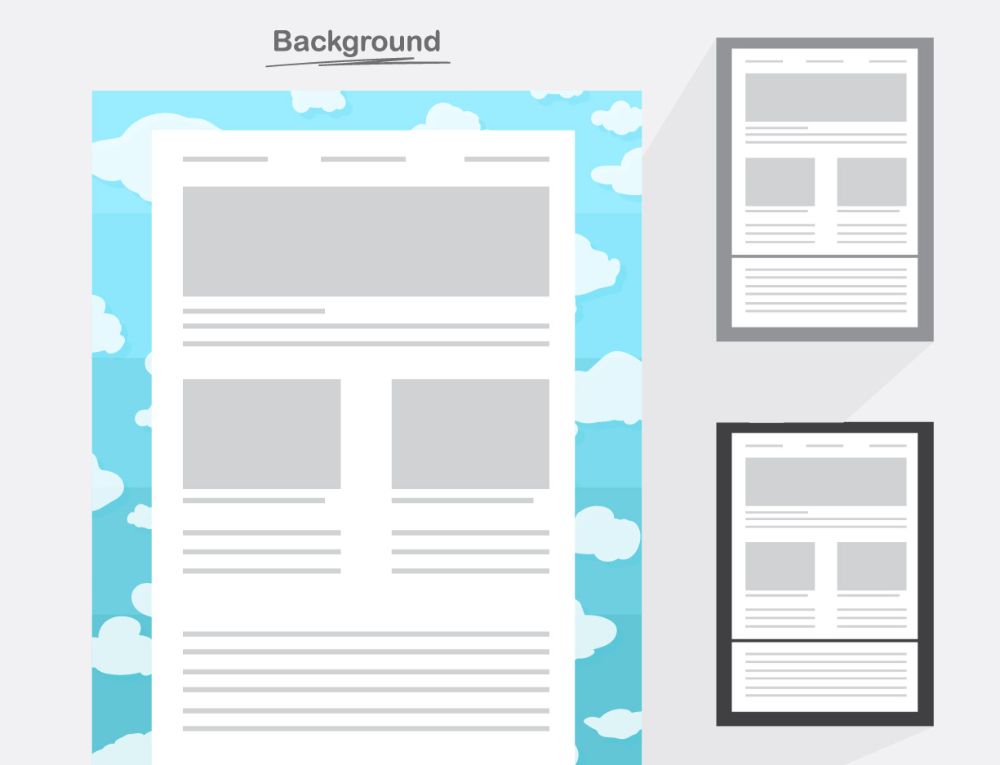
A background image may sound promising and aesthetically an excellent practice to have; however, with a great design, you also need to consider the consistency of that grand design. There are many email clients that people use, each different from the other in some aspect or the other. The parameters can be different. Which is why putting a background image can disrupt consistency because it might look excellent on a few mail client services, while not being visible at all in some, and stretching and reshaping in others. This ruins the design and works against the purpose of creating beautiful newsletters.
15. Use alt text:
Not many individuals follow this crucial practice, but you definitely should. Many times people get annoyed by multiple ads and images being displayed on their web surfing experience. Hence they turn it off. If you designed a newsletter that was primarily only image-based, you’d lose out on such potential clients since your image won’t be shown to them. This is where Alt Text comes to the rescue, as it is an alternative text describing the contents of those images if the image is not viewable under any circumstance. This helps retain such potential subscribers as well.
This concludes 15 Best Practices for Newsletter Design you should keep in mind when creating your next newsletter. From the website placement area to understanding the basic guidelines of what to do and not to do. Also, by using some design techniques to stand out from your competitors. The main focus point should always be on clarity, ease of access, and engaging material.
The post 15 Best Practices for Newsletter Design appeared first on Web Design Blog | Magazine for Designers.
via https://ift.tt/2VvqETH


No comments:
Post a Comment