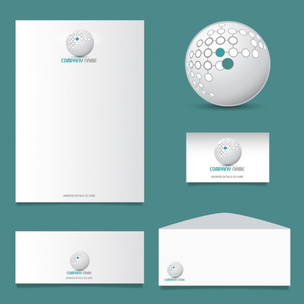
Business Stationery Design refers to every tangible element that enhances and establishes your business. The papers, office supplies, writing equipment, cases, business cards, letterheads all are a part of your business stationary. It is a practice of proper social etiquette, which holds value in today’s time. The overall aim of designing business stationery is to reinforce branding in a beautiful way.
This makes it crucial for anyone in the business industry to have correctly designed business stationary. Specific guidelines help you ensure your business stationery is designed appealingly and adequately. Here, we will talk about 20 things to keep in mind while designing your business stationery.
1. The use of right colour:
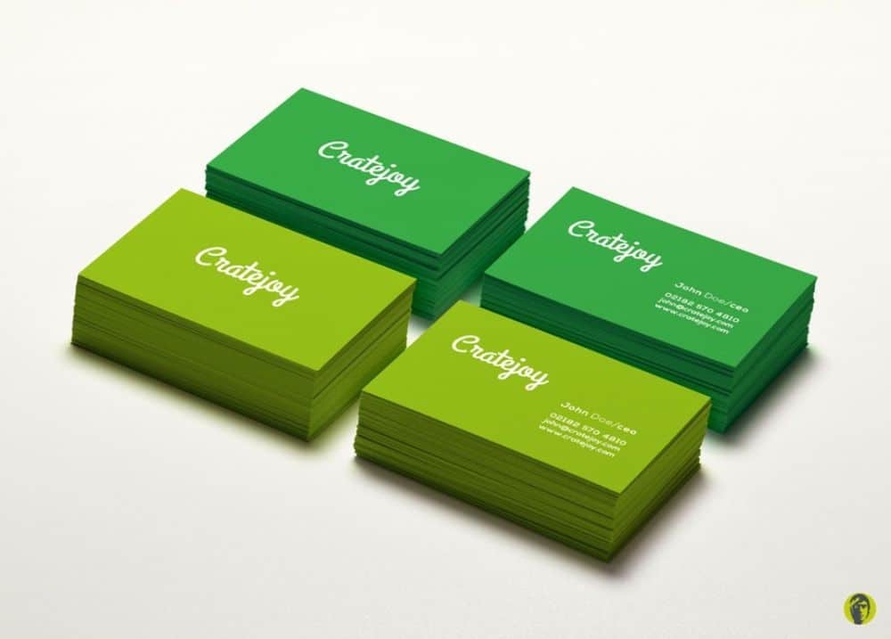
Colour has the most visual impact on business stationery articles. The eyes are trained first to register the colour, and then move to other features of the articles. As colours take up so much visual importance, it is important to use pleasant colours, which complement the brand’s aesthetic values. It has to create a sense of connecting with the recipient of the stationery, in a way that he/she should be able to recollect the name of your brand upon seeing that particular colour.
2. Understanding typography:
3. Crisp and short content:
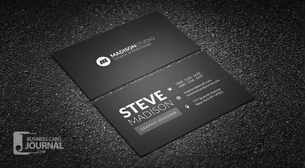
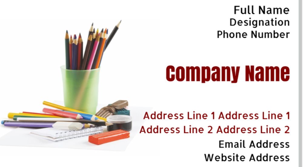
The content that goes on your business stationery articles has to be crisp and short. It needs to convey what you want to say with minimum words. Since business articles generally help create a first impression and first connecting point with potential customers, it should only talk about the essential contact details with one appealing line optional. The focus needs to be on the contact information because that’s the purpose of creating these articles in the first place.
4. Spend time designing your card:
In the era of online content and services, it is straightforward to download a pre-designed template for your business card and use it as it is, but the problem with this is, it is as easy for many others out there to do the same. There are high chances your design is being used by several other companies, some from your niche as well. As business cards are a personal expression of identity, you should consider investing some time deciding on the design element and language, and match it to your brand’s aesthetics to create a unique stand out – card.
5. Finding the right Quantity:
While printing thousands of business cards at one go may sound practical and the right thing to do, it often isn’t. No matter how frequent or actively you give out your cards; you mostly won’t give out more than one or two per day. If you print thousands of cards, that last you longer than a year, chances are those cards won’t do you any good as your business would have evolved during that duration and there would be changes in design elements inwards your business and in general trend too. This is why it is always advisable to print less and update your design of all articles, from time to time, to avoid becoming obsolete.
6. The importance of Proofreading:
Many times people overlook this small aspect while designing their stationery which can have severe consequences for the brand’s identity. This stationery is physical, tangible assets that showcase your business in the correct light; if there are typing errors or false information, it directly does not connect the bridge between you and the potential clients. Moreover, it might set them off, thinking you’re not responsible enough to maintain your identity, let alone theirs. Apart from spelling and accurate content checking, the alignment and other small designing elements should also be kept in mind and placed correctly.
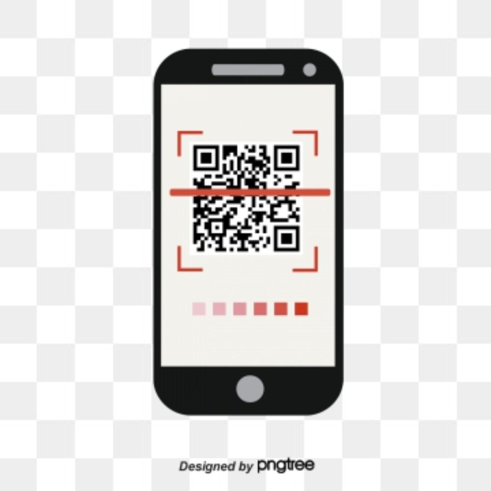
7. Web integration via QR code:
It is a safe assumption that most people these days use smartphones. This provides a great opportunity for you to connect your physical brand’s persona to your digital persona by the aid of QR code. You can redirect a potential client to your website, social media platforms, a specialized landing page, and much more based on what is your priority. Integrate QR code into your business card.
8. Social Contact Details:
Many social apps have now support for business aspects as well. With the vast popularity of these social media platforms, it comes a natural connection point for businesses to stay in touch with the masses and their clients. Many of these social media apps only require saving one’s number in call directory to access. This is why you should always mention your business number on your business stationery articles, along with your mail id and links to social media accounts.
9. Choose material wisely:
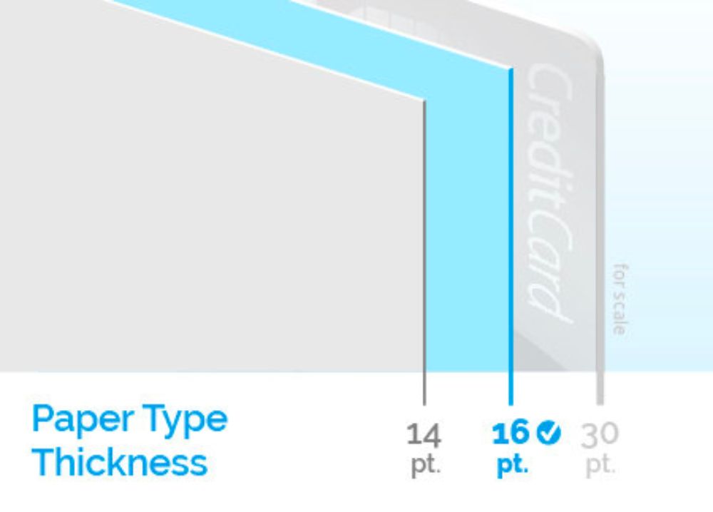
Since it is a physical copy of whatever you design digitally, there are many factors that might change the visual design of what you created on your desktop to what comes physically. Different inks interact differently with different kinds of materials used for these stationery articles. Some materials create much spread; some absorb very efficiently. Hence it is important to understand the different materials and to use them to your advantage to enhance your design as you want.
10. Pick your range wisely:
Logistics is a crucial element of planning your business stationery design. Business cards and letterheads are generally cost-effective and easy to procure. However, other articles could prove to be a bit expensive and unnecessary for some businesses. You need to consider your budget and plan the range of your business stationery accordingly.
11. Experiment with layouts:
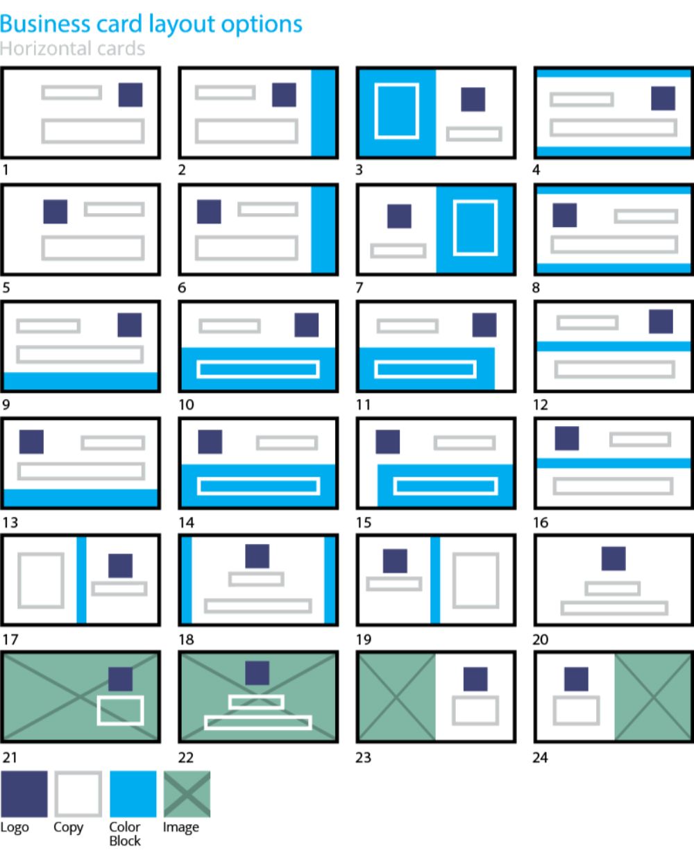
With the competitive nature of the market; standing out of the crowd is more important than ever to have a certain edge over your competition. One way you can go about this is by experimenting with different layouts; the general perception of business cards or labels are generally horizontal orientation. You could experiment with a vertical layout for a business card, though you wouldn’t be the pioneer to be using this format; it might work to your advantage if you justify it with a good design. Having said this, it is also essential to understand that you shouldn’t take a big leap and create different shapes primarily to stand out. Stick to the basics, and experiment within safe grounds to avoid uncertainty.
12. Reinforce your logo:
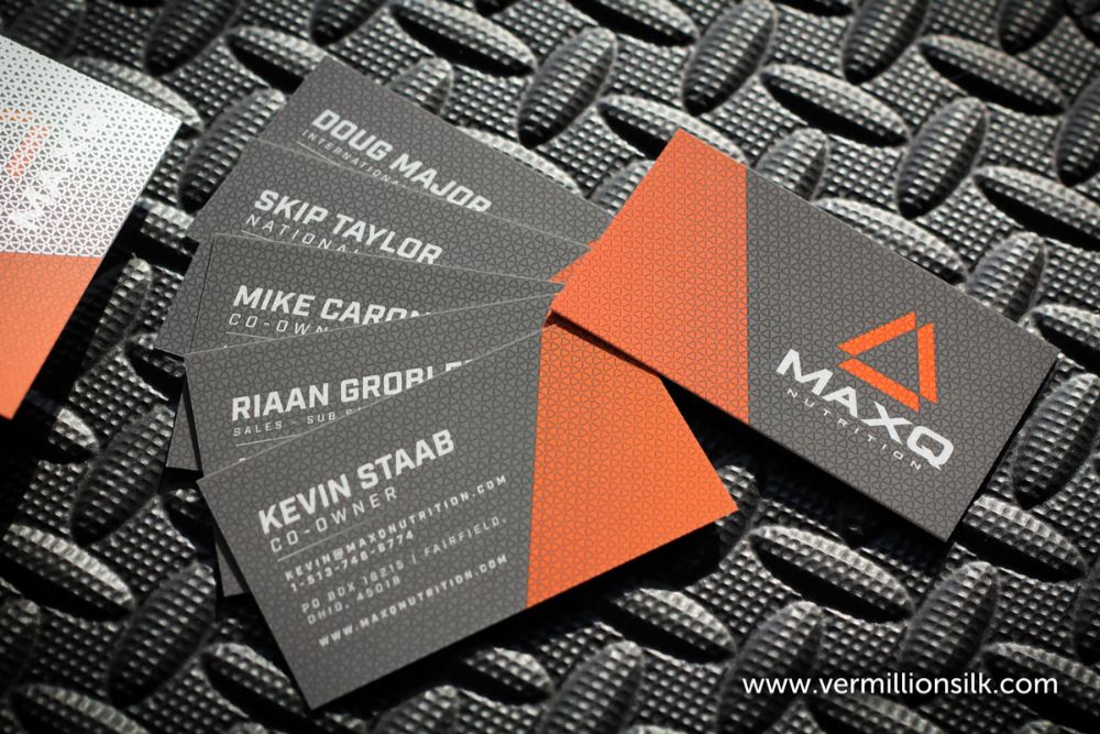
In design language, colours and logo have the most retention on a client’s mind when it comes to remembering a brand. It also accounts for most of the perception they create about your brand. Hence the entire line of business stationery must highlight your logo in an appropriate and subtle, yet effective manner. Placement of logo can depend on your design language; it can be in the dead centre, top right, or any other such place. However, visual hierarchy generally makes the logo most visible on the top right alignment. Try and keep the positioning constant throughout your stationery range.
13. Understand proper spacing:
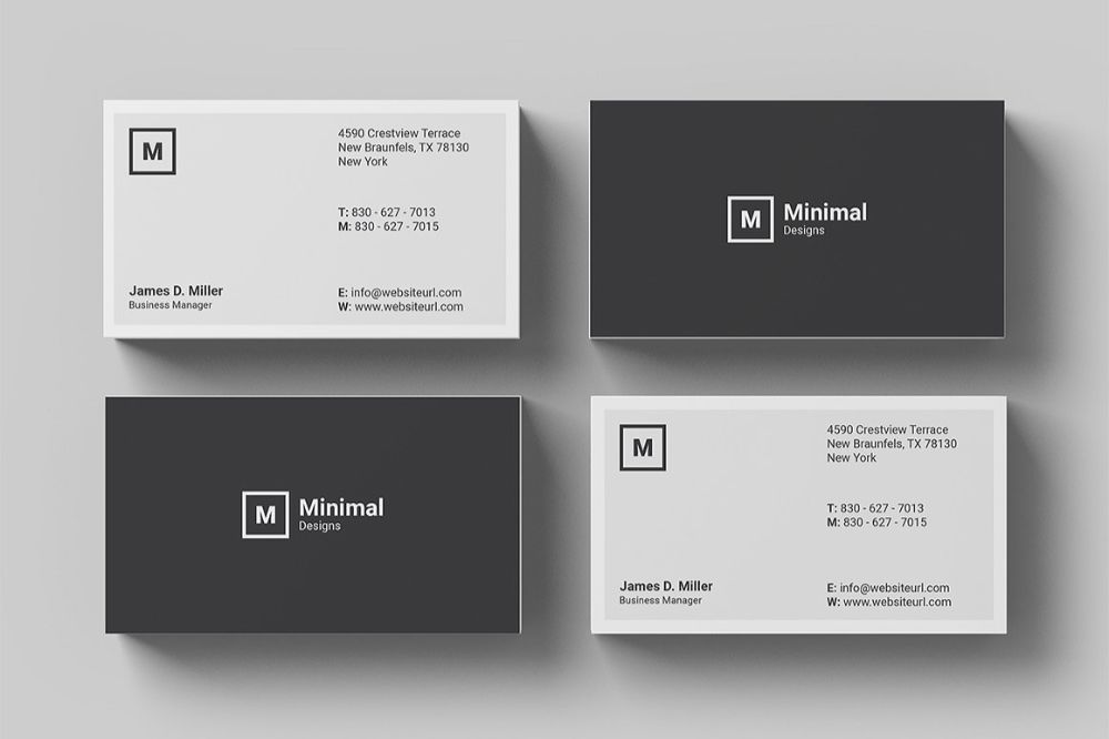
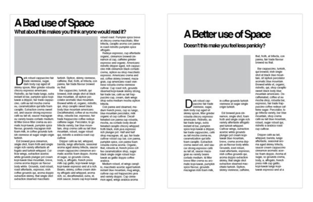
All articles of business stationery come with finite spacing, and it comes all the more important to use that available space efficiently and not overcrowding it with content. Proper spacing ensures the legibility, accuracy, and impact of your content. It helps the recipient follow a design flow and focus on relevant content with ease.
14. The practicality of design:
It is natural to at times go overboard and wanting to break some conventional design guidelines to create something unique. The thought that needs to keep in mind; however, the practicality of that experiment is. Some designing guidelines are crucial to follow as the same guidelines are used while creating other products that depend on them. For instance, you can’t experiment with extending the size of your business cards to a great extent because wallets that carry them are generally created with pockets of a specified size that all visiting cards generally follow. If your card is visually amazing and stands out from the rest due to that extra size, it still holds little or no value if it doesn’t fit your client’s pocket.
15. Graphic or Typography:
Your design language needs to be in correspondence to your niche and your field of working. It has to reflect your perception of the service you’re providing and how it’s different from the rest. Choosing whether you need to use a graphical design or heavily rely on just text can be one such decision. For instance, a heavy priority of graphics can complement the brand’s value if it’s stationary for architects, lawyers, and luxury brands. There is no black and white to use only one of the two, you should try prioritizing one over the other, and yet find the right balance between the two.
16. Understand the element of white space:
One of the designing elements is Whitespace. The unused portions of any section of any article are called Whitespace. This concept of keeping certain portions unused helps demarcate the different contents present on any article from each other and also creates a visual hierarchy that allows the reader to follow an intentionally created flow which makes it easier for delivering relevant information across.
17. A supportive Call to Action:
It is true that you shouldn’t overfill the business stationery articles with content, and focus mainly on the contact information details, so they know how to contact you. However, this in itself might not be as appealing to the recipient or create an immediate need of emergency to want to contact you, which is why you should also focus on the ‘why’ to contact you element. A brief tagline or call to action reinforces the idea of getting in touch in the recipients’ minds.
18. Include year of establishment:
It is an element that most people generally don’t even think about. However, mentioning your year of establishment, especially if you’re in your industry from a reasonable period can serve multiple advantages. First of all, it indicates that the business has been in the market for a long time and flourishing amongst its competition as well, it gives them the credibility of experience and expertise as well.
19. Location:
You might have a business with multiple offices/stores. Mentioning the address of your head office and other branches doesn’t only help in showing your economic stability and success to have so many branches but also helps the recipient understand the ease of access you have to offer as your stores/offices are spread across the city or country. It goes on to show that your business is well-reputed and famous in its domain. It also helps customers reach your office efficiently.
20. Match the guidelines as per your clientele:
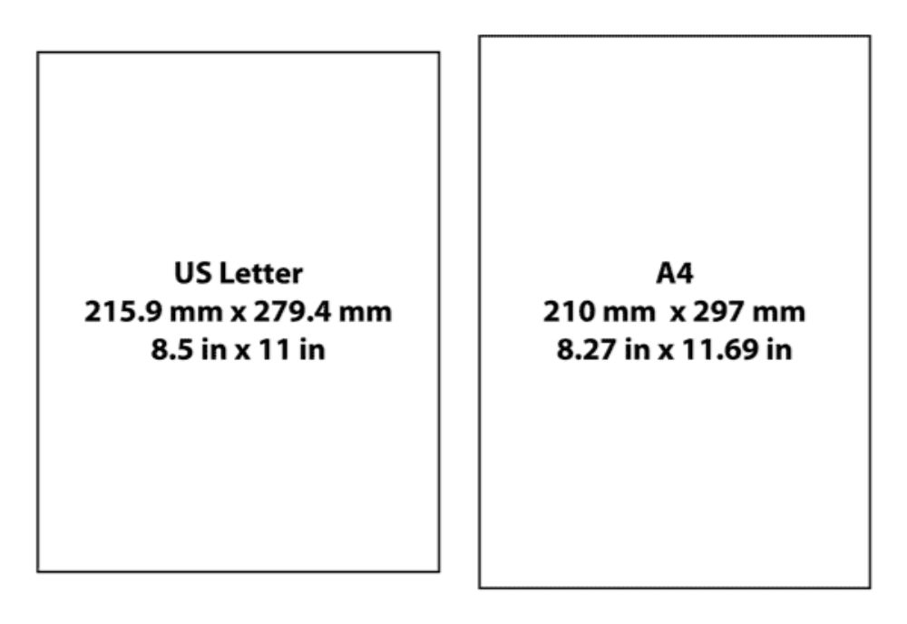
We live in a global market. It is very much possible that your clientele is strictly from a foreign country or multiple foreign countries. This makes it essential to identify your target audience and create stationery as per the dimensions and guidelines they follow. Having a customer-centric approach won’t only show that you care about your customers but also avoid mismatch of false measurements and unease of carrying your stationery. For instance, a U.S envelope differs in size from the rest of the world.
These are the 20 tips to keep in mind while designing your next business stationery. We have already talked about the implications and importance of business stationary design. Keeping these pointers in mind can help you implement and achieve those milestones and create the perfect range of stationery for your business.
The post Your Guide to Business Stationery Design appeared first on Web Design Blog | Magazine for Designers.
via https://ift.tt/2IoX7Wz


No comments:
Post a Comment