If you want to try a CMS blogging alternative, then you must try Ghost. Moreover, to make your welcome easier, we will help you find a Ghost template so that you simply download it, install it and start using it.
Ghost is a fresh proposal that is presented as an alternative for bloggers and editors in general. Its creation took place in 2013, and its main advantage is to be an open-source platform written in JavaScript with MIT license.
Despite its differences, Ghost shares many similarities with WordPress, such as working with themes that save us the tedious part of designing.
If you want to try Ghost, but you are not a fan of the idea of starting over, you should not worry, since the service can migrate our content from other sites, such as Tumblr, Blogger or the same WordPress
Of course, no migration is total. Depending on the site we come from, we will lose some things, such as widgets or themes. In this case, we can replace our previous design with many Ghost themes. Although the quality of the majority is questionable, we will not let you go blind to find the ideal.
The following list contains only the best themes that you can use in ghost.io. Whether you’re looking for something minimalist or modern, you will find what you want.
Ghost template examples and themes
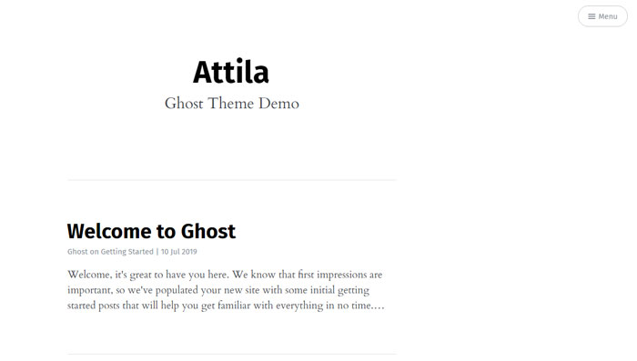
Attila theme – Keeping it simple
The first Ghost template we present is specifically designed to be as responsive as possible. That is why it has been decided to maintain a simple design that can be easily adapted to many formats, such as Smartphones.
Without many colors, but with many useful qualities, it is designed to write everything we want.
The Parallax function allows us to make our blog clearer for search engines and users. It also has the typical comment box and social networks’ share buttons.
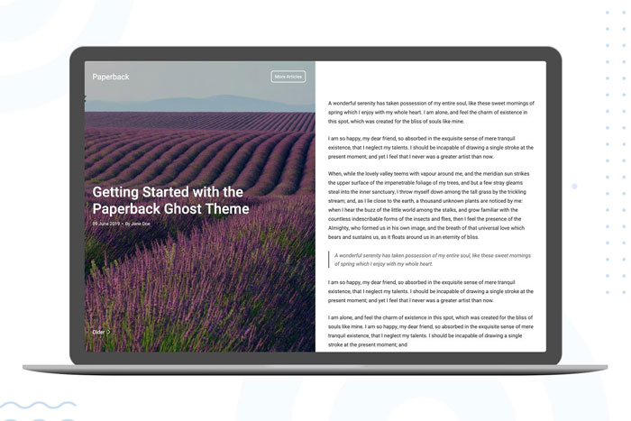
Paperback – One side to write, the other to observe
This design that we can get in the theme market is modern and effective to make people feel comfortable with your blog.
On one side, we will have graphic elements, while on the other we will place the posts.
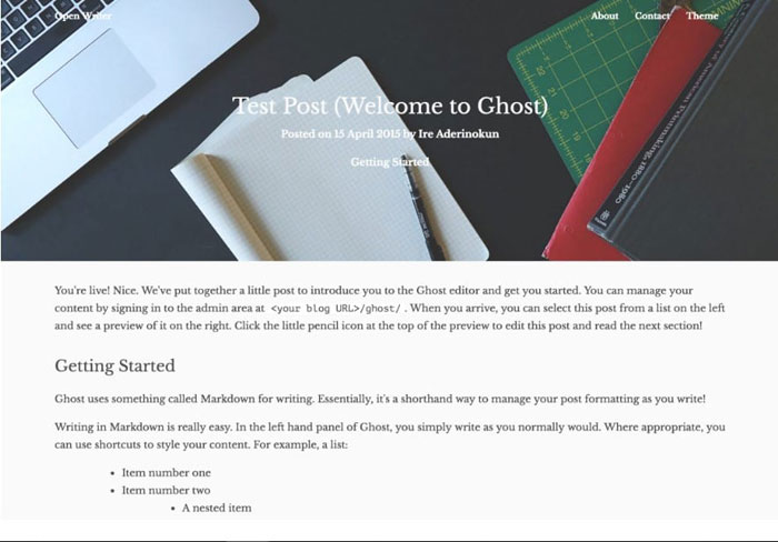
OpenWriter Theme – Easy to configure
If we are not very skilled at setting up a theme, then we can choose to install OpenWriter. This is easy to fix and quite complete in features.
We can separate articles by tags, add authors with their information, and other visual details.
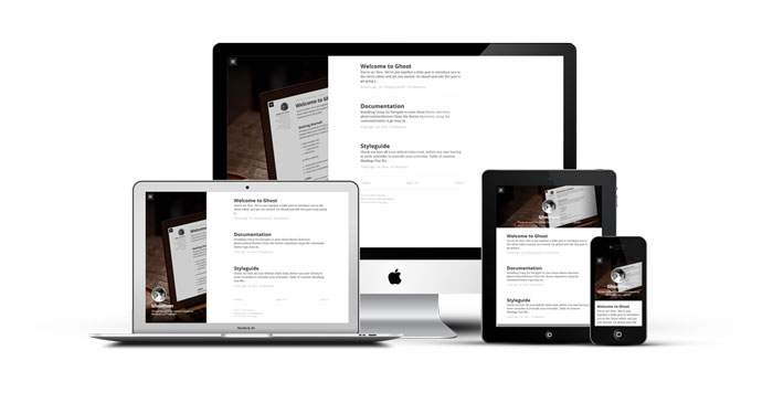
Ghostium Theme – Another alternative similar to Medium
Perhaps it is because its design is user-friendly, or because it is clean in aesthetic elements, but the truth is that Medium is the inspiration of many Ghost templates.
The sidebar easily adapts to different devices, while the text stands out for being so crisp.
Landscape – The distribution that always works
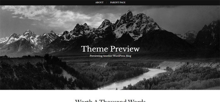
A large cover image at the top, and a single column that organizes our publications by date. This theme allows us to fully enjoy the content we make (in addition to having attractive options for writing).
Cedar Theme – A single column alternative
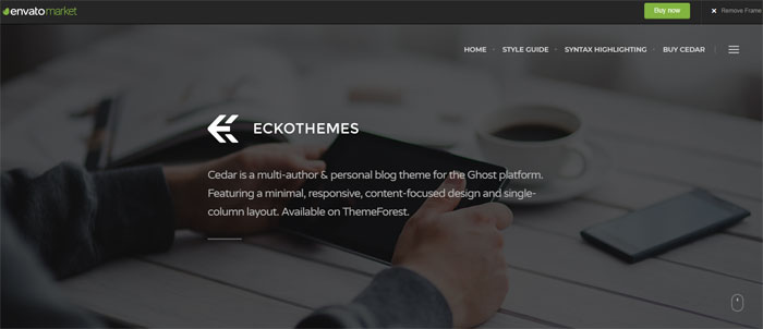
If you don’t want to use Landscape as a theme, you can always opt for Cedar. This is very similar in conception since it also has a single column of content with a large top photo.
Znews – When you are looking to create a complete blog
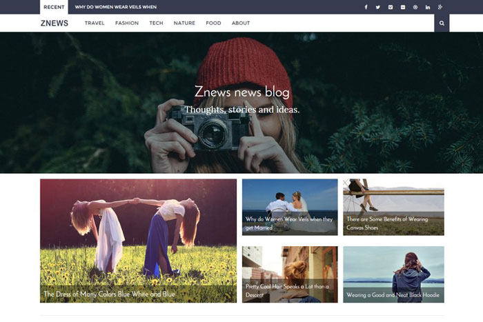
The elegant distribution of Znews makes it perfect for variety blogs. Whether we have many news, curious topics, deals, among other categories, we can separate everything in its section.
Among the windows, it includes, it has Top News, recent publications, and contact information.
Mention – Those little details that count
Mention has some details within its design that make it unique. Among them, we have an improved displacement indicator and the estimated time that it will take us to read the article.
Mnml theme – Let everything be easy to read
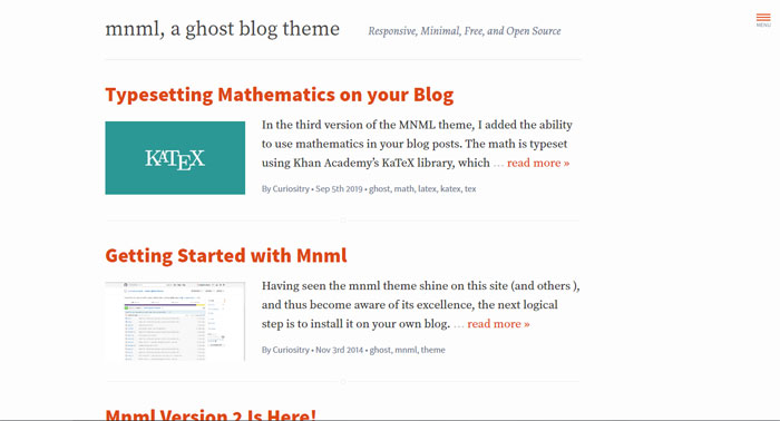
Mnml offers us an easy-to-read format by focusing on typefaces. To facilitate browsing the blog, it also includes a gallery of thumbnails for the home page.
It’s hard to get a free theme that also provides menu options, but that’s not a problem for Mnml. We can also enable comments through Disqus and place the social networks we have.
Paperleaf theme – A minimalist catalog
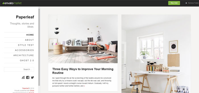
The distribution in small vertical boxes of this theme makes it easy to organize our content and always have it in sight. Two columns allow us to move between our writings, while a third column serves as a menu.
Optimization for mobile devices is in charge in this case of Google AMP, so we can use it to target our content to any field.
Saga theme – For photographers
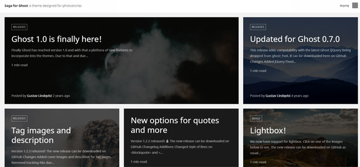
We can also get Ghost blog themes focused exclusively on photography (well, not 100%, but as the main focus).
Saga orders all the photographic material in different grids as if it were Pinterest, where publications stand out for having a large main image.
Ghost WBKD theme – Bright colors
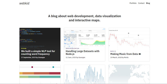
WBKD is a different theme than the rest, since it does not directly target minimalism, but uses a series of bright colors in a two-column design.
The only serious detail is that the theme has been discontinued, so they will not add new features.
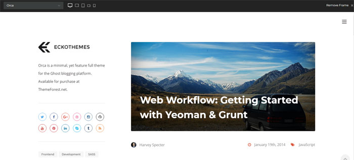
Orca – A mix of various patterns
To prevent our experience from becoming monotonous, this Ghost template combines both a column design and large cover images at the top.
However, the most important thing about Orca is its complete integration with mobile devices.
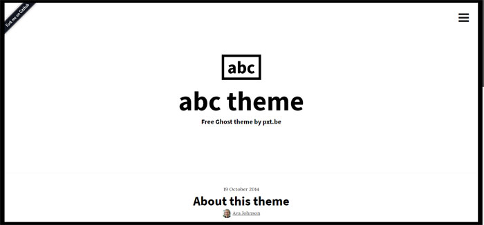
ABC Theme – Overflowing modern options
As a developer, being up to date on the latest programming tools is very important. The ABC theme is precisely designed in integration with some of the existing modern options, such as SASS and Foundation Framework.
This is one of the themes that, if we understand it 100%, we can make the most of it to create real wonders.
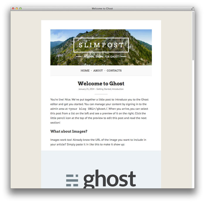
Slimpost theme – Adding some color
Perhaps the white color in the previous themes is very heavy to digest. It is understandable, especially when what we want is a more cheerful blog or with another color in mind. Slimpost allows us to change the background so that our content is surrounded by colors.
It has other very interesting additional aggregates, such as the full-screen image viewer, the Disqus comment box, or the OpenGraph and Twitter cards within the theme.
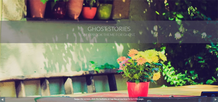
GhostStories – When we are interested in a Flipbook style
The style shown in this theme is very different from the rest thanks to the different page change animations it has.
Very interesting when we want to add some more charisma to our blog, although it has the disadvantage that it has no comment box or share buttons.
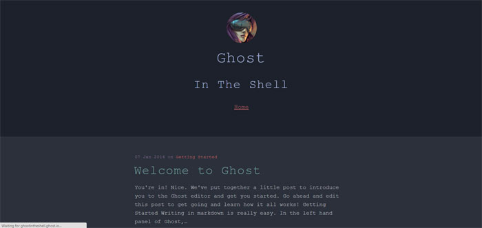
The Shell – Your inner programmer
A palette of dark colors and a simple but modern font. It seems as if it were a machine that is writing to us in our blog, so we recommend this theme for those who want that futuristic touch.
Innovative Ghost Blog Template – Menu to the right, content to the left
We finalize this list of Ghost templates with a responsive alternative similar to Medium, but with the variant that our content will be read on the left while the menu is on the right.
The post Ghost template examples and themes, you should check out appeared first on Design your way.
Source: https://ift.tt/2Izf9Wj


No comments:
Post a Comment