If you are a car lover for sure you know that one of the most iconic manufacturers in the US is the Jeep. It was launched in 1944 and the brand has been producing powerful and tough vehicles that have been used for civilian use but also for military purposes. They are still a key player in this market and for sure you have to love their simple Jeep logo.
The main purpose of a logo is, of course, to be recognized easily by people that see it. Even though they are just a small piece in the car they play an important role when it comes to promoting a brand. Car logos should be considered one of the easiest ways of communicating what a brand is at what it stands for.
If you didn’t know the word “Jeep” was registered as a trademark in 1963 and the logo has been a constant for so many years for the vehicle made by Kaiser-Jeep Corporation.
Origins and history of Jeep
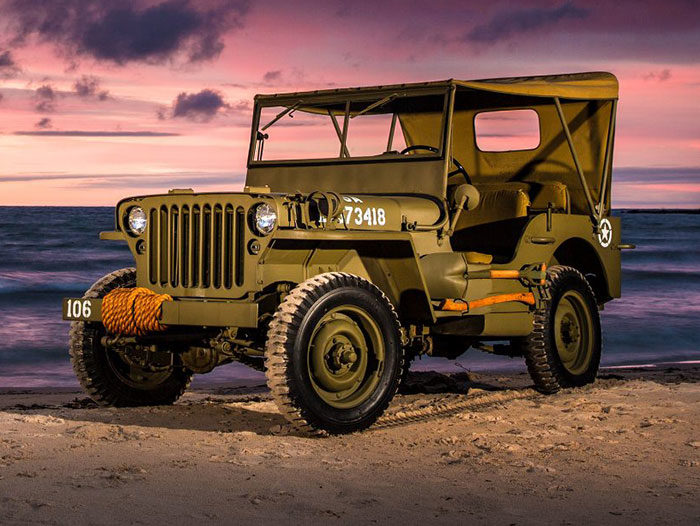
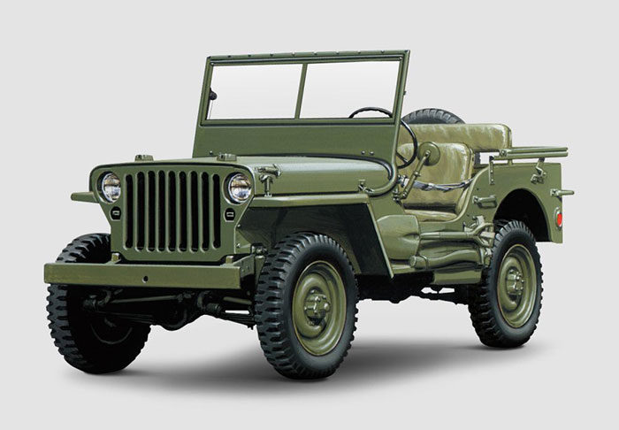
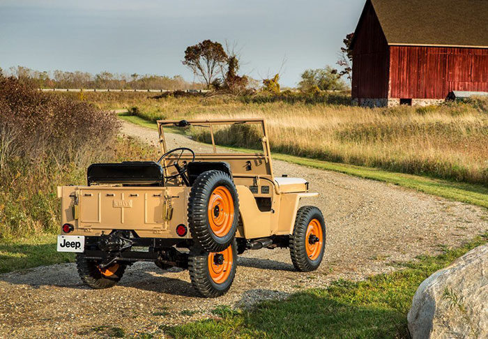
Since it was launched the Jeep has been sold and bought by a few owners. The first one was Willys-Overland who offered the Army a four-wheel-drive vehicle that could be used in military operations. He worked along Ford to produce his firs prototypes and we can see that they were a success.
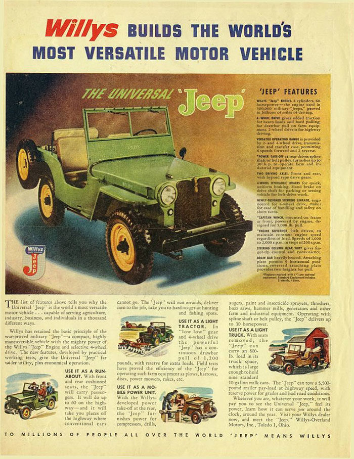
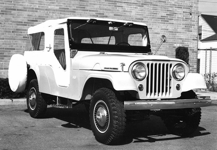
The history of Jeep is quite a rich and colorful one. In the first and the second world war wars, Jeep produced vehicles for the US and was an important instrument in helping Allied forces towards their victories. After the war Jeep continued to produce vehicles in a similar style. They focused on high-quality construction and durability. Even today Jeep’s focus is to create vehicles that are tougher than almost anything on the road.
Meaning and History of Jeep Logo
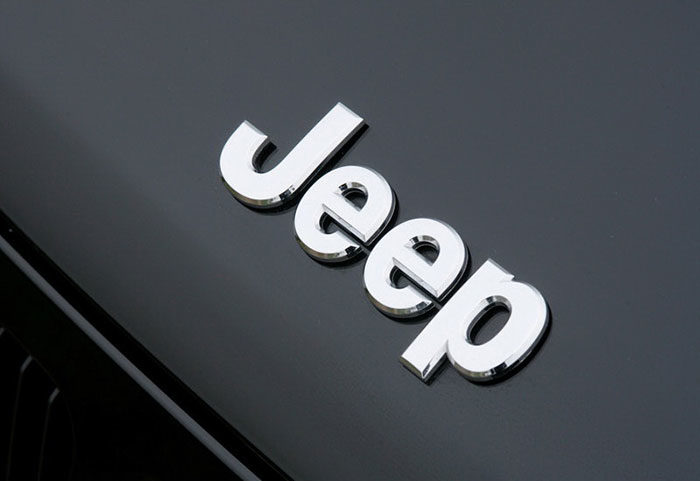
The Jeep logo appeared first in 1963 and it was placed in the center of the steering wheel for the Wagonner and Gladiator car models. What is interesting about this logo is that the full logo was actually never placed on the car itself. Jeep vehicles have only the word jeep on them while the logo is used for advertising purposes.
Origins of the term Jeep
There is still no exact source for the origin of the term jeep. A well-known opinion is that it comes from “GP” that stands for general purpose. Other theories consider that it might be inspired by Popeye.
Jeep Logo
Jeep logo Description
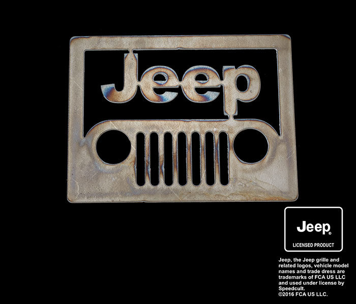
The jeep logo has a simple design and can be spotted in the front of a jeep. It has two lights that represent the headlights and some vertical bars that represent the grill. After there is a word jeep on the top of the image. Compared with other car logos that are presented in an elegant way Jeep might look just too simply, but it still caught the attention of its consumers.
Symbol
![]()
From the start of this brand, the emblem was writing of the brand name used in the front. The emblem was not the same in size on different models, but the shape was still the same. No other extra elements were ever used. Probably the idea behind was to keep a minimalist design and this is what they really did.
Shape of the Jeep Symbol
You can compare the Jeep logo with a grill of a car that has two circles. For sure you can figure it out pretty easy that the circles represent the headlights, so the design is different from logos that are used by most automobile brands.
Compared to other cars where ovals, circles or shields are something common Jeep just had a simple font used.
Font of the Jeep Logo
The main idea of the font that is in the front of a Jeep Logo is that it can be easily spotted. To put it simply, people can read it easily. For this purpose, a font was created in which they had the trust that it will do the job. They avoided any sharp angles and they wanted to show the reliability of the vehicle, the fact that people inside it are safe.
Later on, when marketing research was done on the psychology of perception for different fonts Jeep proved to have made the right choice. The brand strategy was really effective for both the new products and the old ones that have been known for a long period of time.
Placement of the jeep logo
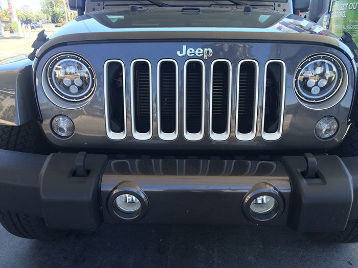
If we look at the position of the Jeep Logo it is located above the grill of the car. Some green vertical lines can also be spotted, and they are used to typify grills that are located between the headlights.
Color of the Jeep Emblem
The Jeep logo has changed a few times if we speak about its color. The first official one had a red and gold color scheme but later on, the gold was changed with blue. When Jeep was acquired by AMC that change too place.![]()
Today the Jeep is in a solid dark green color, probably a choice made having in mind its rich history with the US army. The color represents uniqueness and growth and the white color brings the charm and elegance to play. The colors look nice now and they can be used with no problems.
Taking everything into account we can still consider that the Jeep logos that have been in the past did a great job and more or less they remained the same even from its start.
The popularity of the Jeep Logo
It is quite difficult to judge how popular a logo is of a brand, especially when the Jeep symbol is not really used all the time. Still, Jeep is a brand that has remained loyal to its style in time and put a lot of focus on their quality as a brand and what they did with it.
Jeep logo and the overall brand is a good example of a company that kept its values through history and made it simple to look good in the face of your clients.
If you enjoyed reading this article about Jeep logo, you should read these as well:
- The Adidas logo: What makes it so special
- Try these pretty fonts for fun and sweet projects
- The Amazon logo: Its meaning and the history behind it
- The Pepsi Logo: The old, the new, its meaning and history
- The Disney logo: All there is to know about the Walt Disney brand
The post Jeep logo: The car company’s classic branding that still stands out appeared first on Design your way.


Source: https://ift.tt/2nNXlPP


No comments:
Post a Comment