A very challenging task for a graphic designer is to find the right kind of fonts for their visual designing tasks. There are so many fonts available around the Internet that are free to download. Selecting the right calligraphy font becomes difficult when you notice that every font has a different character, and every font gives a different style to the graphics and other designs.
Calligraphic fonts are used widely for countless projects. They look balanced when they are paired with simple body fonts. These calligraphic fonts are great for highlighting and to attract the viewer’s attention. We are going to look at some eye-catching fonts in this blog today.
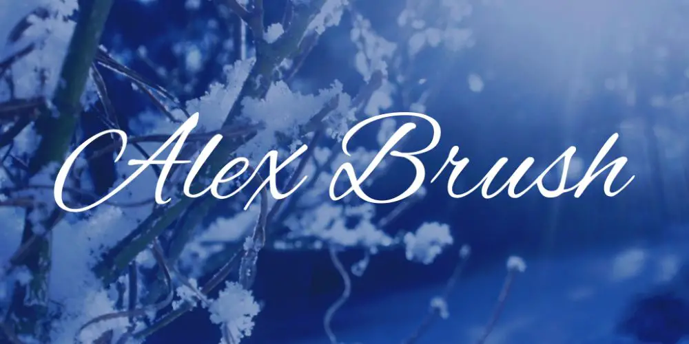
1. Alex Brush:
These fonts have short font ascenders and descenders, which are very rare. Alex Brush are elegant and look like they have strokes that are similar to brush strokes. The capitals of these fonts are dramatic and curvy. It looks identical to classic brush style calligraphic fonts. They offer excellent legibility and readability to the readers.
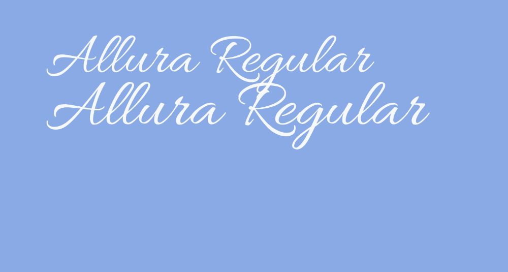
2. Allura Regular:
It has a flowing typeface that looks feminine, and it feels like a handwritten script. These fonts appear simple yet offer legibility and are eligible for package designing and display fonts.
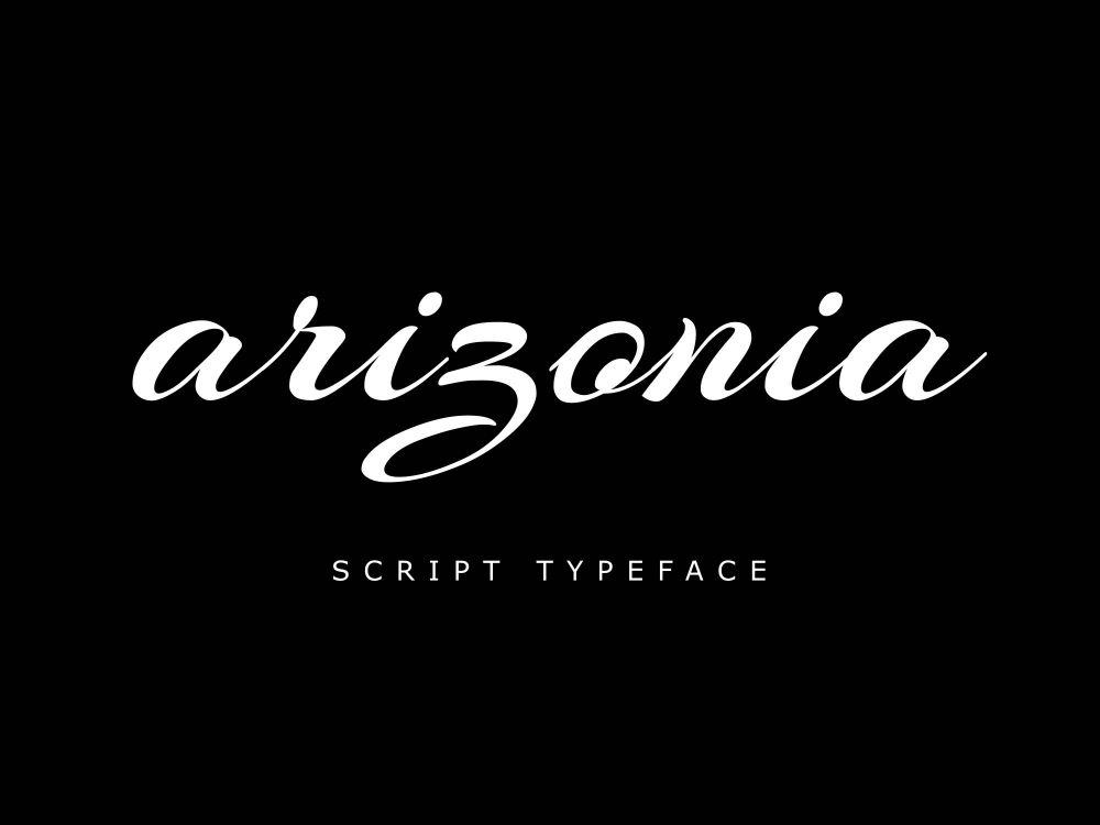
3. Arizonia:
These fonts are varying fonts that have bold, thick strokes. They change into think and sharp strokes. But this font type can draw the viewer’s eyes to it. It gives an Arabic script feel to it and can ae suitable in animations that involve Arabic culture. This font evolved from a painter’s brush, which is a brush from the camel’s hair.
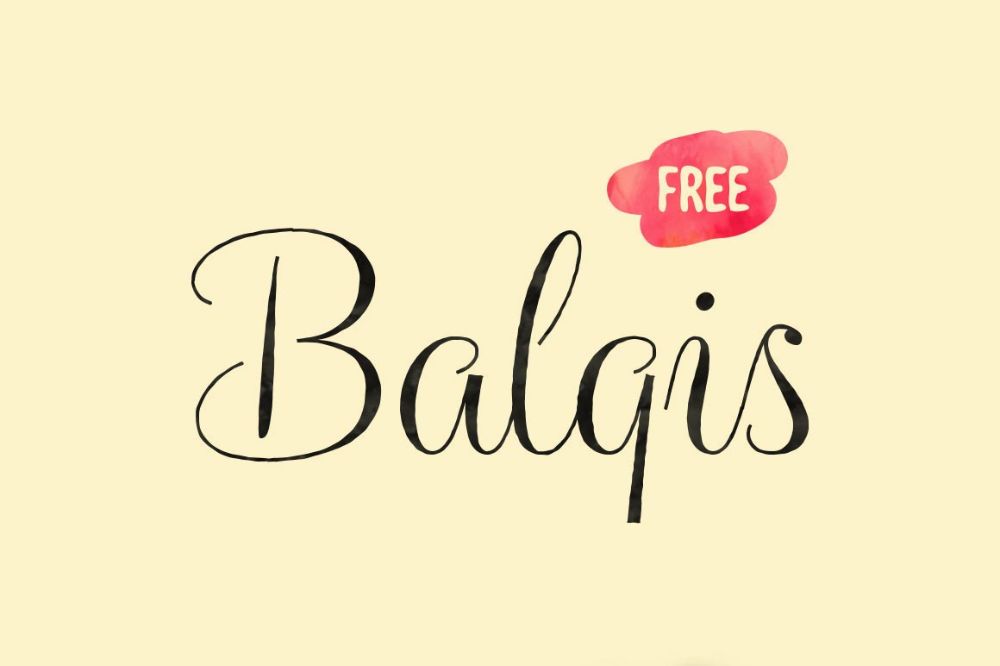
4. Balqis:
This font style looks like a simple handwritten script yet offers it the touch of modernity. When you want to add your personal touch without being too formal for your taste, it has varying thin and thick strokes that define the style of this calligraphic font type.
5. Black Jack:
These fonts are a monolinetypeface that gives a clean appearance that offers a touch of modern design. The curves and strokes of this font type give it a perfect character; hence these are perfect for designing feminine as well as masculine projects.
6. Blenda:
These fonts look like vintage style fonts that have thick, durable, and upfront strokes. They make good eye-catching titles and headers that project a lot of style and character.
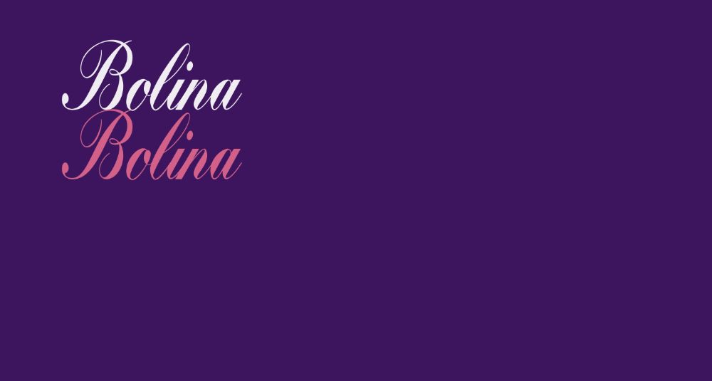
7. Bolina:
These fonts are condensed in nature that has varying stroke sizes. They look like cursive fonts that we practice in our school days. With the legibility it offers, you can use these fonts across countless projects sparingly.
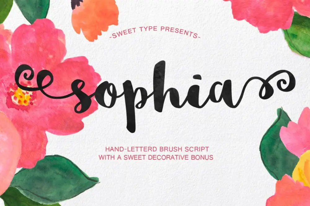
8. Sophia:
These fonts offer a charming appearance to wherever it is used. It looks like brush script fonts that change between thick and thin brush strokes. Sophia font gives a hand-drawn effect and is best to use if you want to sprinkle a dash of your personal touch to a project.
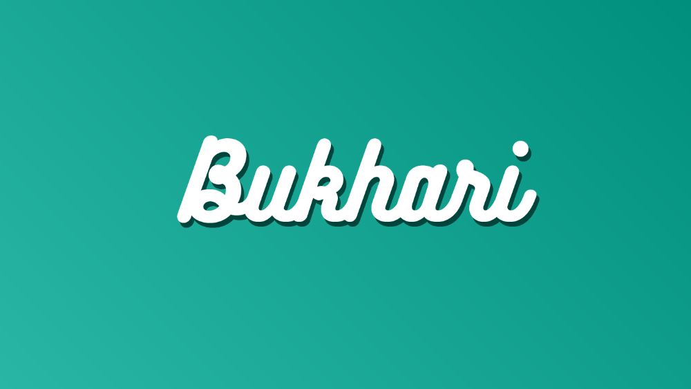
9. Bukhari Script:
These are monoline fonts that have a cursive nature. It has a few OpenType features that create an exciting script with a lot of variations. Bukhari Script look bold and can be useful in the places where you need to draw the reader’s or viewer’s attention.
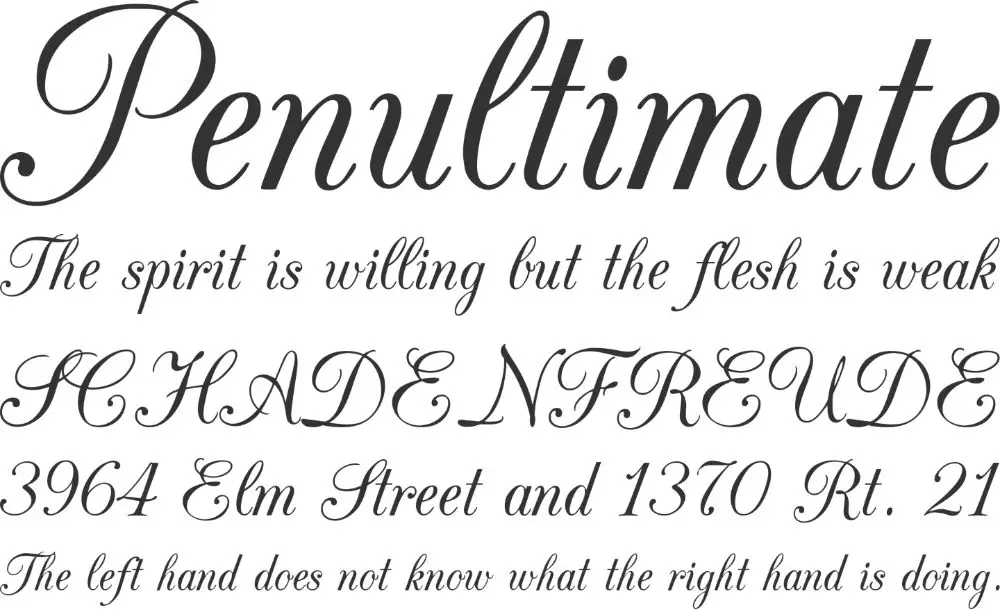
10. CAC Champagne:
These fonts offer an air of elegance to your graphic designing projects that are very legible. Because of its timeless design nature and versatility, it is useful in traditional as well as formal applications and projects.
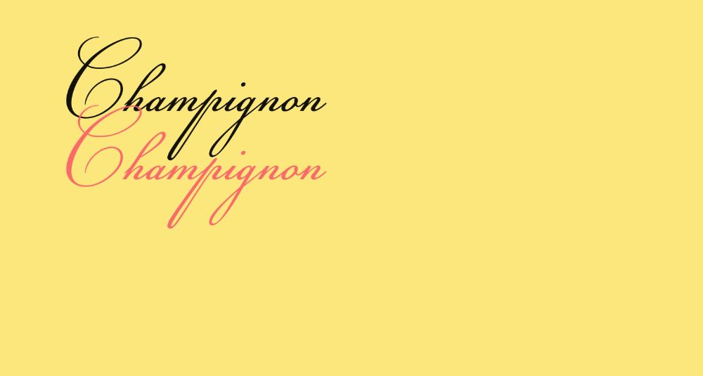
11. Champignon:
These fonts have thin strokes and are feminine. These look best when they are in medium and large font sizes of text. Its stylish strokes and curves can be useful for titles and the text on invitations and greeting cards.
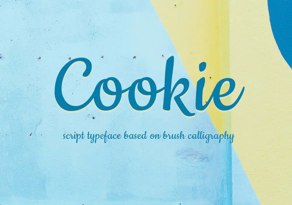
12. Cookie:
These fonts offer an appearance that is similar to calligraphy made using a brush. Cookie have a 1950-ish style and seem very easy to approach. They are not very decorative, yet capture your attention with versatility that is not very aggressive.
13. Cursif:
Cursif fonts are very tall and long, and hence it looks like they are condensed. These condensed fonts offer a touch of elegance to any text. It looks great when you have to highlight short lines of text or add a phrase or an idiom to the version.
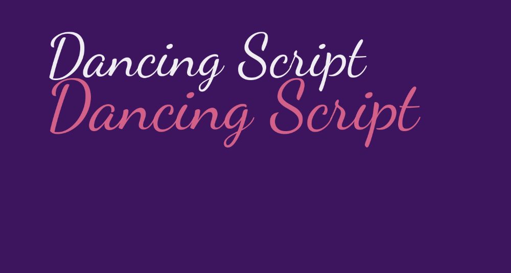
14. Dancing Script:
These fonts appear very lively and are modern. Its capital letters get beyond the baseline. Dancing Script offers an amicable look at the project of any graphic designs. Because they are stylish in their appearance, they look good in almost any usage of them.
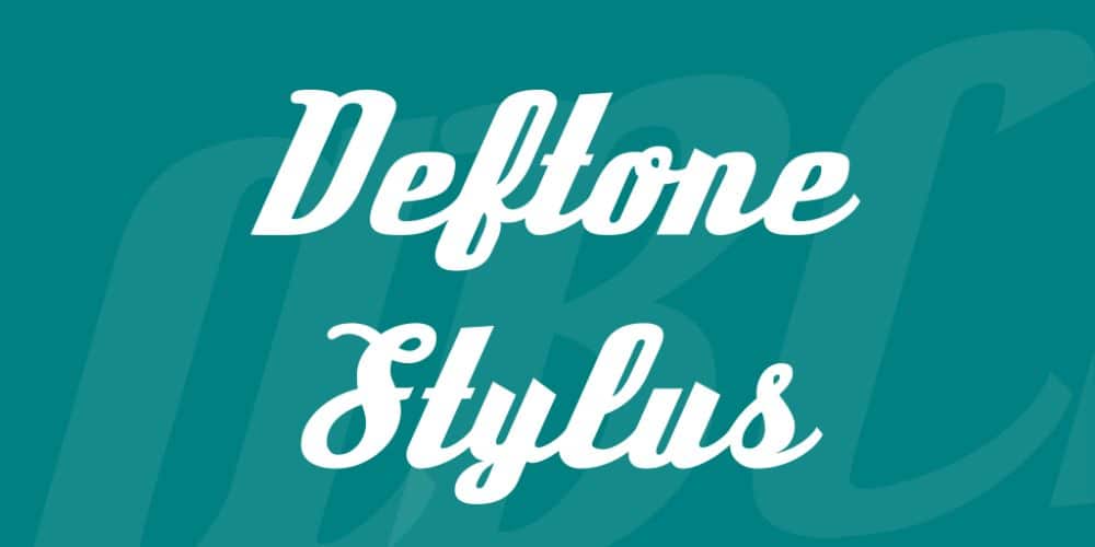
15. Deftone Stylus:
Deftone Stylus offers very structured design calligraphy to its projects. It draws the attention of a user quickly with its thick and bold strokes that give a compelling character. This font type is excellent for providing a substantial impact on the headlines or titles.
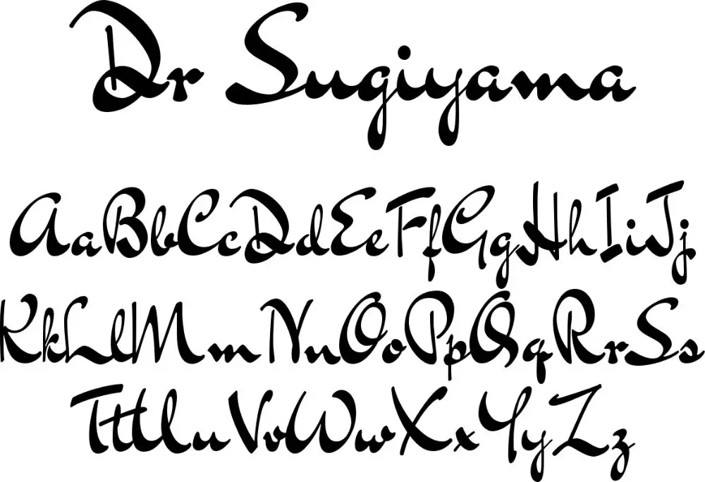
16. Dr. Sugiyama:
These fonts are descendants of early, handwritten text style that gives a vintage look to the text. Also, it provides an air of exotic feel because it has a lot of varying strokes and widths that make them unforgettable. You can use these sparingly to have uncomplicated designs.
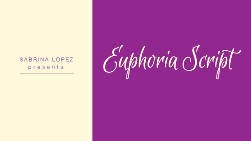
17. Euphoria Script:
Euphoria Script casual calligraphy fonts are very playful and have letters that are separate from each other. These unconnected letters offer it a significant amount of legibility and hence look good when they are suitable for writing short phrases or lines of text. They are widely loveable in the fashion and food industry because of its stylish look and feel.
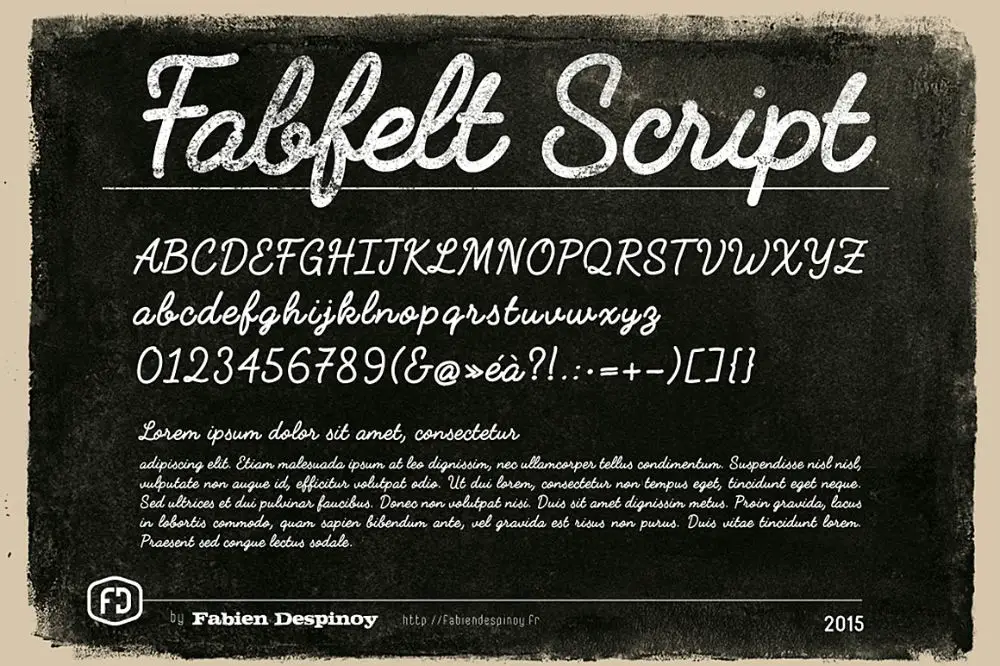
18. Fabfelt Script:
Fabfelt Script fonts give a retro feel to the project and are monoline in nature. These fonts are widely suitable for brandings along with their use in titles. They look excellent when paired with serif font or minimal sans serif. This combination of fonts can be useful to make a substantial impact.
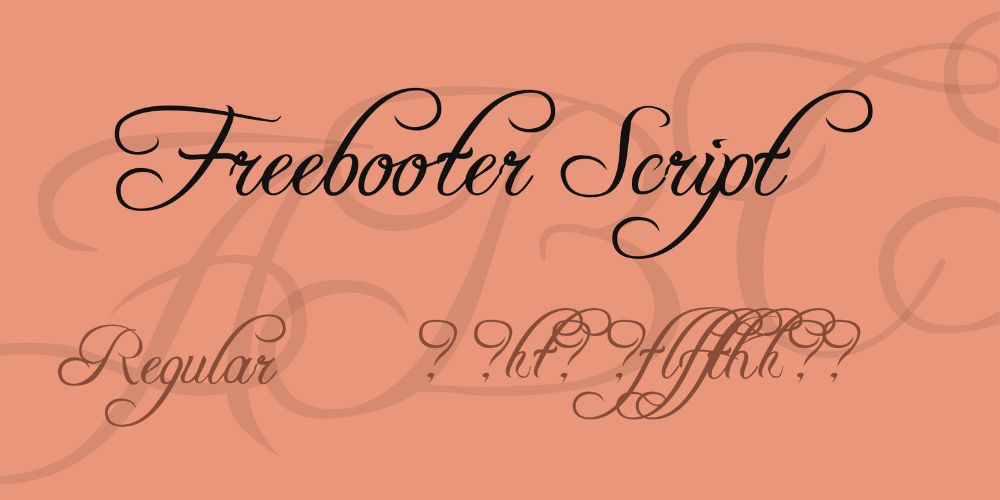
19. Freebooter Script:
These are unique because they comprise of a lot of curves and curls in their appearance. It gives a formal feel to the text, along with a hint of elegance. These fonts are great to entice their audience because of their graceful nature.
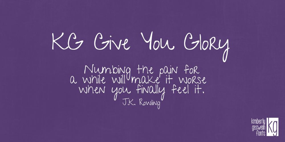
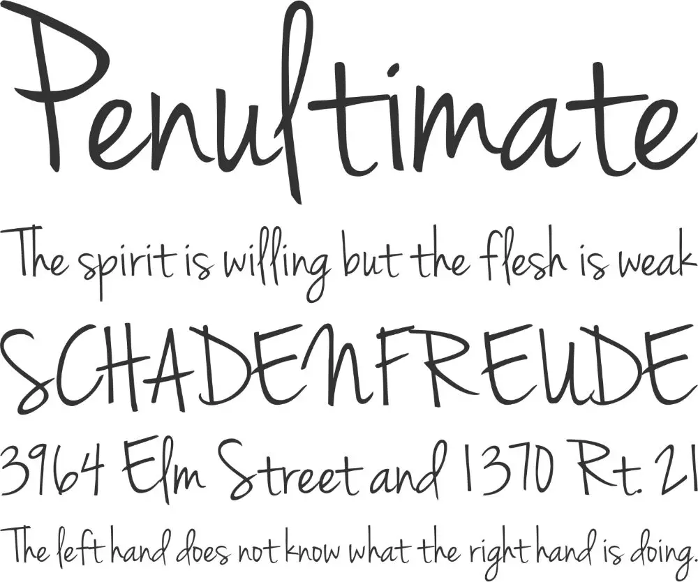
20. Give you glory:
These fonts look real and handwritten that seem quirky. The letters are very uneven that gives it a personal touch when you don’t want to scan your handwriting for texts in graphic design projects.
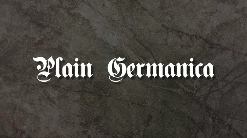
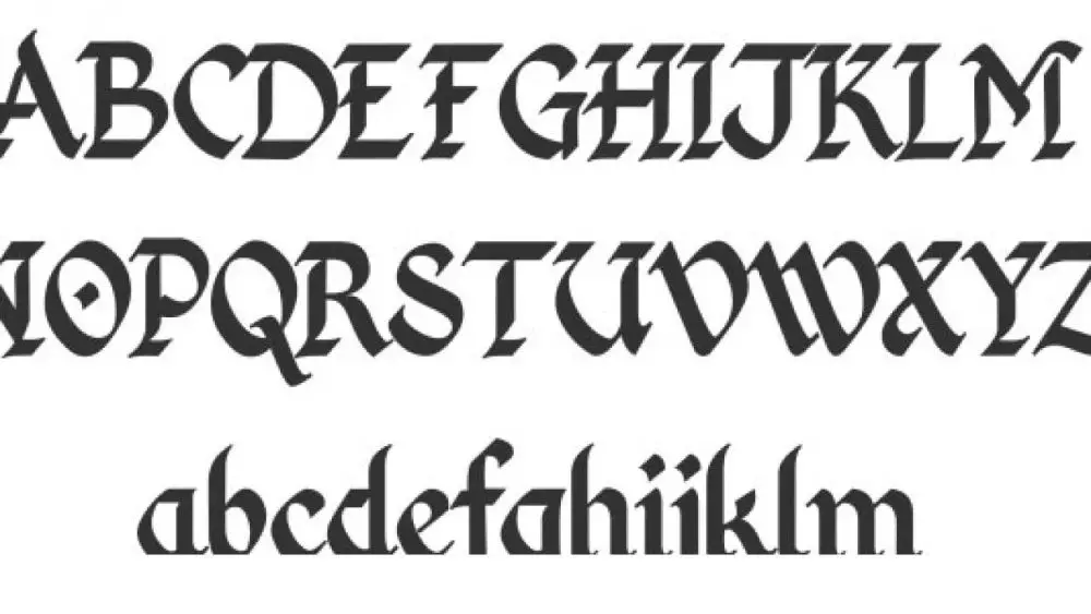
21. Germanica:
Germanica are a bit different as they derive their presence from the medieval age. These fonts appear gothic and have thick and bold strokes that look like they have are suitable with calligraphic nibs. It surely adds a traditional touch to your text and is great for highlighting your text.
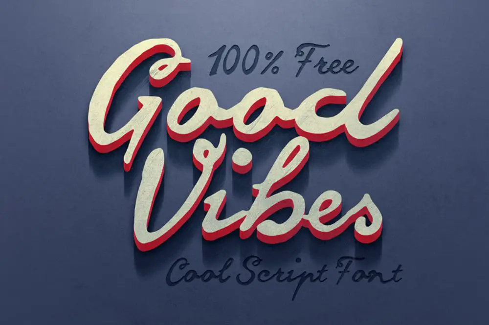
22. Good vibes:
These fonts have uneven handwriting with so many imperfections and thick, large stroke width. Even though it has flaws, it still makes your text come to life and stand out among the rest of the document. People who insist on using the perfect font styles won’t feel like using these fonts.
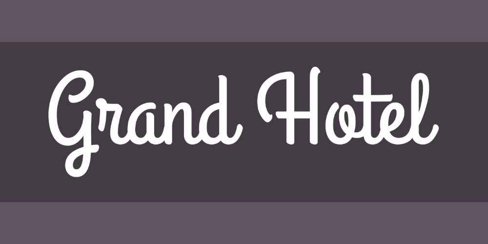
23. Grand Hotel:
Grand Hotel fonts are upright fonts that have a condensed style to it. With the classic vibe they offer, it would be great to pair these fonts with minimal sans serif to create the designs that keep you engaged. They provide high legibility as it has monoline font weights.
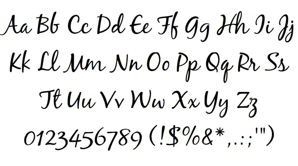
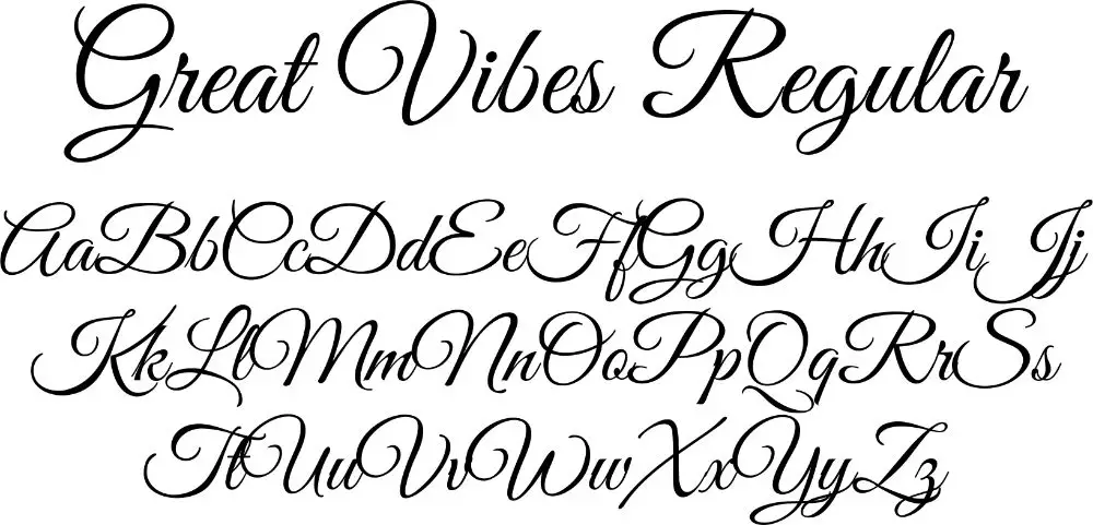
24. Great Vibes:
The font name itself suggests clean and good vibes that have beautiful flow with sharp and heavy strokes with dramatic capitals. It has loops that give the text an elegant feel and is excellent to use when you have to highlight titles and bring them to front.
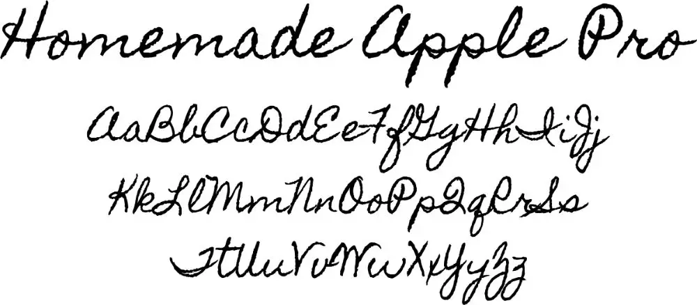
25. Homemade Apple:
Homemade Apple fonts have a style that resembles a child’s real handwriting. It adds a lot of character and charm if it has a good use. These fonts are perfect for use when you have to design invites for a family gathering or anything that involves food.
26. Jenna Sue:
Jenna Sue fonts have clean strokes that give you an appearance and feel of elegance as well. These types of fonts offer a personal touch to your project, along with the addition of a character to it.
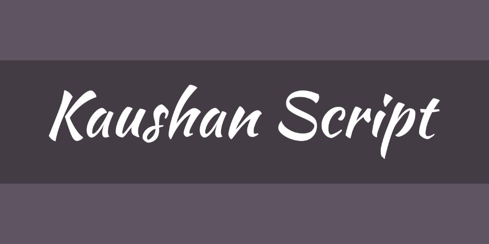
27. Kaushan Script:
These are fonts that have beautiful imperfections that have a rustic feel to it. They give you an optimized appearance when they have small to medium sizes of fonts. The imperfect strokes are the only thing that gives it a unique feel to it that adds impact to your work.
28. Kingthings Foundation:
These are traditional letters that look great when they are black. It gives a modern twist when it combines with classic thick strokes. They offer a very casual feel and appearance to whichever text it applies.
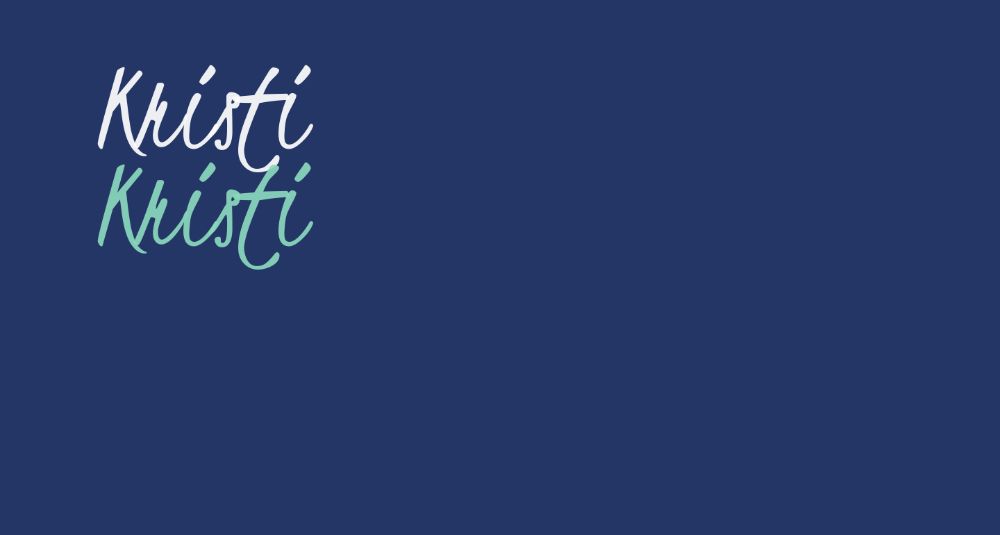
29. Kristi:
These are fonts that are very casual with strokes that are very uneven, tall, and slim. Kristi fonts look best when they are present in large size for highlighting a title or for a logo design. It projects a lot of impact along with a personal feel.
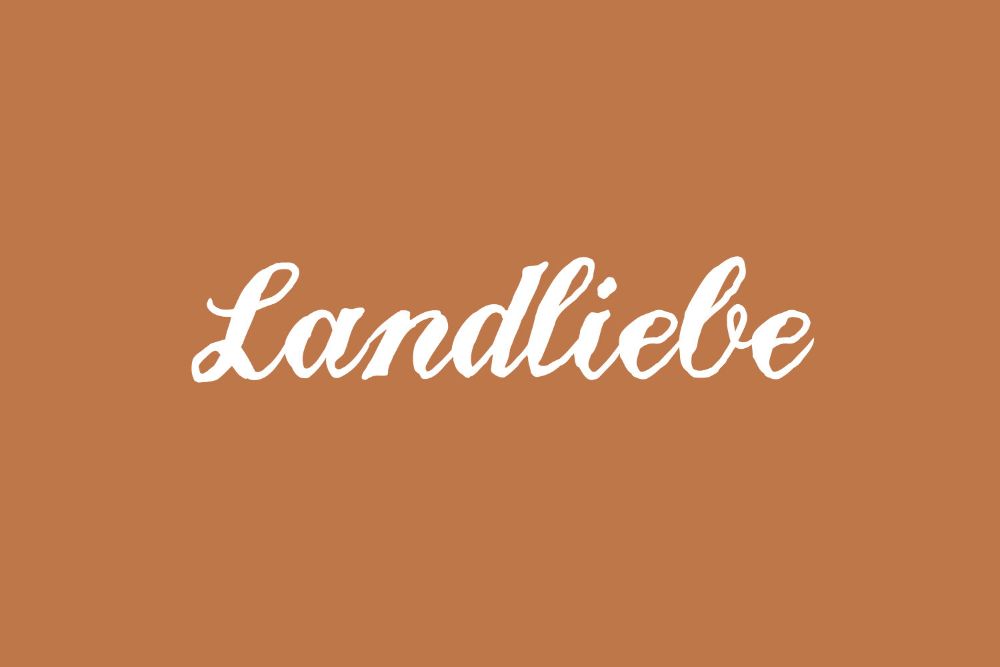
30. Landliebe:
These fonts have an appearance that looks like they have wobbled while they were in the process of their formation. Because of its imperfections, it gives the project a personal feel through its different thick and thin strokes. Landliebe are best for highlighting titles and text with short lines.
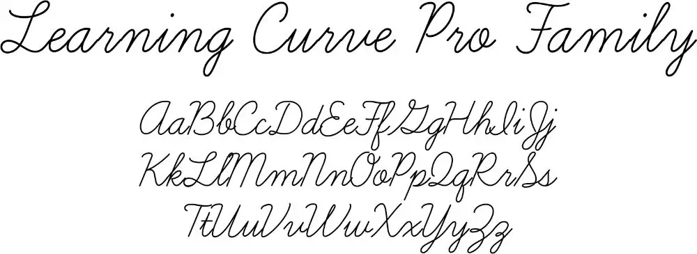
31. Learning Curve Pro:
Again, these fonts look like a person’s handwriting that seems to have a cursive writing worksheet practice. It offers a very modern appearance to the text and is legible, along with the flexibility factor.
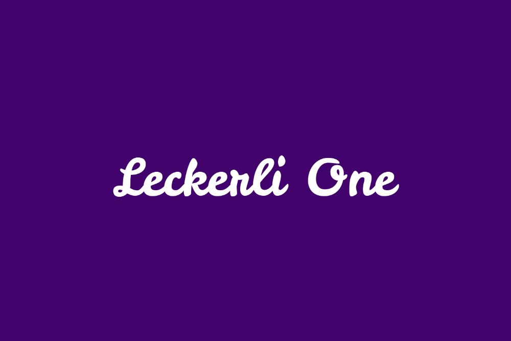
32. Leckerli one:
These fonts add a bit of charm to your graphic design tasks with its thick and bold strokes. It has very typical chunky curves and curls that connect one letter to another, making it readable and sharp.
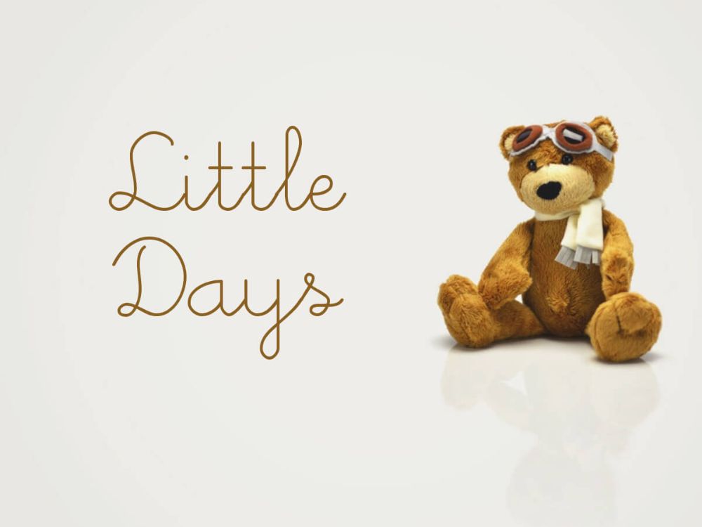
33. Little days:
These fonts are straightforward. It has a thin line like strokes, which are monoline in nature that adds a feminine touch to the text that uses this font. Tiny and straightforward curves make the fonts look classy and offer a little beauty to the project.
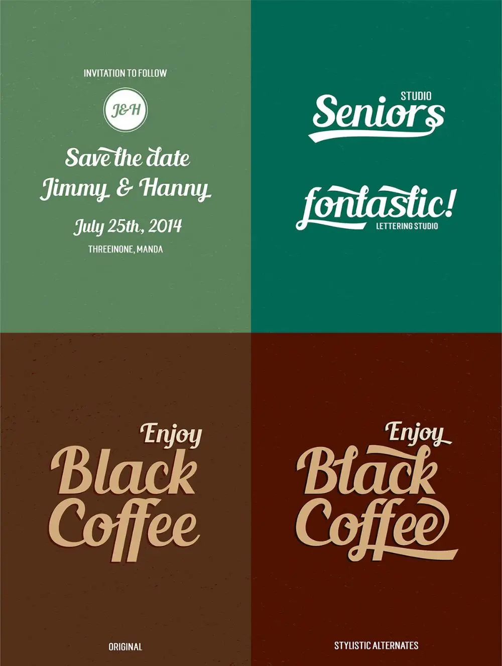
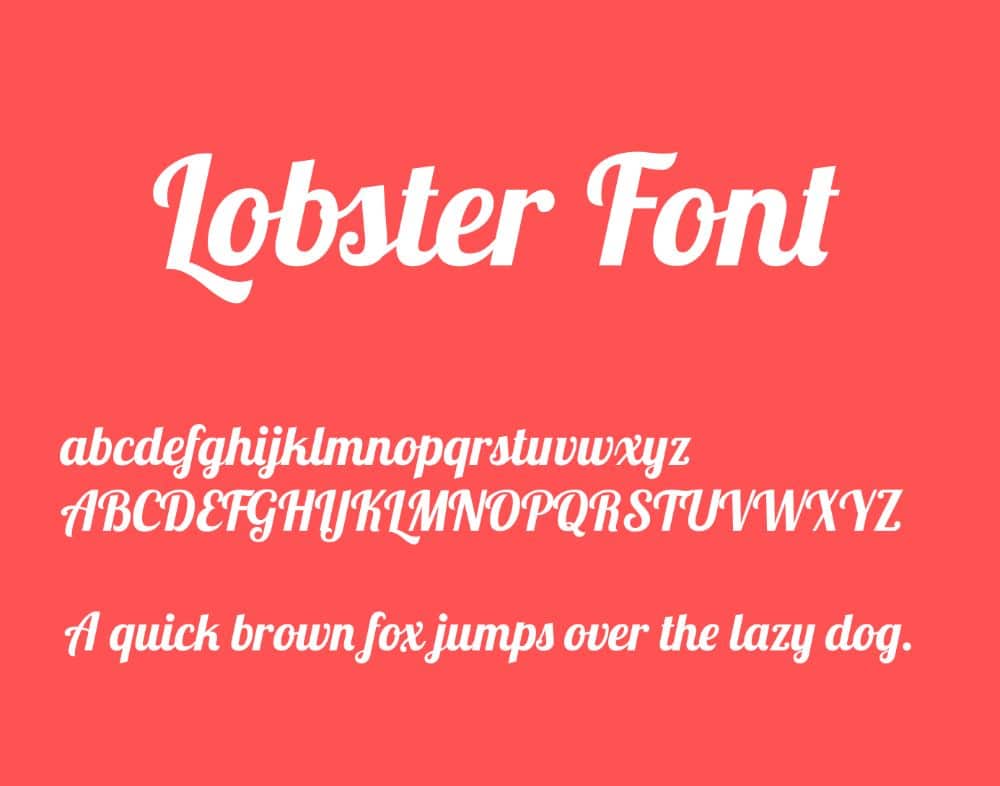
34. Lobster:
Lobster fonts are bold with a condensed form. The thick and bold strokes that have similar width all over the text has versatility to offer. And this versatility has led to these fonts being useful widely. The individual blog that has excellent clicks often use these fonts to highlight their artistic pictures.
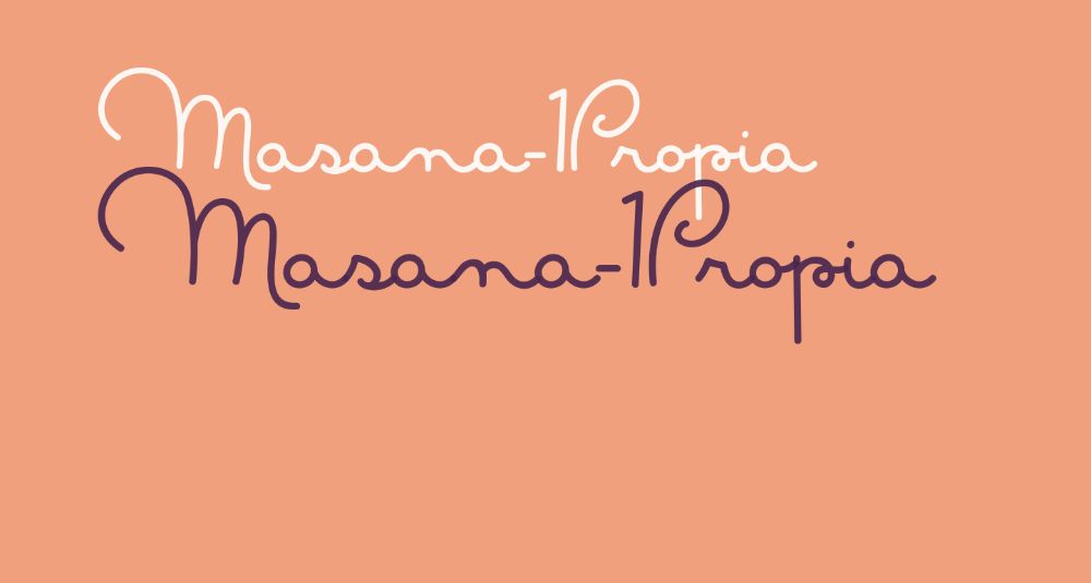
35. Masana Script:
These fonts look like they are handwritten fonts that are monoline in nature. It has a low X height with great descenders as well as ascenders. This font is excellent for projects that involve women and children alike, as the fonts are feminine in their appearance and representation.
36. Miama:
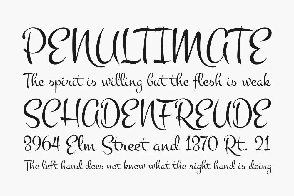
These fonts are said to be inspired by the creator’s love interest and her beautiful handwriting skills. Miama fonts look very romantic and give a top-notch feel of a personal touch. Hence, they are not useful for use in long lines of texts. These fonts are suitable to highlight only the phrases or titles of a project.
37. Montez:
These fonts have changing stroke widths and weights, which give you a feeling of happiness and joy along with elegance. It displays the flair of a beautiful script, Montez fonts are useful. The fonts look like simple paintbrush strokes that look lazy. But, because of its high impacting nature, it is best suited when the text is present in large-sized Montez fonts.
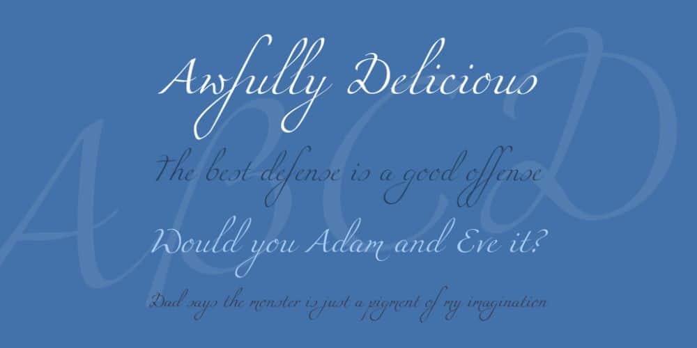
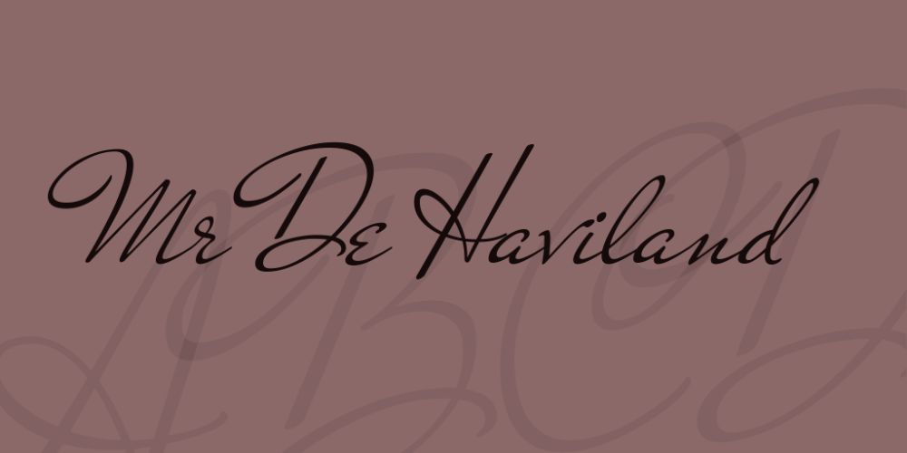
38. Mr. De Haviland:
These are simple fonts that also display intricacies that add a specific character to your designs and projects. They offer a great deal of legibility even while the letters are connected. Mr. De Haviland fonts are full of fonts that have curved capitals and thin strokes.
Conclusion:
Typography in any graphic design project is crucial as the content is the first thing the user goes through after going through the designs. A calligraphic font is about selecting the right font face to highlight certain parts of the text along with the simple fonts. These fonts provide aesthetic value to any project and help to set the tone of the graphic design project. It plays a significant role in creation of and maintaining a sense of balance between graphics, simple text, and the text written with calligraphic fonts. It attracts readers by the fonts used in the project. Hence, the selection of the right font type is very significant.
via https://ift.tt/2Z0CZld

No comments:
Post a Comment