SaaS websites best practices and tips to design one. The development of any website requires acknowledging the requirements of the users in well-formulated content, web design, and testing, but the task is particularly tricky for software as a service (SaaS) companies. SaaS website design is a crucial way to get things right because the business is completely online—meaning there’s no brick & mortar to rely on—and hands-off—meaning that ideally sales are made without the intervention of an actual salesperson communicating back & forth with a potential customer.
While designing your SaaS website, the impression the website gives your potential customer is very important. SaaS website design should be engaging, cohesive, and innovative.
SaaS represents a low cost and agile way for users to access software – and for SaaS companies that means there’s a lot of room for opportunity and competition. This means that your website not only needs to have the right design, but it should also address pain points – particularly because it’s the first interaction visitors will have with your company. Understanding the best practices can be a great way for web designers (and SaaS founders) to identify their own brand presence.
Engaging Homepage
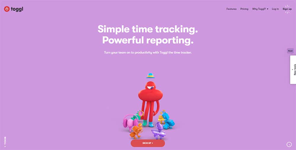
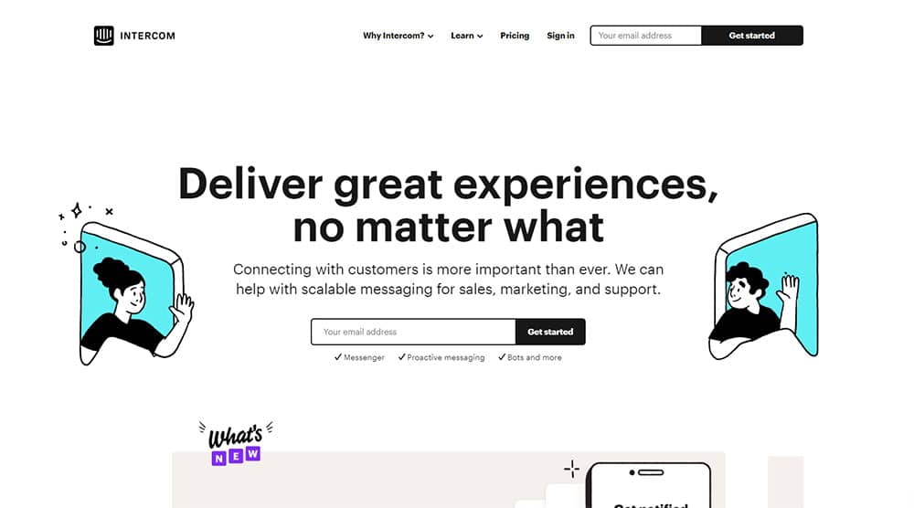
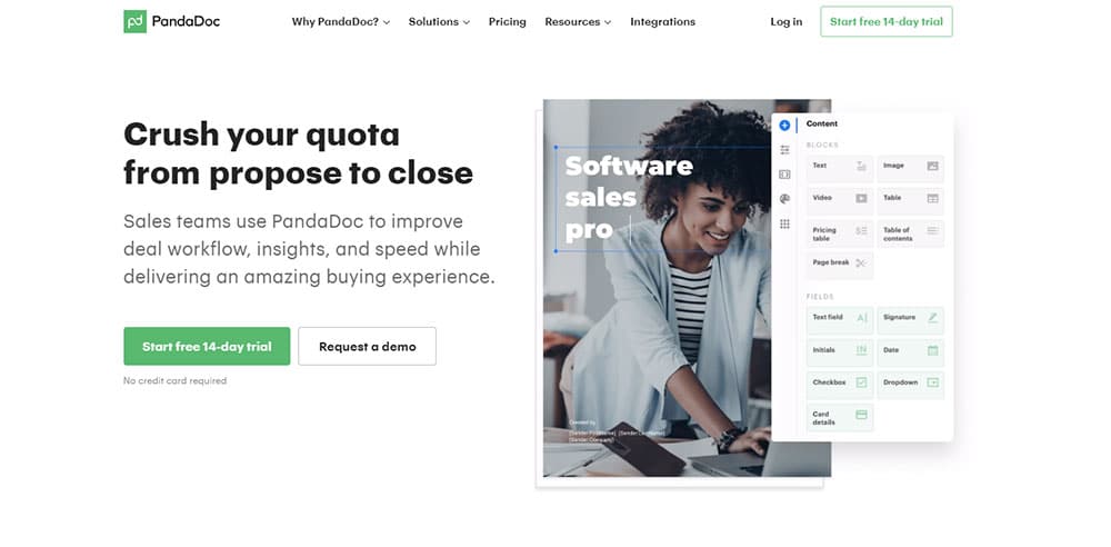
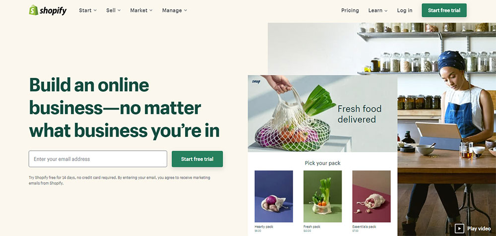
A compelling headline, an eye-catching product hero shot (or explainer video clip), an obvious demo or free trial Call-to-Action (CTA), along with a clean user interface — focusing on providing a simple user experience would be a good way to represent your homepage of the website.
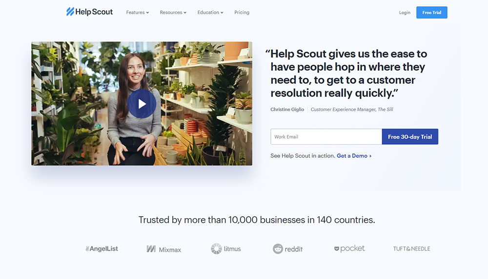
Whether it is a demo or a case study in the form of video on the homepage, more than half of the sites took the approach. The majority of SaaS companies leverage a video but not by a significant margin to make it considered a best practice. And most SaaS companies also know about the impact of social proof elements — such as testimonials and customer logos. These are standard best practices and key design elements that build trust and attract visitors.
Website headers
Highlight your website headers as most consumers will skim your site and your headers prevent this and seek their attention and make them browse the page longer. Creating bold, fun, and conversational headers for your website can be a great way to drive people deeper into the website. Showcase your brand personality to connect with visitors on a more personal level.
Customer engaging content
The content on your site should first and foremost help your visitor, wherever they are on their journey. You can help through whitepapers, blog posts, and other useful content. Your website should be used for more than just a brochure of what your company does; it can be a highly engaging and persuasive sales tool.
Ease of browsing
Create a website that is easy for customers to navigate. A simple design can be easily interpreted by customers. Mentioning all of your company information on the homepage of your website is not going to be fruitful. A clean design with one main call-to-action will go a long way.
Sleek Design
Keep your designs up-to-date, modern, and aesthetically pleasing; this is what prospects expect from a software company. If a visitor or client does not like the presentation of your website, they will have a more negative view regarding the services you offer. Website design correlates very closely with the way prospects trust and align with the views of your company. Hence, Fresh design will benefit you.
Effective Presentation
Using colors effectively in your SaaS homepage involves limiting your color palette to 2–4 colors and assigning roles to each color.
For example, if orange is the color of your first primary call to action button, you should continue to use orange for the call to action, and only for calls to action. Visually, it becomes confusing if the same color is used for more than one purpose.
Responsive Design
Responsive design is all about how well adapted your site is to different devices. The number of mobile devices is predicted to hit 16.8 billion by 2023, and people no longer would browse the internet solely from their desktop computers. In fact, in 2018 almost 58% of website visits were from mobile devices, and these devices made up 42% of total time spent online.
Hence, making your website compatible and user-friendly for mobile devices is necessary. A responsive site is different from building a separate mobile site: it is about building one website that runs efficiently on various devices.
Efficient loading time
Slow-loading websites are forgettable and frustrating which fails to engage the client. To explain it in a simple way slow websites are bad for business. They make your potential customers unhappy. You can try to optimize your website to enhance its performance and watch how your page view count and time spent on site increases, while your bounce rate drops.
Organization
Make sure your SaaS website design provides the utmost clarity. Your company may have a lot to offer, but if it isn’t strategically placed on your website, it may not reach the buyers in the best way possible. Cluttered and busy sites can overwhelm visitors. Hence make your website flow and present your content in a logical sequence.
Portraying your motive
Make it easy for anyone who visits your site to know what you’re offering right from the start. When someone visits a website, they don’t want to spend a lot of time snooping around to find the actual purpose of the site. Make your SaaS website design user-friendly, and use it to support the motive of your business.
Payment Page
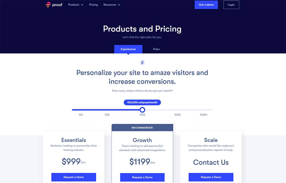
All SaaS websites should feature information about pricing, whether it is explicit in dollars or not. For higher-level enterprise SaaS products, it is often not possible to give numbers due to the complexity of custom integrations. But that doesn’t mean you shouldn’t have a payment page. If possible, you should show how your pricing range is compared to other competitors. Base camp does this better than any other SaaS product.
Presenting future outcomes
Considering most of the customers, what will impress them is not your features or the company mission. In fact, it is nothing you have direct control over. It is all about their imagination. It’s how they see themselves changed after using your product. One of the most effective ways to increase your conversion rate is to encourage this kind of visualization within your homepage.
Social proof
Social proof is evidence that other people have used your service and hey, they liked it alright. Social proof can be presented in the form of the following ways:
- Customer logos
- Customer feedback?/?testimonials
- Case studies
- Awards you’ve won
- The displayed number of active users
Because SaaS lacks information about personal factors, it’s vital to show your visitors that people just like them or entities they respect have given you the stamp of approval.
A Manual Or FAQ
For every customer that asks for the 100th time about your refund policy, there are many who have the same query but never bother contacting you. Those customers are most likely to immediately turn to a competitor to fulfill their objective. Even just a short FAQ can prevent some of them from immediately turning away and give your service a second chance. Hence always include a manual to present the procedures of your site in a detailed manner.
Analyzed Blog Posts
A lot of SaaS companies make the mistake of simply feeding their most recent blog posts into the homepage. Next, if you’re going to show blog posts, we believe it’s better to analyze and find the blog articles that give the best returns in terms of engagement, signups, or lead magnet downloads and present them on the homepage.
Hover Tips
When your users have to enter data or complete a form, it is important to introduce hover tips. If there’s a field needs filling, offer an explanation or clarification that will appear once you hover the mouse over. It is surprising how little sense some forms can make to an outsider or how for one reason or another you might lose people who simply will not understand how to fill a form. You could have retained from losing such a customer by introducing a quick hover tip.
The footer
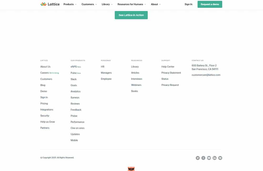
On the one hand, Google has been hinting at devaluing footer links for quite some time. Then again, they referred to site-wide footer links. You can use the footer to boost give your SaaS SEO strategy a nice boost. The footer gives you the opportunity to present reference pages you didn’t have space to include in the main navigation. And that’s precisely the approach many companies take into consideration.
Regular updates
One of the most common fears for consumers regarding signing up for a SaaS is whether the SaaS Company is active and thriving. If a visitor sees no sign of your website is updated in the last year, you can be sure it will set off alarm bells in their head. Customers want to know not only that their provider can help them through timely customer support but that the product is successful (aka profitable) and won’t shut down on them any time soon. Hence, timely updates and information management on the website should be taken care of in order to not lose the customers.
via https://ift.tt/2NdFfA8

No comments:
Post a Comment