One of the most well-known automotive manufacturers in the world is Toyota. In 2016 it sold more than 8 million cars for example and netted over $2 billion. These are some big numbers and when we think about the Toyota brand most of us associate it with things like quality, technology, and safety. The Toyota logo has a rich history together with the brand.
They have been producing high-quality cars for many generations. And the Toyota symbol that we can see on each car carries a deep meaning that should be explored. Always the Toyota logo will be associated with a great car.
Origins of Toyota

Toyota had a big success in the automobile industry but actually they did not start with selling cars. They were known as Toyoda Automatic Loom Works when they started out and their focus was on textiles and automatic looms.
By 1930 however, the Japanese government began to propose to Toyoda to go into automobile production so they could help the nation with the ongoing war with China.
In the present Toyota has really made an impact on the large share of the global market for cars because it sells affordable ones. It is the second most profitable company in Japan and chances are it might advance even further. So, what was the role that the Toyota logo played in all of this?
Origin of the Toyota logo
The current Toyota symbol was made in October 1989 in order to celebrate 50 years of activity as a company. The creation of the current logo took almost 5 years to make sure it is going to be suitable for all the foreign countries. So, the old Toyota logo got replaced and the new one came with more strong visuals and made their cars stand out from other automobiles.
From “TOYODA” to “TOYOTA”
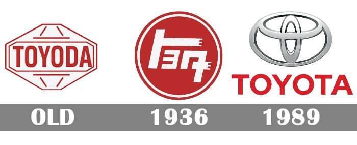
In 1936 the company had a public contest in order to gather suggestions for a new logo so they could transcend to a more corporate approach. More than 27.000 entries were made and the winning one used a Japanese katana letter to create the logo.
Ideas
This logo has three ovals that have been combined in a horizontally symmetrical configuration. There are two perpendicular ovals that go inside the bigger one. Basically, they represent the heart of the customer and the hearing of the company. And when they intersect, they create a mutually beneficial relationship and trust between each other.
The overlapping of the two perpendicular ovals inside the outer oval symbolize “T” and also a steering wheel. Different strokes are being used for the contour. The space that we see in the background of the logo shows that Toyota focuses a lot on quality, joy and innovation. The Toyota logo is a really good looking one.
The History of the Toyota Logo


The Toyota emblem that was first used on the cars they made in 1936 was the last name of the founder Kiichiro Toyoda. After a decade it got replaced with the simple Toyoda word that was spelled in Japanese and had a red circle.
This remained the active design till 1989. Because the company was expanding into foreign markets that had to come up with a new universal logo that could represent the Toyota symbol.
They launched their new logo with the new luxury model the Celsior in 1989. After this, the new logo could be found on all the vehicles that Toyota had in its production. The version of today only suffered some minor changes. The Toyota logo followed also the cultural traditions from Japan, and it was both simple and meaningful.
Design Elements of the Toyota Logo
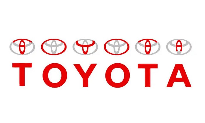
The Toyota logo has a horizontal symmetric shape that can be spotted easily by anybody that sees one of their car models. It is completed with an oval that is circling the other two and it shows the world embracing Toyota.
The ellipses are designed using different brush strokes and are paying tribute to the Japanese calligraphy craft. This means that the space between the oval is meant to symbolize the values that Toyota stands for.
Its cars have made Toyota win millions of loyal customers in the globe and are making their best to always meet their expectations. The Toyota logo could seem quite simple if this is the time when you first see it and understand what it stands for is something that you might already be curious.
The shape of the Toyota Symbol

All the shapes that you can find in the Toyota logo make it symmetric and it can be spotted easily from both the front and when it is seen through rear-view mirrors.
The Color of the Toyota logo
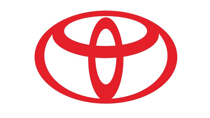
The corporate version of the Toyota logo has a red color on a white background because it is attractive, and it stands out. The one you see on most of its cars is silver with some gradient shades. This is quite an elegant and modern option that is typical for most car manufacturers and the hybrid models feature the silver emblem on a black font with some blue shades.
The popularity of the Toyota Logo
Even though the Toyota logo had a lot of success in its history compared with other car brands it hasn’t really generated a lot of popularity like Ford, for example, has made. You could say that this fight is unfair because Ford has the tradition and national appeal as an advantage.
We will also not find it on that many clothing for example but still, the Toyota emblem did its part of the job. They managed to create a simple logo that comes with a complex message to its customers.

Another thing they did was that they adapted their logo to so many influences and different countries in order to get a universal design that could work in the countries they are selling their vehicles.
In conclusion, the Toyota logo is really a great example of how a simple and well-thought idea can become reality and impact a brand in so many good ways in the face of challenges that come from this field.
If you liked this article on the Toyota logo, you should check out these articles as well:
- Typography posters: Tips, Best Practices, And 108 Examples
- Typography Books From Which You Can Learn About This Beautiful Art
- Personal Logo Design Ideas: How to Create Your Own
The post The meaning of the Toyota logo and the history behind it appeared first on Design your way.
Source: https://ift.tt/2U2HvxB

No comments:
Post a Comment